モジュールのインポート
import pandas as pd
import matplotlib.pyplot as plt
pd.set_option('display.unicode.east_asian_width', True)
plt.rcParams['font.family'] = 'IPAexGothic'  # 日本語表示に必要
データの読み込み
data_path = "./titanic.csv"
df_data = pd.read_csv(data_path,  encoding="utf-8-sig")
グラフの出力方法
基本の書き方
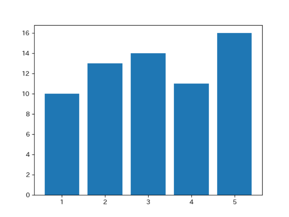
x = [1, 2, 3, 4, 5]
y = [10, 13, 14, 11, 16]
plt.bar(x, y)  # 棒グラフの場合
# plt.plot(x, y)  # 折れ線グラフの場合
# plt.scatter(x, y)  # 散布図の場合
plt.show()
 グラフを画像として保存する場合は下の通り。
x = [1, 2, 3, 4, 5]
y = [10, 13, 14, 11, 16]
plt.bar(x, y)  # 棒グラフの場合
# plt.plot(x, y)  # 折れ線グラフの場合
# plt.scatter(x, y)  # 散布図の場合
plt.savefig("./bar_chart.png")
Panadasのデータを用いる場合
x = df_data.loc[:, "年齢"]
y = df_data.loc[:, "運賃"]
plt.scatter(x, y, s=100, alpha=0.2)
plt.xlabel("年齢")
plt.ylabel("運賃")
plt.show()

Pandasで集計した結果を用いる場合
df_count = df_data["旅客クラス"].value_counts(sort=False)
x = df_count.index
y = df_count
plt.plot(x, y)
plt.show()
 同様にこのようなグラフも描ける。
df_mean = df_data.groupby("旅客クラス").mean()
x = df_mean.index
y = df_mean.loc[:, "生存状況"]
plt.bar(x, y)
plt.xlabel("旅客クラス")
plt.ylabel("生存状況")
plt.show()
 どちらも`x`を`index`で指定することになる。
indexについて簡単に説明すると
print(df_data.groupby("旅客クラス").mean())
 赤丸で囲んだ箇所は、データのインデックスと呼ばれている。
print(df_data.groupby("旅客クラス").mean().loc[:, "生存状況"]))
を実行すると、

データを取得することができるが、
print(df_data.groupby("旅客クラス").mean().loc[:, "旅客クラス"]))
このようにインデックスの旅客クラスを選択して実行すると、エラーになる。正しくは、
print(df_data.groupby("旅客クラス").mean().index)
と書く必要がある。
マルチインデックスを用いる場合
マルチインデックスとは
print(df_data.groupby(["旅客クラス", "生存状況"]).mean())
 赤丸で囲んだ箇所がマルチインデックスと呼ばれている。
マルチインデックスで指定する方法
旅客クラスが1の年齢を得るためには
print(df_data.groupby(["旅客クラス", "生存状況"]).mean().loc[1, "年齢"])
と書き、旅客クラスが1で生存状況が1の'年齢'を得るためには
print(df_data.groupby(["旅客クラス", "生存状況"]).mean().loc[(1, 1), "年齢"])
と書く必要がある。この辺りは何度も間違える。
複数の列を対象にしたグラフ
例えば、「データの分析」で求めたこのようなデータが対象になるが、

そもそもは、このコードがもとになっているので、
print(df_data.groupby("旅客クラス").mean())
このように書くことになる。
df_mean = df_data.groupby("旅客クラス").mean()

fig, axes = plt.subplots(3, 2, figsize=(10, 8))  # 楯に3つ、横2つのグラフ
for c, column in enumerate(list(df_mean.columns)):
    x = df_mean.index
    y = df_mean.loc[:, column]

    row = c // 2
    col = c % 2
    axes[row, col].bar(x, y)
    axes[row, col].set_ylabel(column)

fig.suptitle('旅客クラスごとの平均')
fig.subplots_adjust(wspace=0.15, hspace=0.15, top=0.93)  # グラフ位置の調整
fig.patch.set_alpha(0)  # 余白部分を透明にする
fig.savefig("./images/sample_subplots.png",
            bbox_inches='tight',  # タイトル等がはみ出ないようにする
            pad_inches=0.1,   # 余白を設定する
            dpi=300)  # 解像度に関係する
 グラフの余白が透明になる。`Pandas`の`plot()`ではこれを実現することがややこしいので、背景が白ではない場合は、`matplotlib`で上のように書いた方が簡単。
最後の空白をなくすために
df_mean = df_data.groupby("旅客クラス").mean()

fig, axes = plt.subplots(3, 2, figsize=(10, 8))
for c, (column, number_ax) in enumerate(zip_longest(list(df_mean.columns), range(3*2))):
    row = c // 2
    col = c % 2
    if column:
        x = df_mean.index
        y = df_mean.loc[:, column]

        axes[row, col].bar(x, y)
        axes[row, col].set_ylabel(column)
    else:
        axes[row, col].axis("off")

fig.suptitle('旅客クラスごとの平均')
fig.subplots_adjust(wspace=0.15, hspace=0.15, top=0.93)  # 下から99%のところからグラフを描く
fig.patch.set_alpha(0)  # 余白部分を東名にする
fig.savefig("./images/subplots.png",
            bbox_inches='tight',  # タイトル等がはみ出ないようにする
            pad_inches=0.1,   # 余白を設定する
            dpi=300)  # 解像度に関係する
このように書くと、

最後の空白が表示されなくなる。