なんかあんまり知られてなさそうだなと思ったので。
tools:composableName
Jetpack Compose は Android View から段階的に移行することが可能です。
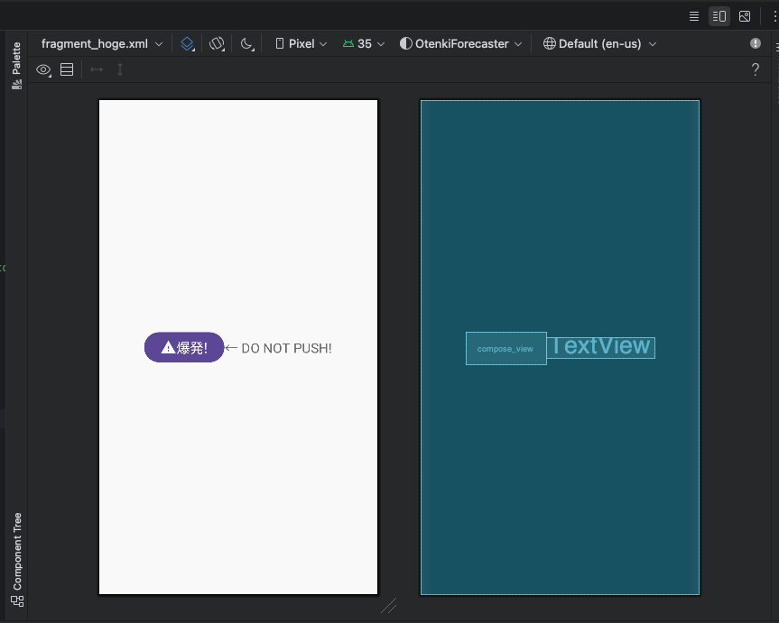
現在も段階移行中のプロジェクトは多いと思いますが(弊社ももれなく移行中です)、XML に ComposeView や AbstractComposeView を継承した CustomView を置くと、Layout Editor 上で表示されず、サイズと見た目がよくわからない状態になってしまうことがあると思います。

わからない…。

ComposeView には onCreate などのタイミングで setContent をすることによって上記のような Compose を渡すことができます。Compose 側では@Previewを使えば確認できますが、画面全体のバランス感はわかりにくいですね。
そこでおすすめなのが tools:composableName です。
tools:composableName には任意の Composable関数 を設定することができ、Layout Editor 上でも描画されるようになります。
そのため、逐一ビルドしなくても、Android View 上における Compose のレイアウトが確認でき、マージンなど細かい調整もしやすくなります。
<LinearLayout xmlns:android="http://schemas.android.com/apk/res/android"
+    xmlns:tools="http://schemas.android.com/tools"
    android:layout_width="match_parent"
    android:layout_height="match_parent"
    android:gravity="center"
    android:orientation="horizontal">

    <androidx.compose.ui.platform.ComposeView
        android:id="@+id/compose_view"
        android:layout_width="wrap_content"
        android:layout_height="wrap_content"
+        tools:composableName="com.yasuworks.apps.sample.ui.component.BombButtonKt.BombButton"
        />

    <TextView
        android:id="@+id/text_view"
        android:layout_width="wrap_content"
        android:layout_height="wrap_content"
        android:text="@string/description"
        android:textSize="20sp"
        />

</LinearLayout>
プレビュー表示したいViewに対してtools:composableNameを指定してあげます。BombBotton.ktファイルの場合はBombButtonKtになることに注意。

無事表示されました。
ところがどっこい、引数を設定したいケースがあります。
(というより、基本そういうケースのほうが多いですね。)
package com.yasuworks.apps.sample.ui.component

import androidx.compose.material.icons.Icons
import androidx.compose.material.icons.filled.Warning
import androidx.compose.material3.Button
import androidx.compose.material3.Icon
import androidx.compose.material3.Text
import androidx.compose.runtime.Composable
import androidx.compose.ui.tooling.preview.Preview
import androidx.compose.ui.unit.sp

@Composable
fun BombButton(
+    label: String,
    onClick: () -> Unit = {}
) {
    Button(onClick = onClick) {
        Icon(
            imageVector = Icons.Default.Warning,
            contentDescription = "Bomb"
        )
        Text(
-            text = "Bomb!",
+            text = label,
            fontSize = 20.sp
        )
    }
}
上記のような 引数が必須なComposable関数の場合、tools:composableNameを指定してもエラーになってしまいます。この場合は、プレビュー用に@Preview関数を作ってあげて、それを指定すればOKです。
@Composable
@Preview
fun BombButtonPreview() {
    BombButton(label = "爆発!")
}
<LinearLayout xmlns:android="http://schemas.android.com/apk/res/android"
    xmlns:tools="http://schemas.android.com/tools"
    android:layout_width="match_parent"
    android:layout_height="match_parent"
    android:gravity="center"
    android:orientation="horizontal">

    <androidx.compose.ui.platform.ComposeView
        android:id="@+id/compose_view"
        android:layout_width="wrap_content"
        android:layout_height="wrap_content"
-        tools:composableName="com.yasuworks.apps.sample.ui.component.BombButtonKt.BombButton"
+        tools:composableName="com.yasuworks.apps.sample.ui.component.BombButtonKt.BombButtonPreview"
        />

    <TextView
        android:id="@+id/text_view"
        android:layout_width="wrap_content"
        android:layout_height="wrap_content"
        android:text="@string/description"
        android:textSize="20sp"
        />

</LinearLayout>
無事表示されました。
大抵の場合 Composable関数とプレビューはセットで作っていると思うので、基本運用として xml側でも確認できるようにしたい場合はプレビュー用の関数を指定してあげるのがいいですね。
別解: AbstractComposeView
Compose と Android View を併用する場合、AbstractComposeView を使う方法もあります。また、その場合 tools:composableName を使う必要はなくなります。また、isInEditMode のフラグを使えば、XML Preview 用に任意の値をセットしておくことも可能です。
class BombButtonView @JvmOverloads constructor(
    context: Context,
    attrs: AttributeSet? = null,
    defStyle: Int = 0,
) : AbstractComposeView(context, attrs, defStyle) {
    var label by mutableStateOf<String>("")
    var onClick by mutableStateOf({})

    init {
        if (isInEditMode) { label = "BAKUHATSU!" }
    }

    @Composable
    override fun Content() {
        BombButton(
            label = label,
            onClick = onClick
        )
    }
}
<LinearLayout xmlns:android="http://schemas.android.com/apk/res/android"
    android:layout_width="match_parent"
    android:layout_height="match_parent"
    android:gravity="center"
    android:orientation="horizontal">

    <com.yasuworks.apps.sample.ui.component.BombButtonView
        android:id="@+id/compose_view"
        android:layout_width="wrap_content"
        android:layout_height="wrap_content"
        />

    <TextView
        android:id="@+id/text_view"
        android:layout_width="wrap_content"
        android:layout_height="wrap_content"
        android:text="@string/description"
        android:textSize="20sp"
        />

</LinearLayout>
バッジやボタンなど様々な画面で使い回す View が多いので、小さいUIコンポーネントはどちらかというと AbstractComposeView を継承して作ることが多いです。
実際のところtools:composableNameを使用するケースとしては、RecylerViewをLazyListなどで置き換えた場合など、ボタンなどより大きい粒度のUIコンポーネントのプレビューをしたいときに使うことが多いですね。
@Composable
fun BombButtonList(labels: List<String>) {
    LazyColumn {
        items(labels) { label ->
            BombButton(label = label)
        }
    }
}

@Composable
@Preview
fun BombButtonListPreview() {
    BombButtonList(labels = listOf("ボタンA", "ボタンB", "ボタンC", "ボタンD"))
}
<LinearLayout xmlns:android="http://schemas.android.com/apk/res/android"
    xmlns:tools="http://schemas.android.com/tools"
    android:layout_width="match_parent"
    android:layout_height="match_parent"
    android:gravity="center"
    android:orientation="vertical">

    <androidx.compose.ui.platform.ComposeView
        android:id="@+id/list"
        android:layout_width="wrap_content"
        android:layout_height="wrap_content"
        tools:composableName="com.yasuworks.apps.sample.ui.component.BombButtonKt.BombButtonListPreview"
        />

</LinearLayout>

こんな感じに表示されます。つまり、Compose関数さえ書いてしまえば基本なんでも Layout Editor 側でプレビューできてしまいます。XML派の人も安心です。
さいごに
実は公式ドキュメントのこちらを読めばすべて書いてあります。
Composeはやっぱり書いてい楽しいですね。よきComposeライフを!