はじめに
React Tutorial, Redux Tutorial共にTodoアプリを作ると思うのですが、そのあとに読むレベルのものが見つからなかったので書いてみることにしました。
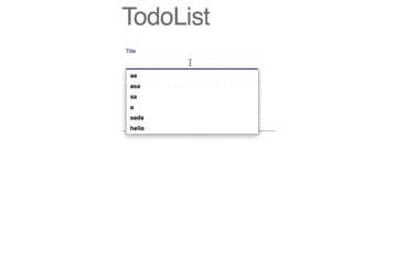
前回はReact, Redux, Redux-Formを使って複数項目のTodoアプリを作りました。
(-> React+Redux+Material-UI(+Redux Form)でReactTutorialの先へ行く[前編])
今回は、Material-UIを組み込む方法について書いてみます。
完成コードはこちら
使うライブラリとか
- React
- Redux
- Redux-form ... reduxでのフォーム処理などに便利
- Material-UI ... Reactで一番人気のCSSフレームワーク
完成品
準備
@material-ui/icons以外は前回と同じです
% npm install -S @material-ui/core @material-ui/icons classnames react-redux redux redux-form
% npm install -D redux-devtools
なお、今回の完成後のディレクトリ構成は以下のようになりました。
% tree src
src
├── actions
│   └── todos.js
├── components
│   ├── button.js
│   ├── card.js
│   ├── textField.js
│   └── todos.js
├── consts.js
├── containers
│   ├── todoForm.js
│   └── todos.js
├── index.js
├── logo.svg
├── reducers
│   └── todos.js
└── store.js
実装
タイトル文字 -> フォーム -> Card -> 色の変更
という順番で書いて行こうと思います
タイトル文字
Typographyというコンポネントを使って作ります。
ここでは変更点のみ示そうと思います。詳しくはこちら
(+が追加、 -が削除)
+ import Typography from '@material-ui/core/Typography';
// (略)
-       <h2>TodoList</h2>
+       <Typography variant="display3" gutterBottom>TodoList</Typography>
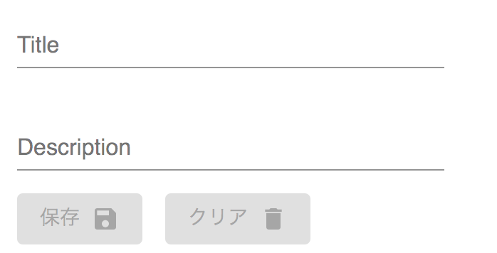
フォーム画面
次はフォーム画面を作っていきます。
完成像が
- 何も書いていない時
- 記入時
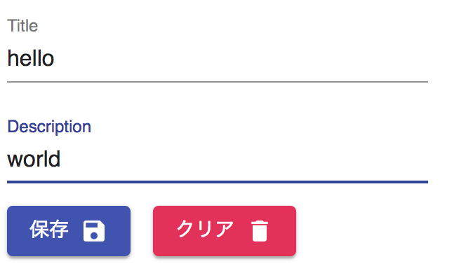
となる風に実装します。もう少し具体的には
- タイトルと説明の欄があり、タイトルは一行、説明は四行まで書くことが可能
- 保存、クリアボタンはアイコン付きのボタンで色も指定する
という風に作っていきます。
ボタン
フォームのボタンの実装をします
参考URL -> https://material-ui.com/demos/buttons/#buttons-with-icons-and-label
を参考にしながら書いていきます。ひっかかりそうなところはコード内にコメントをつけています。
import React from 'react';
import classNames from 'classnames';  // classNameに複数項目指定する場合に便利
import PropTypes from 'prop-types';  // 引数の型を指定する場合に必要
import Button from '@material-ui/core/Button';
import { withStyles } from '@material-ui/core/styles';
import DeleteIcon from '@material-ui/icons/Delete';
import SaveIcon from '@material-ui/icons/Save';

// 作成するコンポネントのスタイルを設定する
const styles = theme => ({
  button: {
    margin: theme.spacing.unit,
  },
  leftIcon: {
    marginRight: theme.spacing.unit,  // 通常のCSSの場合ハイフンで区切る(margin-right)ところを繋いで大文字にする
  },
  rightIcon: {
    marginLeft: theme.spacing.unit,
  },
  iconSmall: {
    fontSize: 20,
  },
});

// 今回は色々な書き方に慣れるためにわざとconst, function, classをバラバラにしています
function IconLabelButton(props) {
  const { classes, type, disabled, variant, color, value, iconClassName, onClick } = props;
  return (
      <Button
        variant={variant}
        color={color}
        className={classes.button}
        disabled={disabled}
        type={type}
        onClick={onClick}
      >
        {value}
        {iconClassName === 'delete' &&  // 外から渡されたiconClassNameの値によって変化するようにします
          <DeleteIcon className={classNames(classes.rightIcon, classes.iconSmall)} />
        }
        {iconClassName === 'save' &&
          <SaveIcon className={classNames(classes.rightIcon, classes.iconSmall)} />
        }
      </Button>
  );
}

IconLabelButton.propTypes = {
  classes: PropTypes.object.isRequired,
};

export default withStyles(styles)(IconLabelButton);
テキストの入力画面
入力画面を作っていきます。基本的には上のButtonと同じ作りです。
import React from 'react';
import PropTypes from 'prop-types';
import { withStyles } from '@material-ui/core/styles';
import TextField from '@material-ui/core/TextField';

const styles = theme => ({
  textField: {
    marginLeft: theme.spacing.unit,
    marginRight: theme.spacing.unit,
    width: 300,
  },
});

const renderTextField = props => {
  const { input, classes, ...custom } = props;
  return (
    <TextField
      {...input}
      {...custom}
      className={classes.textField}
    />
  );
}

renderTextField.propTypes = {
  classes: PropTypes.object.isRequired,
};

export default withStyles(styles)(renderTextField);
フォーム
最後に上で作ったコンポネントを呼び出すように修正していきます。
material-ui/textField
redux-form/material-ui-example
などを参考に書き進めていきます。
先ほどcolorなどを含め受け取り可能なコンポネントを作りましたので、『保存』と『クリア』を同じコンポネントを使って作成することができます。
import React from 'react';
import { Field, reduxForm } from 'redux-form';
import renderTextField from '../components/textField';  // 作成したコンポネントの呼び出し
import IconLabelButton from '../components/button';

const TodoForm = props => {
  const { handleSubmit, pristine, reset, submitting } = props;
  return (
    <form onSubmit={handleSubmit}>
      <div>
        <div>
          <Field
            id="name"
            name="title"
            label="Title"
            component={renderTextField}  // Fieldタグに渡した引数をrenderTextField上で受け取ってくれるようになっている
            type="text"
            margin="normal"
          />
        </div>
      </div>
      <div>
        <div>
          <Field
            id="multiline-flexible"
            name="description"
            label="Description"
            component={renderTextField}
            type="text"
            multiline
            rowsMax="4"
            margin="normal"
          />
        </div>
      </div>
      <div>
        <IconLabelButton
          type="submit"
          variant="contained"
          color="primary"
          value="保存"
          iconClassName="save"
          disabled={pristine || submitting} />
        <IconLabelButton
          variant="contained"
          color="secondary"
          value="クリア"
          iconClassName="delete"
          disabled={pristine || submitting}
          onClick={reset} />
      </div>
    </form>
  );
};

export default reduxForm({
  form: 'todo',
})(TodoForm);
これで、Form画面のMaterial-UI化が完了しました。
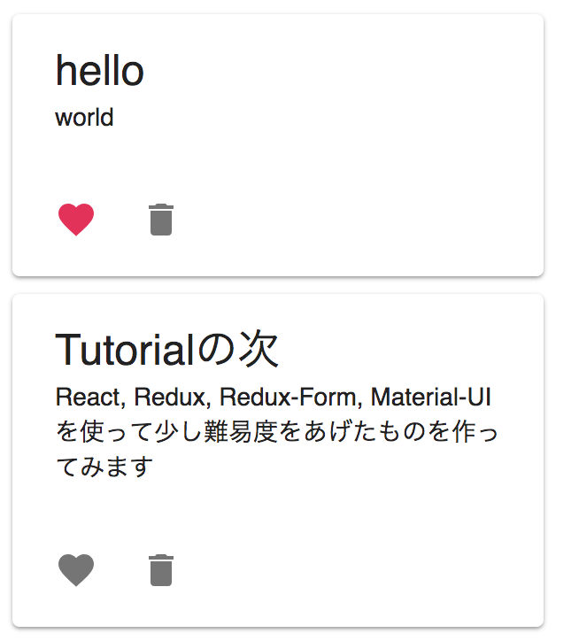
カード画面
前回は、テーブルで実装を行いましたが、今回はCard Componentを使ってもう少しオシャレにしてみようと思います。
完成後はこちら(ハートを押すことによって変化させるのはこの後)
では、作っていきましょう
カードのコンポネント
基本的には先ほどのボタンコンポネントの作り方と同じです。
Card, CardContentの階層構造に少し気をつけながら書いていくとよさそうです。
import React from 'react';
import PropTypes from 'prop-types';
import { withStyles } from '@material-ui/core/styles';
import Card from '@material-ui/core/Card';
import CardContent from '@material-ui/core/CardContent';
import Typography from '@material-ui/core/Typography';

const styles = {
  card: {
    marginTop: 10,
    minWidth: 200,
    maxWidth: 300,
  },
};
function TodoCard(props) {
  const { classes, title, description } = props;
  return (
    <Card className={classes.card}>
      <CardContent>
        <Typography variant="headline" component="h2">
          {title}
        </Typography>
        <Typography component="p">
          {description}
        </Typography>
      </CardContent>
    </Card>
  );
}
TodoCard.propTypes = {
  classes: PropTypes.object.isRequired,
};
export default withStyles(styles)(TodoCard);
テーブルを消して、カードを呼び出す
カードコンポネントを作成したことでテーブルは不要になったので、入れ替えましょう
消した箇所を具体的に知りたい場合はこちらをご覧ください。
import React from 'react';
import TodoCard from './card';

export default class TodoList extends React.Component {
  render() {
    const { todoList } = this.props;
    return (
      <div>
        {todoList.map((todo, i) => (
          <TodoCard
            key={i}
            title={todo.title}
            description={todo.description}
          />
        ))}
      </div>
    );
  }
}
カードの内容を充実させる
現在、まだカードはタイトルと説明を描画するためのものでしかないのでこれにアイコンを足して、削除機能とファボ機能をつけていきます。
delete関数の呼び出し方の変更
TodoCardに対して、引数を追加します。参考
import React from 'react';
import TodoCard from './card';

export default class TodoList extends React.Component {
  render() {
    const { todoList } = this.props;
    return (
      <div>
        {todoList.map((todo, i) => (
          <TodoCard
            key={i}
            title={todo.title}
            description={todo.description}
            handleDelete={this.props.handleDelete}
            index={i}
            />
        ))}
      </div>
    );
  }
}
カードの中身修正
先ほどかいたばかりですが、早速修正します。
いくつかの修正箇所にはコメントをつけています。
handleChangeColor関数はこのコンポネント内の関数を使うようにbindしていますが、handleDelete関数はsrc/containers/todos.jsのものが使われることに注意してください(src/components/todos.jsを経由している)
import React from 'react';
import PropTypes from 'prop-types';
import { withStyles } from '@material-ui/core/styles';
import Card from '@material-ui/core/Card';
import CardContent from '@material-ui/core/CardContent';
import CardActions from '@material-ui/core/CardActions';
import Typography from '@material-ui/core/Typography';
import IconButton from '@material-ui/core/IconButton';  // ボタンがアイコンのみのコンポネントを作る際に便利
import FavoriteIcon from '@material-ui/icons/Favorite';
import DeleteIcon from '@material-ui/icons/Delete';

const styles = {
  card: {
    marginTop: 10,
    minWidth: 200,
    maxWidth: 300,
  },
  actions: {
    display: 'flex',
  },
};

class TodoCard extends React.Component{  // 色を状態として持っておきたいので、classに変更しています
  constructor(props) {
    super(props);

    this.state = {
      color: 'default',
    };

    this.handleChangeColor = this.handleChangeColor.bind(this);
  }

  handleChangeColor() {  // 押されるたびに、今の状態を確認し、別の状態に遷移するようにします
    console.log(this.state.color);
    if (this.state.color === 'default') {
      this.setState({color: 'secondary'})
    }
    if (this.state.color === 'secondary') {
      this.setState({color: 'default'})
    }
  }

  render() {
    const { classes, title, description, handleDelete, index } = this.props;
    return (
      <Card className={classes.card}>
        <CardContent>
          <Typography variant="headline" component="h2">
            {title}
          </Typography>
          <Typography component="p">
            {description}
          </Typography>
        </CardContent>
        <CardActions className={classes.actions} disableActionSpacing>
            <IconButton
              aria-label="Add to favorites"
              onClick={() => this.handleChangeColor()}  // クリックイベントを設定しています
              color={this.state.color}
            >
              <FavoriteIcon />
            </IconButton>
            <IconButton
              aria-label="Delete"
              onClick={() => handleDelete(index)}  // 引数にうけとったhandleDeleteを呼んでいます
            >
              <DeleteIcon />
            </IconButton>
          </CardActions>
      </Card>
    );
  }
}

TodoCard.propTypes = {
  classes: PropTypes.object.isRequired,
};

export default withStyles(styles)(TodoCard);
これでカードの追加機能の部分も完成しました。
細かいところ
最後に細かいところですが、formを保存するたびにリセットされるようにしてみます
この機能はredux-formを使うことでとても簡単に実装することができます
import React from 'react';
import { connect } from 'react-redux';
import { reset } from 'redux-form';  // resetするためのもの
import { addTodo, deleteTodo } from '../actions/todos';
import TodoForm from './todoForm';
import TodoList from '../components/todos';
import Typography from '@material-ui/core/Typography';

class TodoApp extends React.Component {
  constructor(props) {
    super(props)
    this.handleDelete = this.handleDelete.bind(this)
  }

  handleDelete(index) {
    this.props.deleteTodo(index)
  }

  render() {
    return (
      <div>
        <Typography variant="display3" gutterBottom>TodoList</Typography>
        <TodoForm onSubmit={this.props.addTodo}/>

        <hr />
        <TodoList
          todoList={this.props.todoList}
          handleDelete={this.handleDelete}
        />
      </div>
    )
  }
}

const mapStateToProps = (state) => ({
  todoList: state.todoList,
});
const mapDispatchToProps = (dispatch) => ({
  addTodo: (todo) => {
    dispatch(addTodo(todo))
    dispatch(reset('todo'))  // addTodoが呼ばれるタイミングでフォームのリセットを行う & todoForm.jsで設定した名前をいれる
  },
  deleteTodo: (index) =>  dispatch(deleteTodo(index)),
});

export default connect(mapStateToProps, mapDispatchToProps)(TodoApp);
以上で終わりです。
終わりに
長くなってしまいましたが読んでいただきありがとうございました。
何かわからないことがあればコメント欄などに書いていただけると助かります。
また、もっとよいプラクティスなどあれば教えていただければ幸いです。