はじめに
みなさんPlotlyつかってますか?
PlotlyはPythonのグラフ描画ライブラリです。Pythonでグラフといえばmatplotlibが特に有名ですが、インタラクティブにグラフを操作できたり、簡単にHTMLで出力できる、色合いがちょっぴりオシャレ、といった理由で最近ではPlotlyばかり使っています。
散布図を作成した際にデータ量が多すぎてグラフ内の点の分布がわかりづらいこという事がよくあります。そんなときは散布図の縦軸、横軸に1次元ヒストグラムをつけるとわかりやすいのですが、plotlyでも描画できるのか試してみました。
なお、サンプルコードは Python3.6, JupyterNotebookで実行しています。
基本的な散布図の作図法
Plotlyでは一つ一つのグラフをグラフオブジェクトとして定義することができます。今回必要となるグラフオブジェクトは散布図、x軸ヒストグラム、y軸ヒストグラムの3種類です。まずは元となる散布図を作成してみます。
from plotly.offline import iplot
from plotly.graph_objs import Scatter,Figure, Layout,Histogram

N = 10000
x_data = np.random.randn(N)
y_data = np.random.randn(N)

# Create Graph Object
scat = Scatter(
    x = x_data,
    y = y_data,
    mode = 'markers'
)

layout = Layout(
    title = "散布図のみ",

    width=1000,
    height=550,
    xaxis=dict(
        title="x",
        showgrid=True
    ),
    yaxis=dict(
        title="y",
        showgrid=True
    )
)

data = [scat]
fig = Figure(data=data,layout=layout)
iplot(fig)
出力結果は以下の通り。
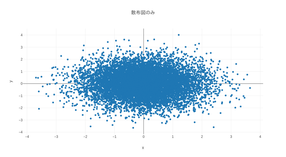
このように散布図のグラフオブジェクトを定義し、iplot()にデータを入れてあげるとグラフが出力されます。拡大・縮小などの操作が直感的に出来、とても便利ですね! また、グラフタイトルや細かな設定はLayoutオブジェクトで設定できるようになっています。
ヒストグラム付き散布図の作図法
では次にヒストグラムを追加してみます。
まずは全体のコードから。
from plotly.offline import iplot
from plotly.graph_objs import Scatter, Figure, Layout,Histogram

N = 10000
x_data = np.random.randn(N)
y_data = np.random.randn(N)

# Create Graph Object
scat = Scatter(
    name="Scatter",
    x = x_data,
    y = y_data,
    mode = 'markers'
)
hist_x = Histogram(
    name="Histogram_X",
    x = x_data,
    yaxis='y2',
)
hist_y = Histogram(
    name="Histogram_Y",
    y = y_data,
    xaxis='x2'
)

data = [scat,hist_x,hist_y]

layout = Layout(
    title = "散布図+ヒストグラム",

    width=1000,
    height=550,
    xaxis=dict(
        title="x",
        domain=[0, 0.85],
        showgrid=True
    ),
    yaxis=dict(
        title="y",
        domain=[0, 0.85],
        showgrid=True
    ),
    xaxis2=dict(
        domain=[0.85, 1],
    ),
    yaxis2=dict(
        domain=[0.85, 1],
    )
)
fig = Figure(data=data, layout=layout)
iplot(fig)
手法としては散布図と同じデータを使ったヒストグラムをx軸とy軸方向にひとつずつ用意し、同じグラフエリアにうまいこと重ねるというものです。
まずヒストグラムのグラフオブジェクトの定義時、各ヒストグラムの高さを表す軸にx2、y2を指定します。
# Create Histogram Graph Object X
hist_x = Histogram(
    x = x_data,
    yaxis='y2',
)

# Create Histogram Graph Object Y
hist_y = Histogram(
    y = y_data,
    xaxis='x2'
)
このように別の軸として定義してあげることで、Layoutオブジェクト内での設定を別にすることができます。
Layoutオブジェクトではグラフエリア内でそれぞれの軸がプロットされる範囲を0から1の範囲で指定することができます。今回は散布図の描画エリアが縦横ともに全体の0-85%の範囲とし、残りの15%は2つのヒストグラムが描画される範囲としました。 なお、グラフオブジェクト定義時に指定したx2、y2 はそれぞれLayoutオブジェクトのxaxis2、yaxis2に対応づきます。
layout = Layout(
    title = "散布図+ヒストグラム",
    xaxis=dict(
        title="x",
        domain=[0, 0.85],
        showgrid=True
    ),
    yaxis=dict(
        title="y",
        domain=[0, 0.85],
        showgrid=True
    ),
    xaxis2=dict(
        domain=[0.85, 1]
    ),
    yaxis2=dict(
        domain=[0.85, 1]
    )
)

fig = Figure(data=data, layout=layout)
iplot(fig)
これで出力された図が以下の通り。
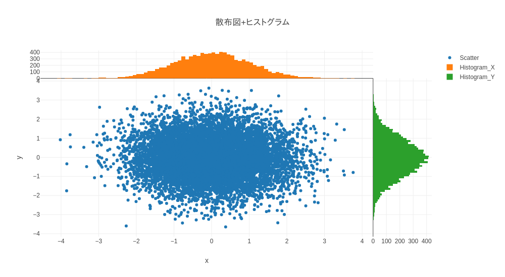
これでヒストグラム付きの散布図ができました。簡単です!