はじめに
プロ野球が開幕して早一ヶ月が立っております。皆様、贔屓球団の調子はいかがでしょうか。
え?私の贔屓球団はどうだって?最下位(7/23現在)ですけど?
...まぁシーズンも始まったばかりなのでまだわかりませんね!
野球といえば他のスポーツと比べて多くの指標があり、データ分析にはもってこいな球技です。
いわゆるセイバーメトリクスは、メジャーはもちろん日本野球においても大きな注目を受けています。
今回の記事ではこれらの指標を主成分分析してクラスタリングすれば打者の傾向を見抜くことができるのでは?と思い実際に行ってみました!できたものがこちら!

(*かなり画質を落としています)
今回は4パターンに分類しました。できたものをぐるぐる回して見ると多くの気付きがありましたので
ぜひ皆さんもやってみてほしいと思います!
Webスクレイピング
まずは、指標データの取得をするためWebスクレイピングを行いました。今回はプロ野球データFreak様のデータを利用しました。
内容としてはセ・パ両リーグの打席数ランキング上位50名の成績が22項目にわたって載っています。スクレイピング用に関数をいくつか定義しています。
これはこちらのサイトを参考にしました。
# Webスクレイピングのためのimport
import requests
from bs4 import BeautifulSoup as BS
import os, csv

# Webスクレイピングし、table情報を取得する関数を定義
def get_tables(content, is_talkative=True):
    """table要素を取得する"""
    bs = BS(content, "lxml")
    tables = bs.find_all("table")
    n_tables = len(tables)
    if n_tables == 0:
        emsg = "table not found."
        raise Exception(emsg)
    if is_talkative:
        print("%d table tags found.." % n_tables)
    return tables

# table要素のデータを読み込んで二次元配列を返す関数を定義
def parse_table(table):
    """table要素のデータを読み込んで二次元配列を返す"""

    ##### thead 要素をパースする #####

    # thead 要素を取得 (存在する場合)
    thead = table.find("thead")

    # thead が存在する場合
    if thead:
        tr = thead.find("tr")
        ths = tr.find_all("th")
        columns = [th.text for th in ths]    # pandas.DataFrame を意識

    # thead が存在しない場合
    else:
        columns = []

    ##### tbody 要素をパースする #####

    # tbody 要素を取得
    tbody = table.find("tbody")

    # tr 要素を取得
    trs = tbody.find_all("tr")

    # 出力したい行データ
    rows = [columns]

    # td (th) 要素の値を読み込む
    # tbody -- tr 直下に th が存在するパターンがあるので
    # find_all(["td", "th"]) とするのがコツ
    for tr in trs:
        row = [td.text for td in tr.find_all(["td", "th"])]
        rows.append(row)

    return rows

# parse_table情報をcsvに変換する関数を定義
def table2csv(path, rows, lineterminator="\n",
    is_talkative=True):
    """二次元データをCSVファイルに書き込む"""

# HTMLを取得
url = 'https://baseball-data.com/stats/hitter2-all/tpa-2.html'
res = requests.get(url)
content = res.text

# table 要素を取得
tables = get_tables(content)
table = tables[0]
rows = parse_table(table)

# CSV ファイルとして出力する
# 出力先が Windows なら以下のようにする
table2csv("./table.csv", rows, "\r\n")
これで選手の「table.csv」ファイルが作られるはずです。中身を見てみましょう。
import pandas as pd
url =r'table.csv' # datasetのdirectory or URLを指定
raw_data = pd.read_csv(
    url,
    thousands  = ',',
    encoding='cp932'
)

   順位    選手名     チーム     打率  試合  打席数   打数  得点  安打  ...  犠打  犠飛  四球  敬遠  死球  三振  併殺打    出塁率    長打率
0   1  西川 遥輝    日本ハム  0.275  30  137  109  23  30  ...   2   0  25   0   1  21    2  0.415  0.367
1   1  栗原 陵矢  ソフトバンク  0.234  30  137  124  13  29  ...   2   3   7   0   1  32    0  0.274  0.419
2   3  大島 洋平      中日  0.299  30  134  117  11  35  ...   2   1  12   1   2  11    2  0.371  0.342
3   4  鈴木 大地      楽天  0.316  29  133  114  22  36  ...   6   1  10   0   2  16    4  0.378  0.368
4   5  梶谷 隆幸    DeNA  0.295  29  131  112  23  33  ...   1   0  17   0   1  27    1  0.392  0.491

[5 rows x 25 columns]
うまくできていますね!ではこのデータを使って主成分分析をしていきましょう!
主成分分析及びその後のFigure作成には以下のパッケージをimportします。
データの標準化
文字データが入ると主成分分析できないので該当するカラムを削除し、 StandardScalerを用いてデータを標準化します。
from sklearn.preprocessing import StandardScaler
raw_data_drop = raw_data.drop(columns=['選手名','順位', 'チーム'] ) # 文字が入るとPCAできないのでcolumnの削除


# StandardScalerを用いたdatasetの標準化
scaler = StandardScaler()
scaler.fit(raw_data_drop)
scaler.transform(raw_data_drop)
raw_data_drop_normalize = pd.DataFrame(scaler.transform(raw_data_drop), columns=raw_data_drop.columns) # 標準化したdatasetをraw_data_drop_normalizeとする

raw_data_drop_normalize.head()
         打率        試合       打席数        打数  ...        三振       併殺打       出塁率        長打率
0  0.001746  1.148813  2.045134  0.621331  ... -0.060951 -0.201524  0.914646 -0.704579
1 -0.893094  1.148813  2.045134  2.470530  ...  1.535373 -1.262178 -1.463906 -0.247859
2  0.525555  1.148813  1.679931  1.607570  ... -1.512154 -0.201524  0.172403 -0.924156
3  0.896586  0.480899  1.558197  1.237730  ... -0.786552  0.859129  0.290487 -0.695796
4  0.438253  0.480899  1.314729  0.991171  ...  0.809771 -0.731851  0.526655  0.384523

[5 rows x 22 columns]
標準化したデータを使って主成分分析を行います。scikitlearnを用いて
主成分分析
今回は3次元のプロットにしたいので、n_components = 3としました。
主成分分析したデータはデータフレームにしています。
from sklearn.decomposition import PCA
# raw_data_drop_normalizeを用いたPCA
pca = PCA(n_components = 3) #3軸でPCA classを作成する
pca.fit(raw_data_drop_normalize) #fitting、実際のPCA処理はここ

# PCAの結果はarrayで返ってくるのでをData.Frameにする
pca_result = pca.transform(raw_data_drop_normalize)
pca_result = pd.DataFrame(pca_result)
pca_result.columns = ['PC1', 'PC2', 'PC3']
これでプロ野球選手50名分のデータを用いた主成分分析ができているはずなので中身を確認してみましょう。
pca_result.head()
        PC1       PC2       PC3
0 -0.217280  4.262306  0.512089
1 -0.516226 -0.131497  4.269493
2 -0.592064  2.799863  2.578358
3  0.086469  1.690605  2.112824
4  1.128880  2.884067  0.784286

len(pca_result)
50
これで、22項目のデータを3つに集約することができました!
では次にクラスタリングをしてみましょう!
クラスタリング
クラスタリングは有名なk-means法を用いています。
# PCAのためのimport

from sklearn.cluster import KMeans
# クラスタリング
num_cluster = 4
pca_result_cluster = KMeans(n_clusters=num_cluster).fit(pca_result)
できているかのチェックは、.labels_を見ることでわかります。
pca_result_cluster.labels_
array([2, 0, 2, 2, 2, 3, 1, 1, 2, 0, 1, 3, 2, 2, 1, 0, 1, 0, 3, 3, 1, 1,
       3, 0, 0, 1, 2, 0, 0, 0, 2, 0, 3, 0, 1, 0, 2, 0, 0, 0, 0, 3, 0, 0,
       0, 3, 3, 3, 3, 3])
0-3の数字が割り振られていることから4グループに分類できていることがわかります!
では実際に分類された結果を可視化していきましょう!
可視化(3D plot)
まずは主成分分析の結果にクラスタリングの結果と選手名の列を追加します。
player_name = raw_data['選手名'] # annotation用に格納
pca_result["name"] = player_name
pca_result["cluster"] = pca_result_cluster.labels_
pca_result.head()
        PC1       PC2       PC3   name  cluster
0 -0.217280  4.262306  0.512089  西川 遥輝        2
1 -0.516226 -0.131497  4.269493  栗原 陵矢        0
2 -0.592064  2.799863  2.578358  大島 洋平        2
3  0.086469  1.690605  2.112824  鈴木 大地        2
4  1.128880  2.884067  0.784286  梶谷 隆幸        2
さて、ここから、matplotlibを使って選手をアノテーションを付けつつ3次元にプロットするのですが、
matplotlibのAnnotationは2次元のプロットにしか対応していません。そこで、Annotationクラスを継承し新たにannotation3Dという関数を定義します。
また、アニメーションgifを作る都合上3次元にplotする関数(plot_3D)も作成しておきます。
import matplotlib.pyplot as plt
from matplotlib.text import Annotation
from mpl_toolkits.mplot3d.axes3d import Axes3D
from PIL import Image # アニメーション用
from matplotlib import animation # アニメーション用
from io import BytesIO # アニメーション用

# クラスの継承
class Annotation3D(Annotation):
    '''Annotate the point xyz with text s'''

    def __init__(self, s, xyz, *args, **kwargs):
        Annotation.__init__(self,s, xy=(0,0), *args, **kwargs)
        self._verts3d = xyz

    def draw(self, renderer):
        xs3d, ys3d, zs3d = self._verts3d
        xs, ys, zs = proj_transform(xs3d, ys3d, zs3d, renderer.M)
        self.xy=(xs,ys)
        Annotation.draw(self, renderer)

# annotate3Dを定義
def annotate3D(ax, s, *args, **kwargs):
    '''add anotation text s to to Axes3d ax'''

    tag = Annotation3D(s, *args, **kwargs)
    ax.add_artist(tag)

# plot_3Dを定義
color = ["red", "blue", "green", "orange"] # クラスタリング用の色
def plot_3D(data, angle = 50):
    # 3d plot用Figure
    fig = plt.figure(num=None, figsize=(12, 12), dpi=150) #アニメーションgifを作る際はdpiを72にする
    ax = fig.gca(projection = '3d')
    for i in range(len(data.index)):
        ax.scatter3D(data.iloc[i,0], data.iloc[i,1],data.iloc[i,2], c=color[int(data.iloc[i,4])]) # プロットの座標を指定
        annotate3D(ax, s=str(data.iloc[i,3]), xyz=(data.iloc[i,0], data.iloc[i,1],data.iloc[i,2]),
        fontsize=6,
        xytext=(-3,3),
        textcoords='offset points', ha='right',va='bottom', fontname="MS Gothic") # annotation
    ax.view_init(30, angle)
    ax.set_xlim(data.describe().at['min', 'PC1'], data.describe().at['max', 'PC1'])
    ax.set_ylim(data.describe().at['min', 'PC2'], data.describe().at['max', 'PC2'])
    ax.set_zlim(data.describe().at['min', 'PC3'], data.describe().at['max', 'PC3'])
    ax.set_xlabel('PC1 ' + str(round(pca.explained_variance_ratio_[0]*100, 1)) + "%") # 軸に寄与率を表示
    ax.set_ylabel('PC2 ' + str(round(pca.explained_variance_ratio_[1]*100, 1)) + "%")
    ax.set_zlabel('PC3 ' + str(round(pca.explained_variance_ratio_[2]*100, 1)) + "%")
    buf = BytesIO()
    fig.savefig(buf, bbox_inches='tight', pad_inches=0.0)
    return Image.open(buf)
ここまでこれば可視化までもう一歩です。
plot_3D(pca_result)
plt.show()

できました!もし、アニメーションgifを作成したい場合は、
 # gif animationを作る場合
images = [plot_3D(pca_result,angle) for angle in range(180)]
images[0].save('output.gif', save_all=True, append_images=images[1:], duration=100, loop=0)
と書くことで一番最初に出ているようなgifアニメーションが出力されます。
ただし、dpiを大きくしすぎるとメモリ不足に陥るので注意してください。
データ分析+考察
データのクラスタリング+可視化ができましたので、これを元に色々と考察をしていきたいと思います。
まず、各軸の固有ベクトルを出してみましょう。固有ベクトルの成分がわかることで、各軸が何を表しているかを考えることができます。
# PCの固有ベクトルの成分を表示
component = pd.DataFrame(pca.components_)

fig = plt.figure(figsize=(12, 20))
for i in range(len(component.index)):
    ax = fig.add_subplot(3,1,i+1)
    ax.bar(raw_data_drop_normalize.columns, component.iloc[i])
    ax.set_xticks(raw_data_drop_normalize.columns)
    ax.set_xticklabels(raw_data_drop_normalize.columns, rotation = 270, fontname="MS Gothic", fontsize=10)
    ax.set_title('PC' +str(i+1) + 'の固有ベクトル', fontname="MS Gothic", fontsize=10)
    ax.set_ylabel('ベクトルの大きさ', fontname="MS Gothic", fontsize=10)
    plt.xticks(rotation = '0')
    plt.tick_params(labelsize=10)
    ax.plot()

plt.show()
こうすることで、以下のような図が出力されます。
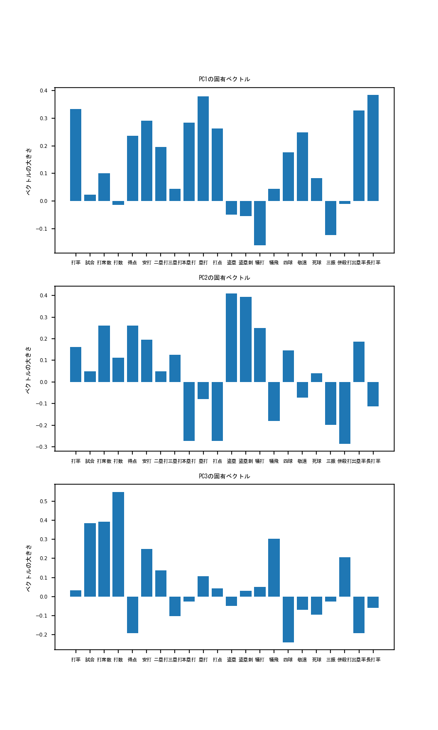
これを見てみると、PC1は、本塁打、塁打、打点ベクトル成分が非常に大きいことがわかります。
このことから、PC1の大きい選手はパワー自慢の長距離バッターであると考えられます。そこで、PC1の軸でplotを見てみると...
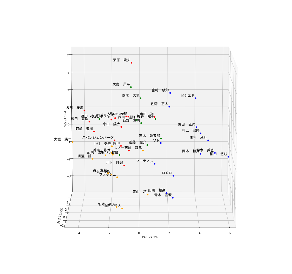
ギータやべぇ...もう独走しています。他にも岡本和真、鈴木誠也、吉田正向、村上宗隆など、まさにホームランバッターと呼ばれる選手の名前が散見されます。
しかもクラスタリングにおいても彼らは青色のグループに属していることがわかります。これらのことから、この青色のグループは4番バッターグループと言って良いでしょう
次にPC2を見てみると、本塁打の大きさがぐっとさがり、代わりに盗塁、盗塁刺、犠打の値が大きくなっています。
すなわちPC2の高いバッターはスピードに特化したバッターであると推察されます。そこで、PC2の軸でplotを見てみると...

荻野やべぇ...もう独走(ry。他にも西川遥輝、源田壮亮、大島洋平などの名が見られており、彼らは緑色のグループに分けられています。
これらの結果を踏まえると緑色のグループはスピード特化の1,2番打者グループと言えそうです。
最後にPC3の軸について考えてみましょう。打率の寄与が低いですが併殺打、犠飛のベクトル成分が大きいほか、四球の大きさが非常に低いことがわかります。
ということはPC3の高いバッターはフリースインガータイプなのでは?と考えられます。見てみましょう。

縦軸がPC3を示しています。栗原ェ...もう独(ry。他にはビシエド、宮崎敏郎、大田泰示などの名前も見られますね。
ここで大事なのはビシエド、宮崎敏郎は青グループである一方で大田泰示は赤グループであるという点です。
ビシエド、宮崎敏郎はある程度フリースインガーであるものの、本塁打や打点が高くPC1が大きいため4番バッターグループに入ったのだと考えられます。
そういったことから赤グループは典型的フリースインガー、四球拒否マンであると考えられます。
では残った黄色グループはどう考えればよいでしょうか?彼らは青グループほど長打力があるわけでもなく、
緑色グループほど走力が高いわけでもない、ある程度の選球眼も有しているバランスタイプであると考えても良いかもしれません。
また、PC1-PC3全てにおいて試合、打席数、打数のベクトル成分が大きいことも無視できません。
つまり、彼らは一時的に離脱をした結果PC1-PC3全てのスコアが伸び悩み、黄色グループに入っている可能性もあります。
そういったことから黄色グループはバランスタイプ or 今後のペナントに大きく影響しうる眠れる獅子グループと考えてみました。
さいごに
いかがでしたでしょうか?まだ開幕して1ヶ月のデータで分析した結果なので、ここからどのように変化していくかはわかりません。
ですがこのようなデータを元に野球観戦をするとまた別の趣があって楽しめると思います!では素敵な野球観戦ライフを!
おまけ
codeの全文をこちらに表記しておきます。
# Webスクレイピングのためのimport
import requests
from bs4 import BeautifulSoup as BS
import os, csv

# Webスクレイピングし、table情報を取得する関数を定義
def get_tables(content, is_talkative=True):
    """table要素を取得する"""
    bs = BS(content, "lxml")
    tables = bs.find_all("table")
    n_tables = len(tables)
    if n_tables == 0:
        emsg = "table not found."
        raise Exception(emsg)
    if is_talkative:
        print("%d table tags found.." % n_tables)
    return tables

# table要素のデータを読み込んで二次元配列を返す関数を定義
def parse_table(table):
    """table要素のデータを読み込んで二次元配列を返す"""

    ##### thead 要素をパースする #####

    # thead 要素を取得 (存在する場合)
    thead = table.find("thead")

    # thead が存在する場合
    if thead:
        tr = thead.find("tr")
        ths = tr.find_all("th")
        columns = [th.text for th in ths]    # pandas.DataFrame を意識

    # thead が存在しない場合
    else:
        columns = []

    ##### tbody 要素をパースする #####

    # tbody 要素を取得
    tbody = table.find("tbody")

    # tr 要素を取得
    trs = tbody.find_all("tr")

    # 出力したい行データ
    rows = [columns]

    # td (th) 要素の値を読み込む
    # tbody -- tr 直下に th が存在するパターンがあるので
    # find_all(["td", "th"]) とするのがコツ
    for tr in trs:
        row = [td.text for td in tr.find_all(["td", "th"])]
        rows.append(row)

    return rows

# parse_table情報をcsvに変換する関数を定義
def table2csv(path, rows, lineterminator="\n",
    is_talkative=True):
    """二次元データをCSVファイルに書き込む"""

#    # 安全な方に転ばせておく
#    if os.path.exists(path):
#        emsg = "%s already exists." % path
#        raise ValueError(emsg)

    # データを書き込む
    with open(path, "w") as f:
        writer = csv.writer(f, lineterminator=lineterminator)
        writer.writerows(rows)
        if is_talkative:
            print("%s successfully saved." % path)

# HTMLを取得
url = 'https://baseball-data.com/stats/hitter2-all/tpa-2.html'
res = requests.get(url)
content = res.text

# table 要素を取得
tables = get_tables(content)
table = tables[0]
rows = parse_table(table)

# CSV ファイルとして出力する
# 出力先が Windows なら以下のようにする
table2csv("./table.csv", rows, "\r\n")

# PCAのためのimport
import numpy as np
import pandas as pd
import scipy as sp
import seaborn as sns
from sklearn.decomposition import PCA
from sklearn.cluster import KMeans
import matplotlib.pyplot as plt
from matplotlib.text import Annotation
from mpl_toolkits.mplot3d.proj3d import proj_transform
from mpl_toolkits.mplot3d.axes3d import Axes3D
from PIL import Image
from sklearn.preprocessing import StandardScaler
from matplotlib import animation
from io import BytesIO

# 3D annotationのために、Annotation classを継承
class Annotation3D(Annotation):
    '''Annotate the point xyz with text s'''

    def __init__(self, s, xyz, *args, **kwargs):
        Annotation.__init__(self,s, xy=(0,0), *args, **kwargs)
        self._verts3d = xyz

    def draw(self, renderer):
        xs3d, ys3d, zs3d = self._verts3d
        xs, ys, zs = proj_transform(xs3d, ys3d, zs3d, renderer.M)
        self.xy=(xs,ys)
        Annotation.draw(self, renderer)

# annotate3Dを定義
def annotate3D(ax, s, *args, **kwargs):
    '''add anotation text s to to Axes3d ax'''

    tag = Annotation3D(s, *args, **kwargs)
    ax.add_artist(tag)

url =r'table.csv' # datasetのdirectory or URLを指定
raw_data = pd.read_csv(
    url,
    thousands  = ',',
    encoding='cp932'
)
raw_data_drop = raw_data.drop(columns=['選手名','順位', 'チーム'] ) # columnのドロップ。文字型のカラムはPCAできないので削除。
player_name = raw_data['選手名'] # annotation用に格納

# StandardScalerを用いたdatasetの標準化
scaler = StandardScaler()
scaler.fit(raw_data_drop)
scaler.transform(raw_data_drop)
raw_data_drop_normalize = pd.DataFrame(scaler.transform(raw_data_drop), columns=raw_data_drop.columns) # 標準化したdatasetをraw_data_drop_normalizeとする

# raw_data_drop_normalizeを用いたPCA
pca = PCA(n_components = 3) #3軸でPCA classを作成する
pca.fit(raw_data_drop_normalize) #fitting、実際のPCA処理はここ

# PCAの結果はarrayで返ってくるのでをData.Frameにする
pca_result = pca.transform(raw_data_drop_normalize)
pca_result = pd.DataFrame(pca_result)
pca_result.columns = ['PC1', 'PC2', 'PC3'] # columnに

# クラスタリング
num_cluster = 4
color = ["red", "blue", "green", "orange"] # クラスタリング用の色
pca_result_cluster = KMeans(n_clusters=num_cluster).fit(pca_result)

# annotation用
pca_result["name"] = player_name
pca_result["cluster"] = pca_result_cluster.labels_

# PCの固有ベクトルの成分を表示
component = pd.DataFrame(pca.components_)

fig = plt.figure(figsize=(6, 10))

for i in range(len(component.index)):
    ax = fig.add_subplot(3,1,i+1)
    ax.bar(raw_data_drop_normalize.columns, component.iloc[i])
    ax.set_xticks(raw_data_drop_normalize.columns)
    ax.set_xticklabels(raw_data_drop_normalize.columns, rotation = 30, fontname="MS Gothic", fontsize=6)
    ax.set_title('PC' +str(i+1) + 'の固有ベクトル', fontname="MS Gothic", fontsize=6)
    ax.set_ylabel('ベクトルの大きさ', fontname="MS Gothic", fontsize=6)
    plt.xticks(rotation = '0')
    plt.tick_params(labelsize=5)
    ax.plot()
plt.show()
fig.savefig("PCA_vector.png", dpi = 150)

def plot_3D(data, angle = 50):
    # 3d plot用Figure
    fig = plt.figure(num=None, figsize=(12, 12), dpi=72)
    ax = fig.gca(projection = '3d')
    for i in range(len(data.index)):
        ax.scatter3D(data.iloc[i,0], data.iloc[i,1],data.iloc[i,2], c=color[int(data.iloc[i,4])]) # プロットの座標を指定
        annotate3D(ax, s=str(data.iloc[i,3]), xyz=(data.iloc[i,0], data.iloc[i,1],data.iloc[i,2]),
        fontsize=12,
        xytext=(-3,3),
        textcoords='offset points', ha='right',va='bottom', fontname="MS Gothic") # annotation
    ax.view_init(30, angle)
    ax.set_xlim(data.describe().at['min', 'PC1'], data.describe().at['max', 'PC1'])
    ax.set_ylim(data.describe().at['min', 'PC2'], data.describe().at['max', 'PC2'])
    ax.set_zlim(data.describe().at['min', 'PC3'], data.describe().at['max', 'PC3'])
    ax.set_xlabel('PC1 ' + str(round(pca.explained_variance_ratio_[0]*100, 1)) + "%") # 軸に寄与率を表示
    ax.set_ylabel('PC2 ' + str(round(pca.explained_variance_ratio_[1]*100, 1)) + "%")
    ax.set_zlabel('PC3 ' + str(round(pca.explained_variance_ratio_[2]*100, 1)) + "%")
    buf = BytesIO()
    fig.savefig(buf, bbox_inches='tight', pad_inches=0.0)
    return Image.open(buf)

plot_3D(pca_result)
plt.show()

 # gif animationを作る場合
images = [plot_3D(pca_result,angle) for angle in range(180)]
images[0].save('output.gif', save_all=True, append_images=images[1:], duration=100, loop=0)