この記事は、Qiitaの Flutter Advent Calendar 2023 シリーズ2 の14日目の記事です。
他の方の記事もぜひご覧ください!
昨日:flutterKaigi2023セッションまとめ
明日:Coming Soon...
できたもの

- ソース
- デモページ
はじめに
皆さんがFlutterをはじめたキッカケはなんでしょうか?
私がFlutterをはじめたキッカケは、なんといってもクロスプラットフォームが魅力的だったからです。
はじめた当時の対応プラットフォームはモバイル + Web(Β)でしたが、今ではWebも正式対応されDesktopにも対応しています。
しかし、モバイルに比べるとWebやDesktopの採用事例はまだ少ない印象があります。
「少ない手間で多くのプラットフォームに対応が行える」ことはとても魅力的だと思います。
そこで今回はクロスプラットフォーム対応の第一歩として、画面サイズに応じたレスポンシブ対応について、flutter_adaptive_scaffoldを利用する方法をまとめていきます。
Flutterにおけるレスポンシブ対応について
まずはFlutterにおけるレスポンシブ対応についてカンタンに触れたいと思います。
よく耳にするレスポンシブ対応ですが、どういった対応を行えばよいのでしょうか?
Flutterの公式ドキュメントを参照すると、Flutterにおけるマルチプラットフォームへの対応としては、大きく分けて2つの視点で考慮する必要があるようです。
Responsive
Typically, a responsive app has had its layout tuned for the available screen size. Often this means (for example), re-laying out the UI if the user resizes the window, or changes the device’s orientation. This is especially necessary when the same app can run on a variety of devices, from a watch, phone, tablet, to a laptop or desktop computer.
Adaptive
Adapting an app to run on different device types, such as mobile and desktop, requires dealing with mouse and keyboard input, as well as touch input. It also means there are different expectations about the app’s visual density, how component selection works (cascading menus vs bottom sheets, for example), using platform-specific features (such as top-level windows), and more
@kira_pukaさんがわかりやすく記事にまとめられていたので、こちらもぜひご覧下さい。
Responsive(適応性)
画面サイズ/デバイスの向きに応じて、
適切なサイズ・レイアウトにするAdaptive(応答性)
レイアウトだけでなく、デバイスの入力方法(タッチ/マウス/キーボード)などに応じて、
適切な視覚密度(visual density)やメニューなどのUIコンポーネントを利用なども含む。
今回行うのは画面サイズに応じた表示の切り替えですが、コンポーネントの切り替えなどを行うためAdaptive視点での対応になりそうです。
flutter_adaptive_scaffoldの利用
公式ドキュメントにも記載されている通り、
レスポンシブ対応はMediaQueryやLayoutBuilderなど、Flutter標準の機能を用いて自作していくこともできます。
ですが、今回はタイトルにもある通り、flutter_adaptive_scaffoldパッケージを利用して作成していきます。
このパッケージはMaterial Designのガイドラインに記載されているレイアウトを実現するため、便利なWidgetが用意されています。
公式パッケージということもあり、今後のアップデートにも期待できますね。
パッケージを利用することで実現できるレイアウトを機能別にまとめていきます。
📪ナビゲーション - NavigationBar, NavigationRail
アプリの主要な機能に対するナビゲーションを管理する機能です。
ガイドライン1では、機能 x 画面サイズに応じて適したコンポーネントが記載されています。
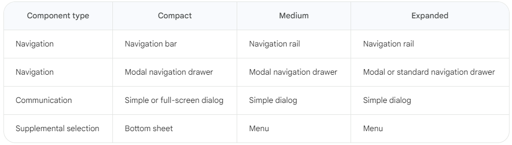
まずはNavigationBarを対応します。
NavigationBar (BottomNavigation)
- タップ操作がしやすいように画面下部に表示
- 遷移先の数は3~5個の範囲
NavigationRail
- 画面側面に表示されるため、デザインの統一性がでる
- 遷移先の数は3~7個の範囲 + FABなどを含めることもできる
🧑💻実装
パッケージで公開されているサンプルでは、パスに応じて表示を切り替えたり、URLによる制御などは行われていません。
今回はパス対応も行いたいので、go_routerを利用してナビゲーション管理を行います。
当記事の内容から外れてしまうので、実装方法は割愛します。
公開したコードか公式のサンプルプログラムを参照下さい。
ガイドライン1に記載されているNavigationBarとNavigationRailの切り替えは、 AdaptiveScaffoldウィジェットを利用することで、意識せずに実装することができます。
(コード)AdaptiveScaffoldを利用した切り替え
@override
Widget build(BuildContext context) {
  // 遷移先の定義
  const destinations = [
    NavigationDestination(
      icon: Icon(Icons.view_list_outlined),
      selectedIcon: Icon(Icons.view_list),
      tooltip: 'Nav A',
      label: 'Nav A',
    ),
    NavigationDestination(
      icon: Icon(Icons.grid_view_outlined),
      selectedIcon: Icon(Icons.grid_view_sharp),
      tooltip: 'Nav B',
      label: 'Nav B',
    ),
    NavigationDestination(
      icon: Icon(Icons.settings_outlined),
      selectedIcon: Icon(Icons.settings),
      tooltip: 'Nav C',
      label: 'Nav C',
    )
  ];

  // `Scaffold`の代わりに`AdaptiveScaffold`を利用
  return AdaptiveScaffold(
    useDrawer: false,
    selectedIndex: ...,
    onSelectedIndexChange: ...,
    // 遷移先を指定するだけで、画面サイズに応じてコンポーネントを切り替えてくれる
    destinations: destinations,
    body: (_) => ...,
  );
}
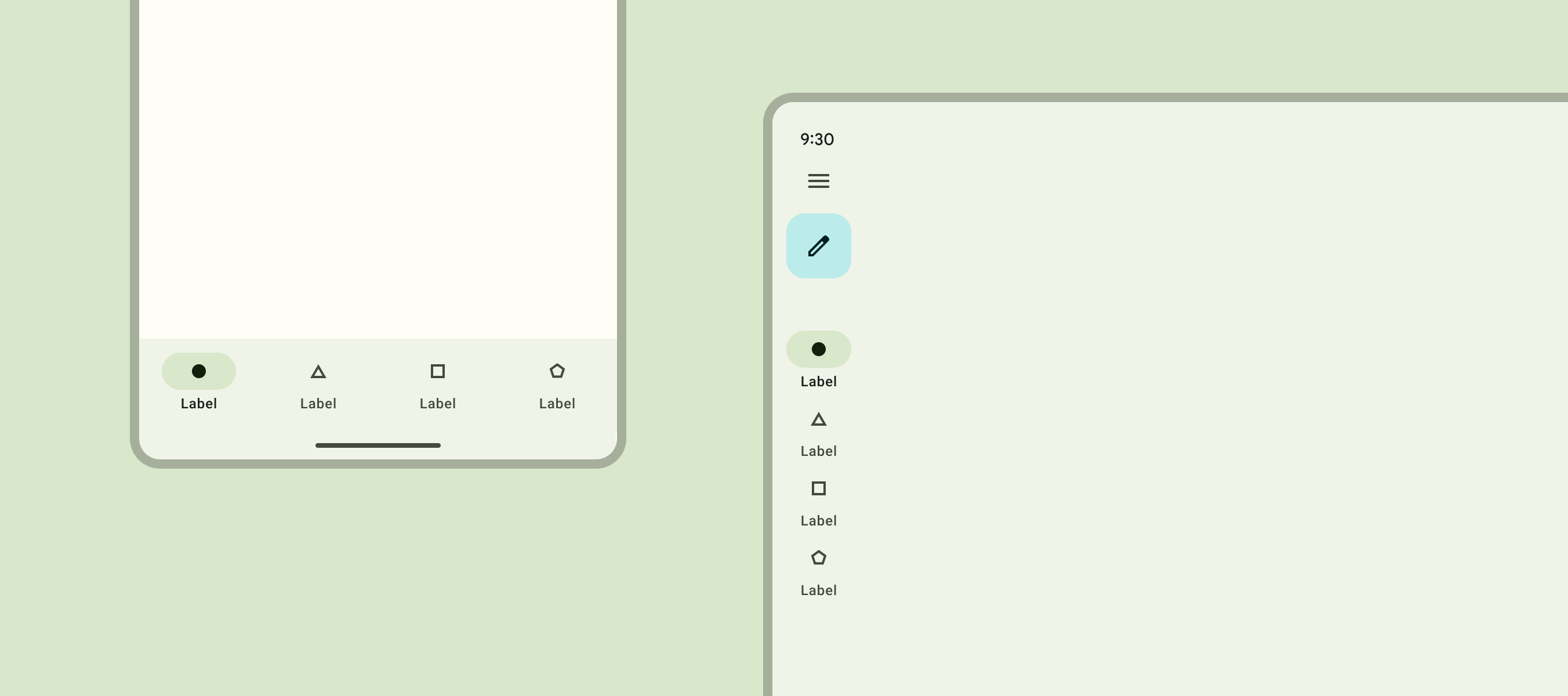
gif画像の通り、順番に切り替わってくれます。
- NavigationBar
- NavigationRail
- NavigationRail (extended)

🖥️ペイン - Body, SecondaryBody
画面内のコンテンツグループを表す区画です。
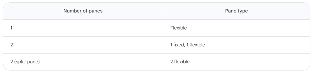
ガイドライン2を確認すると、画面サイズや表示コンテンツに応じたペインの数についても記載されています。
Compact
- 1つのペインで構成
Medium
- 1つ(推奨) または 2つのペインで構成
Expanded
- 1つ または2つ(推奨) のペインで構成
2つのペインで構成される場合、表示内容に応じてペインの幅まで指標として用意されています。
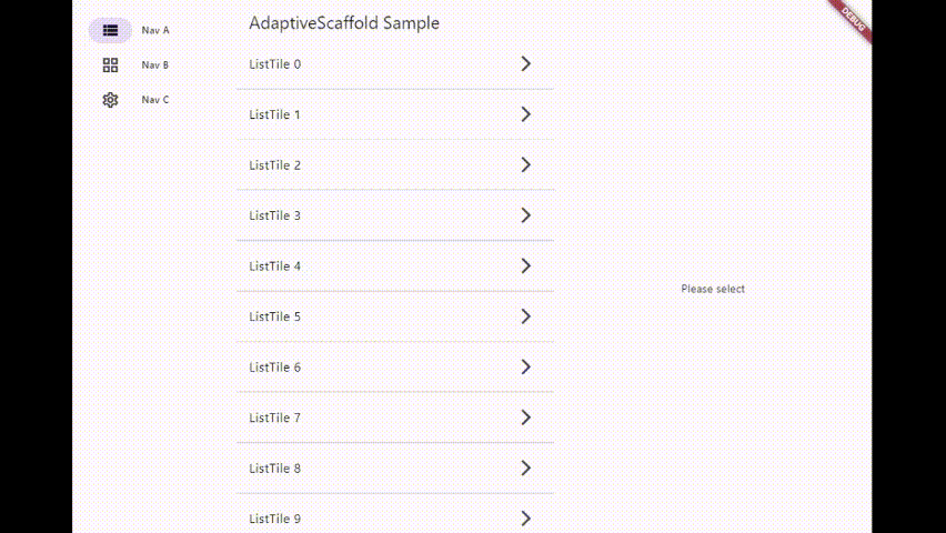
今回はよくある一覧/明細画面を例に作っていきます。
🧑💻実装
先程利用したAdaptiveScaffoldにbody, secondaryBodyが用意されているので、そちらを指定する方法もよいのですが、ナビゲーション管理と各画面で表示するコンテンツが密接な関係になってしまいます。
そのため、ペインの制御に関しては画面単位で指定できるようにしたいと思います。
AdaptiveLayoutでは、画面レイアウトが切り替わるサイズとしてBreakPointsを設定し、それぞれに対してのレイアウトを定義します。
自作しなくてはならない部分が多くなってしまいますが、より自由なレイアウトを組むことができます。
まずはAdaptiveLayoutを利用して、ペイン制御を行うための自作Scaffoldを作成します。
(コード)AdaptiveLayoutを利用したペイン制御用のScaffold
/// 画面サイズに応じてペインを分割表示する`Scaffold`
class AdaptiveSplitPaneScaffold extends StatelessWidget {
  const AdaptiveSplitPaneScaffold({
    super.key = const ValueKey('AdaptiveSplitPaneScaffold'),
    required this.body,
    this.secondaryBody,
    this.showSmallSecondary = true,
  });

  final Widget body;
  final Widget? secondaryBody;
  final bool showSmallSecondary;

  @override
  Widget build(BuildContext context) {
    return AdaptiveLayout(
      body: SlotLayout(
        config: <Breakpoint, SlotLayoutConfig>{
          // 画面サイズがSmall以上の場合
          Breakpoints.smallAndUp: SlotLayout.from(
            key: _firstPaneKey,
            // 一覧画面などのデフォルト表示を切り替えるため、どちらを表示するべきか選択させる
            builder: (_) => secondaryBody != null && showSmallSecondary
                ? secondaryBody!
                : body,
          ),
          // 画面サイズがLarge(Expanded)の場合
          Breakpoints.large: SlotLayout.from(
            key: _firstPaneKey,
            builder: (_) => body,
          ),
        },
      ),
      // ガイドライン上の`Second pane`にあたる部分
      secondaryBody: SlotLayout(
        config: <Breakpoint, SlotLayoutConfig>{
          Breakpoints.smallAndUp: SlotLayout.from(
            key: _secondPaneKey,
          ),
          Breakpoints.large: SlotLayout.from(
            key: _secondPaneKey,
            builder: secondaryBody != null
                ? (_) => secondaryBody!
                : AdaptiveScaffold.emptyBuilder,
          ),
        },
      ),
    );
  }
}
あとは利用する画面ごとに、ペインをどのように利用するかを記載していきます。
(コード)作成したScaffoldの利用方法
// 一覧画面
const AdaptiveSplitPaneScaffold(
  body: ListPage(),
  // 空要素をデフォルト表示
  secondaryBody: Scaffold(
    body: Center(child: Text('Please select')),
  ),
  showSmallSecondary: false,
);

// 明細画面
AdaptiveSplitPaneScaffold(
  body: const ListPage(),
  secondaryBody: DetailPage(id: id),
);
少しイビツなアニメーションにはなりますが、gifの通り画面サイズにあわせてペインが分割されるようになりました。
今回は分割アニメーションが崩れないようにするため、遷移アニメーションをOFFにしました。
このままではiOSなどでスワイプバックが機能しなくなったりするため、実際に利用する際はプラットフォームに応じた遷移アニメーションを設定した方がよいです。
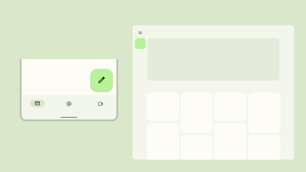
➕FAB - Floating Action Button
画面上で最も一般的 または 重要なアクションを表すために利用します。
Gmailではメールを新規作成する操作に割り当てられていますね。
ガイドライン3を確認すると、FABについても画面サイズに応じて配置先を変更することが推奨されています。
Expanded window size
A consistent position for FABs improves discoverability as it appears across a responsive range of layouts. For large screens in the expanded window size class, it’s recommended to place the FAB in the upper left region.
Compact, Medium (モバイル、タブレット)
- 画面右下に表示
Expanded (デスクトップ)
- 画面左上に表示 (NavigationRail,Drawerなど)
🧑💻実装
残念ながら、当パッケージではまだFABのサポートはされていません。
しかしまったく対応できないというわけではありません。
画面側で利用したAdaptiveLayoutを利用してNavigationRailへの切り替えを自作することで、FABやメニューを追加することができます。
(コード)AdaptiveScaffoldからAdaptiveLayoutへの書き換え
// FABやメニューを追加する場合は`AdaptiveLayout`を利用する
// `AdaptiveScaffold`の内部実装と合わせるため、`Scaffold`でラッピング
return Scaffold(
  body: AdaptiveLayout(
    body: SlotLayout(
      config: <Breakpoint, SlotLayoutConfig>{
        Breakpoints.standard: SlotLayout.from(
          key: _bodyKey,
          builder: (_) => Scaffold(
            appBar: AppBar(title: const Text(appName)),
            body: ...,
          ),
        ),
      },
    ),
    // 画面左側に表示するNavigation領域
    primaryNavigation: SlotLayout(
      config: <Breakpoint, SlotLayoutConfig>{
        // 画面サイズがMediumの場合
        Breakpoints.medium: SlotLayout.from(
          key: _primaryNavigationKey,
          builder: (_) => AdaptiveScaffold.standardNavigationRail(
            // NavigationBarとNavigationRailで定義が異なるので変換を行う
            destinations: _toRailDestinations(destinations),
            selectedIndex: ...,
            onDestinationSelected: ...,
          ),
        ),
        // 画面サイズがLarge(Expanded)の場合
        Breakpoints.large: SlotLayout.from(
          key: _primaryNavigationExtendedKey,
          builder: (_) => AdaptiveScaffold.standardNavigationRail(
            extended: true,
            destinations: _toRailDestinations(destinations),
            selectedIndex: ...,
            onDestinationSelected: ...,
          ),
        ),
      },
    ),
    // 画面下部に表示するNavigation領域
    bottomNavigation: SlotLayout(
      config: <Breakpoint, SlotLayoutConfig>{
        // 画面サイズがSmall(Compact)以上の場合
        Breakpoints.smallAndUp: SlotLayout.from(
          key: _bottomNavigationKey,
          builder: (_) => AdaptiveScaffold.standardBottomNavigationBar(
            destinations: destinations,
            currentIndex: ...,
            onDestinationSelected: ...,
          ),
        ),
        // 画面サイズがMedium以上の場合
        Breakpoints.mediumAndUp: SlotLayoutConfig.empty(),
      },
    ),
  ),
);
後はNavigationRailを実装するのと変わりません。
NavigationRailの実装を見ると下記のように記載されています。
/// The leading widget in the rail that is placed above the destinations.
///
/// It is placed at the top of the rail, above the [destinations]. Its
/// location is not affected by [groupAlignment].
///
/// This is commonly a [FloatingActionButton], but may also be a non-button,
/// such as a logo.
///
/// The default value is null.
final Widget? leading;
FABなどを表示するためにはleadingに設定すれば良さそうですね
AdaptiveScaffold.standardNavigationRailのleadingにFABを追加します。
(コード)FABの追加
AdaptiveScaffold.standardNavigationRail(
  destinations: _toRailDestinations(destinations),
  selectedIndex: ...,
  onDestinationSelected: ...,
+  // ガイドラインのスペース指定に従うため、`Padding`を指定
+  leading: Padding(
+    padding: const EdgeInsets.only(bottom: 56),
+    child: FloatingActionButton(
+      onPressed: () {},
+      child: const Icon(Icons.add),
+    ),
+  ),
)
gifの通り、FABの表示位置についても画面サイズに応じて切り替わるようになりました。
コードを見て感づかれている方もいると思いますが、NavigationRailへFABを追加するとなるとナビゲーション定義側に記載する必要があります。
FABは画面のコンテンツとして管理したいのですが、NavigationRailと同居する都合上、上記のような記載となっています。
Web版のGmailのようにDrawerに逃がす対応や、InheritedWidgetなどで画面から指定することでごまかす事はできますが、そうしている理由がわかりにくいこともあり、FABに関してはパッケージ側の対応を待ったほうがいいという印象でした。
🚩おわり
レスポンシブ対応としてはまだまだ残っていますが、パッケージを利用したレスポンシブ対応は以上です。
自作部分が多くなってしまったので、パッケージ利用の恩恵が薄くなっているように感じますが、自前ですべてを組んでいくよりは、だいぶカンタンに対応することができたと思います。
まだメジャーリリースされていないパッケージなので課題はありますが、Material3の対応がどんどん進んでいる状況もあり、このパッケージの更新も期待したいです。
作成したサンプルコードはGithubに公開しています。
デモページも公開していますので、遊んでみて下さい。
🙇あとがき
最後までお読み頂きありがとうございました。
ここまでまとめましたが、私はWebエンジニアをしており、業務でFlutterを触る機会はまったくありません。
(釈迦に説法だったらはずかしい・・・)
そんな私でもFlutterは使い勝手がよく、もっと多方面で利用されればと思っています。
新しいものに触れている楽しさもありますが
マルチプラットフォームへの対応として、記事の内容が少しでも参考になれば幸いです。
-
Common swappable components - https://m3.material.io/foundations/layout/applying-layout/window-size-classes#ec42735d-d855-4e86-afb6-6762333f0e19 ↩ ↩2
-
Panes - https://m3.material.io/foundations/layout/understanding-layout/parts-of-layout#667b32c0-56e2-4fc2-a618-4066c79a894e ↩
-
FAB - Responsive layout - https://m3.material.io/components/floating-action-button/guidelines#34a9762a-b855-465d-9263-650b81a05f42 ↩