はじめに
Handsontableの有料版(バージョン 7.0.0以降、または Pro版)では、NestedHeadersオプションを使用することで、複数行ヘッダーを実現することができます。
MITライセンス版のバージョン 6.2.2を使用して、複数行ヘッダーを実現してみたかった。
参考用に検索すると、下記2つの記事が見つかります。
【2021/08/16追記】
垂直セルの結合のrowspan属性に対応しました。
ただし、行ヘッダー(isRowHeader=true)を表示する場合、ヘッダーを3行にする必要があります。
Handsontable側の不具合と思われるのですが、修正が出来そうもなかった。
注意
このプログラムは有料版では、Handsontable側の"onAfterGetColHeader"にて headerRow.parentNodeがnullになってしまうため、エラーとなり動作しません。MITライセンス版のバージョン 6.2.2ではチェックが無いため動作します。
key: "onAfterGetColHeader",
  value: function onAfterGetColHeader(col, TH) {
  // Corner or a higher-level header
  var headerRow = TH.parentNode;

  if (!headerRow) {
    return;
  }

  var headerRowList = headerRow.parentNode.childNodes;
有料版は標準でNestedHeadersオプションが使用できるので困らないと思います。ただし、rowspanには対応していません。
仕様
HandsontableのNestedHeadersオプションでは、構成配列要素にlabel、colspanプロパティを持つオブジェクトを指定するようになっています。
nestedHeaders: [
  ['A', {label: 'B', colspan: 8}, 'C'],
  ['D', {label: 'E', colspan: 4}, {label: 'F', colspan: 4}, 'G'],
  ['H', 'I', 'J', 'K', 'L', 'M', 'N', 'R', 'S', 'T']
]
「Handsontableのヘッダーを複数行やセルの結合に見せかける方法」で提示しているヘッダー部分を実現しようとすると左寄せなどがなく、colspanプロパティだけでは足りないため、classとstyleプロパティとrowspanプロパティを追加しました。
styleプロパティは、線が2重になるところを消したいと思って追加しています。
let nestedHeaders = [
  [{ label: '氏名', rowspan:2, class: 'htMiddle', style: 'border-bottom: none' }, { label: '2018', colspan: 6, class: 'htLeft' }, { label: '2019', colspan: 6, class: 'htLeft'}],
  [{ label: '7', style: 'border-left: none' }, '8', '9', '10', '11', '12', '1', '2', '3', '4', '5', '6']
];

let isRowHeader = false;
let header = getHeaderHtml(nestedHeaders, isRowHeader);

let hot = new Handsontable(document.getElementById('grid'), {
  rowHeaders: isRowHeader,
  afterGetColHeader: function(col, TH) {
    // thead内の要素を削除
    $('table.htCore thead').empty();
    // thead内に要素を追加
    $('table.htCore thead').prepend(header);
  }
getHeaderHtml関数の引数に、ヘッダーの構成配列要素とヘッダー行有無(行番号部分)を指定します。
afterGetColHeaderオプションにて、ヘッダーの再描画を行います。
ヘッダーの列数分毎回呼ばれてヘッダーを全部作り直しています。無駄なようなんですが、スクロールや列幅変更したときにヘッダーが壊れるので仕方ないです。でも、最初にヘッダー文字列を生成してしまっているので大したコストではない。
下記のCSSは結合セル(colspan)で、非表示セルにhiddenHeaderクラスを指定するために必要となります。
.handsontable thead th.hiddenHeader:not(:first-of-type) {
  display: none;
}
実装
CodePen がQiitaで埋め込みが出来るのですが、表示が真っ白になってしまうので埋め込みはやめました。
CodePenのJSライブラリー「handsontable.full.min.js」の末尾に余分なダブルクォーテーションが付いていたのが原因でした。
See the Pen Handsontable NestedHeader implementation by やじゅ (@yaju-the-encoder) on CodePen.
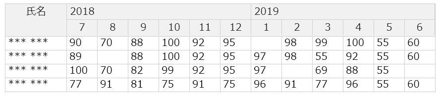
参考記事と違って年の部分はセル結合されています。また、データ部分は数値型にしてみました。
ソースコード
<!DOCTYPE html>
<html lang="jp">
<body>
<head>
<link rel="stylesheet" href="https://cdnjs.cloudflare.com/ajax/libs/handsontable/6.2.2/handsontable.full.css">
<style>
.handsontable thead th.hiddenHeader:not(:first-of-type) {
  display: none;
}
</style>
</head>

<div id="grid"></div>

<script src="https://cdnjs.cloudflare.com/ajax/libs/handsontable/6.2.2/handsontable.full.min.js"></script>
<script src="https://cdnjs.cloudflare.com/ajax/libs/jquery/3.6.0/jquery.min.js"></script>
<script language="javascript" type="text/javascript">
let nestedHeaders = [
  [{ label: '氏名', rowspan:2, class: 'htMiddle', style: 'border-bottom: none' }, { label: '2018', colspan: 6, class: 'htLeft' }, { label: '2019', colspan: 6, class: 'htLeft'}],
  [{ label: '7', style: 'border-left: none' }, '8', '9', '10', '11', '12', '1', '2', '3', '4', '5', '6']
];

let data = [
  ['*** ***', 90, 70, 88, 100, 92, 95, , 98, 99, 100, 55, 60 ],
  ['*** ***', 89, , 88, 100, 92, 95, 97, 98, 55, 92, 55, 60 ],
  ['*** ***', 100, 70, 82, 99, 92, 95, 97, , 69, 88, 55,  ],
  ['*** ***', 77, 91, 81, 75, 91, 75, 96, 91, 77, 96, 55, 60 ]
]

let isRowHeader = false;
let header = getHeaderHtml(nestedHeaders, isRowHeader)

let hot = new Handsontable(document.getElementById('grid'), {
  data: data,
  manualColumnResize: true,
  colHeaders: true,
  columns: [
    { type: 'text',width: 100 },
    { type: 'numeric',width: 60},
    { type: 'numeric',width: 60},
    { type: 'numeric',width: 60},
    { type: 'numeric',width: 60},
    { type: 'numeric',width: 60},
    { type: 'numeric',width: 60},
    { type: 'numeric',width: 60},
    { type: 'numeric',width: 60},
    { type: 'numeric',width: 60},
    { type: 'numeric',width: 60},
    { type: 'numeric',width: 60},
    { type: 'numeric',width: 60}
  ],
  rowHeaders: isRowHeader,
  afterGetColHeader: function(col, TH) {
    // thead内の要素を削除
    $('table.htCore thead').empty();
    // thead内に要素を追加
    $('table.htCore thead').prepend(header);
  },
});

function getHeaderHtml(nestedHeaders, isRowHeader) {
  let headerHtml = [''];

  for(const row of nestedHeaders) {
    headerHtml.push('<tr>');

    for(const [index, value] of row.entries()) {
      if(index == 0) {
        if(isRowHeader) {
          headerHtml.push('<th class="">');
          headerHtml.push(getThHtml(""));
        }
      }

      if(typeof value == 'object') {
        if(value.label != undefined) {
          headerHtml.push('<th class=');
          headerHtml.push(value.class != undefined   ? '"' + value.class + '"' : '""');
          headerHtml.push(value.colspan != undefined ? ' colspan="' + value.colspan + '"' : "");
          headerHtml.push(value.rowspan != undefined ? ' rowspan="' + value.rowspan + '"' : "");
          headerHtml.push(value.style != undefined   ? ' style="' + value.style   + '"' : "");
          headerHtml.push('>');
          headerHtml.push(getThHtml(value.label));
          for(let i = 1; i < value.colspan; i++) {
            headerHtml.push('<th class="hiddenHeader">' + getThHtml(""));
          }
        }
      }
      else {
         headerHtml.push('<th class="">');
         headerHtml.push(getThHtml(value));
      }
    }

    headerHtml.push('</tr>');
  }

  return headerHtml.join('');
}

function getThHtml(text) {
  // Handsontableが自動で生成するヘッダーの内容に合わせる
  return '<div class="relative"><span class="colHeader">' + text + '</span></div></th>';
}
</script>
</body>
</html>
その他の例
Handsomtableの複数行ヘッダーで画像検索して見つけたのを実装してみました。
参考1
HandsomtableのNestedHeadersの機能説明のサンプル
https://handsontable.com/docs/api/nested-headers/#nestedheaders
参考1の実装
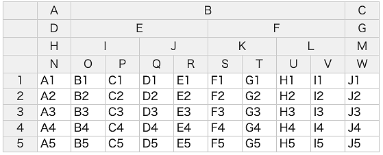
let nestedHeaders = [
  ['A', { label: 'B', colspan: 8 }, 'C'],
  ['D', { label: 'E', colspan: 4 }, { label: 'F', colspan: 4 }, 'G'],
  ['H', { label: 'I', colspan: 2 }, { label: 'J', colspan: 2 }, { label: 'K', colspan: 2 }, { label: 'L', colspan: 2 }, 'M'],
  ['N', 'O', 'P', 'Q', 'R', 'S', 'T', 'U', 'V', 'W']
];

let isRowHeader = true;
let header = getHeaderHtml(nestedHeaders, isRowHeader);
参考2
HandsomtableのIssuesから
https://github.com/handsontable/handsontable/issues/5718
参考2の実装
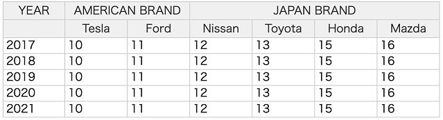
let nestedHeaders = [
  ['YEAR',  { label: 'AMERICAN BRAND', colspan: 2 }, { label: 'JAPAN BRAND', colspan: 4 }],
  ['', 'Tesla', 'Ford', 'Nissan', 'Toyota', 'Honda', 'Mazda']
];

let isRowHeader = false;
let header = getHeaderHtml(nestedHeaders, isRowHeader);
let rowHeaders = ['Mazda','Mazda','Datsun','Hornet','Hornet','Valiant','Duster','Merc 2']
参考3
HandsomtableのIssuesから
https://github.com/jrowen/rhandsontable/issues/204
参考3の実装
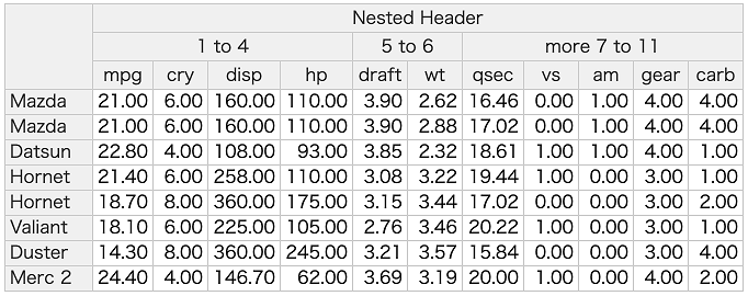
let nestedHeaders = [
  [{ label: 'Nested Header', colspan: 11 }],
  [{ label: '1 to 4', colspan: 4 }, { label: '5 to 6', colspan: 2 }, { label: 'more 7 to 11', colspan: 5 }],
  ['mpg', 'cry', 'disp', 'hp', 'draft', 'wt', 'qsec', 'vs', 'am', 'gear', 'carb']
];

let isRowHeader = false;
let header = getHeaderHtml(nestedHeaders, isRowHeader);
コーナーのセル結合は下線を消すことで実現しています。
.ht_clone_left.handsontable tbody tr th {
  text-align: left;
}

.handsontable thead tr:first-child th:first-child {
  border-bottom: none
}
.handsontable thead tr:nth-child(2) th:first-child {
  border-bottom: none
}
参考4
サイボウズのkintone カスタマイズ フォーラムから
HandsonTableの表頭2行結合表記方法について
参考4の実装
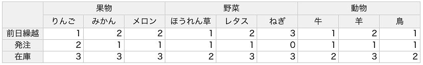
let nestedHeaders = [
  [{ label: '果物', colspan: 3 }, { label: '野菜', colspan: 3 }, { label: '動物', colspan: 3 }],
  ['りんご', 'みかん', 'メロン', 'ほうれん草', 'レタス', 'ねぎ', '牛', '羊', '鳥']
];

let isRowHeader = true;
let header = getHeaderHtml(nestedHeaders, isRowHeader);
let rowHeaders = ['前日繰越','発注','在庫'];
コーナーのセル結合は下線を消すことで実現しています。
.handsontable thead tr:first-child th:first-child {
  border-bottom: none
}
参考5
SPREAD for ASP.NET 10.0J サンプルコード集から
https://docs.grapecity.com/help/spread-aspnet-samplecodes-10/MultiRow-01.html
参考5の実装
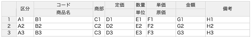
垂直セルのrowspan属性対応
冒頭で説明したように行ヘッダー(isRowHeader=true)を表示する場合、ヘッダーを3行にする必要があります。
複数行ヘッダーの実現ってことで、データ部分については1レコード複数行入力の調査中なのでダミーデータのままです。
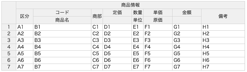
let nestedHeaders = [
  [ { label: '商品情報', colspan: 8 }],
  [ { label: '区分', rowspan: 2, class: 'htMiddle', style: 'border-bottom: none;' }, 'コード',  { label: '商部', rowspan: 2, class: 'htMiddle',style: 'border-bottom: none;' },  '定価', '数量', '単価', '金額', { label: '備考', rowspan: 2, class: 'htMiddle', style: 'border-bottom: none;' } ],
  [ { label: '商品名', style: 'border-left: none;' }, '', '単位', '原価', '' ]
];
コーナーのセル結合は下線を消すことで実現しています。
.handsontable thead tr:first-child th:first-child {
  border-bottom: none
}
.handsontable thead tr:nth-child(2) th:first-child {
  border-bottom: none
}
ヘッダー行が2行の場合
行ヘッダーの先頭コーナーの高さが不具合で大きくなってしまうために隠れてしまいます。
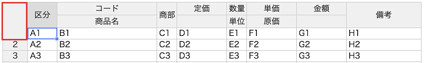
回避策
とりあえず、afterRenderとafterSelection時に、100ms後にコーナーの高さを変更しています。タイマーを使わずにCSSのみで何とかならんかしら。
  afterRender: function() {
    setCornerHeight();
  },
  afterSelection: function (r, c, r2, c2) {
    setCornerHeight();
  }

function setCornerHeight()
{
  setTimeout(function() {
    $('.ht_clone_top_left_corner').css("height", "25px");
  }, 100);
}
セルをクリックすると行ヘッダーの先頭が少しチラつく程度です。気にしないならこの方法でもいいです。
参考6
参考6の実装
垂直セルのrowspan属性対応
冒頭で説明したように行ヘッダー(isRowHeader=true)を表示する場合、ヘッダーを3行にする必要があります。
複数行ヘッダーの実現ってことで、データ部分については1レコード複数行入力の調査中なのでダミーデータのままです。
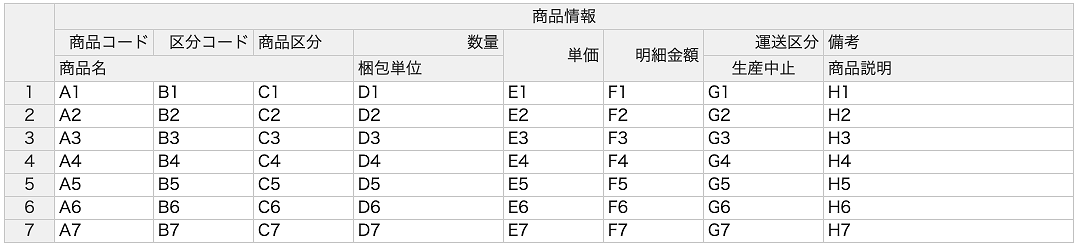
let nestedHeaders = [
  [ { label: '商品情報', colspan: 8 }],
  [ { label: '商品コード', class: 'htRight'},
    { label: '区分コード', class: 'htRight'},
    { label: '商品区分', class: 'htLeft'},
    { label: '数量', class: 'htRight'},
    { label: '単価', rowspan: 2, class: 'htRight htMiddle',style: 'border-bottom: none;' },
    { label: '明細金額', rowspan: 2, class: 'htRight htMiddle',style: 'border-bottom: none;' },
    { label: '運送区分', class: 'htRight'}, { label: '備考', class: 'htLeft'} ],
  [ { label: '商品名', colspan: 3, class: 'htLeft' },
    { label: '梱包単位', class: 'htLeft'}, '生産中止', { label: '商品説明', class: 'htLeft'} ]
];
最後に
有償版のNestedHeadersオプションと遜色ない機能になっています。これで、MITライセンス版のバージョン 6.2.2でも複数ヘッダーを気軽に実装できるでしょう。
本当は脱jQueryにしたかったのですが、下記の部分の書き換えがうまく行きませんでした。
もし分かる人がいたらコメントお待ちしています。
afterGetColHeader: function(col, TH) {
  // thead内の要素を削除
  $('table.htCore thead').empty();
  // thead内に要素を追加
  $('table.htCore thead').prepend(header);
}