はじめに
前回は、ボタンのマウスオーバー時の背景色の変更を行った。
今回は、WineskinServerで動作するランチャー作成として参考にしている「CLaunch」のようにボタンにイメージを付けたい。
スタイルに追加実装
前回のボタンのマウスオーバー時の背景色の変更のスタイルをContentTemplateプロパティーを追加します。
ContentTemplateプロパティーのDataTemplateタグ内にStackPanelタグ(縦方向)を用意して、ImageタグとContentControlタグを追加して実現しています。
イメージは仮として、サクラエディタのアイコンにしてみました。
<Window.Resources>
    <SolidColorBrush x:Key="Button.MouseOver.Border" Color="#FF3C7FB1"/>
    <SolidColorBrush x:Key="Button.Pressed.Background" Color="#FFC4E5F6"/>
    <SolidColorBrush x:Key="Button.Pressed.Border" Color="#FF2C628B"/>
    <SolidColorBrush x:Key="Button.Disabled.Background" Color="#FFF4F4F4"/>
    <SolidColorBrush x:Key="Button.Disabled.Border" Color="#FFADB2B5"/>
    <SolidColorBrush x:Key="Button.Disabled.Foreground" Color="#FF838383"/>
    <LinearGradientBrush x:Key="Button.Background" StartPoint="0,0" EndPoint="1,1">
        <GradientStop Color="#FFFDFDFD" Offset="0"/>
        <GradientStop Color="#FFCECECE" Offset="0.35"/>
        <GradientStop Color="#FFA4A4A4" Offset="0.65"/>
    </LinearGradientBrush>
    <LinearGradientBrush x:Key="Button.MouseOver.Background" StartPoint="0,0" EndPoint="0,1">
        <GradientStop Color="#FFFFD030" Offset="0"/>
        <GradientStop Color="#FFFFFDF4" Offset="0.50"/>
        <GradientStop Color="#FFFFD030" Offset="1.00"/>
    </LinearGradientBrush>
    <ControlTemplate x:Key="ButtonTemplate1" TargetType="{x:Type ButtonBase}">
        <Border x:Name="border" Background="{TemplateBinding Background}" BorderBrush="{TemplateBinding BorderBrush}" BorderThickness="{TemplateBinding BorderThickness}" SnapsToDevicePixels="true">
            <ContentPresenter x:Name="contentPresenter" Focusable="False" HorizontalAlignment="{TemplateBinding HorizontalContentAlignment}" Margin="{TemplateBinding Padding}" RecognizesAccessKey="True" SnapsToDevicePixels="{TemplateBinding SnapsToDevicePixels}" VerticalAlignment="{TemplateBinding VerticalContentAlignment}" />
        </Border>
        <ControlTemplate.Triggers>
            <Trigger Property="Button.IsDefaulted" Value="true">
                <Setter Property="BorderBrush" TargetName="border" Value="{DynamicResource {x:Static SystemColors.HighlightBrushKey}}"/>
            </Trigger>
            <Trigger Property="IsMouseOver" Value="true">
                <Setter Property="Background" TargetName="border" Value="{StaticResource Button.MouseOver.Background}"/>
                <Setter Property="BorderBrush" TargetName="border" Value="{StaticResource Button.MouseOver.Border}"/>
            </Trigger>
            <Trigger Property="IsPressed" Value="true">
                <Setter Property="Background" TargetName="border" Value="{StaticResource Button.Pressed.Background}"/>
                <Setter Property="BorderBrush" TargetName="border" Value="{StaticResource Button.Pressed.Border}"/>
            </Trigger>
            <Trigger Property="IsEnabled" Value="false">
                <Setter Property="Background" TargetName="border" Value="{StaticResource Button.Disabled.Background}"/>
                <Setter Property="BorderBrush" TargetName="border" Value="{StaticResource Button.Disabled.Border}"/>
                <Setter Property="TextElement.Foreground" TargetName="contentPresenter" Value="{StaticResource Button.Disabled.Foreground}"/>
            </Trigger>
        </ControlTemplate.Triggers>
    </ControlTemplate>

    <Style x:Key="ButtonStyle1" TargetType="Button">
        <Setter Property="Template" Value="{StaticResource ButtonTemplate1}" />
        <Setter Property="Background" Value="{StaticResource Button.Background}" />
        <Setter Property="ContentTemplate">
            <Setter.Value>
                <DataTemplate>
                    <StackPanel Orientation="Vertical">
                        <Image Width="48" Height="48" VerticalAlignment="Center" Source="/Images/my_appicon.ico"  />
                        <ContentControl Content="{Binding}" HorizontalAlignment="Center"/>
                    </StackPanel>
                </DataTemplate>
            </Setter.Value>
        </Setter>
        <Style.Triggers>
            <Trigger Property="IsMouseOver" Value="true">
                <Setter Property="Foreground" Value="red"/>
            </Trigger>
        </Style.Triggers>
    </Style>
</Window.Resources>

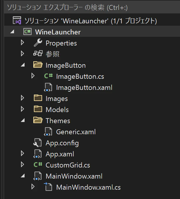
カスタムコントロール化
イメージが付いたボタンは今後もよく使用するので、カスタムコントロールにしてしまいましょう。
ただ、あまり汎用的に作成してしまうと記事的に長くなってしまうのでほどほどにします。
今回のプロパティは、ImageSource、ImageWidth、ImageHeightの3つとします。
カスタムコントロールは、新規作成のカスタムコントロール(WPF)から作成します。作成すると、クラスが1つとThemesフォルダの中にGeneric.xamlが作成されます。
このGeneric.xaml内にコントロールのデフォルトのStyleを定義してコントロールを作成します。
ネームスペースはWine用のランチャー作成としているので、clr-namespace:WineLauncherになっています。
<ResourceDictionary
    xmlns="http://schemas.microsoft.com/winfx/2006/xaml/presentation"
    xmlns:x="http://schemas.microsoft.com/winfx/2006/xaml"
    xmlns:local="clr-namespace:WineLauncher">

    <SolidColorBrush x:Key="Button.MouseOver.Border" Color="#FF3C7FB1"/>
    <SolidColorBrush x:Key="Button.Pressed.Background" Color="#FFC4E5F6"/>
    <SolidColorBrush x:Key="Button.Pressed.Border" Color="#FF2C628B"/>
    <SolidColorBrush x:Key="Button.Disabled.Background" Color="#FFF4F4F4"/>
    <SolidColorBrush x:Key="Button.Disabled.Border" Color="#FFADB2B5"/>
    <SolidColorBrush x:Key="Button.Disabled.Foreground" Color="#FF838383"/>
    <LinearGradientBrush x:Key="Button.Background" StartPoint="0,0" EndPoint="1,1">
        <GradientStop Color="#FFFDFDFD" Offset="0"/>
        <GradientStop Color="#FFCECECE" Offset="0.35"/>
        <GradientStop Color="#FFA4A4A4" Offset="0.65"/>
    </LinearGradientBrush>
    <LinearGradientBrush x:Key="Button.MouseOver.Background" StartPoint="0,0" EndPoint="0,1">
        <GradientStop Color="#FFFFD030" Offset="0"/>
        <GradientStop Color="#FFFFFDF4" Offset="0.50"/>
        <GradientStop Color="#FFFFD030" Offset="1.00"/>
    </LinearGradientBrush>
    <ControlTemplate x:Key="ButtonTemplate1" TargetType="{x:Type ButtonBase}">
        <Border x:Name="border" Background="{TemplateBinding Background}" BorderBrush="{TemplateBinding BorderBrush}" BorderThickness="{TemplateBinding BorderThickness}" SnapsToDevicePixels="true">
            <ContentPresenter x:Name="contentPresenter" Focusable="False" HorizontalAlignment="{TemplateBinding HorizontalContentAlignment}" Margin="{TemplateBinding Padding}" RecognizesAccessKey="True" SnapsToDevicePixels="{TemplateBinding SnapsToDevicePixels}" VerticalAlignment="{TemplateBinding VerticalContentAlignment}" />
        </Border>
        <ControlTemplate.Triggers>
            <Trigger Property="Button.IsDefaulted" Value="true">
                <Setter Property="BorderBrush" TargetName="border" Value="{DynamicResource {x:Static SystemColors.HighlightBrushKey}}"/>
            </Trigger>
            <Trigger Property="IsMouseOver" Value="true">
                <Setter Property="Background" TargetName="border" Value="{StaticResource Button.MouseOver.Background}"/>
                <Setter Property="BorderBrush" TargetName="border" Value="{StaticResource Button.MouseOver.Border}"/>
            </Trigger>
            <Trigger Property="IsPressed" Value="true">
                <Setter Property="Background" TargetName="border" Value="{StaticResource Button.Pressed.Background}"/>
                <Setter Property="BorderBrush" TargetName="border" Value="{StaticResource Button.Pressed.Border}"/>
            </Trigger>
            <Trigger Property="IsEnabled" Value="false">
                <Setter Property="Background" TargetName="border" Value="{StaticResource Button.Disabled.Background}"/>
                <Setter Property="BorderBrush" TargetName="border" Value="{StaticResource Button.Disabled.Border}"/>
                <Setter Property="TextElement.Foreground" TargetName="contentPresenter" Value="{StaticResource Button.Disabled.Foreground}"/>
            </Trigger>
        </ControlTemplate.Triggers>
    </ControlTemplate>

    <Style TargetType="{x:Type local:ImageButton}" BasedOn="{StaticResource {x:Type Button}}">
        <Setter Property="Template" Value="{StaticResource ButtonTemplate1}" />
        <Setter Property="Background" Value="{StaticResource Button.Background}" />
        <Setter Property="ContentTemplate">
            <Setter.Value>
                <DataTemplate>
                    <StackPanel Orientation="Vertical">
                        <Image Source="{Binding ImageSource, RelativeSource={RelativeSource AncestorType=local:ImageButton}}"
                               Width="{Binding ImageWidth, RelativeSource={RelativeSource AncestorType=local:ImageButton}}"
                               Height="{Binding ImageHeight, RelativeSource={RelativeSource AncestorType=local:ImageButton}}"
                               VerticalAlignment="Center" />
                        <ContentControl Content="{Binding}" HorizontalAlignment="Center"/>
                    </StackPanel>
                </DataTemplate>
            </Setter.Value>
        </Setter>
        <Style.Triggers>
            <Trigger Property="IsMouseOver" Value="true">
                <Setter Property="Foreground" Value="red"/>
            </Trigger>
        </Style.Triggers>
    </Style>
</ResourceDictionary>
ネームスペースはWine用のランチャー作成としているので、WineLauncherになっています。
using System.Windows;
using System.Windows.Controls;
using System.Windows.Media;

namespace WineLauncher
{
    public class ImageButton : Button
    {
        static ImageButton()
        {
            DefaultStyleKeyProperty.OverrideMetadata(typeof(ImageButton), new
                FrameworkPropertyMetadata(typeof(ImageButton)));
        }

        public int ImageWidth
        {
            get { return (int)GetValue(ImageWidthProperty); }
            set { SetValue(ImageWidthProperty, value); }
        }

        public static readonly DependencyProperty ImageWidthProperty =
            DependencyProperty.Register("ImageWidth", typeof(int), typeof(ImageButton), new PropertyMetadata(48));

        public int ImageHeight
        {
            get { return (int)GetValue(ImageHeightProperty); }
            set { SetValue(ImageHeightProperty, value); }
        }

        public static readonly DependencyProperty ImageHeightProperty =
            DependencyProperty.Register("ImageHeight", typeof(int), typeof(ImageButton), new PropertyMetadata(48));

        public ImageSource ImageSource
        {
            get { return (ImageSource)GetValue(ImageSourceProperty); }
            set { SetValue(ImageSourceProperty, value); }
        }

        public static readonly DependencyProperty ImageSourceProperty =
            DependencyProperty.Register("ImageSource", typeof(ImageSource), typeof(ImageButton), new PropertyMetadata(null));
    }
}
イメージサイズは48、イメージソースはサクラエディタのアイコンを指定しています。
gridMain.GridRowCount = 2;
gridMain.GridColumnCount = 4;
gridMain.ShowGridLines = true;

int count = 1;
for (int i = 0; i < 2; i++)
{
    for (int j = 0; j < 4; j++)
    {
        ImageButton MyControl = new ImageButton();
        MyControl.Content = count.ToString();
        MyControl.Name = "Button" + count.ToString();
        MyControl.ImageSource = new BitmapImage(new Uri("/Images/my_appicon.ico", UriKind.Relative));
        MyControl.ImageHeight = 48;
        MyControl.ImageWidth = 48;
        MyControl.Click += new RoutedEventHandler(Button_Click);
        Grid.SetColumn(MyControl, j);
        Grid.SetRow(MyControl, i);

        gridMain.Children.Add(MyControl);

        count++;
    }
}
嵌まったこと
カスタムコントロール化したらウィンドウサイズを変更するとボタンのサイズも連動して変更されるのですが、イメージが左上で固定化されたままでした。カスタムコントロール化する前はイメージはセンターの位置に表示されていました。
原因が分からず、ネットで調べても回答が見つかりませんでした。そこでイメージボタンのカスタムコントロール化しているサイトを見つけ、Gridの中に組み込むとセンターに表示されました。
自分のと何が違うのか調べてみると、「BasedOn="{StaticResource {x:Type Button}}"」が不足していました。これを追加したら自分のもセンター位置に表示されました。
<Style TargetType="{x:Type local:ImageButton}">
                                                  ↓
<Style TargetType="{x:Type local:ImageButton}" BasedOn="{StaticResource {x:Type Button}}">
カスタムコントロールをスマートにする
今後カスタムコントロールを増やしていった場合、Generic.xamlにひたすら追加していくようになります。それだとGeneric.xamlが肥大化して見づらい状態になってしまいますよね。
フォルダ内に納める
カスタムコントロール用(ImageButton)のフォルダを作成し、その中にXAMLファイルとCSファイルを移動させます。
XAMLファイルは、Generic.xamlの中身をそのままコピーしてImageButton.xamlにします。
その後にGeneric.xamlをResourceDictionaryタグを指定した下記コードに書き換えます。
<ResourceDictionary
    xmlns="http://schemas.microsoft.com/winfx/2006/xaml/presentation"
    xmlns:x="http://schemas.microsoft.com/winfx/2006/xaml"
    xmlns:local="clr-namespace:WineLauncher">
    <ResourceDictionary.MergedDictionaries>
        <ResourceDictionary Source="/WineLauncher;component/ImageButton/ImageButton.xaml"/>
    </ResourceDictionary.MergedDictionaries>
</ResourceDictionary>
Mac上のWineskinServerで起動

XAMLファイルとCSファイルの階層化
別方法としてユーザーコントロールのようにXAMLファイルとCSファイルの階層化する方法もあるようです。
自分の場合はコンパイルエラーが解決出来なくて、上記のフォルダ内に納める方法にしてしまいました。
- CustomControl1.xaml
- CustomControl1.xaml.cs
最後に
今回のイメージボタンはイメージとテキストは縦方向(Vertical)にしていますが、下記の部分を変えれば横方向(Horizontal)にできます。
<StackPanel Orientation="Vertical">
                          ↓
<StackPanel Orientation="Horizontal">
イメージを上下左右に指定したい場合、下記サイトのイメージボタンはGridを使用して指定できるようになっています。
WPFというかXAMLは慣れないと難しいですね。レイアウトの自由度は高いのはいいんだけど。
でも、これを理解しないことには次世代UIである「MAUI」とか使いこなせない。