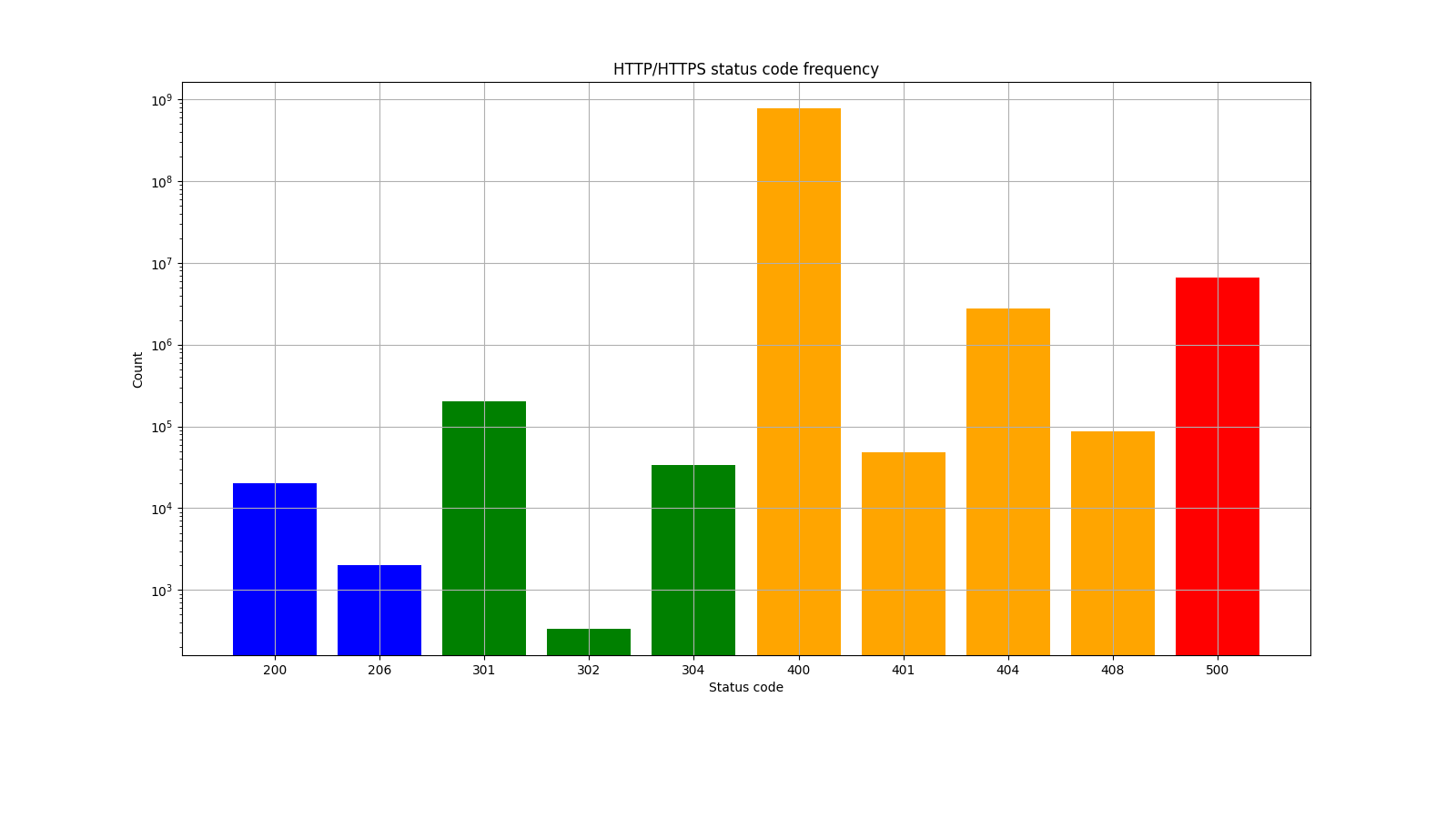
$ cat mc2.py
# !/usr/bin/env python3

import pandas as pd
import matplotlib.pyplot as plt
import os
import sys


def get_color_list(x):

  cl = []

  # print(x)
  for i in x:
    # print(i)
    if i >= 200 and i < 300:
      cl.append('blue')
    elif i >= 300 and i < 400:
      cl.append('green')
    elif i >= 400 and i < 500:
      cl.append('orange')
    elif i >= 500:
      cl.append('red')
  return cl


csv_file = "source.csv"
png_file = csv_file.replace(".csv", ".png")

df = pd.read_csv(csv_file, encoding="UTF8")
print(df)

# 数値型だとその大小に応じたピッチにX軸での表示位置が依存して醜いので、文字型に変える
x = df["HTTP status code"].apply(lambda _: str(_))
y = df["count"]

# ステータスコードに合わせて描画色を変える
color_list = get_color_list(df["HTTP status code"])
print(color_list)

plt.figure(figsize=(16, 9))
plt.bar(x, y, color=color_list)

plt.title("HTTP/HTTPS status code frequency")
plt.xlabel("Status code")
plt.ylabel("Count")
plt.grid(True)
plt.yscale("log")  # 対数軸にプロットして表示
plt.subplots_adjust(bottom=0.2, top=0.9)

# plt.show()

plt.savefig(png_file)
print(png_file, "created.")
$ cat source.csv
HTTP status code,count
200,20000
206,2000
301,200050
302,333
304,33333
400,778877777
401,47777
404,2777777
408,87777
500,6667777