CSS3をいじったりした過程や結果をノートのように残しておく。随時追記していく予定。
[ 経緯 ]
自作アプリの画面は全部HTMLで作成するようにしたいと考えていて、その準備のための勉強が必要。
今はjavafxのwebviewオンリーの画面構成でツールを作ったりしている。
(でもあんまりしっくりきてないんだよなあ・・・何かいいアーキテクチャはないだろうか。)
グラデーション背景CSSを作る
とりあえずメタリックな背景色を作りたいと思ったが、検索してもコピペできそうなソースが出てこなかった。
ただし、グラデーションの色をCSS3で出力するようなジェネレータがヒットしたので、それを利用して作ってみた。
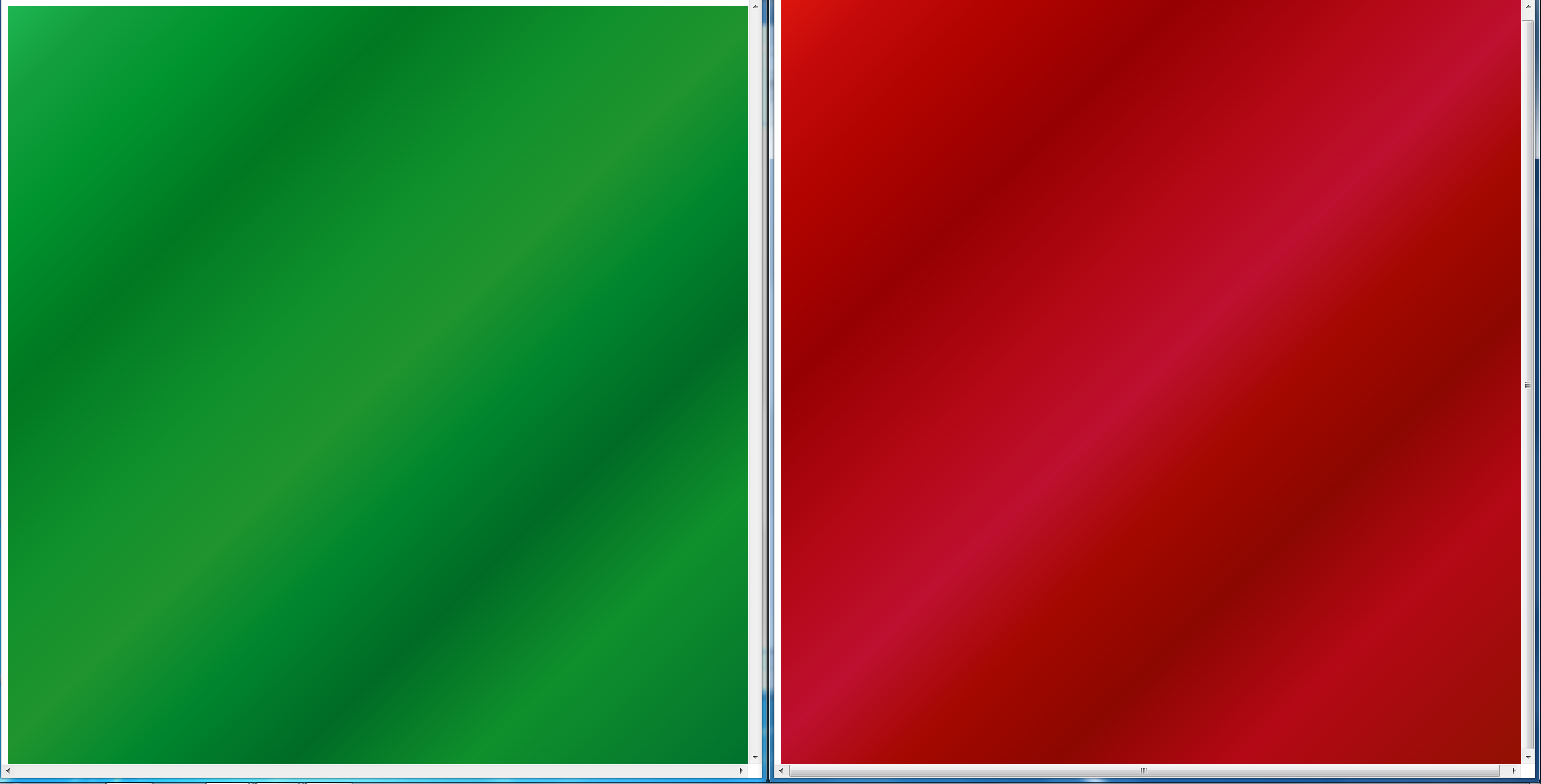
まずはメタリックなブラックとブルー。

(追記)
レッドとグリーンも作ってみた。
/*
 * メタルブラック背景色
 */
.bg-metal-black {
  /* Old browsers */
  background: rgb(34,35,38);

  /* FF3.6+ */
  background: -moz-linear-gradient(-45deg,  rgba(34,35,38,1) 0%, rgba(51,56,58,1) 5%, rgba(74,79,84,1) 21%, rgba(52,55,58,1) 47%, rgba(69,72,77,1) 71%, rgba(41,42,45,1) 90%, rgba(20,20,20,1) 100%);

  /* Chrome,Safari4+ */
  background: -webkit-gradient(linear, left top, right bottom, color-stop(0%,rgba(34,35,38,1)), color-stop(5%,rgba(51,56,58,1)), color-stop(21%,rgba(74,79,84,1)), color-stop(47%,rgba(52,55,58,1)), color-stop(71%,rgba(69,72,77,1)), color-stop(90%,rgba(41,42,45,1)), color-stop(100%,rgba(20,20,20,1)));

  /* Chrome10+,Safari5.1+ */
  background: -webkit-linear-gradient(-45deg,  rgba(34,35,38,1) 0%,rgba(51,56,58,1) 5%,rgba(74,79,84,1) 21%,rgba(52,55,58,1) 47%,rgba(69,72,77,1) 71%,rgba(41,42,45,1) 90%,rgba(20,20,20,1) 100%);

  /* Opera 11.10+ */
  background: -o-linear-gradient(-45deg,  rgba(34,35,38,1) 0%,rgba(51,56,58,1) 5%,rgba(74,79,84,1) 21%,rgba(52,55,58,1) 47%,rgba(69,72,77,1) 71%,rgba(41,42,45,1) 90%,rgba(20,20,20,1) 100%);

  /* IE10+ */
  background: -ms-linear-gradient(-45deg,  rgba(34,35,38,1) 0%,rgba(51,56,58,1) 5%,rgba(74,79,84,1) 21%,rgba(52,55,58,1) 47%,rgba(69,72,77,1) 71%,rgba(41,42,45,1) 90%,rgba(20,20,20,1) 100%);

  /* W3C */
  background: linear-gradient(135deg,  rgba(34,35,38,1) 0%,rgba(51,56,58,1) 5%,rgba(74,79,84,1) 21%,rgba(52,55,58,1) 47%,rgba(69,72,77,1) 71%,rgba(41,42,45,1) 90%,rgba(20,20,20,1) 100%);

  /* IE6-9 fallback on horizontal gradient */
  filter: progid:DXImageTransform.Microsoft.gradient( startColorstr='#222326', endColorstr='#141414',GradientType=1 );
}

/*
 * メタリックブルー背景色
 */
.bg-metal-blue {
  /* Old browsers */
  background: rgb(61,104,153);

  /* FF3.6+ */
  background: -moz-linear-gradient(-45deg,  rgba(61,104,153,1) 0%, rgba(32,124,202,1) 2%, rgba(32,124,202,1) 13%, rgba(32,124,202,1) 34%, rgba(96,161,214,1) 53%, rgba(32,124,202,1) 77%, rgba(41,137,216,1) 93%, rgba(125,185,232,1) 100%);

  /* Chrome,Safari4+ */
  background: -webkit-gradient(linear, left top, right bottom, color-stop(0%,rgba(61,104,153,1)), color-stop(2%,rgba(32,124,202,1)), color-stop(13%,rgba(32,124,202,1)), color-stop(34%,rgba(32,124,202,1)), color-stop(53%,rgba(96,161,214,1)), color-stop(77%,rgba(32,124,202,1)), color-stop(93%,rgba(41,137,216,1)), color-stop(100%,rgba(125,185,232,1)));

  /* Chrome10+,Safari5.1+ */
  background: -webkit-linear-gradient(-45deg,  rgba(61,104,153,1) 0%,rgba(32,124,202,1) 2%,rgba(32,124,202,1) 13%,rgba(32,124,202,1) 34%,rgba(96,161,214,1) 53%,rgba(32,124,202,1) 77%,rgba(41,137,216,1) 93%,rgba(125,185,232,1) 100%);

  /* Opera 11.10+ */
  background: -o-linear-gradient(-45deg,  rgba(61,104,153,1) 0%,rgba(32,124,202,1) 2%,rgba(32,124,202,1) 13%,rgba(32,124,202,1) 34%,rgba(96,161,214,1) 53%,rgba(32,124,202,1) 77%,rgba(41,137,216,1) 93%,rgba(125,185,232,1) 100%);

  /* IE10+ */
  background: -ms-linear-gradient(-45deg,  rgba(61,104,153,1) 0%,rgba(32,124,202,1) 2%,rgba(32,124,202,1) 13%,rgba(32,124,202,1) 34%,rgba(96,161,214,1) 53%,rgba(32,124,202,1) 77%,rgba(41,137,216,1) 93%,rgba(125,185,232,1) 100%);

  /* W3C */
  background: linear-gradient(135deg,  rgba(61,104,153,1) 0%,rgba(32,124,202,1) 2%,rgba(32,124,202,1) 13%,rgba(32,124,202,1) 34%,rgba(96,161,214,1) 53%,rgba(32,124,202,1) 77%,rgba(41,137,216,1) 93%,rgba(125,185,232,1) 100%);

  /* IE6-9 fallback on horizontal gradient */
  filter: progid:DXImageTransform.Microsoft.gradient( startColorstr='#3d6899', endColorstr='#7db9e8',GradientType=1 );
}

/*
 * メタリックレッド背景色
 */
.bg-metal-red {
  /* Old browsers */
  background: #dc150e;

  /* FF3.6+ */
  background: -moz-linear-gradient(-45deg,  #dc150e 0%, #c40a0a 6%, #b00300 15%, #960002 26%, #b40816 39%, #be1030 49%, #a40800 58%, #8c0700 68%, #b40816 80%, #8e1100 100%);

  /* Chrome,Safari4+ */
  background: -webkit-gradient(linear, left top, right bottom, color-stop(0%,#dc150e), color-stop(6%,#c40a0a), color-stop(15%,#b00300), color-stop(26%,#960002), color-stop(39%,#b40816), color-stop(49%,#be1030), color-stop(58%,#a40800), color-stop(68%,#8c0700), color-stop(80%,#b40816), color-stop(100%,#8e1100));

  /* Chrome10+,Safari5.1+ */
  background: -webkit-linear-gradient(-45deg,  #dc150e 0%,#c40a0a 6%,#b00300 15%,#960002 26%,#b40816 39%,#be1030 49%,#a40800 58%,#8c0700 68%,#b40816 80%,#8e1100 100%);

  /* Opera 11.10+ */
  background: -o-linear-gradient(-45deg,  #dc150e 0%,#c40a0a 6%,#b00300 15%,#960002 26%,#b40816 39%,#be1030 49%,#a40800 58%,#8c0700 68%,#b40816 80%,#8e1100 100%);

  /* IE10+ */
  background: -ms-linear-gradient(-45deg,  #dc150e 0%,#c40a0a 6%,#b00300 15%,#960002 26%,#b40816 39%,#be1030 49%,#a40800 58%,#8c0700 68%,#b40816 80%,#8e1100 100%);

  /* W3C */
  background: linear-gradient(135deg,  #dc150e 0%,#c40a0a 6%,#b00300 15%,#960002 26%,#b40816 39%,#be1030 49%,#a40800 58%,#8c0700 68%,#b40816 80%,#8e1100 100%);

  /* IE6-9 fallback on horizontal gradient */
  filter: progid:DXImageTransform.Microsoft.gradient( startColorstr='#dc150e', endColorstr='#8e1100',GradientType=1 );
}

/*
 * メタリックグリーン背景色
 */
.bg-metal-green {
  /* Old browsers */
  background: #1db651;

  /* FF3.6+ */
  background: -moz-linear-gradient(-45deg,  #1db651 0%, #149f3e 6%, #00942e 15%, #007822 26%, #0f902c 39%, #20942e 49%, #00862e 58%, #006b25 68%, #0f902c 80%, #006e2e 100%);

  /* Chrome,Safari4+ */
  background: -webkit-gradient(linear, left top, right bottom, color-stop(0%,#1db651), color-stop(6%,#149f3e), color-stop(15%,#00942e), color-stop(26%,#007822), color-stop(39%,#0f902c), color-stop(49%,#20942e), color-stop(58%,#00862e), color-stop(68%,#006b25), color-stop(80%,#0f902c), color-stop(100%,#006e2e));

  /* Chrome10+,Safari5.1+ */
  background: -webkit-linear-gradient(-45deg,  #1db651 0%,#149f3e 6%,#00942e 15%,#007822 26%,#0f902c 39%,#20942e 49%,#00862e 58%,#006b25 68%,#0f902c 80%,#006e2e 100%);

  /* Opera 11.10+ */
  background: -o-linear-gradient(-45deg,  #1db651 0%,#149f3e 6%,#00942e 15%,#007822 26%,#0f902c 39%,#20942e 49%,#00862e 58%,#006b25 68%,#0f902c 80%,#006e2e 100%);

  /* IE10+ */
  background: -ms-linear-gradient(-45deg,  #1db651 0%,#149f3e 6%,#00942e 15%,#007822 26%,#0f902c 39%,#20942e 49%,#00862e 58%,#006b25 68%,#0f902c 80%,#006e2e 100%);

  /* W3C */
  background: linear-gradient(135deg,  #1db651 0%,#149f3e 6%,#00942e 15%,#007822 26%,#0f902c 39%,#20942e 49%,#00862e 58%,#006b25 68%,#0f902c 80%,#006e2e 100%);

  /* IE6-9 fallback on horizontal gradient */
  filter: progid:DXImageTransform.Microsoft.gradient( startColorstr='#1db651', endColorstr='#006e2e',GradientType=1 );
}
使ってみる
上記cssを自分のChrome環境で試したら以下のような事象が発生。
・body要素につけたら縦方向にしかグラデーションされない
・div要素につけたらうまくいった
htmlよくわかってないけど、基本的にdiv使えってことなのかな。
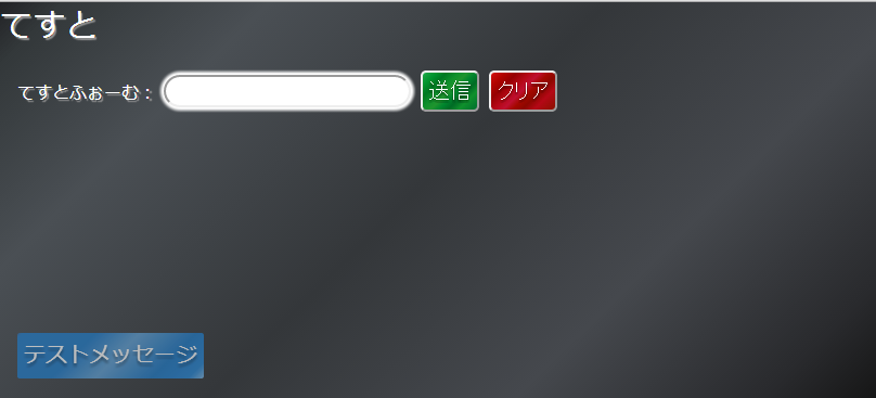
(追記)
これらの色を使って画面ぽいものを作ってみた。
まあ思ってたより悪くはないかな…
覚えておきたいこと(備忘録)
css3を適用するならできるだけdiv要素にしたほうがよさそう
つまりグラデーション背景色を指定する場合はbody要素直下にdiv置いたほうがいい。
ほかのrelative要素とかぶると面倒なのでz-index:-1がよい?
メニューとかも作るのであれば、
・背景 = z-index: -1
・コンテンツ= z-index: 0
・メニュー = z-index: 1
・メッセージ= z-index: 2
くらいがいいかも。
z-indexの使い方については感覚で使ってるので数値はおかしいかもしれない。
とりあえず、bodyに使えないのでこんな感じの配置を考える必要あり。
cssフレームワークや拡張jsを使わなくてもある程度はできる
グラデーションやテキストシャドウ・ボックスシャドウは気に入ったジェネレータをブクマしておくなどすれば、そんなに作るのは手間ではない気がする。
特に簡単な画面で簡単なアプリを作る機会が多いのであれば、自作オンリーでもなんとかなりそう。
さらに、CSS疑似クラスとか、transition, animationあたり使いこなせるようになればゴリゴリ作るロジックはかなり減らせそうだ。覚えなきゃなあ・・・
試しに作った画面のソース(かなり適当)
body {
	top: 0;
	margin: 0;
	font-family: "メイリオ", "Meiryo", "ヒラギノ角ゴ ProN W3", "Hiragino Kaku Gothic ProN", Sans-Serif;
	text-shadow: 2px 2px 1px rgba(150, 150, 150, 1);
	color: white;
}


# background {
	z-index: -1;
	position: fixed;
	width: 100%;
	height: 100%;
}

# contains {
	z-index: 0;
	position: relative;
	width: 100%;
	height: 100%;
}

# message {
	z-index: 1;
	position: fixed;
	padding: 0.3em;
	bottom: 5%;
	left: 2%;
	font-size: 20px;
	text-align: center;
    border-radius: 2px;
    text-shadow: 0 3px 3px rgba(0, 0, 0, 0.5);
	opacity: 0.65;
}

form {
	margin: 2%;
}

input,
textarea,
select,
button {
	font-size: 20px;
	border-radius: 5px;
}

button {
	padding: 5px;
	color: white;
	text-shadow: 0 2px 2px rgba(0, 0, 0, 0.5);
}

input {
	-moz-border-radius: 50px;
	-webkit-border-radius: 50px;
	border-radius: 50px;
	-moz-box-shadow: 0px 0px 3px 3px #FFFFFF;
	-webkit-box-shadow: 0px 0px 3px 3px #FFFFFF;
	box-shadow: 0px 0px 3px 3px #FFFFFF;
}
<!DOCTYPE html>
<html lang="ja">
<head>
  <link rel="stylesheet" href="./sample.css">
  <link rel="stylesheet" href="./color.css">
</head>
<body>
  <!-- 背景 -->
  <div id="background" class="bg-metal-black"></div>

  <!-- コンテンツ -->
  <div id="contains">
    <div style="font-size:30px;">てすと</div>
    <form>
      <p>
        <label>てすとふぉーむ:</label>
        <input type="text" />
        <button type="submit" class="bg-metal-green">送信</button>
        <button type="reset" class="bg-metal-red">クリア</button>
      </p>
    </form>
  </div>

  <!-- メッセージ表示領域 -->
  <div id="message" class="bg-metal-blue">テストメッセージ</div>
</body>
</html>
参考サイト
【CSS】CSSのグラデーションを使ってメタリック感を出すメモ
メタリック系背景のサンプルがいくつか見ることができる。
今回はここにないブラックがほしかったので作ることにした。
HTML5やCSS3を使った次世代表現を学ぶのに役立つコードサンプル
色々勉強になった。powerbuttonとか使ってみたい。
CSS3 グラデーションが簡単に作れるジェネレーターまとめ
ここから以下のようなツールにたどりつくことが出来た。
Ultimate CSS Gradient Generator
今回利用したジェネレータツール。使いやすい。
CSS3 GENERATOR
丸角やシャドウ、透過度等の設定がしやすいツール。
少しいじったけど、メッセージボックスのようなものを作るために将来使いそう。