はじめに
この記事では、市区町村ごとの外食費内訳がどのように違うのかを、家計調査データを元に地図上のベクトルタイルと円グラフで可視化してみました。
実際に可視化したイメージは以下のようになります。

データについて
家計調査データ
家計調査とは、総務省が実施する全国約9千世帯を対象とする家計収支に関する調査です。
その調査結果の一つである「家計調査年報 家計収支編 総世帯(2024年)」をベースにして、マップマーケティングで加工・推計しているデータ(家計調査年報1)を利用しています。
ベクトルタイル
データの形式はPMTilesのベクトルタイルで、市区町村ポリゴンに対して下記の属性値を持たせました。家計調査には外食費の月平均額が含まれており、その中の8項目2をピックアップしました。
| 属性名 | 説明 |
|---|---|
| geocode | 市区町村コード |
| lat | 代表点緯度 |
| lng | 代表点経度 |
| 家計調査・属性名 | 説明 |
|---|---|
| JPN_FOOD | 外食 和食 (千円/月) |
| SUSHI | 外食 すし (千円/月) |
| YAKINIKU | 外食 焼肉 (千円/月) |
| SOBA_UDON | 外食 日本そば・うどん (千円/月) |
| RAMEN | 外食 中華そば (千円/月) |
| CHN_FOOD | 外食 中華食 (千円/月) |
| WESTERN_FOOD | 外食 洋食 (千円/月) |
| HAMBURGER | 外食 ハンバーガー (千円/月) |
GeoJSONファイルからPMTilesを作成できますが、その方法については以前の記事をご参照下さい。
ソース
地図ライブラリにはMapLibre GL JS、地図内の円グラフ(SVG)作成にはD3.js、大きい円グラフの作成にはChart.jsをそれぞれ利用しています。
以下は、あくまでも上手くいった実装の一例です。同じ円グラフなのでわざわざライブラリを分けなくても実現はできたかもしれません。
const protocol = new pmtiles.Protocol();
maplibregl.addProtocol("pmtiles", protocol.tile);

let clickedCityId = null;
let pieChart = null;

const map = new maplibregl.Map({
  container: "map",
  center: [139.66204291, 35.67260863],
  zoom: 11,
  maxZoom: 17,
  style: "https://tile.openstreetmap.jp/styles/osm-bright-ja/style.json",
});

map.addControl(new maplibregl.NavigationControl());

map.on("load", function () {
  // データソースを追加
  map.addSource("mvt_data", {
    type: "vector",
    tiles: [`pmtiles://kakei2024_city.pmtiles/{z}/{x}/{y}`],
    minzoom: 8,
    maxzoom: 11,
    promoteId: "geocode",   // ジオコードをデータのIDに
  });

  // ポリゴンレイヤーを追加
  map.addLayer({
    id: "mvt_polygon",
    type: "fill",
    source: "mvt_data",
    "source-layer": "kakei2024_city_layer", // PMTilesのレイヤー名
    layout: {},
    paint: {
      "fill-color": "#7fffd4",
      "fill-opacity": [
        "case",
        ["boolean", ["feature-state", "selected"], false], // 選択されているかどうかで透明度を変える
        0.5,
        0.1,
      ],
    },
  });

  // ラインレイヤーを追加
  map.addLayer({
    id: "mvt_line",
    type: "line",
    source: "mvt_data",
    "source-layer": "kakei2024_city_layer", // PMTilesのレイヤー名
    layout: {},
    paint: {
      "line-color": "#2e8b57",
      "line-width": 0.5,
    },
  });

  // クリックイベントを追加
  map.on("click", "mvt_polygon", (e) => {
    const props = e.features[0].properties;
    updateFocusPieChart(props);

    if (e.features.length > 0) {
      if (clickedCityId) {
        // 既に選択されている場合は、選択を解除
        map.setFeatureState(
          {
            source: "mvt_data",
            sourceLayer: "kakei2024_city_layer",
            id: clickedCityId,
          },
          { selected: false }
        );
      }
      // 新しい市区町村を選択
      clickedCityId = e.features[0].properties.geocode;
      map.setFeatureState(
        {
          source: "mvt_data",
          sourceLayer: "kakei2024_city_layer",
          id: clickedCityId,
        },
        { selected: true }
      );
    }
  });

  // マーカーを管理する変数
  let markers = {};
  let markersOnScreen = {};

  // マーカーを更新する関数
  function updateMarkers() {
    const features = map.queryRenderedFeatures({
      layers: ["mvt_polygon"],
    });
    let newMarkers = {};
    for (let i = 0; i < features.length; i++) {
      const props = features[i].properties;
      const id = props.geocode; // ジオコードをIDとして使用

      if (props["JPN_FOOD"] === 0) continue;
      // 家計調査2024・外食費データを取得
      const japanese = props["JPN_FOOD"];
      const sushi = props["SUSHI"];
      const yakiniku = props["YAKINIKU"];
      const sobaudon = props["SOBA_UDON"];
      const ramen = props["RAMEN"];
      const chinese = props["CHN_FOOD"];
      const western = props["WESTERN_FOOD"];
      const hamburger = props["HAMBURGER"];

      // マーカーが存在しない場合は作成
      let marker = markers[id];
      if (!marker) {
        // 円グラフのSVGを作成してマーカーの要素にセット
        const el = createMapPieChart([
          japanese,
          sushi,
          yakiniku,
          sobaudon,
          ramen,
          chinese,
          western,
          hamburger,
        ]);

        marker = markers[id] = new maplibregl.Marker({
          element: el,
        }).setLngLat([props.lng, props.lat]); // マーカーの代表点位置を設定
      }
      newMarkers[id] = marker; // 新しいマーカーを追加

      // マーカーが画面に表示されていない場合は追加
      if (!markersOnScreen[id]) marker.addTo(map);
    }

    // 不要なマーカーを削除
    for (const id in markersOnScreen) {
      if (!newMarkers[id]) markersOnScreen[id].remove();
    }
    markersOnScreen = newMarkers;
  }

  // データが読み込まれたり、更新されたときのイベント
  map.on("data", (e) => {
    if (e.sourceId !== "mvt_data" || !e.isSourceLoaded) return;
    // マーカーを更新
    map.on("moveend", updateMarkers);
    updateMarkers();
  });
});

// D3.jsで地図上の円グラフを作成する関数
// 参考)https://d3-graph-gallery.com/graph/pie_basic.html
function createMapPieChart(items) {
  const width = 60,
    height = 60,
    margin = 5;

  const radius = Math.min(width, height) / 2 - margin;

  const svg = d3.create('div')
    .append('svg')
    .attr('width', width)
    .attr('height', height)
    .append('g')
    .attr('transform', `translate(${width / 2}, ${height / 2})`);

  const color = d3
    .scaleOrdinal()
    .range([
      "#E41A1C",
      "#F781BF",
      "#FF7F00",
      "#FFFF33",
      "#4DAF4A",
      "#377EB8",
      "#984EA3",
      "#A65628",
    ]);

  const pie = d3.pie()
    .sort(null)
    .value(function (d) { return d[1] });
  const dataReady = pie(Object.entries(items));

  svg
    .selectAll("whatever")
    .data(dataReady)
    .join("path")
    .attr("d", d3.arc().innerRadius(0).outerRadius(radius))
    .attr("fill", function (d) {
      return color(d.data[1]);
    })
    .attr("stroke", "#333333")
    .style("stroke-width", "0.9px")
    .style("opacity", 0.8);

  return svg.node().parentNode;
}

// Chart.jsの円グラフを更新する関数
function updateFocusPieChart(props) {
  const ctx = document.getElementById('pieChart').getContext('2d');
  const data = {
    labels: ['和食', '寿司', '焼肉', 'そば・うどん', 'ラーメン', '中華', '洋食', 'ハンバーガー'],
    datasets: [{
      data: [
        props["JPN_FOOD"],
        props["SUSHI"],
        props["YAKINIKU"],
        props["SOBA_UDON"],
        props["RAMEN"],
        props["CHN_FOOD"],
        props["WESTERN_FOOD"],
        props["HAMBURGER"]
      ],
      backgroundColor: [
        "#E41A1C",
        "#F781BF",
        "#FF7F00",
        "#FFFF33",
        "#4DAF4A",
        "#377EB8",
        "#984EA3",
        "#A65628"
      ],
      borderColor: '#333333',
      borderWidth: 0.9
    }]
  };

  const config = {
    type: "pie",
    data: data,
    plugins: [ChartDataLabels],
    options: {
      responsive: true,
      maintainAspectRatio: false,
      events: [],
      plugins: {
        legend: {
          position: "bottom",
          labels: {
            font: {
              size: 18,
            },
            boxWidth: 15,
            padding: 10,
          },
          onClick: function () {
            return false;
          },
        },
        title: {
          display: true,
          text: props.city_name,
          font: {
            size: 24,
          },
          padding: {
            bottom: 20,
          },
        },
        datalabels: {
          formatter: function (value, context) {
            return Math.round(value).toLocaleString();
          },
          color: "#333333",
          font: {
            size: 12,
          },
        },
      },
    },
  };

  if (!pieChart) {
    pieChart = new Chart(ctx, config);
  } else {
    pieChart.data.datasets[0].data = data.datasets[0].data;
    pieChart.options.plugins.title.text = props.city_name;
    pieChart.update();
  }
}
index.html
<!DOCTYPE html>
<html lang="ja">
  <head>
    <meta charset="UTF-8" />
    <title>ベクトルタイルで外食費内訳の円グラフを表示</title>
    <script src="https://unpkg.com/maplibre-gl@5.5.0/dist/maplibre-gl.js"></script>
    <link
      href="https://unpkg.com/maplibre-gl@5.5.0/dist/maplibre-gl.css"
      rel="stylesheet"
    />
    <script src="https://unpkg.com/pmtiles@3.2.0/dist/pmtiles.js"></script>
    <script src="http://d3js.org/d3.v7.min.js" charset="utf-8"></script>
    <script src="https://cdn.jsdelivr.net/npm/chart.js"></script>
    <script src="https://cdn.jsdelivr.net/npm/chartjs-plugin-datalabels@2.2.0"></script>
    <style>
      .container {
        display: flex;
        width: 100%;
        height: 95vh;
      }
      #map {
        width: 66.67%;
        height: 100%;
      }
      #chart-container {
        width: 33.33%;
        height: 100%;
        background-color: rgba(255, 255, 255, 0.9);
        display: flex;
        flex-direction: column;
        align-items: center;
        justify-content: center;
      }
      #chart-title {
        text-align: center;
        margin-bottom: 20px;
        font-size: 1.2em;
        font-weight: bold;
      }
      #pieChart {
        height: 100% !important;
        width: 100% !important;
        padding-left: 30px;
        padding-right: 30px;
        padding-bottom: 60px;
      }
    </style>
  </head>
  <body>
    <div class="container">
      <div id="map"></div>
      <div id="chart-container">
        <div id="chart-title">外食費の内訳(千円/月)</div>
        <canvas id="pieChart"></canvas>
      </div>
    </div>
    <script src="map.js"></script>
  </body>
</html>
可視化してみて
第一印象としては「和食と寿司がほとんどで4~5割を占め、外食費内訳は市区町村で変わりは無さそう」と思いましたが、細かくみてみるとピンポイントで、焼肉が多かったり、洋食が多かったりするのは確認できました。
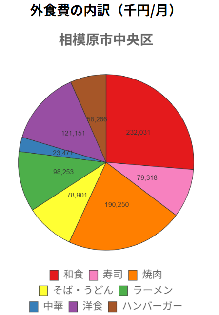
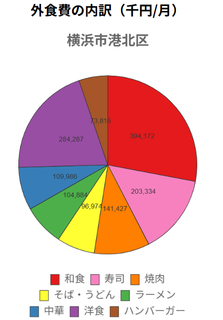
あと面白かったのは、東北ではラーメン、北海道では寿司の割合が比較的多く出ていたことです。


総務省の家計調査は全市区町村が調査対象とはなっていないため、このデータでは所属地方や都市階級などを利用し各項目の推計を独自に行っています。
従って、サンプル値が近くの推計値に強く影響しているとは思いますが、それでも地方・地域的な傾向がある程度見受けられました。