これは何
- iOSのアイコンがただの角丸ではなく、曲率変化が滑らかな角丸であるのは有名だと思います
- 古い記事ですがこちらに詳しく書かれています
- https://hackernoon.com/apples-icons-have-that-shape-for-a-very-good-reason-720d4e7c8a14
- それをWeb上でもどうにか再現しようと試みて、それなりに上手くいったのでまとめてみました
- 最終形は以下のgifのようになります
滑らかな角丸四角形をSVGで再現する
CSSだけではどう頑張っても滑らかな角丸は作れないので、SVGを作成して切り貼りする方向で考えました。
まずはFigmaで形を作ります。

左側のような角丸四角形を作るつもりでいきましょう。
余談ですが、Figmaで滑らかな角丸四角形を作るやり方はこちらの記事で解説しています。
1つの角をシンボルとして登録する
書き出したSVGをそのまま貼り付けては、角丸が上手く拡大縮小しません。
例えば横幅を伸ばすとこんな感じになっていまいます。

これを解消するために、角丸とそれ以外の部分を分けて実装しましょう。
角丸部分は常に同じサイズで、直線部分だけが拡大縮小されるようにすれば問題ありません。
HTML、CSSにそれぞれ以下のようにコードを書きます。
<!-- DOCTYPE宣言などは省略 -->
<body>
  <div class="wrapper">
    <svg
      xmlns="http://www.w3.org/2000/svg"
      class="svgRoot"
    >
      <style type="text/css">
        .svgRoot {
          position: relative;
        }
      </style>
      <defs>
        <symbol
          id="corner"
          width="100px"
          height="100px"
          viewBox="0 0 100 100"
        >
          <path d="M0 100C0 52.8595 0 29.2893 14.6447 14.6447C29.2893 0 52.8595 0 100 0V0V100H0V100Z" />
        </symbol>
      </defs>

      <!-- top left corner -->
      <use xlink:href="#corner" width="100px" height="100px" x="0" y="0" />
    </svg>
  </div>
</body>
* {
  box-sizing: border-box;
  margin: 0;
  padding: 0;
}

html, body {
  height: 100%;
}

.wrapper {
  height: 100%;
  padding: 200px;
}

.svgRoot {
  display: block;
  width: 100%;
  height: 100%;
  fill: #55c500;
}
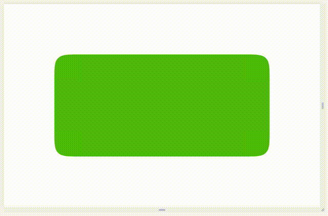
現時点ではこのような見た目になっているはずです。

defs, symbol, useとは
SVGでは実は要素の再利用が可能です。
defsの中でsymbolとして定義し、後からuseでインスタンス化するようなイメージだと分かりやすいのではないでしょうか。
defsやsymbolを使わず画面内に描画されている要素を直接useで呼び出すことも可能なのですが、推奨はされていないようです。
useを用いて4つの角を作る
コードとしては以下のようになります。
    <div class="wrapper">
      <svg
        xmlns="http://www.w3.org/2000/svg"
        class="svgRoot"
      >
        <style type="text/css">
          .svgRoot {
            position: relative;
          }
        </style>
        <defs>
          <symbol
            id="corner"
            width="100px"
            height="100px"
            viewBox="0 0 100 100"
          >
            <path d="M0 100C0 52.8595 0 29.2893 14.6447 14.6447C29.2893 0 52.8595 0 100 0V0V100H0V100Z" />
          </symbol>
        </defs>

        <!-- top left corner -->
        <use xlink:href="#corner" width="100px" height="100px" x="0" y="0" />
+
+       <!-- top right corner -->
+       <use
+         xlink:href="#corner"
+         transform="scale(-1, 1)"
+         width="100px"
+         height="100px"
+         x="-100%"
+         y="0"
+       />
+
+       <!-- bottom left corner -->
+       <use
+         xlink:href="#corner"
+         transform="scale(1, -1)"
+         width="100px"
+         height="100px"
+         x="0"
+         y="-100%"
+       />
+
+       <!-- bottom right corner -->
+       <use
+         xlink:href="#corner"
+         transform="scale(-1, -1)"
+         width="100px"
+         height="100px"
+         x="-100%"
+         y="-100%"
+       />
      </svg>
    </div>
見た目はこんな感じ。

角以外の部分を埋める
ここまで来たら後は簡単です。
間の部分を塗りで埋めれば良いだけ。
    <div class="wrapper">
      <svg
        xmlns="http://www.w3.org/2000/svg"
        class="svgRoot"
      >
        <style type="text/css">
          .svgRoot {
            position: relative;
          }
+         .edge {
+           height: 100px;
+           width: calc(100% - 200px);
+         }
+         .center {
+           height: calc(100% - 200px);
+           width: 100%;
+         }
        </style>
        <defs>
          <symbol
            id="corner"
            width="100px"
            height="100px"
            viewBox="0 0 100 100"
          >
            <path d="M0 100C0 52.8595 0 29.2893 14.6447 14.6447C29.2893 0 52.8595 0 100 0V0V100H0V100Z" />
          </symbol>
        </defs>

        <!-- top left corner -->
        <use xlink:href="#corner" width="100px" height="100px" x="0" y="0" />

+       <!-- top edge -->
+       <rect x="100" y="0" width="100%" height="100%" class="edge" />

        <!-- top right corner -->
        <use
          xlink:href="#corner"
          transform="scale(-1, 1)"
          width="100px"
          height="100px"
          x="-100%"
          y="0"
        />

+       <!-- center -->
+       <rect x="0" y="100" width="100%" height="100%" class="center" />

        <!-- bottom left corner -->
        <use
          xlink:href="#corner"
          transform="scale(1, -1)"
          width="100px"
          height="100px"
          x="0"
          y="-100%"
        />

+       <!-- bottom edge -->
+       <rect transform="scale(1, -1)" x="100" y="-100%" width="100%" height="100%" class="edge" />

        <!-- bottom right corner -->
        <use
          xlink:href="#corner"
          transform="scale(-1, -1)"
          width="100px"
          height="100px"
          x="-100%"
          y="-100%"
        />
      </svg>
    </div>
これで、冒頭に貼ったような拡大縮小可能な、滑らかな角丸の四角形が完成しました。
参考にしたコード