この記事の概要
ふと、モダンブラウザでは三角関数が使えるようになっていることを思い出しました。
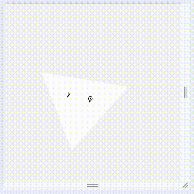
何か面白いことができないかなと思い、正四面体を作ってみました。
完成形
HTML
HTML は非常にシンプルです。
<body>
<div class="scene">
<div class="regular-tetrahedron">
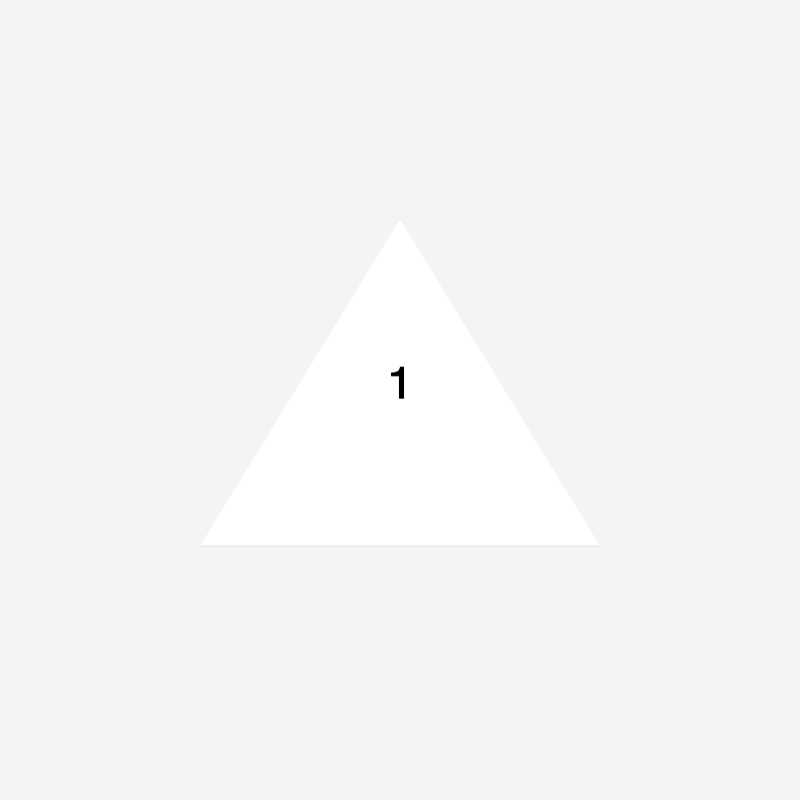
<div class="face face-1">1</div>
<div class="face face-2">2</div>
<div class="face face-3">3</div>
<div class="face face-4">4</div>
</div>
</div>
</body>
CSS
シーンの準備
.scene {
  width: 100dvw;
  height: 100dvh;
  display: grid;
  place-items: center;
}
単に幅と高さを画面いっぱいに設定して、子要素(正四面体)を中心に配置するための指定です。
正四面体の wrapper を作る
それぞれの面を個別に用意すると何かと大変なので、wrapper を用意しておきます。
.regular-tetrahedron {
  --length: 50dvh;
  --width: var(--length);
  --height: calc(var(--length) * sin(60deg));
  width: var(--width);
  height: calc(var(--height));
  transform-style: preserve-3d;
}
正四面体のそれぞれの面、つまり正三角形の高さは一辺の高さ * sin(60°)です。
CSS custom properties も用いながら計算しています。
また、3D として作るのでtransform-style: preserve-3d;を指定してあります。
すべての面に共通のスタイル
正四面体なので面は 4 つ存在します。
すべてに共通なものを先に定義しておきます。
.face {
  transform-origin: bottom center;
  position: absolute;
  width: 100%;
  height: 100%;
  clip-path: polygon(0 100%, 100% 100%, 50% 0);
}
あらかじめ正三角形としての幅、高さを定義してあるので、width, heightともに 100% と設定しつつpolygon(0 100%, 100% 100%, 50% 0)でクリッピングをすれば正三角形ができあがります。
また、この後に角度を変えたり位置を動かしたりするので、計算しやすいようにtransform-origin: bottom center;を指定しています。
底面以外の 3 面
正四面体において、二面角をθとするとcosθ = 1/3が成り立ちます。
つまりacos(1/3)を使えば底面以外の 3 つの面の角度を求められます。
.face-1 {
  transform:
    translateZ(calc(var(--height) / 2))
    rotateX(calc(90deg - acos(calc(1 / 3))));
}

.face-2 {
  transform:
    translateX(calc(var(--width) / 4))
    rotateY(120deg)
    rotateX(calc(90deg - acos(calc(1 / 3))));
}

.face-3 {
  transform:
    translateX(calc(var(--width) / 4 * -1))
    rotateY(240deg)
    rotateX(calc(90deg - acos(calc(1 / 3))));
}
底面
他の面と違い、特に難しいことはありません。
.face-4 {
  transform:
    rotateX(90deg)
    rotateY(180deg)
    translateY(calc(var(--height) / 2));
}
アニメーション
動かしでもしないと全体像が見えづらいので、簡単にアニメーションを設定します。
+ @keyframes rotate {
+   from {
+     transform: rotateX(0deg) rotateY(0deg);
+   }
+   to {
+     transform: rotateX(360deg) rotateY(360deg);
+   }
+ }

  .regular-tetrahedron {
    --length: 50dvh;
    --width: var(--length);
    --height: calc(sin(60deg) * var(--length));
    width: var(--width);
    height: calc(var(--height));
    transform-style: preserve-3d;
+   animation: rotate 5s infinite linear;
  }
完成
これで、HTML と CSS だけで正四面体を作ることができました。