この記事の概要
Material Designにはお世話になっているのですが、Shadowsの見た目にはなんとなく違和感を覚えていました。
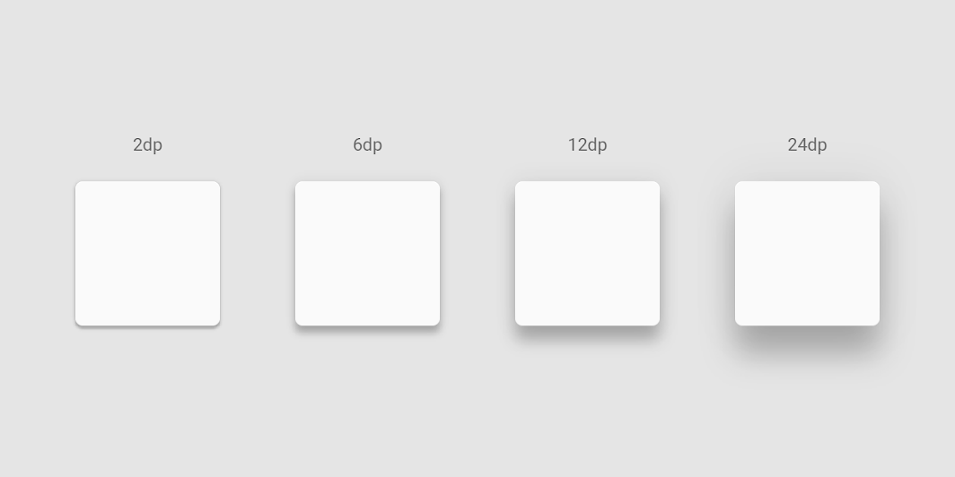
Material Design. Light and shadows. https://material.io/design/environment/light-shadows.html#shadows
というわけで、3DCGを参考に(比較的)現実世界の影に近いbox-shadowを再現してみようと思います。
3DCGで作った見本の影
Material Design内でDefault elevationsとして登録されている9種類を作成しました。
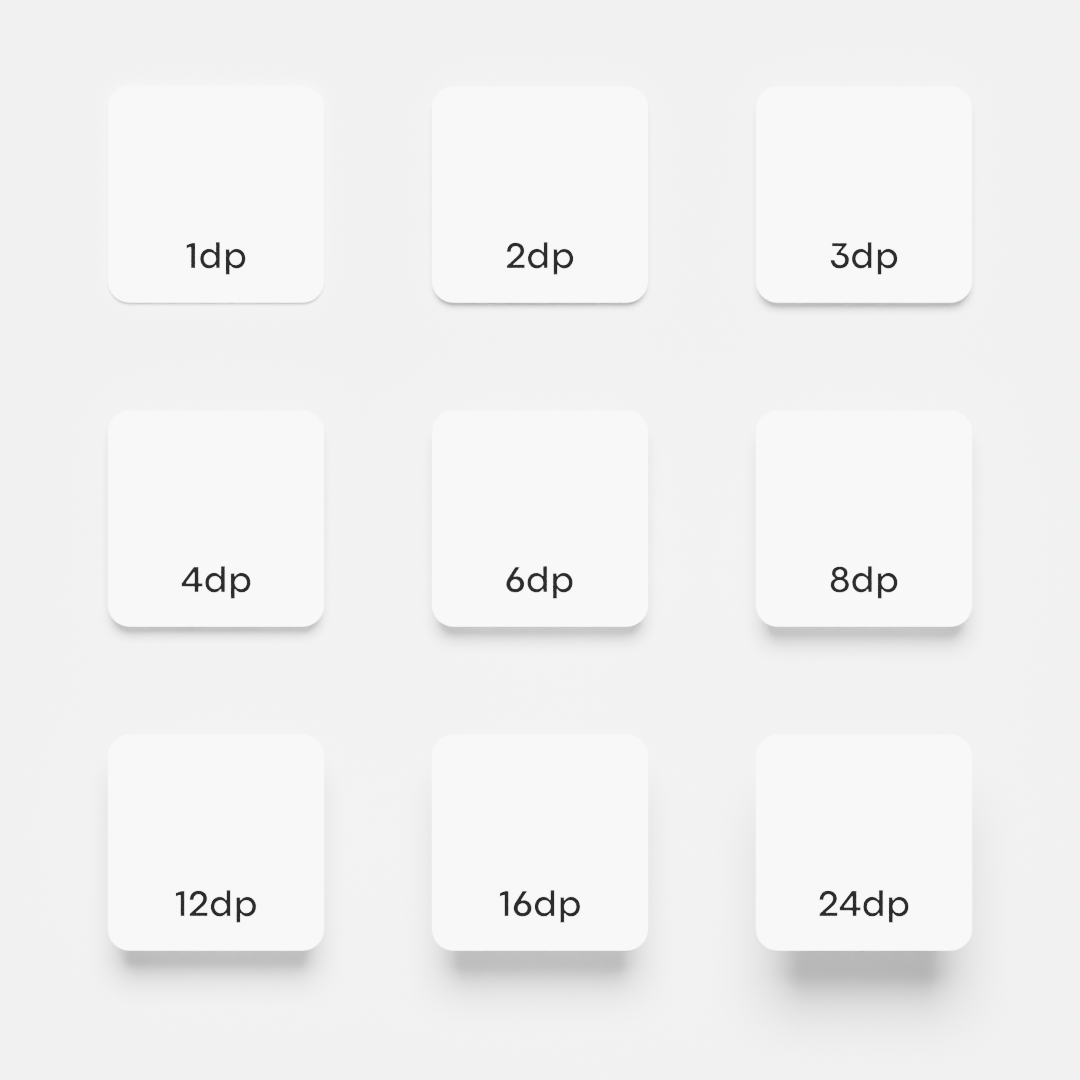
様子はこんな感じ。
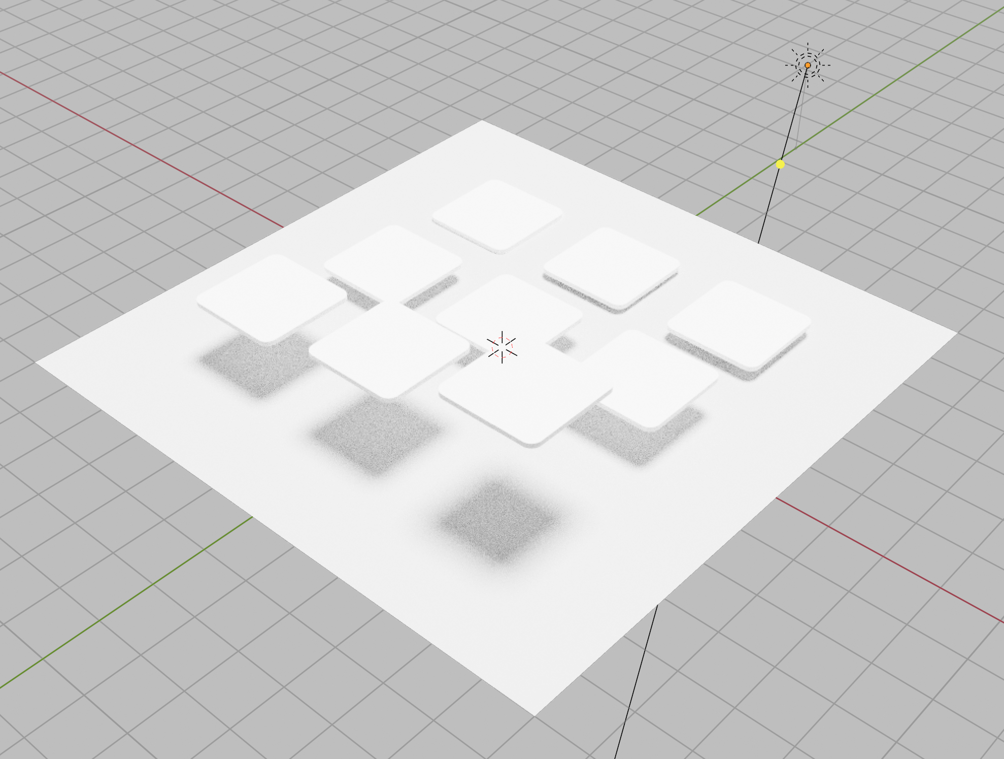
BlenderのSun light(無限遠から同じ強さで照らすライト)を使っています。
影の幅とボケ具合を目視で調整し、光源の向きは上から15度、角半径20度としました。
CSSで再現
See the Pen Untitled by Keisuke Watanuki (@xrxoxcxox) on CodePen.
特に難しいことはしていません。
単に距離に比例したoffset-y、blur-radius、spread-radiusを設定しただけです。(小数点が出るのが嫌だったのでそれだけ調整しています)
影色の濃さは、比例の関係にしたら上手く行かなかったので手作業で合わせましたが、何か良い計算があるのかも……?
<div class="container">
  <div class="panel shadow1"></div>
  <div class="panel shadow2"></div>
  <div class="panel shadow3"></div>
  <div class="panel shadow4"></div>
  <div class="panel shadow6"></div>
  <div class="panel shadow8"></div>
  <div class="panel shadow12"></div>
  <div class="panel shadow16"></div>
  <div class="panel shadow24"></div>
</div>
.container {
  align-items: center;
  background-color: #f0f0f0;
  display: grid;
  gap: 100px;
  grid-template-columns: repeat(3, 200px);
  grid-template-rows: repeat(3, 200px);
  justify-content: center;
  min-height: 100vh;
  padding: 50px 0 100px;
  width: 100%;
}

.panel {
  background-color: #fff;
  border-radius: 20px;
  height: 100%;
  width: 100%;
}

.shadow1 {
  box-shadow: 0 4px 2px -2px rgb(0 0 0 / 12%);
}

.shadow2 {
  box-shadow: 0 7px 3px -3px rgb(0 0 0 / 21%);
}

.shadow3 {
  box-shadow: 0 10px 4px -5px rgb(0 0 0 / 20%);
}

.shadow4 {
  box-shadow: 0 13px 5px -6px rgb(0 0 0 / 19%);
}

.shadow6 {
  box-shadow: 0 18px 7px -8px rgb(0 0 0 / 17%);
}

.shadow8 {
  box-shadow: 0 23px 9px -10px rgb(0 0 0 / 15%);
}

.shadow12 {
  box-shadow: 0 33px 13px -14px rgb(0 0 0 / 19%);
}

.shadow16 {
  box-shadow: 0 43px 17px -18px rgb(0 0 0 / 20%);
}

.shadow24 {
  box-shadow: 0 63px 25px -26px rgb(0 0 0 / 23%);
}
比較
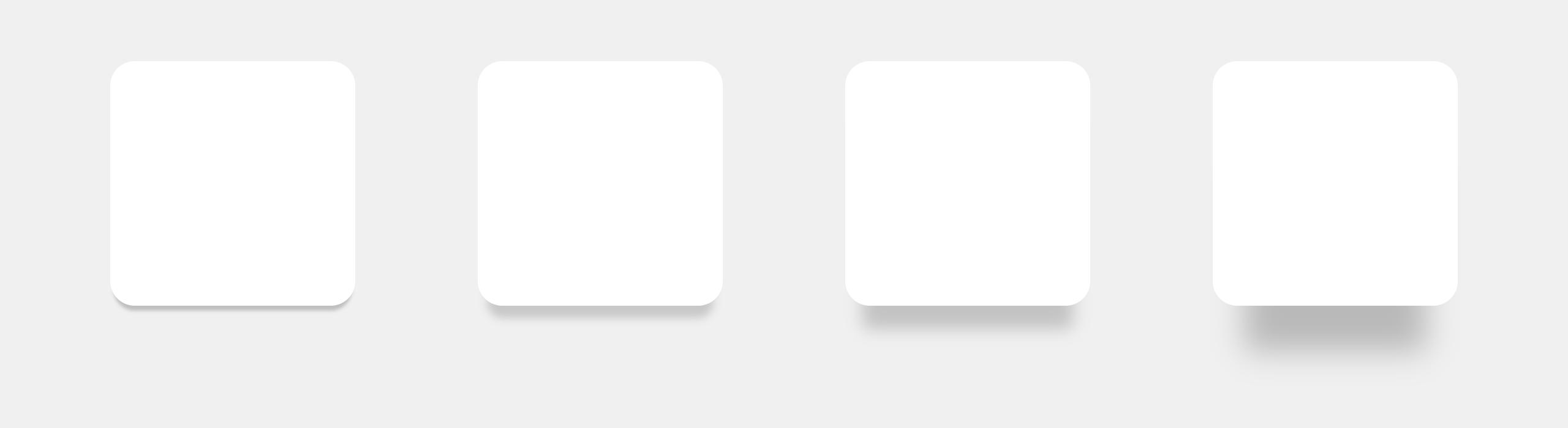
こうして並べると、ぱっと見の印象は今回作ったものの方が自然ではないでしょうか?
複雑に重ね合わせるとどうなるかまで検証できていませんが、こういうアプローチも有りなような気がしています。
| Material Design | 今回作ったもの |
|---|---|
|
 |
最後まで読んでくださってありがとうございます!
Twitterでも情報を発信しているので、良かったらフォローお願いします!