こんにちは。今回紹介するのはgsap+clip-pathだけで画像のようにアニメーションを加えたポップなインタラクティブセクションの紹介をしようとおもいます。
この記事をみれば次の事ができるようになります。
gsapの使い方
clip-pathで任意の要素の背景を作れる。
WEBコンテンツにインタラクティブなアニメーションを実装可能。
まずはhtmlからの紹介です。
その前に、今回はgsapとscrolltriggerを使うのでcdnをこんな風にbodyの閉じタグの前に貼ります。
<!-- 新たに重ねる画像 -->
<div class="image-overlay">
<img src="./assets/images/GSAP.png" class="overlay-img" style="top: 20%; left: 10%;">
<img src="./assets/images/GSAP.png" class="overlay-img" style="top: 60%; left: 50%;">
<img src="./assets/images/GSAP.png" class="overlay-img" style="top: 35%; left: 75%;">
</div>
<!-- テキスト -->
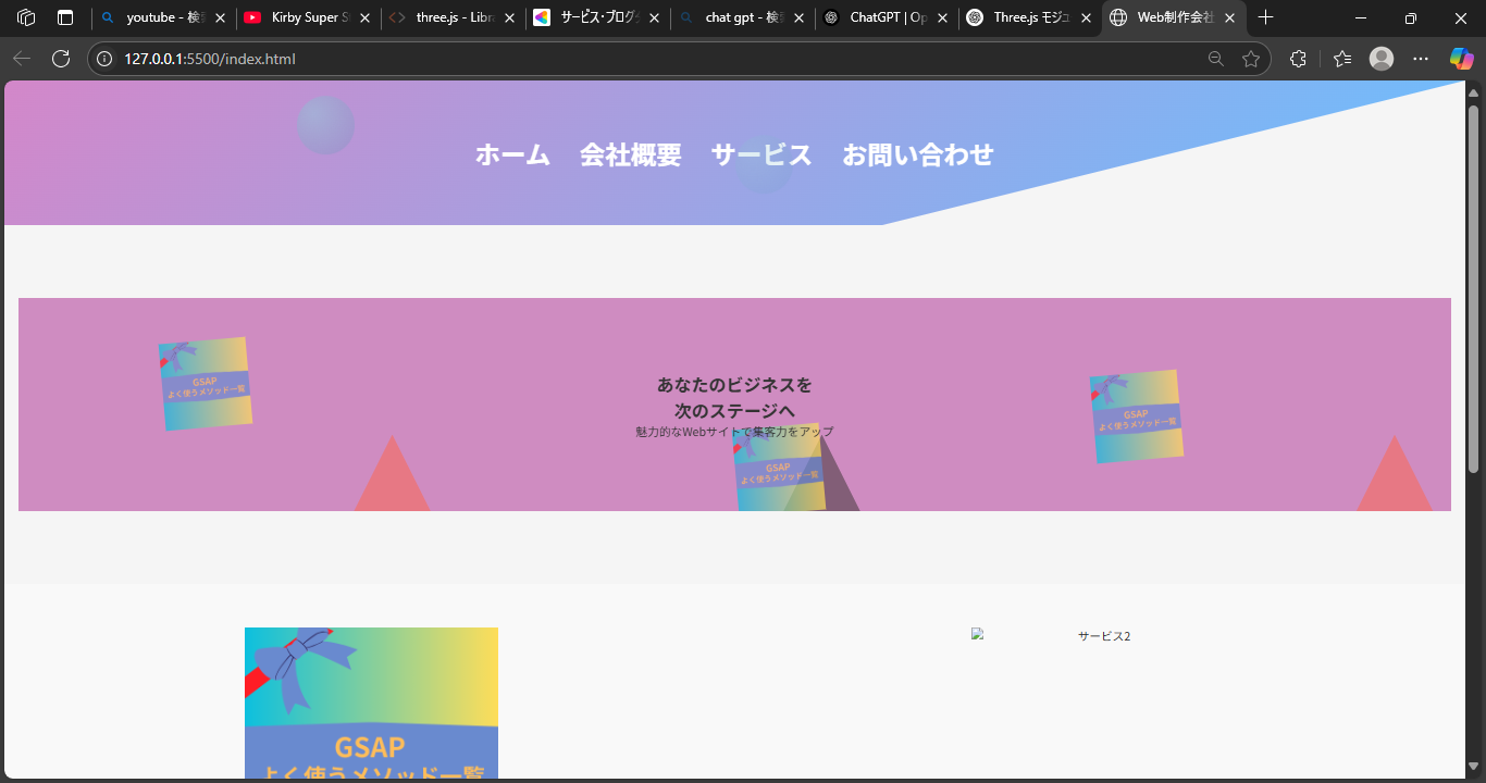
<h1 class="hero-title">あなたのビジネスを<br>次のステージへ</h1>
<p class="hero-subtitle">魅力的なWebサイトで集客力をアップ</p>
htmlの構造としては、まずclippathで表示するエリアを最背面にして、その上に画像3つを配置、そして最前面にタイトルとテキストを配置しています。もちろんこの後のcssで正確な配置場所も調整可能となっており、このhtmlならimage-overlayのstyleを調整することで位置変更も可能です。
2 style.css
/* メインコンテンツ */
.main {
padding: 100px 20px;
text-align: center;
}
.hero {
position: relative;
padding: 100px 20px;
background-color: #cf8cc1;
overflow: hidden;
}
.triangle-container {
position: absolute;
width: 100%;
height: 100%;
pointer-events: none; /* 背景用 */
}
.triangle-bg {
position: absolute;
width: 200px;
height: 200px;
background-size: cover;
background-position: center;
clip-path: polygon(50% 0%, 0% 100%, 100% 100%);
opacity: 0.5; /* 少し透明にしておくと自然 */
z-index: 1;
}
.image-overlay {
position: absolute;
top: 0;
left: 0;
width: 100%;
height: 100%;
z-index: 2;
pointer-events: none;
}
.overlay-img {
position: absolute;
width: 120px;
height: auto;
opacity: 0.7;
transform: rotate(-5deg);
}
.hero-title, .hero-subtitle {
position: relative;
z-index: 3; /* 最前面に表示 */
text-align: center;
}
次にstyle.cssでは先ほどのhrmlの三角形、(clippath)、画像、タイトル、テキストをposition: absoluteとrelativeで配置を決め、さらにそこからz-indexでレイヤーになるように1,2,3と作っております。そして後にgsapでアニメーションしやすいようにもoverflow-hiddenとopacityも加えています。
3 script.js
// 初期化
gsap.registerPlugin(ScrollTrigger);
// 三角形をスクロールごとに回転
gsap.utils.toArray('.triangle-bg').forEach(triangle => {
gsap.to(triangle, {
rotation: 360,
scrollTrigger: {
trigger: triangle,
start: 'top bottom',
scrub: true,
}
});
});
// 画像ふわっと&拡大
gsap.utils.toArray('.hero-image').forEach((img, i) => {
gsap.fromTo(img,
{ opacity: 0, scale: 0.8, y: 50 },
{
opacity: 1,
scale: 1,
y: 0,
delay: i * 0.2,
duration: 1.2,
scrollTrigger: {
trigger: img,
start: 'top 80%',
toggleActions: 'play none none none'
}
}
);
});
// タイトルとサブタイトル:少し遅れてふわっと回転表示
gsap.from('.hero-title', {
opacity: 0,
rotateX: 90,
duration: 1,
delay: 0.8,
scrollTrigger: {
trigger: '.hero-title',
start: 'top 80%',
toggleActions: 'play none none none'
}
});
gsap.from('.hero-subtitle', {
opacity: 0,
rotateX: 90,
duration: 1,
delay: 1.0,
scrollTrigger: {
trigger: '.hero-subtitle',
start: 'top 80%',
toggleActions: 'play none none none'
}
});
最後にscript.jsですが、まずgsapのscrolltriggerを使うので初期化をします。triangle-bg、次に画像と三角形は position: absolute なので、スクロール時も .hero の中で動きます。