はじめに
Macでmatplotlib+cartopyの環境構築という記事で構築した環境で、気温の水平分布を描画してみたいと思います。タイトルにあるように、今回はGSMGPVの気温を題材にしていますが、他のGPVや他の変数に対しても簡単に応用できるはずです。手元の環境はmacOS Big Sur (11.2.1)ですが、他のバージョンやLinuxでもやることは同じです。
データの取得
GSMGPVのデータは、教育研究目的であれば京大のGPVアーカイブから無料で入手できます。企業等で業務として利用する場合は気象業務支援センターに負担金を払って入手してください。
ひとまず手元にZ__C_RJTD_20210213060000_GSM_GPV_Rjp_Lsurf_FD0000-0312_grib2.binというファイルがあるとします。とても長いファイル名ですが、意味は気象庁本庁(RJTD)から発出された、2021年02月13日06UTC初期値の、GSMの、GPV(格子点値)データで、地上(Lsurf)の、初期時刻から3日12時間先まで(FD0000-0312)が格納された、GRIB2形式の、バイナリ(.bin)という意味です。他のGPVについても同様な命名規則になっています。
このデータの仕様は配信資料に関する仕様No.12501 ~全球数値予報モデルGPV~に書かれています。他の気象庁データについても、配信資料に関する仕様ページや、ここに無ければ配信資料に関する技術情報ページで見つけることができます。
netCDF形式への変換
PythonにはGRIB2形式のデータを読むライブラリは存在しますが、気象庁独自のテーブルが使われている場合、そのままでは読み出せずエラーになってします。これを回避するために、wgrib2コマンドを用いてnetCDF形式へとデータを変換します。
wgrib2コマンドのインストールについては、wgrib2 v3.0.0 を macOS Catalina にインストールするという記事を既に書きましたが、ファイルサイズが大きくインストールが面倒ということもあり、v2.x系をインストールしても実用上問題ないと思います。
wgrib2コマンドの後ろにGRIB2のファイル名を指定すると、どのようなデータが格納されているかの一覧を見ることができます。
$ wgrib2 Z__C_RJTD_20210213060000_GSM_GPV_Rjp_Lsurf_FD0000-0312_grib2.bin
1.1:0:d=2021021306:PRMSL:mean sea level:anl:
1.2:0:d=2021021306:PRES:surface:anl:
1.3:0:d=2021021306:UGRD:10 m above ground:anl:
1.4:0:d=2021021306:VGRD:10 m above ground:anl:
1.5:0:d=2021021306:TMP:2 m above ground:anl:
1.6:0:d=2021021306:RH:2 m above ground:anl:
1.7:0:d=2021021306:LCDC:surface:anl:
1.8:0:d=2021021306:MCDC:surface:anl:
1.9:0:d=2021021306:HCDC:surface:anl:
1.10:0:d=2021021306:TCDC:surface:anl:
1.11:0:d=2021021306:PRMSL:mean sea level:1 hour fcst:
1.12:0:d=2021021306:PRES:surface:1 hour fcst:
1.13:0:d=2021021306:UGRD:10 m above ground:1 hour fcst:
1.14:0:d=2021021306:VGRD:10 m above ground:1 hour fcst:
1.15:0:d=2021021306:TMP:2 m above ground:1 hour fcst:
1.16:0:d=2021021306:RH:2 m above ground:1 hour fcst:
1.17:0:d=2021021306:LCDC:surface:1 hour fcst:
1.18:0:d=2021021306:MCDC:surface:1 hour fcst:
1.19:0:d=2021021306:HCDC:surface:1 hour fcst:
1.20:0:d=2021021306:TCDC:surface:1 hour fcst:
1.21:0:d=2021021306:APCP:surface:0-1 hour acc fcst:
1.22:0:d=2021021306:DSWRF:surface:0-1 hour ave fcst:
# (以下略)
セミコロンで区切られていて、第3列が初期時刻、第4列が変数名、第5列が鉛直層、第6列が予報時刻を表します。
変数名の意味は次の通りです。
| 変数名 | 意味 |
|---|---|
| PRMSL | 海面更正気圧 |
| PRES | 気圧 (ここでは地上気圧・現地気圧) |
| UGRD | 東西風速 |
| VGRD | 南北風速 |
| TMP | 気温 |
| RH | 相対湿度 |
| LCDC | 下層雲量 |
| MCDC | 中層雲量 |
| HCDC | 上層雲量 |
| TCDC | 全雲量 |
| APCP | 積算降水量 |
| DSWRF | 地上下向き短波放射 (日照量) |
その他の変数名についてはGRIB2 - CODE TABLE 4.2に書いてあります。
さてデータをnetCDF形式に変換しましょう。ここでは-matchオプションを付けて初期時刻の地上気温だけを抽出して変換していますが、このオプションを付けなければ全てのデータがnetCDFへと格納されます。
$ wgrib2 Z__C_RJTD_20210213060000_GSM_GPV_Rjp_Lsurf_FD0000-0312_grib2.bin -match ":TMP:" -match ":anl:" -netcdf TMP.nc
出力されたTMP.ncの中身をncdumpコマンドで確認してみます。-hオプションはヘッダのみを表示し、格納された値は表示しないという意味です。
 $ ncdump -h TMP.nc
netcdf TMP {
dimensions:
	latitude = 151 ;
	longitude = 121 ;
	time = UNLIMITED ; // (1 currently)
variables:
	double latitude(latitude) ;
		latitude:units = "degrees_north" ;
		latitude:long_name = "latitude" ;
	double longitude(longitude) ;
		longitude:units = "degrees_east" ;
		longitude:long_name = "longitude" ;
	double time(time) ;
		time:units = "seconds since 1970-01-01 00:00:00.0 0:00" ;
		time:long_name = "verification time generated by wgrib2 function verftime()" ;
		time:reference_time = 1613196000. ;
		time:reference_time_type = 1 ;
		time:reference_date = "2021.02.13 06:00:00 UTC" ;
		time:reference_time_description = "analyses, reference date is fixed" ;
		time:time_step_setting = "auto" ;
		time:time_step = 0. ;
	float TMP_2maboveground(time, latitude, longitude) ;
		TMP_2maboveground:_FillValue = 9.999e+20f ;
		TMP_2maboveground:short_name = "TMP_2maboveground" ;
		TMP_2maboveground:long_name = "Temperature" ;
		TMP_2maboveground:level = "2 m above ground" ;
		TMP_2maboveground:units = "K" ;

// global attributes:
		:Conventions = "COARDS" ;
		:History = "created by wgrib2" ;
		:GRIB2_grid_template = 0 ;
}
緯度・経度・時刻といった座標軸を表す変数や気温が格納されているのが確認できます。
Pythonでの描画
下準備が終わったところで、Pythonを使ってGPVデータを描画していきます。
netCDFの読み込み
netCDFの読み込みは以下のようにして行います。
import xarray as xr

nc = xr.open_dataset("TMP.nc")
lon = nc.variables["longitude"].values
lat = nc.variables["latitude"].values
tmp = nc.variables["TMP_2maboveground"].values[0, :, :]
tmpc = tmp - 273.15
ここでは経度・緯度・気温をnumpy.ndarrayとして(.values)取り出しています。気温の行の最後に[0, :, :]と付けているのは、後でmatplotlibで描画するときに2次元配列で渡す必要があるため、0番目の時刻であることを指定します(この場合は時間方向には1つしかデータがないですが)。また気温の単位を[K]から[℃]に変換するために273.15を引いています。
matplotlibを用いた2次元配列の描画
2次元配列を描画する最低限のコードは以下の通りです。
fig = plt.figure()  # Figureオブジェクトの生成
ax = fig.add_subplot(1, 1, 1)  # Axesオブジェクトの生成
ax.contourf(lon, lat, tmp)  # 塗りで表示
# plt.show() # 画面に表示
plt.savefig("TMP.png")  # 画像に保存
plt.clf()  # 画面を消去
plt.close()  # 画面を閉じる
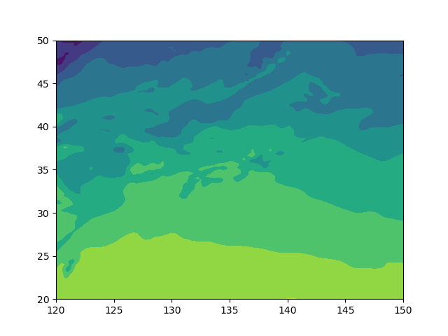
matplotlibで図を描画するには、FigureオブジェクトとAxesオブジェクトを生成するやり方が一般的です。この話については、例えば早く知っておきたかったmatplotlibの基礎知識、あるいは見た目の調整が捗るArtistの話などの記事が参考になると思います。
描画自体はax.contourfで行っています。同様なメソッドとして、等値線図を描くax.contourや、ピクセルで塗りを行うax.pcolormeshがあります。詳細な使い方はmatplotlibの公式ドキュメントを読んで下さい。
画像出力後に、画面の消去をして閉じています。1枚図を書くだけなら問題ないのですが、複数枚の図をループして描く場合にはこれがないとメモリをどんどん消費していきます。詳細はplt.close() だけではメモリが解放されない場合があるという記事を参照下さい。ちなみにplt.savefigしている場合は、plt.clf()とplt.close()をしてもメモリリークするらしいですが、経験上100枚程度の図を描く場合はその影響は無視できます。
タイトルをつける
タイトルはax.set_titleを用いてつけることができます。日本語を使う場合、デフォルトだと文字化け(豆腐)しますが、インストールされている適当な日本語フォントを指定すれば正しく表示されます(ここでは源暎ゴシック)。
ax.set_title("GSM 2m気温(℃)", fontname="GenEi Gothic P", weight="semibold")
図の高さに合わせたカラーバーをつける
図の高さに合わせたカラーバーをつけるには次のようにします。
import numpy as np
import xarray as xr
import matplotlib.pyplot as plt
from mpl_toolkits.axes_grid1 import make_axes_locatable

# (略)

ticks = np.arange(0, 30 + 1, 5) # 閾値を0から30まで5刻みに
mappable = ax.contourf(
    lon, lat, tmpc,
    cmap="rainbow",
    levels=ticks,
    extend="both")
divider = make_axes_locatable(ax)
ax_cb = divider.new_horizontal(
    size=0.15,
    pad=0.1,
    axes_class=plt.Axes)
fig.add_axes(ax_cb)
fig.colorbar(
    mappable,
    cax=ax_cb,
    orientation="vertical",
    shrink=0.8,
    aspect=30,
    ticks=ticks)

# (略)
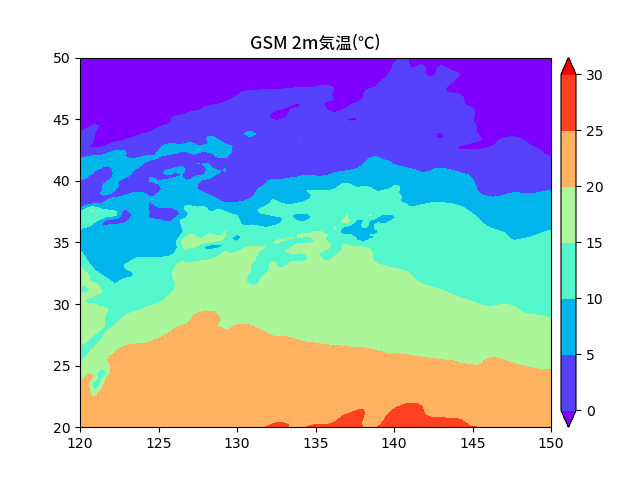
ax.contourfのcmapでカラーマップを指定しています。どのような種類のカラーマップがあるかは、公式ドキュメントを見て下さい。また、levelsで描画する色の閾値を指定し、extend="both"を指定することで0℃未満や30℃以上でも色が塗られるようにしています。
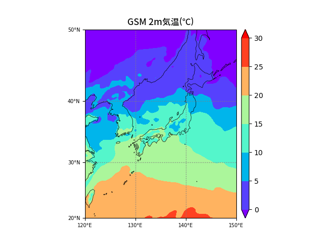
cartopyで図法を変える、海岸線を描画する
少し長いですが、ソースコード全体を貼ります。cartopyを使うポイントとしては、
- axを生成する際に投影法を
projectionで指定する(ここではメルカトル図法) -
ax.set_xticksやax.set_yticksで、crs=ccrs.PlateCarree()を指定する -
ax.contourfで、transform=ccrs.PlateCarree()を指定する
です。
ax.coastlinesで海岸線の描画するとき、初回実行時は海岸線データのダウンロードでDownload Warningが出ますが、2回目以降は出なくなります。海岸線の細かさはresolutionで110m, 50m, 10mのいずれかを指定できます。
import numpy as np
import xarray as xr
import matplotlib.pyplot as plt
import matplotlib.ticker as mticker
from mpl_toolkits.axes_grid1 import make_axes_locatable
import cartopy.crs as ccrs
from cartopy.mpl.ticker import LongitudeFormatter, LatitudeFormatter

# データの読み込み
nc = xr.open_dataset("TMP.nc")
lon = nc.variables["longitude"].values
lat = nc.variables["latitude"].values
tmp = nc.variables["TMP_2maboveground"].values[0, :, :]
tmpc = tmp - 273.15

# 図の準備
fig = plt.figure()
ax = fig.add_subplot(1, 1, 1, projection=ccrs.Mercator(central_longitude=135))

# 海岸線の描画
ax.coastlines(resolution='50m', lw=0.5)

# 緯度・経度目盛りの描画
xticks = np.arange(120, 150 + 1, 10)
yticks = np.arange(20, 50 + 1, 10)
ax.set_xticks(xticks, crs=ccrs.PlateCarree())
ax.set_yticks(yticks, crs=ccrs.PlateCarree())
ax.set_xticklabels(xticks, fontsize=7)
ax.set_yticklabels(yticks, fontsize=7)
lon_formatter = LongitudeFormatter(zero_direction_label=True)
lat_formatter = LatitudeFormatter()
ax.xaxis.set_major_formatter(lon_formatter)
ax.yaxis.set_major_formatter(lat_formatter)

# 緯線・経線の描画
gl = ax.gridlines(
    crs=ccrs.PlateCarree(),
    linestyle=':',
    color='gray',
    linewidth=1)
gl.xlocator = mticker.FixedLocator(xticks)
gl.ylocator = mticker.FixedLocator(yticks)

# 図の描画
ticks = np.arange(0, 30 + 1, 5)
mappable = ax.contourf(
    lon, lat, tmpc,
    cmap="rainbow",
    levels=ticks,
    extend="both",
    transform=ccrs.PlateCarree())

# カラーバーの描画
divider = make_axes_locatable(ax)
ax_cb = divider.new_horizontal(
    size=0.15,
    pad=0.1,
    axes_class=plt.Axes)
fig.add_axes(ax_cb)
fig.colorbar(
    mappable,
    cax=ax_cb,
    orientation="vertical",
    shrink=0.8,
    aspect=30,
    ticks=ticks)

# タイトルの描画
ax.set_title("GSM 2m気温(℃)", fontname="GenEi Gothic P", weight="semibold")

# 画像保存&終了
plt.savefig("TMP.png")
plt.clf()
plt.close()
おわりに
基本的なPythonでのGPVデータの描画方法の説明は以上になります。更に詳しいmatplotlib+cartopyの使い方について知りたい場合、日本語でよくまとまっているページとして山下陽介さんの気象データ解析のためのmatplotlibの使い⽅を挙げておきます。