はじめに
地図上にデータを重ねて描く方法をまとめました。気象データなどの解析をしていると、地図があったほうがわかりやすく、他人に説明する場合もイメージしてもらいやすいな、と感じるときがよくあります。
そこで、今回は次の、よく仕様する2点を順にまとめました。
・正方位図法(Plate Carree)
・正距方位図法(北極、南極中心)
地図を図法ごとに描画する。
下準備
・numpy
・matplotlib
・cartopy
次のように必要なライブラリを呼び出します。
import numpy as np
import mayplotlib.pyplot as plt
import matploblib.path as mpath
import cartopy.crs as ccrs
これだけです。
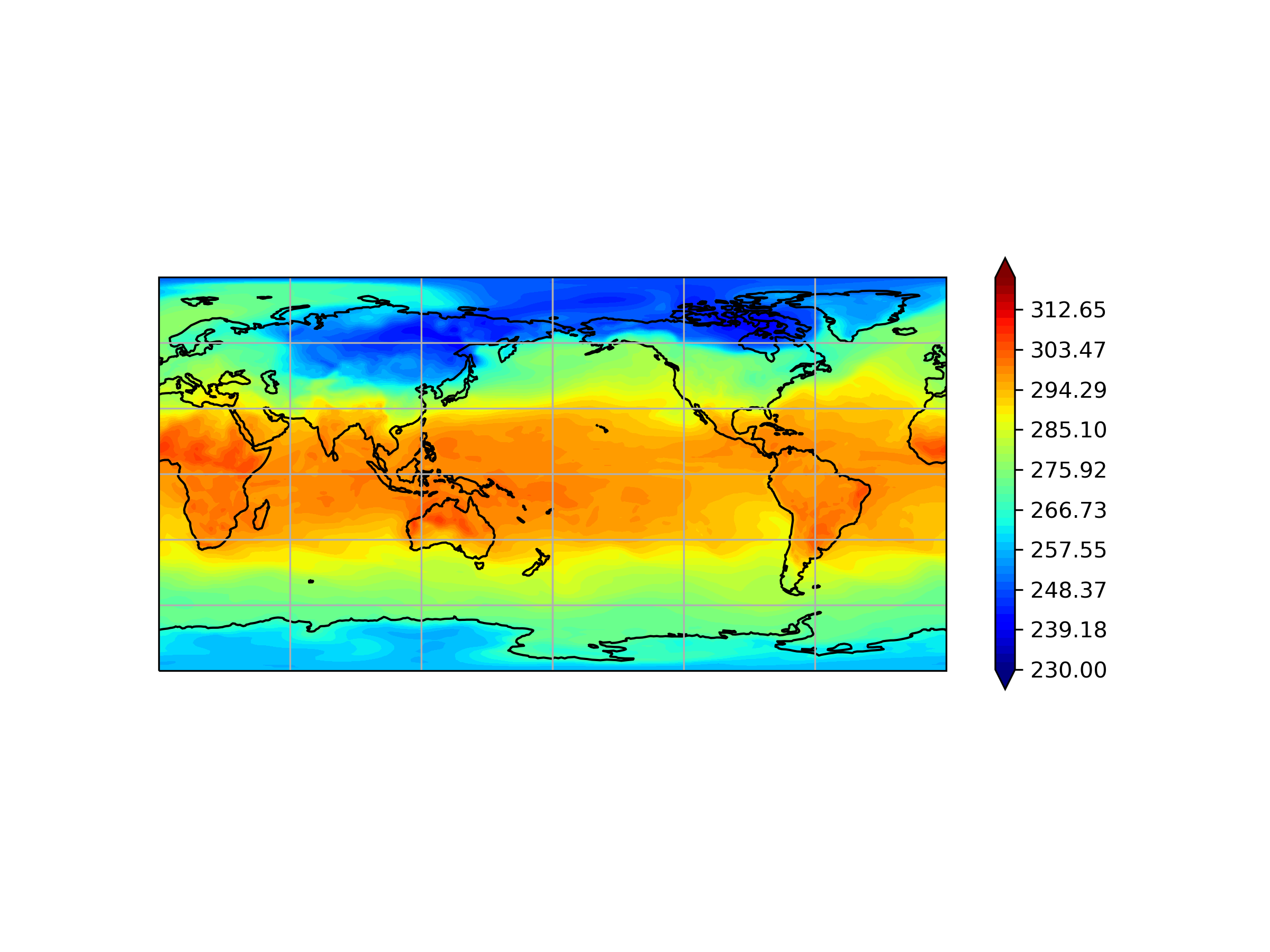
正方形図法(Plate Carree)
まずは、もっともよく目にするであろう、緯線と経線が等間隔に直交している図法です。
fig = plt.figure(1, figsize=(8, 6), facecolor='white', dpi=300)
ax = fig.add_subplot(projection=ccrs.PlateCarree(central_longitude=180.0))
ax.set_global()
ax.coastlines()
ax.gridlines()
axを作成するときに、projectionで地図の形式(ここではPlateCarree)を指定します.
central_longitudeは中心となる軽度を指定しています(ここでは東経180°)。
ax.set_global()で地球全体を指定し、ax.coastlines()で陸地の沿岸部(すなわち地図)を描きます。ax.gridlines()で、図にグリッド線を描きます(なくてもいいかもしれませんがあったほうがわかりやすいので一応)。
あとは軽度、緯度、データを描けば完成です。今回は、気象庁のJRA-55(Kobayashi et al.)を使用。
long = np.linspace(0, 360, 288)
lat = np.linspace(90, -90, 145)
Long, Lat =  np.meshgrid(long, lat)
contf = plt.contourf(Long, Lat, data.T, transform=ccrs.PlateCarree(), levels=np.linspace(230, 320, 50), cmap=cm.jet, extend='both')
plt.colorbar(contf, orientation='vertical', shrink=0.6)
long, latは解析したいデータの形です。transform=ccrs.PlateCarree()を忘れないでください。
今回は例として、地表面でのある日の気温を表示してみます。次のような結果になりました。
正距方位図法(Azimuthal Equidistant)
正方位図法とほとんど同じで、projectionの指定が異なります。また、切り取りを行わないと四角形の図になります。
phi = np.linspace(0, 2*np.pi, 100)
center, radi = [0.5, 0.5]
verts = np.concatenate([np.cos(phi)[:, np.newaxis], np.sin(phi)[:, np.newaxis]], axis=1)
circle = mpath.Path(verts * radi + center)

fig = plt.figure(1, figsize=(8, 6), facecolor='white', dpi=300)
ax1 = fig.add_subplot(1, 2, 1, projection=ccrs.AzimuthalEquidistant(central_latitude=90.0))
ax1.set_boundary(circle, transform=ax.transAxes)
ax1.coastlines()
ax1.gridlines()
ax1.set_extent([-180, 180, 0, 90],  ccrs.PlateCarree())
正距方位図法の場合、projection=ccrs.AzimutualEquidistant()と指定します。そして、central_latitudeでどの緯度を中心にするかを選択します。北極中心の場合、central_latitude=90.0です。
set_extentで、どの範囲で表示するかを決めます。
続いて、南極中心です。
ax2 = fig.add_subplot(1, 2, 2, projection=ccrs.AzimuthalEquidistant(central_latitude=-90.0)
ax2.set_boundary(circle, transform=ax.transAxes)
ax2.coastlines()
ax2.gridlines()
ax2.set_extent([-180, 180, -90, 0],  ccrs.PlateCarree())
変わったのはcental_latitudeの値のみです。ここまでこれば緯度経度の格子点を与え、データを描けば完了です。
全体のコードは次のようになります。
import numpy as np
import mayplotlib.pyplot as plt
import matploblib.path as mpath
import cartopy.crs as ccrs

phi = np.linspace(0, 2*np.pi, 100)
center, radi = [0.5, 0.5]
verts = np.concatenate([np.cos(phi)[:, np.newaxis], np.sin(phi)[:, np.newaxis]], axis=1)
circle = mpath.Path(verts * radi + center)

long = np.linspace(0, 360, 288)
lat = np.linspace(90, -90, 145)
Long, Lat =  np.meshgrid(long, lat)

fig = plt.figure(1, figsize=(8, 6), facecolor='white', dpi=300)
ax1 = fig.add_subplot(1, 2, 1, projection=ccrs.AzimuthalEquidistant(central_latitude=90.0))
ax1.set_boundary(circle, transform=ax.transAxes)
ax1.coastlines()
ax1.gridlines()
ax1.set_extent([-180, 180, 0, 90],  ccrs.PlateCarree())
contf1 = ax1.contourf(Long, Lat, data.T, transform=ccrs.PlateCarree(), levels=np.linspace(230, 320, 50), cmap=cm.jet, extend='both')
plt.colorbar(contf1, shrink=0.6, orientation='vertical')

ax2 = fig.add_subplot(1, 2, 2, projection=ccrs.AzimuthalEquidistant(central_latitude=-90.0)
ax2.set_boundary(circle, transform=ax.transAxes)
ax2.coastlines()
ax2.gridlines()
ax2.set_extent([-180, 180, -90, 0],  ccrs.PlateCarree())
contf2 = ax2.contourf(Long, Lat, data.T, transform=ccrs.PlateCarree(), levels=np.linspace(230, 320, 50), cmap=cm.jet, extend='both')
plt.colorbar(contf2, shrink=0.6, orientation='vertical')

plt.show()
結果は以下のようになりました。
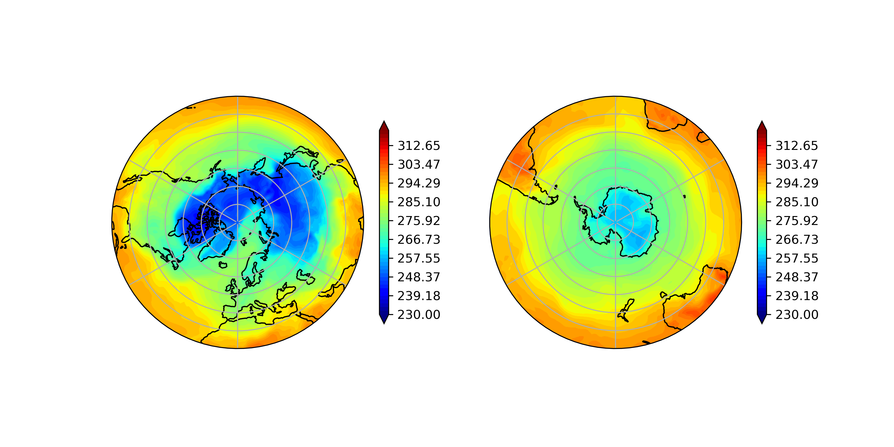
こうすると気温の分布がわかりやすいですね。
また、この記事は以下の記事を参考にしました。
[cartopyとmatplotlibを使って緯度経度座標のデータ(気象データとかを想定)の可視化]
https://www.google.com/url?sa=t&rct=j&q=&esrc=s&source=web&cd=&cad=rja&uact=8&ved=2ahUKEwiGocSetKv1AhUur1YBHXn-C-oQFnoECAkQAQ&url=https%3A%2F%2Fqiita.com%2Fconvection%2Fitems%2F6d5fa546d81fd5c9b452&usg=AOvVaw2YPdWYGpdHFN1OrLd8RolQ