ggplot2はRのデータ可視化パッケージです。
SIGNATEのアヤメの分類から入手したデータを用いて、ggplot2を勉強します。
実行環境:MacBook Air M1, 2020
RとRStudioのインストール
以下のURLから、RとRStudioをインストールします。
https://posit.co/download/rstudio-desktop/
インストール方法は以下のURLの記事にわかりやすく書かれています。
https://qiita.com/azzeten/items/1031c788ed093d3b3946
ggplot2のインストールと読み込み
ggplot2のインストールと読み込みを行います。
RStudioを起動し、以下のコードを実行します。
install.packages("tidyverse")
library(ggplot2)
次回からは、以下のコードのみを実行します。
library(ggplot2)
これにより、ggplot2を読み込むことができます。
ディレクトリの移動とデータの読み込み
# ディレクトリの移動
setwd("~/iris")
getwd()
# データの読み込み
train = read.table("train.tsv", header = TRUE, sep = "\t")
test = read.table("test.tsv", header = TRUE, sep = "\t")
sample_submit = read.csv("sample_submit.csv", header = FALSE)
データ可視化
棒グラフ
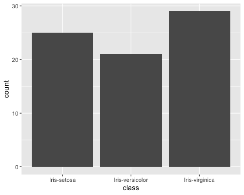
classのカウントを示す棒グラフを作成します。
ggplot(train, aes(x = class)) + geom_bar()
グラフをわかりやすくするため、アヤメの種類ごとに棒に色をつけます。
ggplot(train, aes(x = class, fill = class)) + geom_bar()
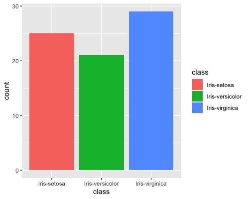
バーが3色になり、わかりやすくなりました。
散布図
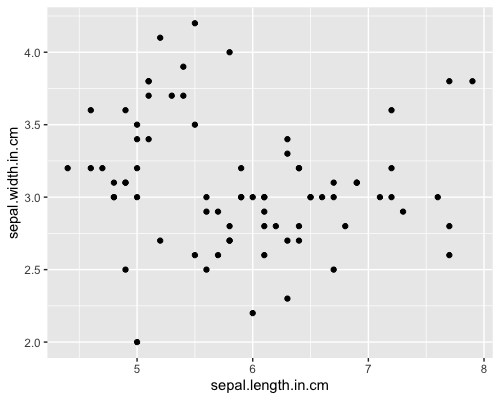
sepal.length.in.cmとsepal.width.in.cmの関係を示す散布図を作成します。
ggplot(train, aes(x = sepal.length.in.cm, y = sepal.width.in.cm)) + geom_point()
棒グラフと同様に、アヤメの種類ごとに点に色をつけます。
ggplot(train, aes(x = sepal.length.in.cm, y = sepal.width.in.cm, colour = class)) + geom_point()
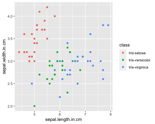
3種類のアヤメで、sepal.length.in.cmとsepal.width.in.cmの分布が異なることがわかります。
ヒストグラム
sepal.length.in.cmの分布を示すヒストグラムを作成します。
ggplot(train, aes(x = sepal.length.in.cm)) + geom_histogram()
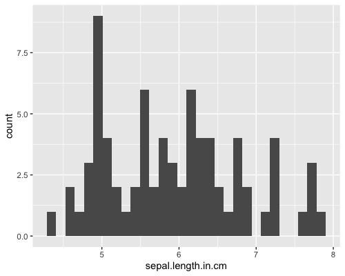
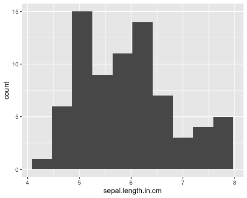
30だったビンの数を10にします。
ggplot(train, aes(x = sepal.length.in.cm)) + geom_histogram(bins = 10)
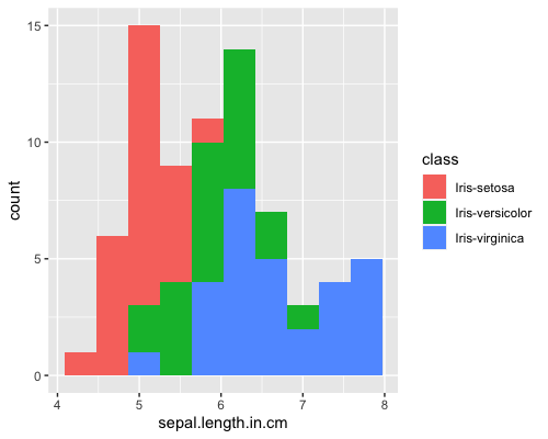
棒グラフと同様に、アヤメの種類ごとにヒストグラムに色をつけます。
ggplot(train, aes(x = sepal.length.in.cm, fill = class)) + geom_histogram(bins = 10)
アヤメの種類ごとのヒストグラムを作成し、透過度を上げます。
ggplot(train, aes(x = sepal.length.in.cm, fill = class)) + geom_histogram(position = "identity", alpha = 0.5, bins = 10)
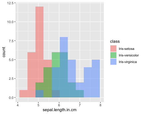
3種類のアヤメで、sepal.length.in.cmの分布が異なることがわかります。
密度曲線
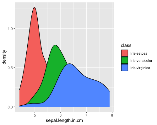
sepal.length.in.cmの密度曲線を作成します。
ggplot(train, aes(x = sepal.length.in.cm, fill = class)) + geom_density()
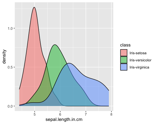
ヒストグラムと同様に、透過度を上げます。
ggplot(train, aes(x = sepal.length.in.cm, fill = class)) + geom_density(alpha = 0.5)
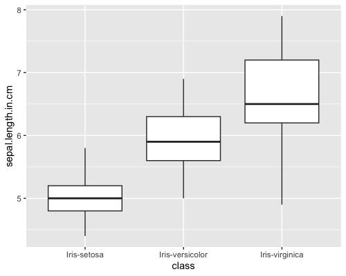
箱ひげ図
ggplot(train, aes(x = class,y = sepal.length.in.cm)) + geom_boxplot()
棒グラフと同様に、アヤメの種類ごとに箱ひげ図に色をつけます。
ggplot(train, aes(x = class,y = sepal.length.in.cm, fill = class)) + geom_boxplot()
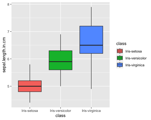
箱ひげ図が3色になり、わかりやすくなりました。
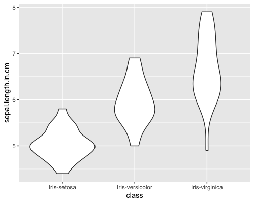
バイオリンプロット
ggplot(train, aes(x = class,y = sepal.length.in.cm)) + geom_violin()
棒グラフと同様に、アヤメの種類ごとにバイオリンプロットに色をつけます。
ggplot(train, aes(x = class,y = sepal.length.in.cm, fill = class)) + geom_violin()
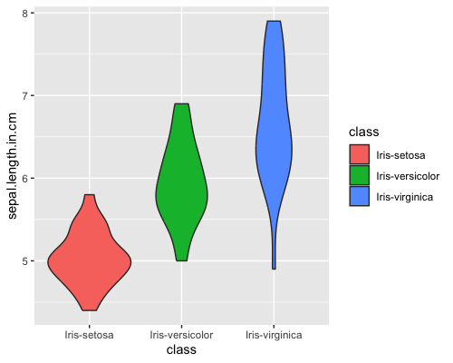
バイオリンプロットが3色になり、わかりやすくなりました。
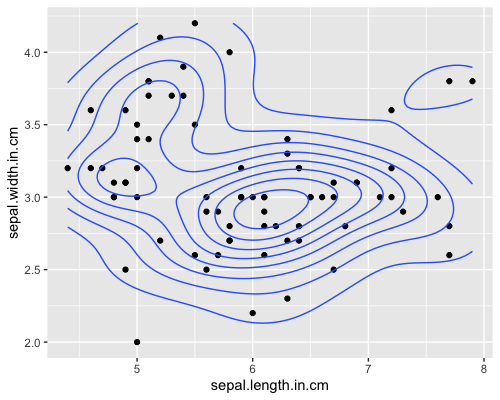
密度プロット
ggplot(train, aes(x = sepal.length.in.cm, y = sepal.width.in.cm)) + geom_point() + stat_density2d()
棒グラフと同様に、アヤメの種類ごとに密度プロットに色をつけます。
ggplot(train, aes(x = sepal.length.in.cm, y = sepal.width.in.cm, colour = class)) + geom_point() + stat_density2d()
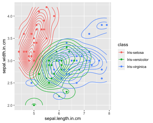
3種類のアヤメで、sepal.length.in.cmとsepal.width.in.cmの分布が異なることがわかります。
特に、Iris-setosaが左上に分布していることがわかります。
ggplot2を用いて、様々なグラフを作成できることがわかりました。
今後は、Arguments(引数)やLayers(レイヤー)について勉強していきます。
参考文献
https://ggplot2.tidyverse.org/index.html
https://www.oreilly.co.jp/books/9784873118925/
https://stats.biopapyrus.jp/r/ggplot/geom_histogram.html