ggplot2で標準偏差付きの折れ線グラフを描きます。
今回は、イヌビエの耐寒性の実験から得られたCO2データセットを用いて折れ線グラフを作成します。
イヌビエは、私が研究しているイネと同じイネ科の植物です。
実行環境:MacBook Air M1, 2020
RとRStudioのインストール
以下のURLから、RとRStudioをインストールします。
https://posit.co/download/rstudio-desktop/
インストール方法は以下のURLの記事にわかりやすく書かれています。
https://qiita.com/azzeten/items/1031c788ed093d3b3946
ggplot2のインストールと読み込み
ggplot2のインストールと読み込みを行います。
RStudioを起動し、以下のコードを実行します。
install.packages("tidyverse")
library(ggplot2)
次回からは、以下のコードのみを実行します。
library(ggplot2)
これにより、ggplot2を読み込むことができます。
データの読み込み
RのデータセットからCO2を読み込みます。
# データの読み込み
data = CO2
head(data)
  Plant   Type  Treatment conc uptake
1   Qn1 Quebec nonchilled   95   16.0
2   Qn1 Quebec nonchilled  175   30.4
3   Qn1 Quebec nonchilled  250   34.8
4   Qn1 Quebec nonchilled  350   37.2
5   Qn1 Quebec nonchilled  500   35.3
6   Qn1 Quebec nonchilled  675   39.2
Qn1-3はQuebecのnonchilled(低温処理なし)、Qc1-3はQuebecのchilled(低温処理)、Mn1-3はMississippiのnonchilled(低温処理なし)、Mc1-3はMississippiのchilled(低温処理)です。
折れ線グラフの作成
シンプルな折れ線グラフを作成する
conc列をx軸、uptake列をy軸として折れ線グラフを作成します。
ggplot(data, aes(x = conc, y = uptake)) + geom_line()
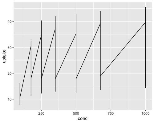
これでは情報を読み取ることができません。
facet_wrap() で種類ごとのグラフを作成する
facet_wrap()を用いて、Plantの種類ごとのグラフを作成します。
ggplot(data, aes(x = conc, y = uptake)) + geom_line() +
  facet_wrap(vars(Plant))
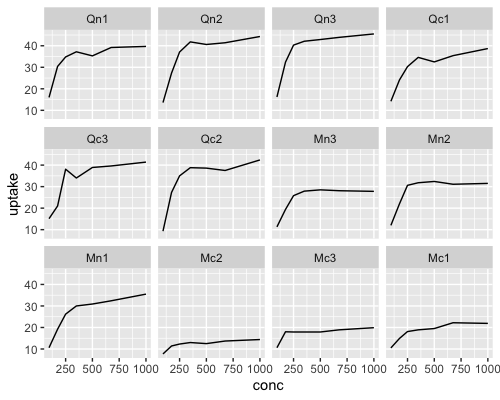
3列×4行のグラフにしてみます。
ggplot(data, aes(x = conc, y = uptake)) + geom_line() +
  facet_wrap(vars(Plant), nrow = 4)

3列×4行のグラフになりましたが、Qn2の下にQc3があったり、Mn3の下にMc2があったり、ラベルの順番がバラバラであることがわかります。
ラベルの順番を揃える
levels(data$Plant)
[1] "Qn1" "Qn2" "Qn3" "Qc1" "Qc3" "Qc2" "Mn3" "Mn2" "Mn1" "Mc2" "Mc3" "Mc1"
levels(data$Plant) <- c("Qn1", "Qn2", "Qn3", "Qc1", "Qc2", "Qc3", "Mn1", "Mn2", "Mn3", "Mc1", "Mc2", "Mc3")
levels(data$Plant)
[1] "Qn1" "Qn2" "Qn3" "Qc1" "Qc2" "Qc3" "Mn1" "Mn2" "Mn3" "Mc1" "Mc2" "Mc3"
ラベルの順番を揃えることができました。
もう一度グラフを作成します。
ggplot(data, aes(x = conc, y = uptake)) + geom_line() +
  facet_wrap(vars(Plant), nrow = 4)
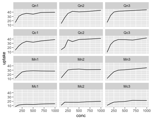
ラベルの順番が揃ったグラフを作成することができました。
データを抽出してグラフを作成する
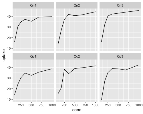
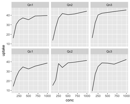
Qn1-3、Qc1-3のデータを抽出してグラフを作成します。
ggplot(data[1:42,], aes(x = conc, y = uptake)) + geom_line() +
  facet_wrap(vars(Plant))
Mn1-3、Mc1-3のデータを抽出してグラフを作成します。
ggplot(data[43:84,], aes(x = conc, y = uptake)) + geom_line() +
  facet_wrap(vars(Plant))
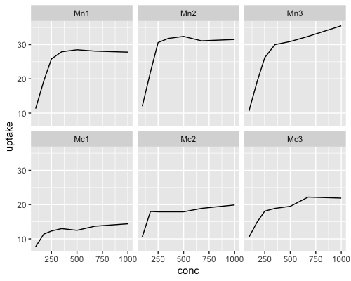
Quebecごと、Mississippiごとにグラフを作成することができました。
2つのグラフでy軸のスケールが揃っていないことがわかります。
y軸のスケールを指定する
scale_y_continuous()を用いて、y軸のスケールを指定します。
ggplot(data[1:42,], aes(x = conc, y = uptake)) + geom_line() +
  facet_wrap(vars(Plant)) +
  scale_y_continuous(limits = c(9, 46))
ggplot(data[43:84,], aes(x = conc, y = uptake)) + geom_line() +
  facet_wrap(vars(Plant)) +
  scale_y_continuous(limits = c(9, 46))
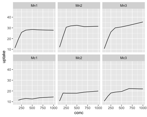
2つのグラフでy軸のスケールを揃えることができました。
Quebecに比べて、Mississippiでは低温処理なしと低温処理でuptake(二酸化炭素取り込み)の差があることがわかります。
平均値と標準偏差を求める
データセットをもう一度確認します。
head(data)
  Plant   Type  Treatment conc uptake
1   Qn1 Quebec nonchilled   95   16.0
2   Qn1 Quebec nonchilled  175   30.4
3   Qn1 Quebec nonchilled  250   34.8
4   Qn1 Quebec nonchilled  350   37.2
5   Qn1 Quebec nonchilled  500   35.3
6   Qn1 Quebec nonchilled  675   39.2
summarize()を用いて、Plant、Type、Treatmentが同じ行のuptakeの平均値と標準偏差を求めます。
Plant列は、Qn1-3をQn、Qc1-3をQc、Mn1-3をMn、Mc1-3をMcとします。
install.packages("dplyr")
library(dplyr)

data2 <- data %>%
  mutate(Plant = gsub("(Qn|Qc|Mn|Mc)[1-3]", "\\1", Plant),
         Plant = factor(Plant, levels = c("Qn", "Qc", "Mn", "Mc"))) %>%
  group_by(Plant, Type, Treatment, conc) %>%
  summarize(mean_uptake = mean(uptake), sd_uptake = sd(uptake))

data2 = as.data.frame(data2)

head(data2)
  Plant   Type  Treatment conc mean_uptake sd_uptake
1    Qn Quebec nonchilled   95    15.26667  1.446836
2    Qn Quebec nonchilled  175    30.03333  2.569695
3    Qn Quebec nonchilled  250    37.40000  2.762245
4    Qn Quebec nonchilled  350    40.36667  2.746513
5    Qn Quebec nonchilled  500    39.60000  3.897435
6    Qn Quebec nonchilled  675    41.50000  2.351595
uptakeの平均値と標準偏差を求めることができました。
平均値と標準偏差で折れ線グラフを作成する
まず、平均値で折れ線グラフを作成します。
ggplot(data2, aes(x = conc, y = mean_uptake)) + geom_line() +
  facet_wrap(vars(Plant))
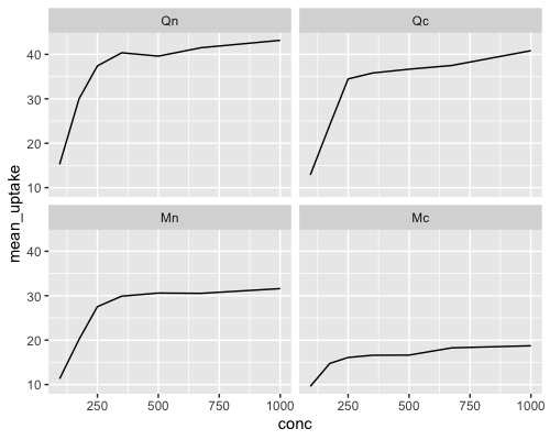
geom_ribbon()を用いて、標準偏差付きの折れ線グラフを作成します。
ggplot(data2, aes(x = conc, y = mean_uptake)) +
  geom_ribbon(aes(ymin = mean_uptake - sd_uptake, ymax = mean_uptake + sd_uptake), fill = "grey70") +
  geom_line() +
  facet_wrap(vars(Plant))
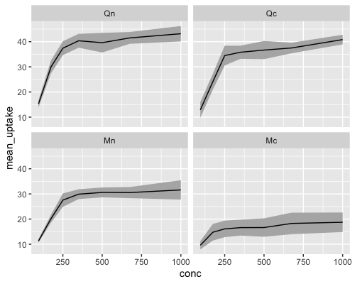
Quebecでは低温処理なしと低温処理でuptakeの差があまりありませんが、Mississippiでは低温処理なしと低温処理でuptakeの差があることがわかります。
ggplot2で標準偏差付きの折れ線グラフを描くことができ、ggplot2が実験データを可視化できるツールであることがわかりました。
ggplot2には、レイヤーがわかりやすくまとめられているチートシートがあります。
以下のURLからアクセスすることができ、おすすめです。
https://github.com/rstudio/cheatsheets/blob/main/data-visualization.pdf
参考文献
https://www.math.chuo-u.ac.jp/~sakaori/Rdata.html
https://qiita.com/hoxo_b/items/8ad3e9c688b8515bb906
https://qiita.com/Surku/items/ae16d444d6c22b0dc4e6