はじめに
おはようございます。こんにちは。こんばんは。
Watatakuです。
今回はフォームコンポーネントを作りながらVue3で登場したcompositionApiについて解説していく記事です。
またcompositionApiを使うためにVue3にアップグレード(しなくても良かった)したのでVue2とVue3の違いについてもお話しできればと思います。
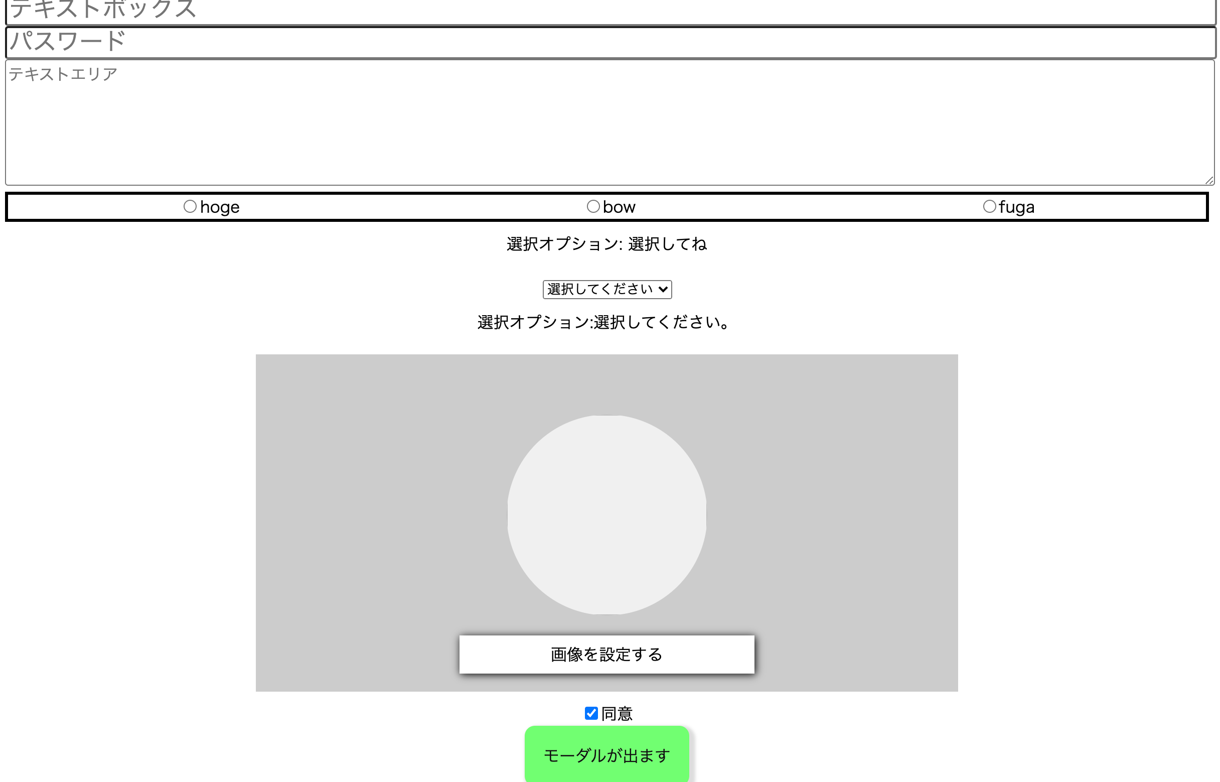
今回作ったやつ。⬇︎
環境(Vueのバージョン)
- optionsApi: ver.2.6.11
- compositionApi: ver.3.0.0
書かないこと
optionApiの書き方、解説。
Vue Composition APIとは
以下の2点のために策定された関数ベースのAPIです。
Vue Composition APIのメリット
1.コードの可読性・再利用性の改善
2.型インターフェースの改善
今までのVue2でのOptions APIでは1つのコンポーネントが複数の役割を持った際にコードが肥大化し、可読性が著しく低下するという問題がありました。
そこでComposition APIでは関心事によってコードを分割し、分割したコードを簡単にコンポーネントに注入できるようになっています。
詳しくはこちら
テキストボックス
- optionsApi
<template>
  <div class="contents">
    <TextInput
      v-model="text"
      type="text"
      name="text"
      placeholder="テキストボックス"
      :value="text"
    />
  </div>
</template>

<script>
import TextInput from "./components/TextInput.vue";

export default {
  components: {
    TextInput,
  },
  data() {
    return {
      text: "",
    };
  },

};
</script>
<template>
  <input
    :type="this.type"
    :placeholder="this.placeholder"
    :name="this.name"
    :value="this.value"
    @input="updateValue"
  />
</template>

<script>
export default {
  props: {
    type: { type: String },
    placeholder: { type: String },
    name: { type: String },
    value: { type: String },
  },
  methods: {
    updateValue(e) {
      this.$emit("input", e.target.value);
    },
  },
};
</script>
- compositionApi
<template>
  <TextInput
    v-model:modalValue="form.text"
    type="text"
    name="text"
    placeholder="テキストボックス"
    :value="form.text"
  />
</template>

<script>
import { reactive } from "vue";
import TextInput from "./components/TextInput.vue";

export default {
  name: "App",
  components: {
    TextInput,
  },
  setup() {
    const form = reactive({
      text: "",
    });

    return {
      form
    };
  },
};
</script>
<template>
  <input
    :type="type"
    :placeholder="placeholder"
    :name="name"
    :value="value"
    @input="updateValue"
  />
</template>

<script>
export default {
  props: {
    type: { type: String, required: true },
    placeholder: { type: String, required: true },
    name: { type: String, required: true },
    value: { type: String, required: true },
  },
  emits: ["update:modalValue"],
  setup(_, context) {
    const updateValue = (e) => {
      context.emit("update:modalValue", e.target.value);
    };
    return { updateValue };
  },
};
</script>
optionApiとcompositionApiを見比べて大きく違うのはsetup(){}の有無ではないでしょうか?
このsetup(){}がCompositionApiを扱うためのキモになります。
このsetup(){}の中に、optionApiで言う*「data, mounted, methods, ・・・・」*を描くイメージです。
data()
まずはじめにdata()をみていきます。
結論から申し上げますと, "vue"からref or reactiveで宣言すればいいです。
そして、その変数をテンプレートで扱うためにreturnします。
// --------------- optionsApi ----------------------
data() {
	return {
	  text: "",
	};
},

// アクセス
this.text

// -------------- compositionApi --------------
// reactiveで書く場合
setup() {
    const form = reactive({
      text: "",
    });

    return {
      form
    };
},

// アクセス
form.text

// refで書く場合
setup() {
   const text = ref("");

    return {
      text
    };
},

// アクセス
text.value
refとreactiveの違いについては下記記事がご参考になると思います。
参照
methods
optionsApiでは、メソッドはmethodsに書かなくてはなりませんでしたが、
compositionApiではこれもsetup(){}に記述します。
書き方は、setup(){}で普通にjavascript(typescriptを使うのであれば、typescript)でメソッド宣言するだけです。
あとはdata()同様、returnするだけ。
//optionApi
methods: {
    updateValue(e) {
      this.$emit("input", e.target.value);
    },
},

//compositionApi
setup(_, context) {
    const updateValue = (e) => {
      context.emit("update:modalValue", e.target.value);
    };
    return { updateValue };
},
propsとemit
- props
propsの渡し方、受け取りかたは大きく変わってないです。
ただ、受け取ったpropsを用いてデータを加工したりする時(setup関数に渡さなければいけない時)に工夫が必要です。
props: {
    title: {
      type: String,
      required: true
    },
    count: {
      type: Number,
      default: 0
    }
},
setup (props) {
    const doubleCount = computed(() => props.count * 2)

    return { doubleCount }
}
setup(){}の第一引数がpropsになります。ちなみに後述しますが第ニ引数がコンテキスト。
コンテキストを用いてemitします。
- emit
まずはじめに、Vue2とVue3で仕様が若干変わっていたので、作者は苦戦しました。ちなみにv-modelも若干仕様が変わっています。
詳しくはこちら。
emits: ["update:modalValue"],
setup(_, context) {
    const updateValue = (e) => {
      context.emit("update:modalValue", e.target.value);
    };
    return { updateValue };
}
Vue2との違いは事前にemitのイベントをemitsプロパティに指定します。
その後、propsの時にも少し触れたのですが、setup(){}の第二引数でコンテキストを指定し、
コンテキストのemitメソッドを使います。
ちなみにpropsが必要なく、emitだけを使いたい場合は上記のように(_, context)のように書きます。
他のcompositionApiの書き方
以上が、このアプリでのcompositionApiの説明でした。
おい、Watataku!!残りのライフサイクルとかwatchはどないすんねん!!
と言うことで、ここからはこのアプリとは関係ないですが*ライフサイクルとかwatch**を説明していきましょう。
結論、importしろ。これだけです。
- ライフサイクル
// optionsApi
export default {
  created() {
    console.log("created");
  },

  mounted() {
    console.log("mounted");
  },
};

// compositionApi
import { onMounted } from "vue";

export default {
  setup() {
    console.log("created");

    onMounted(() => {
      console.log("mounted");
    });
  },
};
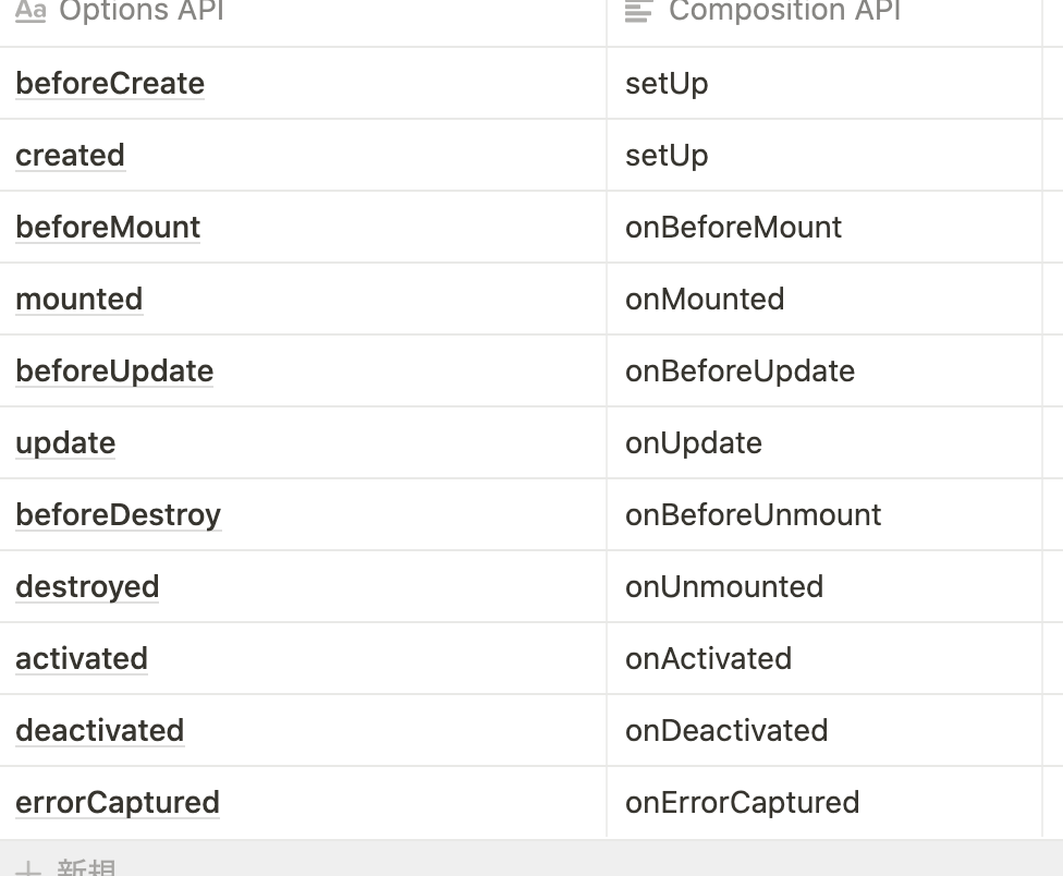
それぞれのライフサイクルに対応したonXXX関数を使用する
beforeCreate・createdがsetupにまとめられている
- computed
//optionsApi
export default {
  data() {
    return {
      count: 1,
    };
  },
  computed: {
    doubleCount() {
      return this.count * 2;
    },
  },
};

//compositionApi
import { ref, computed } from "vue";

export default {
  setup() {
    const countRef = ref(1);

    // computed関数を使用して計算プロパティを定義します
    const doubleCount = computed(() => {
      return countRef.value * 2;
    });

    return {
      countRef,
      doubleCount,
    };
  },
};
- watch
//optionsApi
export default {
  data() {
    return {
      count: 1,
    };
  },

  watch: {
    count(count, prevCount) {
      console.log(count);
      console.log(prevCount);
    },
  },
};

//compositionApi
import { ref, watch } from "vue";

export default {
  setup() {
    const countRef = ref(1);

    // watch関数でリアクティブな変数を監視します
    watch(countRef, (count, prevCount) => {
      console.log(count);
      console.log(prevCount);
    });

    return {
      countRef,
    };
  },
};
watchの第1引数には監視対象、第2引数にはcallback関数を渡します。
callback関数の第1引数には変更後の値、第2引数には変更前の値が渡されます。
画像アップローダー
ここからはフォームコンポーネントの続きをやっていきます。
パスワードとテキストエリアに関してはテキストボックスと同じような作りなので省略します。
- optionsApi
<template>
  <div class="contents">
    <div class="imgContent">
      <ImagePreview :imageUrl="imageUrl" />
      <div class="module--spacing--largeSmall"></div>
      <UploadFile @fileList="setFileList" />
    </div>
  </div>
</template>

<script>
import ImagePreview from "./components/ImagePreview.vue";
import UploadFile from "./components/UploadFile.vue";

export default {
  components: {
    ImagePreview,
    UploadFile,
  },
  data() {
    return {
      imageUrl: "",
      fileList: null,
    };
  },
  methods: {
    setFileList(fileList) {
      this.fileList = fileList;
      const imageUrl = URL.createObjectURL(fileList[0]);
      this.imageUrl = imageUrl;
    },
  }
};
</script>

<style>
@media screen and (min-width: 1026px) {
  .imgContent {
    width: 90%;
    max-width: 700px;
    height: 35vh;
    margin: auto;
    margin-bottom: 10px;
    background-color: #ccc;
    padding-top: 5%;
  }
}
@media screen and (min-width: 482px) and (max-width: 1025px) {
  .imgContent {
    width: 90%;
    max-width: 700px;
    height: 20vh;
    margin: auto;
    margin-bottom: 10px;
    background-color: #ccc;
    padding-top: 5%;
  }
}
</style>
<template>
  <label for="corporation_file" class="btn btn-success">
    画像を設定する
    <input
      type="file"
      class="file_input"
      style="display:none;"
      id="corporation_file"
      mulitple="multiple"
      @change="onDrop"
    />
  </label>
</template>

<script>
export default {
  methods: {
    onDrop(e) {
      const imageFile = e.target.files;
      if(imageFile) {
        this.$emit("fileList", imageFile);
      }
    },
  },
};
</script>

<style scoped>
label {
  background-color: #fff;
  padding: 1%;
  width: 40%;
  margin: 0 auto;
  box-shadow: 1px 1px 8px 0px #000;
  display: block;
}
</style>
<template>
  <div class="imagePreview">
    <img :src="this.imageUrl" width="50" height="50" alt />
  </div>
</template>

<script>
export default {
  props: ["imageUrl"],
};
</script>

<style scoped>
@media screen and (min-width: 1026px) {
  .imagePreview {
    height: 200px;
    width: 200px;
    background: rgb(240, 240, 240);
    overflow: hidden;
    border-radius: 50%;
    background-position: center center;
    background-size: cover;
    margin-left: auto;
    margin-right: auto;
    margin-bottom: 20px;
    position: relative;
  }

  .imagePreview img {
    height: 200px;
    width: 200px;
  }
}

@media screen and (min-width: 482px) and (max-width: 1025px) {
  .imagePreview {
    height: 100px;
    width: 100px;
    background: rgb(240, 240, 240);
    overflow: hidden;
    border-radius: 50%;
    background-position: center center;
    background-size: cover;
    margin-left: auto;
    margin-right: auto;
    margin-bottom: 20px;
    position: relative;
  }

  .imagePreview img {
    height: 100px;
    width: 100px;
  }
}

@media screen and (max-width: 481px) {
  .imagePreview {
    height: 50px;
    width: 50px;
    background: rgb(240, 240, 240);
    overflow: hidden;
    border-radius: 50%;
    background-position: center center;
    background-size: cover;
    margin-left: auto;
    margin-right: auto;
    margin-bottom: 20px;
    position: relative;
  }

  .imagePreview img {
    height: 50px;
    width: 50px;
  }
}
</style>
- compositionApi
<template>
   <div class="imgContent">
    <ImagePreview :imageUrl="form.imageUrl" />
    <div class="module--spacing--largeSmall"></div>
    <UploadFile @fileList="setFileList" />
  </div>
</template>

<script>
import { reactive } from "vue";
import ImagePreview from "./components/ImagePreview.vue";
import UploadFile from "./components/UploadFile.vue";

export default {
  name: "App",
    ImagePreview,
    UploadFile,
  },
  setup() {
    const form = reactive({
      imageUrl: "",
      fileList: null,
    });

    const setFileList = (fileList) => {
      form.fileList = fileList;
      const imgUrl = URL.createObjectURL(fileList[0]);
      form.imageUrl = imgUrl;
    };

    return {
      form,
      setFileList,
    };
  },
};
</script>

<style>
@media screen and (min-width: 1026px) {
  .imgContent {
    width: 90%;
    max-width: 700px;
    height: 35vh;
    margin: auto;
    margin-bottom: 10px;
    background-color: #ccc;
    padding-top: 5%;
  }
}
@media screen and (min-width: 482px) and (max-width: 1025px) {
  .imgContent {
    width: 90%;
    max-width: 700px;
    height: 20vh;
    margin: auto;
    margin-bottom: 10px;
    background-color: #ccc;
    padding-top: 5%;
  }
}
</style>
<template>
  <label for="corporation_file" class="btn btn-success">
    画像を設定する
    <input
      type="file"
      class="file_input"
      style="display: none"
      id="corporation_file"
      mulitple="multiple"
      @change="onDrop"
    />
  </label>
</template>

<script>
export default {
  emits: ["fileList"],
  setup(_, context) {
    const onDrop = (e) => {
      const imageFile = e.target.files;
      if (imageFile) {
        context.emit("fileList", imageFile);
      }
    };
    return { onDrop };
  },
};
</script>

<style scoped>
label {
  background-color: #fff;
  padding: 1%;
  width: 40%;
  margin: 0 auto;
  box-shadow: 1px 1px 8px 0px #000;
  display: block;
}
</style>
<template>
  <div class="imagePreview">
    <img :src="imageUrl" alt />
  </div>
</template>

<script>
export default {
  props: {
    imageUrl: {
      type: String,
      required: true,
    },
  },
};
</script>

<style scoped>
@media screen and (min-width: 1026px) {
  .imagePreview {
    height: 200px;
    width: 200px;
    background: rgb(240, 240, 240);
    overflow: hidden;
    border-radius: 50%;
    background-position: center center;
    background-size: cover;
    margin-left: auto;
    margin-right: auto;
    margin-bottom: 20px;
    position: relative;
  }

  .imagePreview img {
    height: 200px;
    width: 200px;
  }
}

@media screen and (min-width: 482px) and (max-width: 1025px) {
  .imagePreview {
    height: 100px;
    width: 100px;
    background: rgb(240, 240, 240);
    overflow: hidden;
    border-radius: 50%;
    background-position: center center;
    background-size: cover;
    margin-left: auto;
    margin-right: auto;
    margin-bottom: 20px;
    position: relative;
  }

  .imagePreview img {
    height: 100px;
    width: 100px;
  }
}

@media screen and (max-width: 481px) {
  .imagePreview {
    height: 50px;
    width: 50px;
    background: rgb(240, 240, 240);
    overflow: hidden;
    border-radius: 50%;
    background-position: center center;
    background-size: cover;
    margin-left: auto;
    margin-right: auto;
    margin-bottom: 20px;
    position: relative;
  }

  .imagePreview img {
    height: 50px;
    width: 50px;
  }
}
</style>
セレクトボックス
- optionsApi
<template>
  <div class="contents">
    <SelextBox v-model="select" :options="optionsSelect" />
    <span v-if="this.select == ''">選択オプション:選択してください。</span>
    <span v-else>選択オプション: {{ select }}</span>
  </div>
</template>

<script>
import SelextBox from "./components/SelectBox.vue";

export default {
  components: {
    SelextBox,
  },
  data() {
    return {
      select: 0,
      selectValue: "",
      optionsSelect: [
        { label: "Vue.js", value: "Vue.js" },
        { label: "React", value: "React" },
        { label: "Angular", value: "Angular" },
      ],
    };
  },
};
</script>
<template>
  <select name="select-box" @input="updateValue">
    <option value="0">選択してください</option>
    <option
      v-for="(option, index) in options"
      :key="index"
      :value="option.value"
      >{{ option.label }}</option
    >
  </select>
</template>

<script>
export default {
  props: {
    options: { type: Array, required: true },
  },
  methods: {
    updateValue(e) {
      this.$emit("input", e.target.value);
    },
  },
};
</script>
- compositionApi
<template>
  <SelectBox
    v-model:select="form.select"
    name="selectbox"
    :options="form.optionsSelect"
  />
  <div class="module--spacing--verySmall"></div>
  <span v-if="form.select == ''">選択オプション:選択してください。</span>
  <span v-else>選択オプション: {{ form.select }}</span>
</template>

<script>
import { reactive } from "vue";
import SelectBox from "./components/SelectBox.vue";

export default {
  name: "App",
  components: {
    SelectBox,
  },
  setup() {
    const form = reactive({
      select: 0,
      selectValue: "",
      optionsSelect: [
        { label: "Vue.js", value: "Vue.js" },
        { label: "React", value: "React" },
        { label: "Angular", value: "Angular" },
      ],
    });

    return {
      form,
    };
  },
};
</script>
<template>
  <select :name="name" @input="updateValue">
    <option value="0">選択してください</option>
    <option
      v-for="(option, index) in options"
      :key="index"
      :value="option.value"
    >
      {{ option.label }}
    </option>
  </select>
</template>

<script>
export default {
  props: {
    name: { type: String, required: true },
    options: { type: Array, required: true },
  },
  emits: ["update:select"],
  setup(_, context) {
    const updateValue = (e) => {
      context.emit("update:select", e.target.value);
    };
    return { updateValue };
  },
};
</script>
ラジオボタン
- optionsApi
<template>
  <div class="contents">
    <RadioButton v-model="checkName" :options="optionsRadio" />
    <span>選択オプション: {{ checkName }}</span>
  </div>
</template>

<script>
import RadioButton from "./components/RadioButton.vue";

export default {
  components: {
    RadioButton,
  },
  data() {
    return {
      checkName: "選択してね",
      optionsRadio: [
        { label: "hoge", value: "hoge" },
        { label: "bow", value: "bow" },
        { label: "fuga", value: "fuga" },
      ],
    };
  },
};
</script>
<template>
  <div>
    <label v-for="(option, index) in options" :key="index">
      <!-- ラジオボタンにはname属性必須 -->
      <input
        type="radio"
        :value="option.value"
        @change="updateValue"
        name="radio-button"
      />{{ option.label }}</label
    >
  </div>
</template>

<script>
export default {
  props: {
    options: { type: Array, required: true },
  },
  methods: {
    updateValue(e) {
      this.$emit("input", e.target.value);
    },
  },
};
</script>
- compositionApi
<template>
  <RadioButton
    v-model:modalValue="form.checkName"
    :options="form.optionsRadio"
  />
  <span>選択オプション: {{ form.checkName }}</span>
</template>

<script>
import { reactive } from "vue";
import RadioButton from "./components/RadioButton.vue";

export default {
  name: "App",
  components: {
    RadioButton,
  },
  setup() {
    const form = reactive({
      checkName: "選択してね",
      optionsRadio: [
        { label: "hoge", value: "hoge" },
        { label: "bow", value: "bow" },
        { label: "fuga", value: "fuga" },
      ],
    });

    return {
      form,
    };
  },
};
</script>
<template>
  <div>
    <label v-for="(option, index) in options" :key="index">
      <!-- ラジオボタンにはname属性必須 -->
      <input
        type="radio"
        :value="option.value"
        @change="updateValue"
        name="radio-button"
      />{{ option.label }}</label
    >
  </div>
</template>

<script>
export default {
  props: {
    options: { type: Array, required: true },
  },
  emits: ["update:modalValue"],
  setup(_, context) {
    const updateValue = (e) => {
      context.emit("update:modalValue", e.target.value);
    };
    return { updateValue };
  },
};
</script>
ボタン
チェックボックスにチェックを入れないとボタンがクリックできなくて、
そのボタンをクリックしたらモーダルが出現するものを実装します。(説明下手でごめんなさい。)
- optionsApi
<template>
  <div class="contents">
    <CheckBox v-model="checked" :checked="checked" />
    <label>同意</label><br />

    <Button :disabled="!checked" msg="モーダルが出ます" @push="click" />
    <Modal
      title="モーダルタイトル"
      detail="モーダルの内容です。モーダルの内容です。モーダルの内容です。モーダルの内容です。モーダルの内容です。モーダルの内容です。モーダルの内容です。モーダルの内容です。モーダルの内容です。モーダルの内容です。モーダルの内容です。モーダルの内容です。モーダルの内容です。モーダルの内容です。"
      v-if="open"
      @close="open = false"
      @modal-click="modalClick"
    />
  </div>
</template>

<script>
import CheckBox from "./components/CheckBox.vue";
import Button from "./components/Button.vue";
import Modal from "./components/Modal.vue";

export default {
  components: {
    CheckBox,
    Button,
    Modal,
  },
  data() {
    return {
      checked: false,
      open: false,
    };
  },
  methods: {
    click() {
      this.open = true;
    },
    modalClick() {
      console.log("テキストボックスの入力内容:", this.text);
      console.log("パスワードの入力内容:", this.pass);
      console.log("テキストエリアの入力内容:", this.textarea);
      console.log("画像の名前:", this.fileList[0].name);
      alert("コンソールを見ろ!!");
      this.open = false;
      this.checked = false;
      // this.uploadImage();
    },
};
</script>
<template>
  <input type="checkbox" @change="updateValue" :checked="this.checked" />
</template>

<script>
export default {
  props: ["checked"],
  methods: {
    updateValue(e) {
      this.$emit("input", e.target.checked);
    },
  },
};
</script>
<template>
  <button class="button" @click="push">
    {{ this.msg }}
  </button>
</template>

<script>
export default {
  props: ["msg"],
  methods: {
    push() {
      this.$emit("push");
    },
  },
};
</script>
<template>
  <transition name="modal">
    <div class="overlay" @click="$emit('close')">
      <div class="panel" @click.stop>
        <h2>{{ this.title }}</h2>
        <div class="module--spacing--small"></div>
        <div class="modal-contents">
          <p>{{ this.detail }}</p>
        </div>
        <Button :disabled="false" msg="ボタン" @push="click" />
      </div>
    </div>
  </transition>
</template>

<script>
import Button from "./Button.vue";
export default {
  props: ["title", "detail"],
  components: {
    Button,
  },
  methods: {
    click() {
      this.$emit("modal-click");
    },
  },
};
</script>

<style scoped>
.overlay {
  background: rgba(0, 0, 0, 0.8);
  position: fixed;
  width: 100%;
  height: 100%;
  left: 0;
  top: 0;
  right: 0;
  bottom: 0;
  z-index: 900;
  transition: all 0.5s ease;
}
.panel {
  width: 40%;
  text-align: center;
  background: #fff;
  padding: 40px;
  position: absolute;
  top: 50%;
  left: 50%;
  transform: translate(-50%, -50%);
}
.modal-contents {
  text-align: left;
}
.modal-enter,
.modal-leave-active {
  opacity: 0;
}
.modal-enter .panel,
.modal-leave-active .panel {
  top: -200px;
}
</style>
- compositionApi
<template>
  <CheckBox v-model:change="form.checked" :checked="form.checked" />
  <label>同意</label><br />

  <Button :disabled="!form.checked" msg="モーダルが出ます" @push="handleOpen" />
  <Modal
    title="モーダルタイトル"
    detail="モーダルの内容です。モーダルの内容です。モーダルの内容です。モーダルの内容です。モーダルの内容です。モーダルの内容です。モーダルの内容です。モーダルの内容です。モーダルの内容です。モーダルの内容です。モーダルの内容です。モーダルの内容です。モーダルの内容です。モーダルの内容です。"
    v-if="form.open"
    @close="form.open = false"
    @modal-click="modalClick"
  />
</template>

<script>
import { reactive } from "vue";
import CheckBox from "./components/CheckBox.vue";
import Button from "./components/Button.vue";
import Modal from "./components/Modal.vue";

export default {
  name: "App",
  components: {
    CheckBox,
    Button,
    Modal,
  },
  setup() {
    const form = reactive({
      checked: false,
      open: false,
    });

    const handleOpen = () => {
      form.open = true;
    };
    const modalClick = () => {
      aleat("モーダルの中のボタンをクリックしました")
    };


    return {
      form,
      handleOpen,
      modalClick
    };
  },
};
</script>
<template>
  <input type="checkbox" @change="updateValue" :checked="checked" />
</template>

<script>
export default {
  model: {
    prop: "checked",
    event: "change",
  },
  props: {
    checked: {
      type: Boolean,
      required: true,
    },
  },
  emits: ["update:change"],
  setup(_, context) {
    const updateValue = (e) => {
      context.emit("update:change", e.target.checked);
    };
    return { updateValue };
  },
};
</script>
<template>
  <button class="button" @click="push">
    {{ msg }}
  </button>
</template>

<script>
export default {
  props: {
    msg: {
      type: String,
      required: true,
    },
  },
  emits: ["push"],
  setup(_, context) {
    const push = () => {
      context.emit("push");
    };

    return { push };
  },
};
</script>
<template>
  <transition name="modal">
    <div class="overlay" @click="handleClose">
      <div class="panel" @click.stop>
        <h2>{{ title }}</h2>
        <div class="module--spacing--small"></div>
        <div class="modal-contents">
          <p>{{ detail }}</p>
        </div>
        <Button :disabled="false" msg="ボタン" @push="click" />
      </div>
    </div>
  </transition>
</template>

<script>
import Button from "./Button.vue";
export default {
  props: {
    title: {
      type: String,
      required: true,
    },
    detail: {
      type: String,
      required: true,
    },
  },
  components: {
    Button,
  },
  emits: ["close", "modal-click"],
  setup(_, context) {
    const handleClose = () => {
      context.emit("close");
    };
    const click = () => {
      context.emit("modal-click");
    };
    return { handleClose, click };
  },
};
</script>

<style scoped>
.overlay {
  background: rgba(0, 0, 0, 0.8);
  position: fixed;
  width: 100%;
  height: 100%;
  left: 0;
  top: 0;
  right: 0;
  bottom: 0;
  z-index: 900;
  transition: all 0.5s ease;
}

.panel {
  width: 40%;
  text-align: center;
  background: #fff;
  padding: 40px;
  position: absolute;
  top: 50%;
  left: 50%;
  transform: translate(-50%, -50%);
}

.modal-contents {
  text-align: left;
}

.modal-enter,
.modal-leave-active {
  opacity: 0;
}

.modal-enter .panel,
.modal-leave-active .panel {
  top: -200px;
}
</style>
まとめ
以上。
フォームコンポーネントを作りながらcompositionApiについて書かせていただきました。
ご参考になれば幸いです。
もし間違いなどがあれば、ご教授お願いします。