はじめに
ゆるいAtomicDesignを意識してForm部品をComponent化してみました。
Input
input.vue
<template>
  <label>
    <span v-if="$slots.label"><slot name="label"></slot></span>
    <span v-else-if="label">{{ label }}</span>

    <input :type="type"
           :name="name"
           :placeholder="placeholder"
           :value="value"
           @input="updateValue"
           @focus="$emit('focus', $event)"
           @blur="$emit('blur', $event)"
    >
  </label>
</template>
<script>
  export default {
    props: {
      value: {},
      label: { type: String },
      name: { type: String, require: true },
      type: { type: String, default: 'text' },
      placeholder: { type: String }
    },

    methods: {
      updateValue (e) {
        this.$emit('input', e.target.value)
        this.$emit('change', e.target.value)
      }
    }
  }
</script>
グローバル登録
import Input from '@/components/input'
Vue.component('vue-input', Input)
呼び出し
<vue-input label="Input" name="input" v-model="form.input"></vue-input>
propされた値はComponent内で直接更新できないのでv-modelの糖衣構文(v-bind:value、v-on:input)を利用します。
v-bind:value
<input ...省略
       :value="value"
       @input="updateValue"
       ...省略
>
v-on:input
updateValue (e) {
  this.$emit('input', e.target.value)
  this.$emit('change', e.target.value)  // Changeイベント
}
値が変更された場合に処理を行うためにChangeイベントもトリガさせています。
<vue-input label="Input" name="input"
           v-model="form.input"
           @change="handleChange" <!-- 値が変更された場合の処理 -->
></vue-input>
label部分は文字列以外の場合もあるので、slotまたはpropでコンテンツを渡します。
slot
<vue-input name="input" v-model="form.input">
  <template slot="label"> <!-- slotでlabelを渡す -->
    <span>*</span>Label
  </template>
</vue-input>
prop
<vue-input label="Input" name="input" v-model="form.input"></vue-input>
Radio
radio.vue
<template>
  <label>
    <span v-if="$slots.label"><slot name="label"></slot></span>
    <span v-else-if="label">{{ label }}</span>

    <input type="radio"
           :name="name"
           :value="value"
           :checked="checked === value"
           @change="updateValue"
           @focus="$emit('focus', $event)"
           @blur="$emit('blur', $event)"
    >
    <slot></slot>
  </label>
</template>
<script>
  export default {
    model: {
      prop: 'checked',
      event: 'input'
    },

    props: {
      value: {},
      checked: {},
      label: { type: String },
      name: { type: String, require: true }
    },

    methods: {
      updateValue (e) {
        this.$emit('input', this.value)
        this.$emit('checked', this.value)
      }
    }
  }
</script>
グローバル登録
import Radio from '@/components/radio'
Vue.component('vue-radio', Radio)
呼び出し
<vue-radio label="Radio" name="radio1" :value="1" v-model="form.radio1">1</vue-radio>
Radioにはvalue属性があり、v-bind:valueに競合するため、modelを使ってv-bind:valueをv-bind:checkedに変更します。
model: {
  prop: 'checked', // v-bind:checked
  event: 'input' // v-on:input
}
Radio Group
複数のRadioを扱いたい場合があるかもしれません。
その場合はグループ用のComponentを利用します。
group.vue
<template>
  <div class="vue-group">
    <label v-if="$slots.label"><slot name="label"></slot></label>
    <label v-else-if="label">{{ label }}</label>

    <slot></slot>
  </div>
</template>
<script>
  export default {
    props: {
      value: {},
      label: { type: String }
    }
  }
</script>
Radio Componentを変更します。
<template>
  <label>
    <span v-if="$slots.label"><slot name="label"></slot></span>
    <span v-else-if="label">{{ label }}</span>

    <input type="radio"
           :name="name"
           :value="value"
           :checked="input === value"
           @change="updateValue"
           @focus="$emit('focus', $event)"
           @blur="$emit('blur', $event)"
    >
    <slot></slot>
  </label>
</template>
<script>
  export default {
    model: {
      prop: 'checked',
      event: 'input'
    },

    props: {
      value: {},
      checked: {},
      label: { type: String },
      name: { type: String, require: true }
    },

    computed: {
      group () {
        return ('$parent' in this && this.$parent.$options.name === 'vue-group') ? this.$parent : null
      },
      input () {
        return this.group ? this.group.value : this.checked
      }
    },

    methods: {
      updateValue (e) {
        if (this.group) {
          this.group.$emit('input', this.value)
          this.group.$emit('checked', this.value)
        } else {
          this.$emit('input', this.value)
          this.$emit('checked', this.value)
        }
      }
    }
  }
</script>
グローバル登録
import Radio from '@/components/radio'
import Radio from '@/components/radio'
Vue.component('vue-radio', Radio)
Vue.component('vue-group', Group)
呼び出し
<vue-group label="Radio" v-model="form.radio2">
  <vue-radio name="radio2" :value="1">1</vue-radio>
  <vue-radio name="radio2" :value="2">2</vue-radio>
</vue-group>
this.$parentが存在し、それがGroup ComponentならばGroup Componentのv-modelを利用します。
CheckBox
CheckBoxはRaidoとほぼ同様です。
check.vue
<template>
  <label>
    <span v-if="$slots.label"><slot name="label"></slot></span>
    <span v-else-if="label">{{ label }}</span>

    <input type="checkbox"
           :name="name"
           :value="value"
           :checked="input === value"
           @change="updateValue"
           @focus="$emit('focus', $event)"
           @blur="$emit('blur', $event)"
    >
    <slot></slot>
  </label>
</template>
<script>
  export default {
    model: {
      prop: 'checked',
      event: 'input'
    },

    props: {
      value: {},
      checked: {},
      label: { type: String },
      name: { type: String, require: true }
    },

    computed: {
      group () {
        return ('$parent' in this && this.$parent.$options.name === 'vue-group') ? this.$parent : null
      },
      input () {
        return this.group ? this.group.value : this.checked
      }
    },

    methods: {
      updateValue (e) {
        let value = e.target.checked ? this.value : null
        if (this.group) {
          this.group.$emit('input', value)
          this.group.$emit('checked', value)
        } else {
          this.$emit('input', value)
          this.$emit('checked', value)
        }
      }
    }
  }
</script>
グローバル登録
import Check from '@/components/check'
Vue.component('vue-check', Check)
呼び出し
<vue-check label="Check" name="check" :value="1" v-model="form.check">1</vue-check>
Select
select.vue
<template>
  <label>
    <span v-if="$slots.label"><slot name="label"></slot></span>
    <span v-else-if="label">{{ label }}</span>

    <select :name="name"
            :value="value"
            @input="updateValue"
            @focus="$emit('focus', $event)"
            @blur="$emit('blur', $event)"
    >
      <slot :options="options"></slot>
    </select>
  </label>
</template>
<script>
  export default {
    props: {
      value: {},
      label: { type: String },
      name: { type: String, require: true },
      options: { type: Array, required: true }
    },

    methods: {
      updateValue (e) {
        let value = e.target.selectedOptions.length ? e.target.selectedOptions[0]._value : null
        this.$emit('input', value)
        this.$emit('selected', value)
      }
    }
  }
</script>
呼び出し
<vue-select label="Select" name="select" v-model="form.select" :options="options">
  <template slot-scope="props">
    <option v-for="(option, key) in props.options"
            :key="key"
            :value="option.id"
            :selected="form.select === option.id"
     >{{ option.value }}</option>
  </template>
</vue-select>
非同期でoptionsを読み込み糖衣構文を利用すると、v−modelで指定したoptionが選択状態にならないので、selectedを利用して選択状態にします。
<option ...省略
        :selected="form.select === option.id"
>{{ option.value }}</option>
選択したoptionのvalueはString型になるので元々の型がbindされている_valueを利用します。
e.target.selectedOptions[0]._value // e.target.selectedOptions[0].valueはString型
最後に、main.jsとapp.vueです。
main.js
main.js
// The Vue build version to load with the `import` command
// (runtime-only or standalone) has been set in webpack.base.conf with an alias.
import Vue from 'vue'
import App from '@/app'

import Input from '@/components/input'
import Check from '@/components/check'
import Radio from '@/components/radio'
import Select from '@/components/select'
import Group from '@/components/group'
Vue.component('vue-input', Input)
Vue.component('vue-check', Check)
Vue.component('vue-radio', Radio)
Vue.component('vue-select', Select)
Vue.component('vue-group', Group)

Vue.config.productionTip = false

/* eslint-disable no-new */
new Vue({
  el: '#app',
  template: '<App/>',
  components: { App }
})
app.vue
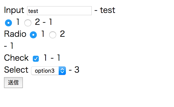
app.vue
<template>
  <div id="app">
    <form @submit.prevent="onSubmit">
      <div class="form-item">
        <vue-input label="Input" name="input" v-model="form.input"></vue-input>
        - {{ form.input }}
      </div>
      <div class="form-item">
        <vue-radio name="radio1" :value="1" v-model="form.radio1">1</vue-radio>
        <vue-radio name="radio1" :value="2" v-model="form.radio1">2</vue-radio>
        - {{ form.radio1 }}
      </div>
      <div class="form-item">
        <vue-group label="Radio" v-model="form.radio2">
          <vue-radio name="radio2" :value="1">1</vue-radio>
          <vue-radio name="radio2" :value="2">2</vue-radio>
        </vue-group>
        - {{ form.radio2 }}
      </div>
      <div class="form-item">
        <vue-check label="Check" name="check" :value="1" v-model="form.check">1</vue-check>
        - {{ form.check }}
      </div>
      <div class="form-item">
        <vue-select label="Select" name="select" v-model="form.select" :options="options">
          <template slot-scope="props">
            <option v-for="(option, key) in props.options"
                    :key="key"
                    :value="option.id"
                    :selected="form.select === option.id"
            >{{ option.value }}</option>
          </template>
        </vue-select>
        - {{ form.select }}
      </div>
      <div class="form-item">
        <button type="submit">送信</button>
      </div>
    </form>
  </div>
</template>

<script>
  export default {
    name: 'app',

    data: () => ({
      form: {
        input: 'test',
        radio1: 1,
        radio2: 1,
        check: 1,
        select: 3
      },
      options: [
        { id: 1, value: 'option1' },
        { id: 2, value: 'option2' },
        { id: 3, value: 'option3' },
        { id: 4, value: 'option4' }
      ]
    }),

    methods: {
      onSubmit () {
        console.log('送信')
      }
    }
  }
</script>
完成品
まとめ
Vue.jsでForm部品をComponent化してみました。
Elementを参考にしています。