今回困ったこと
このようなcssを組みたかった。
テキストは可変で横並び、
一つの要素が横幅の1/3ほどの大きさで横幅超えたら下に潜る感じのもの。
なおかつ、全要素の高さは一緒。
最初に試したこと
最近flexboxばっかり使っていた(flex便利)のでflexでどうにかこうにかできないものかと考えた。
結局行き着いた答えは
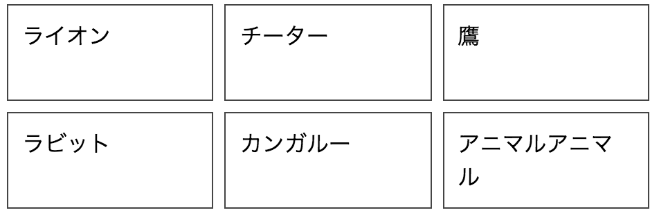
<ul>
  <li>
    ライオン
  </li>
  <li>
    チーター
  </li>
  <li>
    鷹
  </li>
  <li>
    ラビット
  </li>
  <li>
    カンガルー
  </li>
  <li>
    アニマルアニマル
  </li>
</ul>
ul {
  display: flex;
  flex-wrap: wrap;
  padding: 0;
  margin: 0;
  list-style-type: none;
}

li {
  width: 32%;
  min-height: 100px;
  padding: 10px;
  margin-right: 2px;
  margin-bottom: 2px;
  border: 1px solid #444;
  box-sizing: border-box;
}
完成形

見た目的にはやりたいことができた!!
ように思えたが、実はliにmin-height: 100px;を加えていた。。。
なので、テキストの量がめっちゃ増えた時にアウト。
解決策
最近、css grid layoutを
よく聞くけどまだ触っていなかった。。(恥ずかしい)
軽く調べてみて、これでいけるんじゃね?ってことで使ってみました。
css grid layout
css grid layoutとは二次元グリッドシステムだそうです。
簡単に言うと行と列があって、それらをcssで指定してデザインしていく?って感じですかね。
コード
htmlは変わりないので省略。
ul {
  display: grid;
  grid-template-columns: repeat(3, 1fr);
  grid-auto-rows: 1fr;
  grid-row-gap: 6px;
  grid-column-gap: 6px;
  padding: 0;
  margin: 0;
  list-style-type: none;
}

li {
  padding: 10px;
  margin-right: 2px;
  margin-bottom: 2px;
  border: 1px solid #444;
  box-sizing: border-box;
}
できたもの

解説
解説すると、
まず親要素(ここでいうul)にdisplay: gridを指定。
grid-template-columnsは横方向(列)のサイズを定義してます。
grid-row-gap: 6px; grid-column-gap: 6px;で余白を指定してます。