以前仕事で実装したフォームパーツから、radio/checkboxをデザイン換装するやりかたを紹介したいと思います。
デモ
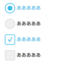
動くデモはこちら
http://codepen.io/skwbr/full/QbgpXq
コード
sample.html
<!--Radio-->
<input type="radio" id="r1" name="r"><label for="r1">あああああ</label>
<input type="radio" id="r2" name="r"><label for="r2">あああああ</label>
<input type="radio" id="r3" name="r"><label for="r3">あああああ</label>

<!--Checkbox-->
<input type="checkbox" id="c1"><label for="c1">あああああ</label>
<input type="checkbox" id="c2"><label for="c2">あああああ</label>
<input type="checkbox" id="c3"><label for="c3">あああああ</label>
sample.scss
$blue : #36bbe7;

/* Radio ---------------------------------------------------*/
input[type="radio"] {
    display: none;

    & + label {
        display: block;
        cursor: pointer;
        margin: 20px;

        /*通常時の見た目*/
        &::before {
            width: 30px;
            height: 30px;
            display: inline-block;
            content: "";
            border-radius: 17px;
            vertical-align: middle;
            border: 2px solid #dddddd;
            background-color: #f0f0f0;
            margin: -2px 5px 0 0;
            -webkit-transition: .1s;
                    transition: .1s;
        }
        /*hover時の見た目*/
        &:hover {
            color: #808080;
            &::before {
                background-color: #fff;
            }
        }
    }
    /*checked時の見た目*/
    &:checked + label {
        color: $blue;
        cursor: default;

        &::before {
            border-color: $blue !important;
            background-color: $blue !important;
            box-shadow: inset 0 0 0 7px #fff;
        }
    }
}

/* Checkbox ------------------------------------------------*/
input[type="checkbox"] {
    display: none;

    & + label {
        display: block;
        cursor: pointer;
        margin: 20px;

        /*通常時の見た目*/
        &::before {
            width: 34px;
            height: 34px;
            line-height: 32px;
            font-size: 42px;
            display: inline-block;
            vertical-align: middle;
            text-align: center;
            content: "\2713";
            color: transparent;
            padding: 0;
            border-radius: 5px;
            border: 2px solid #dddddd;
            background: #f0f0f0;
            margin: -2px 5px 0 0;
            -webkit-transition: .1s;
                    transition: .1s;
            -webkit-box-sizing: border-box;
               -moz-box-sizing: border-box;
                    box-sizing: border-box;
        }
        /*hover時の見た目*/
        &:hover {
            color: #808080;
            &::before {
                background-color: #fff;
            }
        }
    }
    /*checked時の見た目*/
    &:checked + label {
        color: $blue;
        &::before {
            font-size: 25px;
            background: #fff !important;
            border-color: $blue !important;
            color: $blue !important;
        }
    }
}
js
/* JSはなし */
説明
画像使わないで無理やりやってるため余分なCSSが多いのですが、
やってることはざっくり下記です。
- まずデフォルトのradio/checkboxを非表示
- その代わりに
labelのbefore擬似要素で見た目を表現 -
input:checked + labelの隣接セレクタを使用してチェック時の見た目を表現 -
transitionを使用してくどくない程度にアニメーション演出を付与する
備考
for="" と id=""でのペアリングをしたくない場合は、
html
<label><input type="radio"><span>あああああ</span></label>
のように組むといいでしょう。
隣接セレクタを使用したいので、inputタグの弟タグとして上記例ではspanで囲んでいます。
また隣接セレクタやbefore/after擬似要素に対応していない古いブラウザにはデフォルトのradio/checkboxを表示させる対応になってしまいます。
古いブラウザ含めてデザインを反映したい場合は、素直に画像やJSを使用するのがよいでしょう。