今天想要在 Android 上達到「平均分佈按鈕」這件事,
於是就在 linear layout 裡面放了兩顆按鈕。
放失敗之後,
就去查一下要怎麼達成這個 layout
設定權重
於是就查到有個 layout_weight 屬性 (參考)
如果需要再 linear layout 裡面平均分佈的話,
需要把 UI 元件加上
layout_weight="1"
設定的值(在這裡就是那個 "1" )
就是代表這個子 UI 在這個 layout 裡面分佈的大小;
當數值越大,佔據的空間就會越大,
預設則是 0
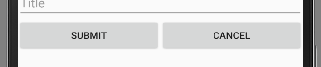
實例
我有一個 leaner layout , 裡面想要水平分佈兩個按鈕,分別是 submit 和 cancel ,就可以這樣寫:
<LinearLayout
    android:orientation="horizontal"
    android:layout_width="match_parent"
    android:layout_height="wrap_content">

    <Button
        android:text="Submit"
        android:layout_width="0dp"
        android:layout_height="wrap_content"
        android:layout_weight="1"/>

    <Button
        android:text="Cancel"
        android:layout_width="0dp"
        android:layout_height="wrap_content"
        android:layout_weight="1"/>

</LinearLayout>
結果圖:
不同排列方向
根據 Android 的官方文件,
如果要讓子畫面能夠分佈一樣的空間
水平排列
如果是在 horizontal linear layout ,
-
android:layout_width="0dp"- 寬要設成0dp android:layout_weight="1"
垂直排列
反之在 vertical linear layout 的時候,
-
android:layout_height="0dp"- 高要設成0dp android:layout_weight="1"
執行環境
- Android Studio 2.2.2
- Android 7.0 (API level 24)