plotの勉強
pivotの勉強の際に作成したpythonでplotをしてみる。
データの可視化への試みです。
ざっくりしています。。。
import numpy as np
import pandas as pd

df = pd.read_csv(r'インプットファイル', index_col=0).drop(['日時','企業名','支払','返金'], axis=1)

df["日時"] = df["日時"].str.split(":").str[0]
print(c_nitiji)
data = pd.pivot_table(df, index='日時',  columns='種別',  values='金額', aggfunc=[sum])

data2 = data.fillna(0)

fig, ax = plt.subplots()
ax.plot(data2)
plt.savefig(r"アウトプット")
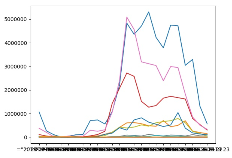
以下の図ができた。
みづらい。。。
もうちょっと改良予定。