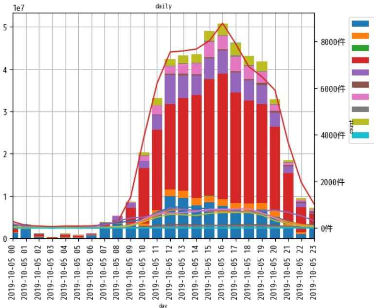
複数のグラフを一つに表示
気を付けたこと
・あまりカッコよくないが、「pivot_table」で集計内容を「sum」・「len」で2つ作成
で、2つのデータを一つのアウトプットにするように調整
項目を「sum」だけ「len」だけ読み込むなんてことできないかな。。。できそうだよね。。。。
・グリッド線は見づらいので片方だけ表示
ax1.grid(True)
ax2.grid(False)
・凡例の表示をオフ「legend=False」
・棒グラフの太さを調整「width=0.8」
data1_sum.plot(ax=ax1, kind='bar', legend=False, width=0.8, stacked=True)
data1_len.plot(ax=ax2, kind='line', legend=False)
・凡例は一緒に表示
・「bbox_to_anchor」で場所をグラフの外に
h1, l1 = ax1.get_legend_handles_labels()
h2, l2 = ax2.get_legend_handles_labels()
ax1.legend(h1, l1, bbox_to_anchor=(1.1,1), loc='upper left',fontsize=10)
コード
※前と同じデータ使ってるけどインデックス名称が変わりやがった。。。
import pandas as pd
import matplotlib.pyplot as plt
from matplotlib import ticker
from matplotlib import dates as mdates
import numpy as np


df = pd.read_csv(r'インプットファイル', index_col=0).drop(['Company Code','Company Name','Store Code','Store Name','Payment Number','Refund Number'], axis=1)
df_pre = df["Date/Time"].str.split("\"").str[1]
df["Date/Time"] = df_pre.str.split(":").str[0]


 #要素の内容を確認
 #要素一覧
pay_syu = df["Payment Option"]
 #要素をカウント
pay_s  = pay_syu.unique()

 #集計
 #合算(aggfunc→sum)
data1_sum = pd.pivot_table(df, index='Date/Time',  columns='Payment Option',  values='Amount', aggfunc=[sum]).fillna(0)
 #件数(aggfunc→len)
data1_len = pd.pivot_table(df, index='Date/Time',  columns='Payment Option',  values='Amount', aggfunc=[len]).fillna(0)

 #plot
 #区画
fig = plt.figure(figsize=(8,6))
ax1 = fig.add_subplot()
ax2	= ax1.twinx()

 #plot
data1_sum.plot(ax=ax1, kind='bar', legend=False, width=0.8, stacked=True)
data1_len.plot(ax=ax2, kind='line', legend=False)

 #凡例情報取得
h1, l1 = ax1.get_legend_handles_labels()
h2, l2 = ax2.get_legend_handles_labels()
 #凡例情報結合
ax1.legend(h1, l1, bbox_to_anchor=(1.1,1), loc='upper left',fontsize=10)

ax1.set_title("daily", fontsize=8)
ax1.set_xlabel("day", fontsize=7)
ax1.set_ylabel("money", fontsize=7)
ax2.set_ylabel("count", fontsize=7)

 #grid線 ax1は残してax2は消す
ax1.grid(True)
ax2.grid(False)

 #グラフのグリッドをグラフの本体の下にずらす
ax1.set_axisbelow(True)

 #軸の目盛りの単位を変更する
ax2.yaxis.set_major_formatter(ticker.FormatStrFormatter("%d件"))

plt.savefig(r'アウトプット' ,bbox_inches='tight')

plt.close()
展望
「Payment Option」要素のユニーク件数をカウント
要素ごとにデータを作成し、グラフを作成。
subplotsで複数表示ってしたい。