plotの勉強
複数のcsvを読み込むことはできたが、
plotした図は正直、、、な状態だったので、どうにか見れる状態にすることが目的。
線グラフ
import numpy as np
import pandas as pd
import matplotlib.pyplot as plt
import glob
import csv

csv_files = glob.glob(r'インプットファイルフォルダ\*.csv')
list = []

for f in csv_files:
    list.append(pd.read_csv(f, index_col=0).drop(['企業コード','企業名称','店舗コード','店舗名称','支払番号','返金番号'], axis=1))
df = pd.concat(list)

df_pre = df["日時"].str.split("\"").str[1]
df_pre_pre = df_pre.str.split(" ").str[0]
df["日時"] = df_pre_pre.str.split(":").str[0]

data = pd.pivot_table(df, index='日時',  columns='種別',  values='金額', aggfunc=[sum])
data2 = data.fillna(0)


# plotはここからdata2を使用
fig = plt.figure(figsize=(8,6))
ax = fig.add_subplot(1,1,1)

data2.plot(ax=ax ,kind='bar' ,stacked=True)

plt.title("dayly",fontsize=14)
plt.xlabel("day", fontsize=7)
plt.ylabel("money", fontsize=7)
plt.subplots_adjust(bottom=0.3)
plt.tick_params(labelsize=5)
plt.legend(bbox_to_anchor=(1.0,1), loc='upper left',borderaxespad=0,fontsize=10)
plt.subplots_adjust(left = 0.1, right = 0.8)

plt.savefig(r"アウトプット")
できた図
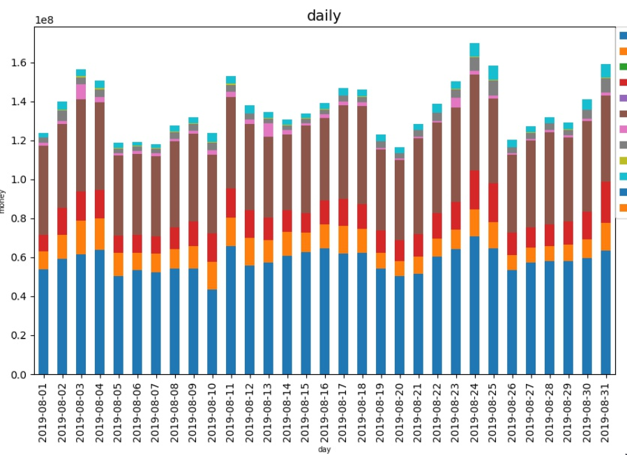
注意したのは↓
stacked=True
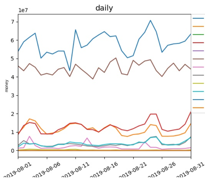
折れ線
# plotはここからdata2を使用するよん
fig = plt.figure(figsize=(8,6))
ax = fig.add_subplot(1,1,1)

data2.plot(rot=30)

plt.title("dayly",fontsize=14)
plt.xlabel("day", fontsize=7)
plt.ylabel("money", fontsize=7)
plt.subplots_adjust(bottom=0.3)
plt.tick_params(labelsize=10)
plt.legend(bbox_to_anchor=(1.0,1), loc='upper left',borderaxespad=0,fontsize=10)
plt.subplots_adjust(left = 0.1, right = 0.8)

plt.savefig(r"アウトプット")
できた図。