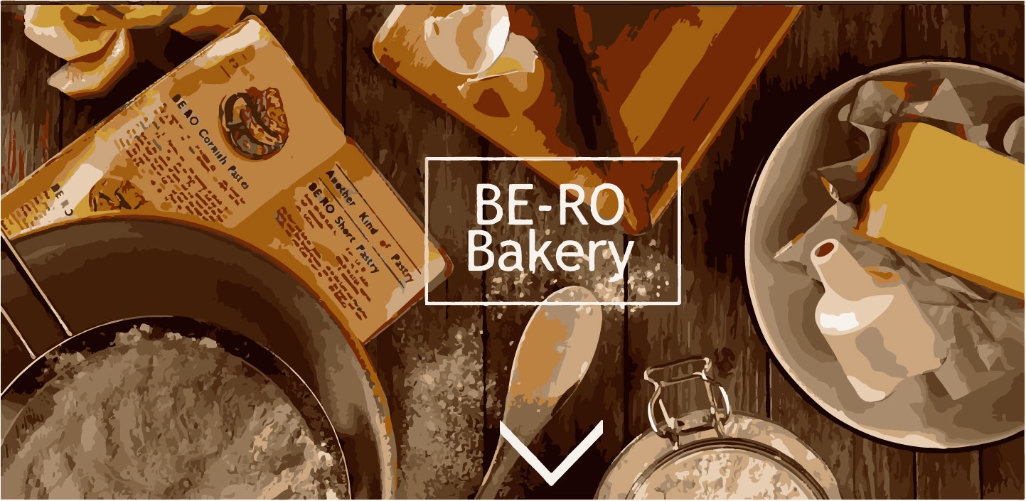
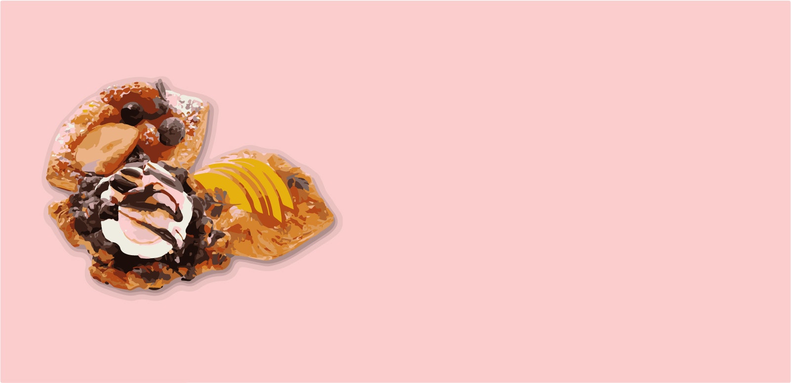
パンを紹介するサイトを作ろう!
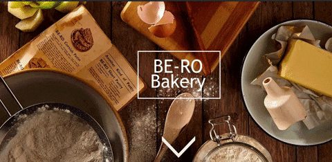
上の画像のようなサイトを作ってみよう!
素材
はじめる前に、これから作業を行うフォルダの中にmaterialというフォルダとstylesheetというフォルダを作っておこうmaterial`は「要素」という意味だ。この中に画像を入れたりしてくれ!
stylesheetは「スタイルシート」、つまりcssファイルはこの中に入れることになるぞ!
htmlの作成
index.htmlというファイルを作ってくれ!
<!DOCTYPE html>
<html lang="en">
  <head>
    <meta charset="UTF-8"/>

    <title>Document</title>
  </head>
  <body>
    <main>

    </main>
  </body>
</html>
ここまで打ち込んでみよう!
これはHTMLの形式的な形になるぞ!
ブラウザ( Chromeかfirefox)にindex.htmlをドラッグアンドドロップしてみよう
何も表示されない真っ白い画面が出てきたら成功だ!
それではbodyタグの中に下の文を打っていこう
<section class="page top">
<div class="parallax"></div>
</section>
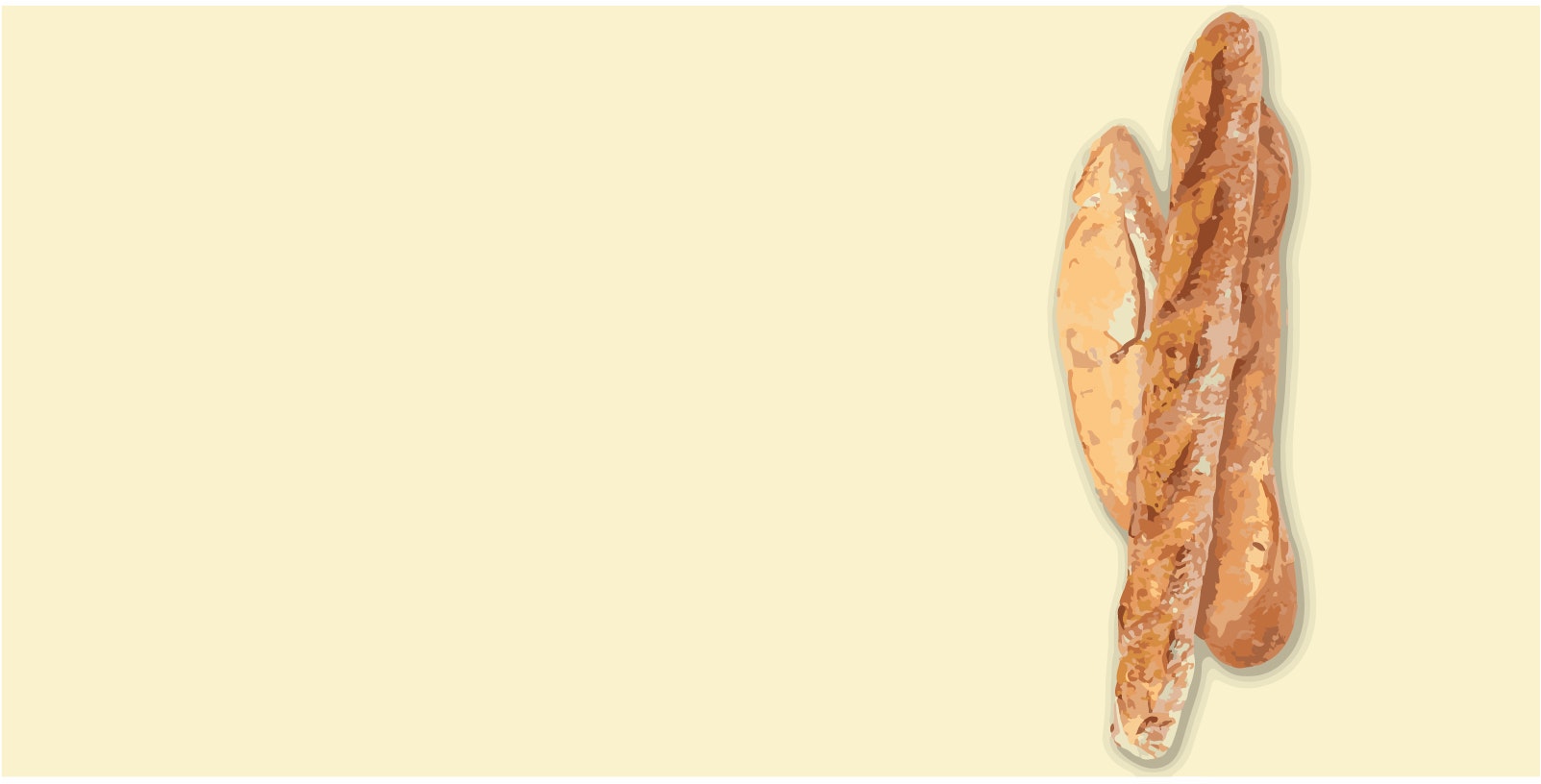
<section class="page1">
<h2>Baguette</h2>
<p>好きなぶんを入れよう!</p>
<div class="parallax"></div>
</section>
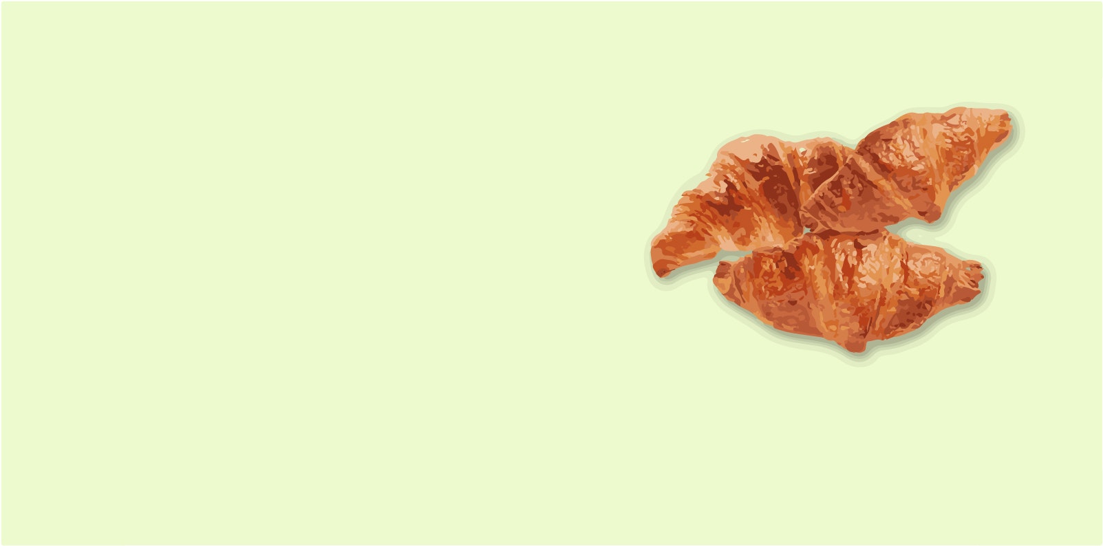
<section class="page2">
<h2>Croissant</h2>
<p>好きなぶんを入れよう!</p>
<div class="parallax"></div>
</section>
<section class="page3">
<h2>Danish</h2>
<p>好きなぶんを入れよう!</p>
<div class="parallax"></div>
</section>
次にmainタグの中に上記の文を打ち込もう!
「好きな文を入れよう!」の中には好きな文を入れてもいいし、loremと打ち込みTabキーを押してみてね
Lorem ipsum dolor sit amet, consectetur adipisicing elit, sed do eiusmod tempor
 incididunt ut labore et dolore magna aliqua. Ut enim ad minim veniam, quisnostrud exercitation ullamco laboris nisi ut aliquip ex ea commodo consequat. Duis aute irure dolor in reprehenderit in voluptate velit esse cillum dolore eu fugiat nulla pariatur. Excepteur sint occaecat cupidatat non proident, sunt in culpa qui officia deserunt mollit anim id est laborum.
と長い文章が出てくるはずだ。文章自体に何も意味を持たず、いわゆる「ここに文字をいれるとこういうふうに見えるぞ」というやつだ。
これは君が使っているであろうVScodeやAtomに入っているemmetという機能のおかげだ。
ものによってはemmetが入ってない場合もある。
reset.css
次にstylesheetというフォルダの中にreset.cssというファイルを作ろう
作ったら下のcssをコピーペーストして保存。
コピーペーストの仕方はmacのcommand+Cを押して、貼り付けたい所にcommand+Vをおそう
@charset "UTF-8";
body, div, dl, dt, dd, p, ul, ol, li, form, textarea, input, table, th, tr, td, h1, h2, h3, h4, h5, blockquote, figure {
  margin: 0;
  padding: 0;
  vertical-align: baseline;
}

body {
  width: 100%;
  -webkit-text-size-adjust: none;
  -ms-text-size-adjust: 100%;
  line-height: 1.6;
  font-family: Arial, "Hiragino Kaku Gothic ProN", "ヒラギノ角ゴ ProN W3", "メイリオ", Meiryo, sans-serif;
  font-size: 16px;
  position: relative;

}

article, aside, details, figcaption, figure, footer, header, hgroup, menu, nav, section {
  display: block;
}

h1, h2, h3, h4, h5, th {
  font-weight: normal;
}

table {
  border-collapse: collapse;
  border-spacing: 0;
}

ul, ol {
  list-style: none;
}

a {
  display: block;
  text-decoration: none;
}

img {
  border: 0;
  vertical-align: bottom;
}

input, select {
  vertical-align: middle;
}


/* clearfix */

.clearfix:after {
  content: "";
  display: block;
  clear: both;
}
これはreset.cssという魔法のスタイルシートだ!。
HTMLでサイトを作るときはこいつを読み込んでおくと、ul liタグの邪魔な黒点とかが表示されなくなってくれたり、bodyタグになぜかついているmarginも0になってくれるぞ!
HTMLの方でもreset.cssを読み込んでおこう
<!DOCTYPE html>
<html lang="en">
  <head>
    <meta charset="UTF-8"/>
    <link rel="stylesheet" href="stylesheet/reset.css"/>
    <title>Document</title>
なんでstylesheet/reset.cssと書くんだって??
それはファイルのデータ構造がこうなっているからだ
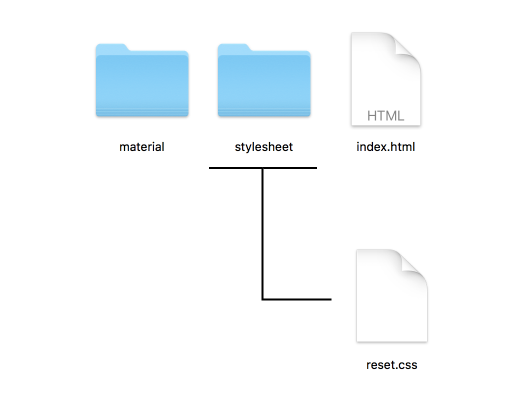
stylesheet/reset.cssはindex.htmlと同じ階層にあるstylesheetというフォルダの中に入っているreset.cssを参照する。という意味だ
stylesheet/reset.cssを「スタイルシートの中のreset.css」と読めば覚えやすいね!
スタイルシート
それではいよいよcssをガツガツ書いて行こう
style.cssという新しいファイルを作ろう!
main {
  overflow: hidden;
}
それではmainタグの高さを3000pxにしてみよう
上の文章になにを加えたらmainの高さは3000pxになるかな
section {
  width: 100%;
  min-height: calc(100vh * 1.5);
  position: relative;
  overflow: hidden;
}

section h2 {
  top: 200px;
  left: 100px;
  position: absolute;
  z-index: 100;
  color: #333;
}
それではsection要素のh2の文字の大きさを大きくしてみよう。なんpxにしたらいいかな
section p {
  top: 400px;
  left: 100px;
  width: 50%;
  position: absolute;
  color: #444;
  line-height: 1.8;
  z-index: 50;
}
position:ralative;と指定することで要素を相対的に決めることができます。
下の四つを加えることで決められた分だけ離すぞ!。
top:10px;とすることで上から10px離す。
left:10px;とすることで左から10px離す。
bottom:10px;とすることで下から10px離す。
right:10px;とすることで右から10px離す。
.page {
  background-image: url(画像のパス);
  background-attachment: fixed;
  background-position: 50% 0;
  background-repeat: no-repeat;
  background-size: cover;
}
こんかい新しく使うbackground-attachmentこれはスクロールした時の背景の動きに手を加えることができるプロパティだ。fixedのほかにもscrollがあるが、今回はfixedを選ぼう。
background-positionこれは背景画像のどの位置を表示するかを決めることができる。
右が上下で左が左右だ。それぞれ値を変えることで位置をへんこうできるぞ。
.page1 .parallax {
  background-attachment: fixed;
  background-position: 50% 0;
  background-repeat: no-repeat;
  background-size: cover;
  background-image: url(画像のパス);
  min-height: calc(100vh * 1.5);
  width: 100%;
}
min-heightこいつは以外と便利だ! 要素の最低限の大きさを決めることができる。100pxと指定すれば100pxより小さくならない。逆にmax-height もあるので覚えておこう。
.page2 .parallax {
  background-attachment: fixed;
  background-position: 50% 0;
  background-repeat: no-repeat;
  background-size: cover;
  background-image: url(画像のパス);
  min-height: calc(100vh * 1.5);
  width: 100%;
}
.page3 .parallax {
  background-attachment: fixed;
  background-position: 50% 0;
  background-repeat: no-repeat;
  background-size: cover;
  background-image: url(画像のパス);
  min-height: calc(100vh * 1.5);
  width: 100%;
}

.page3 p, .page3 h2 {
  left: 600px;
}
See the Pen ukunmisson by Usagino (@usagino) on CodePen.