この記事は TeX & LaTeX Advent Calendar 2015 の19日目の記事です。
昨日は VoD さんでした。明日は hak7a3 さんです。
この記事には,PGFPlots,gnuplot,TikZの成分とちょっとだけpgfmath,TeX言語のスパイスが含まれています.
解説動画
リポジトリ
まえがき
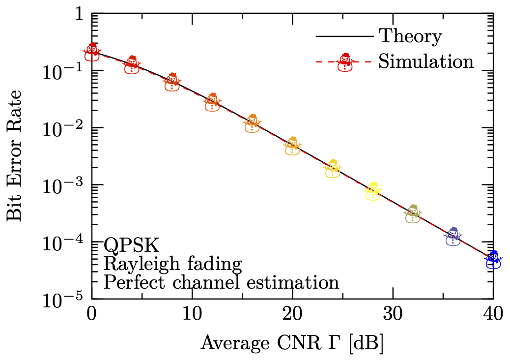
LaTeXで論文を書く場合,PDF形式の高品位なグラフの生成が必須となります1.グラフを生成する代表的なソフトウェアとしては,gnuplotなどが挙げられ,なかでもpdflatexやcairolatexドライバにより生成される図の品質は,本文とのフォントの整合性なども勘案しても,極めて高いと考えられます.以下に示すのは,gnuplotのcairolatexドライバにより生成されるグラフの一例です.
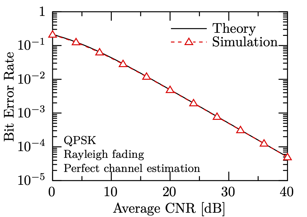
上図に示すように,生成されたグラフの見た目には何の問題もありません.しかしながら,同グラフを生成するgnuplotプログラムは,お世辞にも美しいとは言えません.
set term cairolatex pdf standalone size 8.5cm,6cm linewidth 3
set output "gnuplot-cairolatex.tex"

set border back
set key reverse Left samplen 5 at 38,0.5 spacing 1.2

set log y
set xrange [0:40]; set yrange [1e-5:1]
set xtics 10 scale 2,1; set ytics scale 2,1 add ("1" 1)
set mxtics 2; set mytics 10
set format y "$10^{%L}$"
set xlabel "Avarage CNR [dB]"; set ylabel "Bit Error Rate"

set label 1 "\\footnotesize\\begin{tabular}{l}QPSK\\\\Rayleigh fading\\\\Perfect channel estimation\\end{tabular}" at 2,6e-5 left

plot \
  (1-1/sqrt(1+2/(10**(x/10))))/2 title "Theory" linetype -1, \
  "data.txt" with lines linecolor "red" dashtype (10,10) notitle, \
  "data.txt" with points pointtype 9 linecolor "white" notitle, \
  "data.txt" with points pointtype 8 linecolor "red" notitle, \
  "dummy.txt" with linespoints pointinterval -1 pointtype 8 linecolor "red" dashtype (10,10) title "Simulation"
いろいろ言いたいことはありますが,プロットの白抜きを実現するために2,1つの同じデータに対して4回もプロットを行う必要があるのはいただけません3.
そこで,本項では,TeXでグラフ生成できるのPGFPlotsを用いて,きれいなグラフを生成する方法について説明します.
PGFPlots: まずは作ってみる
PGFPlotsには,サンプルを交えた読みやすいマニュアルが付属しています.普通のTeXの環境であれば,texdoc pgfplotsでそのマニュアルを閲覧することができます.PGFPlotsのマニュアルは504ページしかなく,初めにチュートリアルがあるというような,初学者に優しい構成となっております.チュートリアルに従いコードを書くことにより,以下に示すようなグラフを簡単に作成することができます4.
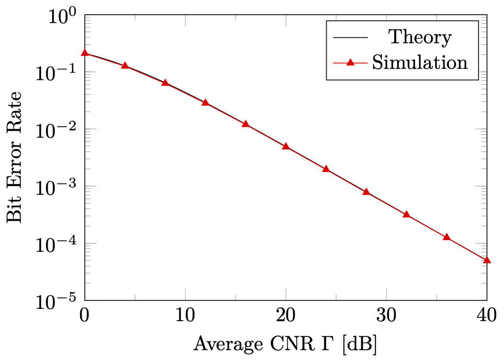
上図のグラフを生成するPGFPlotsプログラムは,以下のようになります.なお,このプログラムは,gnuplotにパスを通した状態で,--shell-escape付きでlualatexかpdflatexによりコンパイルする必要があります.platexはよした方が良いと思います.
\documentclass[tikz]{standalone}
\usepackage{pgfplots}
\pgfplotsset{
  compat=1.17,
  major tick length=0.2cm,
  minor tick length=0.1cm,
}
\begin{document}
\begin{tikzpicture}
\begin{semilogyaxis}[
  width=85mm, height=65mm,
  domain=0:40,
  xmin=0, xmax=40,
  ymin=1e-5, ymax=1,
  minor x tick num=1,
  xlabel={Avarage CNR $\Gamma$ [dB]},
  ylabel={Bit Error Rate},
  legend entries={Theory,Simulation},
]
  \addplot[smooth] gnuplot {(1-1/sqrt(1+2/(10**(x/10))))/2};
  \addplot[sharp plot,red,mark=triangle*] table {data.txt};
\end{semilogyaxis}
\end{tikzpicture}
\end{document}
プログラムの解説
\documentclass[tikz]{standalone}
\usepackage{pgfplots}
PGFPlotsを用いてPDF画像を生成する旨を宣言します.standaloneパッケージのtikzオプションにより,自動的に余白がいい感じになります5.
\pgfplotsset{
  compat=1.17,
  major tick length=0.2cm,
  minor tick length=0.1cm,
}
compat=1.17は,PGFPlots 1.17の機能セットを使用することを宣言します6.
また,major tick lengthとminor tick lengthは,それぞれグラフの大目盛りおよび小目盛りの長さを指定しています7.
\begin{semilogyaxis}[...]
  ...
\end{semilogyaxis}
semilogyaxis環境は,y軸片対数グラフを実現する環境です.同種の環境として,x軸側片対数グラフ を実現するsemilogxaxis環境,両対数グラフを実現するloglogaxis環境,普通のグラフを実現するaxis環境等が挙げられます8.
  width=85mm, height=65mm,
  domain=0:40,
  xmin=0, xmax=40,
  ymin=1e-5, ymax=1,
  xlabel={Avarage CNR $\Gamma$ [dB]},
  ylabel={Bit Error Rate},
  legend entries={Theory,Simulation},
width,heightオプションは,グラフ全体のサイズを指定します9.
domainオプションは,後述する関数描画に与えるxの値の範囲を指定します10.
xmin,xmaxオプションは,x軸方向におけるグラフの描画範囲を指定します.ymin,ymaxオプションは,y軸方向において同様の指定を行います11.
xlabel,ylabelオプションは,それぞれx軸およびy軸のラベルを指定します.上に示したように,軸ラベルには数式環境を含めることも可能です12.
legend entriesオプションは,凡例に表示されるラベルを指定します.本オプションでは,グラフに表示される全てのプロットに対する凡例ラベルを,カンマ区切りで並べることにより一度に指定します4.
\addplot[smooth] gnuplot {(1-1/sqrt(1+2/(10**(x/10))))/2};
\addplot[sharp plot,red,mark=triangle*] table {data.txt};
addplotは,データの描画を指示するPGFPlotsの命令です.addplotを発行することにより,実際にグラフエリアにデータが描画され,凡例に項目が追加されます.
1つめのaddplotは,指定した関数の曲線をグラフエリアに描画します.smoothオプションの指定により,関数のグラフはなめらかな曲線により示されるようになります.また,gnuplotコマンドを指定することにより,関数の計算をgnuplotプログラムが行うようになります.gnuplotに計算を委譲する利点としては,計算がTeXで行うより高速である点とerfcなどの特殊関数が使用できるようになる点が挙げられます.
2つめのaddplotは,外部のテキストファイルの内容をプロットします.
テキストファイルの形式は,2カラムタブ区切りであることが望ましいですが,x,y,x index,y indexオプションにより,挙動を変更することもできます.sharp plotオプションの指定により,プロット間が直線でせつぞくされるようになります.mark=triangle*オプションにより,プロットの形が指定でき,triangle*では塗りつぶし三角形となります13.
PGFPlots+TikZ: もっと調整したい!
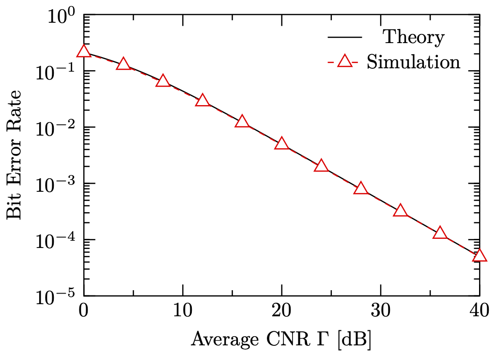
前節で示したグラフは,gnuplotで作成したグラフと比べると,プロットが小さい,白抜きになっていない等の問題があり,gnuplotではないもので作成したことがすぐにばれてしまいます14.
そこで,PGFPlotsのマニュアルのReferenceを読むことにより,以下のようなグラフを実現することができます.
\documentclass[tikz]{standalone}
\usepackage{pgfplots}
\tikzset{% スタイルの作成
  pointtype triangle/.style={mark=triangle*,mark size=4pt},
  every mark/.style={fill=white,solid}
}
\pgfplotsset{% グラフ全体の見た目の設定
  compat=1.17,
  major tick length=0.2cm,
  minor tick length=0.1cm,
  every axis/.style={semithick},
  tick style={semithick,black},
}
\begin{document}
\begin{tikzpicture}[thick]
\begin{semilogyaxis}[% パラメータなどの設定
  width=85mm, height=65mm,
  domain=0:40,
  xmin=0, xmax=40,
  ymin=1e-5, ymax=1,
  minor x tick num=1,
  xlabel={Avarage CNR $\Gamma$ [dB]},
  ylabel={Bit Error Rate},
  legend entries={Theory,Simulation},
  legend style={draw=none,fill=none},
]
  % 理論特性
  \addplot[smooth] gnuplot {(1-1/sqrt(1+2/(10**(x/10))))/2};

  % 復調特性
  \addplot[sharp plot,pointtype triangle,dashed,red] table {data.txt};
\end{semilogyaxis}
\end{tikzpicture}
\end{document}
PGFPlots+TeX: フックして強引に修正する
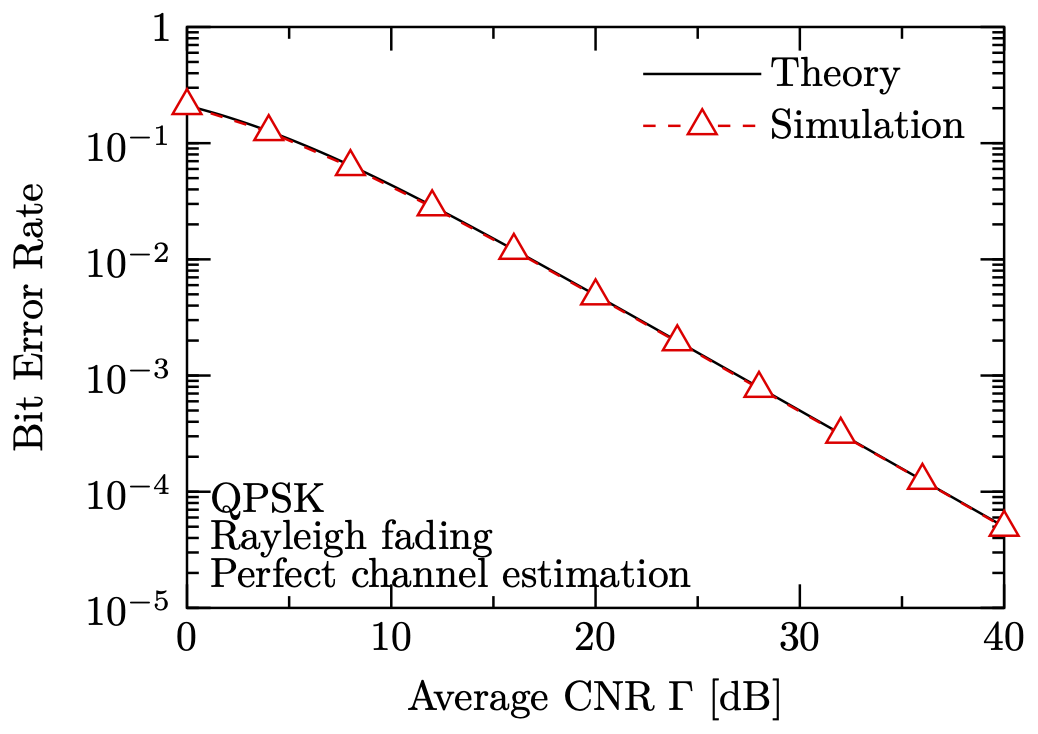
前節で示したグラフは,とても良い見た目になってきましたが,10^0が1となっていないという問題があり,gnuplotにはあと一歩及びません.そこで,マニュアルに記載のあるPGFPlotsのTeXフックを用い,内部の動作を書き換えることによりこの問題を解決します.
\documentclass[tikz]{standalone}
\usetikzlibrary{matrix}
\usepackage{pgfplots}
\tikzset{% スタイルの作成
  pointtype triangle/.style={mark=triangle*,mark size=4pt},
  every mark/.style={fill=white,solid},
  south west label/.style={
    matrix,matrix of nodes,
    anchor=south west,at={(rel axis cs:0.01,0.01)},
    nodes={anchor=west,inner sep=0},
  },
}
\pgfplotsset{% グラフ全体の見た目の設定
  compat=1.17,
  major tick length=0.2cm,
  minor tick length=0.1cm,
  every axis/.style={semithick},
  tick style={semithick,black},
  legend cell align=left,
  legend image code/.code={%
    \draw[mark repeat=2,mark phase=2,#1]
      plot coordinates {(0cm,0cm) (0.5cm,0cm) (1.0cm,0cm)};
  },
  log number format basis/.code 2 args={
    \pgfmathsetmacro\e{#2}
    \pgfmathparse{\e==0}\ifnum\pgfmathresult>0{1}\else
    \pgfmathparse{\e==1}\ifnum\pgfmathresult>0{10}\else
    {$#1^{\pgfmathprintnumber{\e}}$}\fi\fi},
}
\begin{document}
\begin{tikzpicture}[thick]
\begin{semilogyaxis}[% パラメータなどの設定
  width=85mm, height=65mm,
  domain=0:40,
  xmin=0, xmax=40,
  ymin=1e-5, ymax=1,
  minor x tick num=1,
  xlabel={Avarage CNR $\Gamma$ [dB]},
  ylabel={Bit Error Rate},
  legend entries={Theory,Simulation},
  legend style={draw=none,fill=none},
]
  % 理論特性
  \addplot[smooth] gnuplot {(1-1/sqrt(1+2/(10**(x/10))))/2};

  % 復調特性
  \addplot[sharp plot,pointtype triangle,dashed,red] table {data.txt};

  \matrix[south west label] {
    QPSK \\
    Rayleigh fading \\
    Perfect channel estimation \\
  };
\end{semilogyaxis}
\end{tikzpicture}
\end{document}
結論
PGFPlotsにおいても,マニュアルをよく読むことによって,任意のスタイルに従う非常に高品位なグラフを生成することができます.PGFPlotsならば,こんなグラフもお手の物です.
-
本記事は高品位なグラフに関する記事なので,EPS形式の図表については考慮しません ↩
-
gnuplotは様々な出力ドライバをサポートしているため,だいたいの機能はドライバ非依存に実現される必要があり,その結果,非常に貧弱な白抜きしか実装されていません. ↩
-
複数のデータを含める場合,プロットの色・形・線種・重なり順・凡例を制御するためにかなりカオスなプログラムが必要となり,作業量は4倍では済みません.マクロを用いた簡略化を試みましたが,原理的にほぼ実現不可能であることがわかり断念しました. ↩
-
Christian F., Manual for Package pgfplots, Solving a Real Use–Case: Scientific Data Analysis, pp.23-28, Revision 1.12.1 (2015/05/02). ↩ ↩2
-
Christian F., The standalone Package, Usage of the standalone class, p.11, Version v1.2 – 2015/07/15. ↩
-
Martin S., Manual for Package pgfplots, Upgrade remarks, p.8, Revision 1.12.1 (2015/05/02). ↩
-
Martin S., Manual for Package pgfplots, Tick Fine-Tuning, p.293, Revision 1.12.1 (2015/05/02). ↩
-
Martin S., Manual for Package pgfplots, The Axis-Environments, pp.39-40, Revision 1.12.1 (2015/05/02). ↩
-
Martin S., Manual for Package pgfplots, Common Scaling Options, pp.237-238, Revision 1.12.1 (2015/05/02). ↩
-
Martin S., Manual for Package pgfplots, Computing Coordinates with Mathematical Expressions, p.54, Revision 1.12.1 (2015/05/02). ↩
-
Martin S., Manual for Package pgfplots, Configuration of Limits Ranges, p.270, Revision 1.12.1 (2015/05/02). ↩
-
Martin S., Manual for Package pgfplots, Labels, p.200-201, Revision 1.12.1 (2015/05/02). ↩
-
Martin S., Manual for Package pgfplots, Labels, The \addplot Command: Coordinate Input, p.40-72, Revision 1.12.1 (2015/05/02). ↩
-
gnuplotであればいいのかというと,そういうわけではありませんが... ↩