背景
下記の仕様を見たす画面を作るために、チェックボックスの色を動的に変更する必要がありました。
- チェックボックスが全て選択済みの場合のみ、ボタンタップで処理を行う
- 未選択のチェックボックスがある状態でボタンをタップした場合は、未選択のチェックボックスを警告色にする
- 他のチェックボックスの状態が変わったら再度デフォルト色に戻す
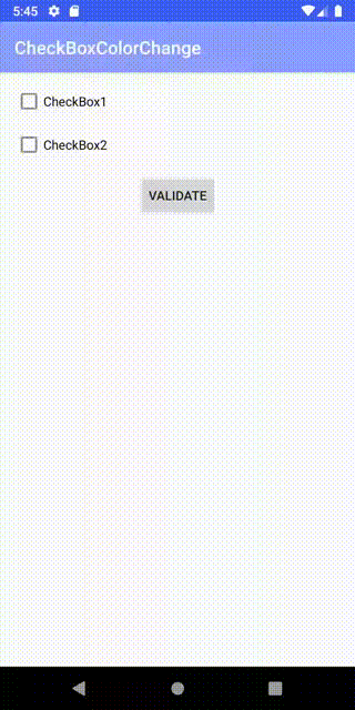
完成イメージはこちらです。
実装方針
MVVM + DataBindingで実装します。
ViewModelでチェックボックスの色と選択状態を保持します。
チェックボックスの色はColorStateListで実装します。
デフォルト色と警告色の2種類のColorStateListをxmlで用意します。
チェックボックスの色を変えるにはCompoundButtonの属性buttonTintを変更する必要があります。
デフォルトではbuttonTintにColorStateListのリソースIDをバインドできないため、カスタムBindingAdapterを実装します。
ソースコード
完全なソースコードはGithubで公開しています。
下記はポイントとなるコードの抜粋です。
main_fragment.xml
<?xml version="1.0" encoding="utf-8"?>
<layout xmlns:android="http://schemas.android.com/apk/res/android"
    xmlns:app="http://schemas.android.com/apk/res-auto"
    xmlns:tools="http://schemas.android.com/tools">

    <data>

        <variable
            name="viewModel"
            type="com.example.checkboxcolorchange.ui.main.MainViewModel" />
    </data>

    <androidx.constraintlayout.widget.ConstraintLayout
        android:id="@+id/main"
        android:layout_width="match_parent"
        android:layout_height="match_parent"
        tools:context=".ui.main.MainFragment">

        <CheckBox
            android:id="@+id/checkBox1"
            android:layout_width="wrap_content"
            android:layout_height="wrap_content"
            android:layout_margin="16dp"
            android:checked="@{viewModel.isCheckedCheckBox1}"
            android:onClick="@{() -> viewModel.onCheckedChanged(@id/checkBox1)}"
            android:text="CheckBox1"
            app:buttonTint="@{viewModel.checkBox1Color}"
            app:layout_constraintStart_toStartOf="parent"
            app:layout_constraintTop_toTopOf="parent" />

        <CheckBox
            android:id="@+id/checkBox2"
            android:layout_width="wrap_content"
            android:layout_height="wrap_content"
            android:layout_margin="16dp"
            android:checked="@{viewModel.isCheckedCheckBox2}"
            android:onClick="@{() -> viewModel.onCheckedChanged(@id/checkBox2)}"
            android:text="CheckBox2"
            app:buttonTint="@{viewModel.checkBox2Color}"
            app:layout_constraintStart_toStartOf="parent"
            app:layout_constraintTop_toBottomOf="@+id/checkBox1" />

        <Button
            android:id ="@+id/button"
            android:layout_width="wrap_content"
            android:layout_height="wrap_content"
            android:layout_margin="16dp"
            android:onClick="@{() -> viewModel.onClickValidateButton()}"
            android:text="Validate"
            app:layout_constraintEnd_toEndOf="parent"
            app:layout_constraintStart_toStartOf="parent"
            app:layout_constraintTop_toBottomOf="@+id/checkBox2" />
    </androidx.constraintlayout.widget.ConstraintLayout>
</layout>
MainViewModel
package com.example.checkboxcolorchange.ui.main

import androidx.annotation.IdRes
import androidx.lifecycle.MutableLiveData
import androidx.lifecycle.ViewModel
import com.example.checkboxcolorchange.R

class MainViewModel : ViewModel() {
  val validated = MutableLiveData<Unit>()

  val isCheckedCheckBox1 = MutableLiveData<Boolean>(false)
  val isCheckedCheckBox2 = MutableLiveData<Boolean>(false)

  val checkBox1Color = MutableLiveData<Int>(R.color.check_box_color_valid)
  val checkBox2Color = MutableLiveData<Int>(R.color.check_box_color_valid)

  fun onCheckedChanged(@IdRes resId: Int) {
    checkBox1Color.value = R.color.check_box_color_valid
    checkBox2Color.value = R.color.check_box_color_valid

    when (resId) {
      R.id.checkBox1 -> isCheckedCheckBox1.value = isCheckedCheckBox1.value?.not()
      R.id.checkBox2 -> isCheckedCheckBox2.value = isCheckedCheckBox2.value?.not()
    }
  }

  fun onClickValidateButton() {
    if (!isValid()) {
      checkBox1Color.value = R.color.check_box_color_invalid
      checkBox2Color.value = R.color.check_box_color_invalid
      return
    }
    validated.value = Unit
  }

  private fun isValid() = isCheckedCheckBox1.value == true && isCheckedCheckBox2.value == true
}
CompoundButton.kt
package com.example.checkboxcolorchange.ui.extention

import android.widget.CompoundButton
import androidx.annotation.ColorRes
import androidx.core.content.ContextCompat
import androidx.databinding.BindingAdapter

@BindingAdapter("buttonTint")
fun CompoundButton.setButtonTint(@ColorRes resId: Int) {
  buttonTintList = ContextCompat.getColorStateList(context, resId)
}
check_box_color_valid.xml
<?xml version="1.0" encoding="utf-8"?>
<selector xmlns:android="http://schemas.android.com/apk/res/android">
    <item android:color="@color/valid" android:state_checked="false" />
    <item android:color="@color/colorPrimary" android:state_checked="true" />
</selector>
check_box_color_invalid.xml
<?xml version="1.0" encoding="utf-8"?>
<selector xmlns:android="http://schemas.android.com/apk/res/android">
    <item android:color="@color/invalid" android:state_checked="false" />
    <item android:color="@color/colorPrimary" android:state_checked="true" />
</selector>
参考リンク
◆CheckBoxのボタン色(buttonTint)属性について
https://developer.android.com/reference/android/widget/CompoundButton
◆ColorStateListとは?
https://developer.android.com/reference/android/content/res/ColorStateList
◆リソースIDからColorStateListを取得する方法
https://stackoverflow.com/questions/12476189/how-to-use-colorstatelist-in-android/18594364