Just Upload & Plot. Easy visualize tool via http.
UplodしてPlotするだけの簡単なhttp経由の可視化ツールです。
csvまたはxlsファイルをブラウザ上のUpload欄に上げるだけでさまざまな形式のグラフを描きます。

csv, xlsを作成時の注意
- 1行目の1列目はx軸のタイトルになります。
- 1列目の2行目以降はx軸になります。
- 1行目の2列目以降は凡例になります。
- 2行目以降の2列目以降がデータになります。
- ファイル名はグラフタイトルになります。
- ファイル名に
_が含まれている時、最初の_で区切られて、前半部分がグラフタイトル、後半部分がy軸のタイトルになります。
対応しているグラフ形式
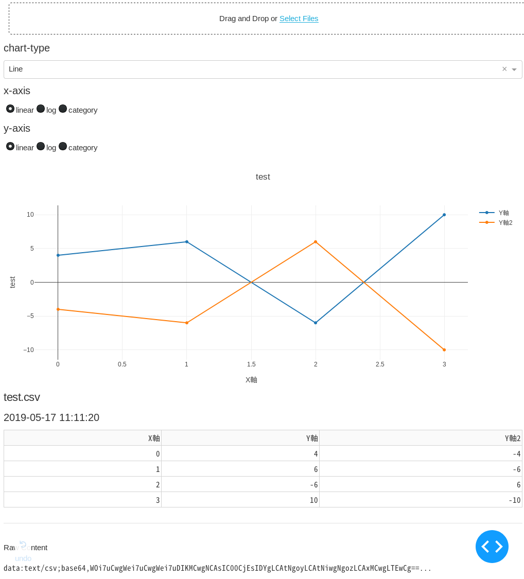
- 'Line'
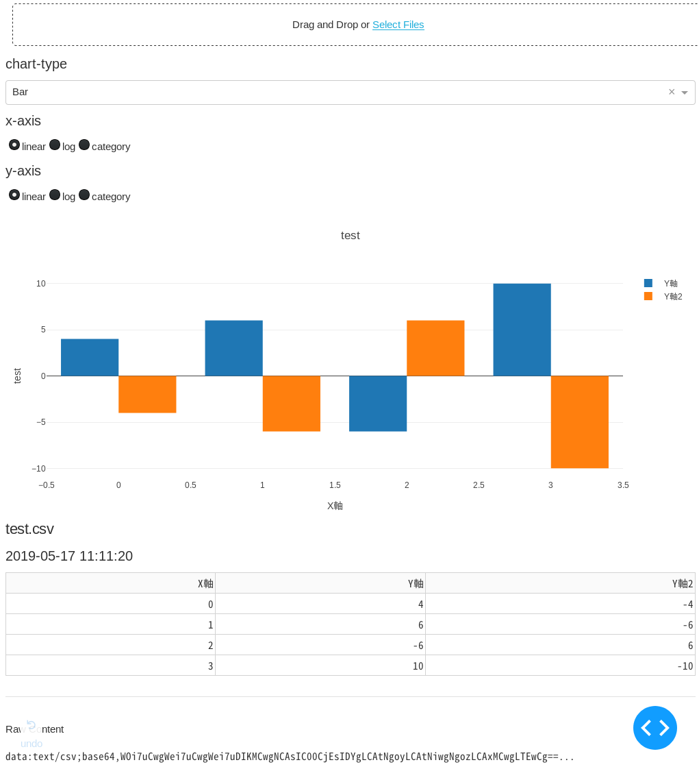
- 'Bar'
- 'Histogram'
- 'Pie'
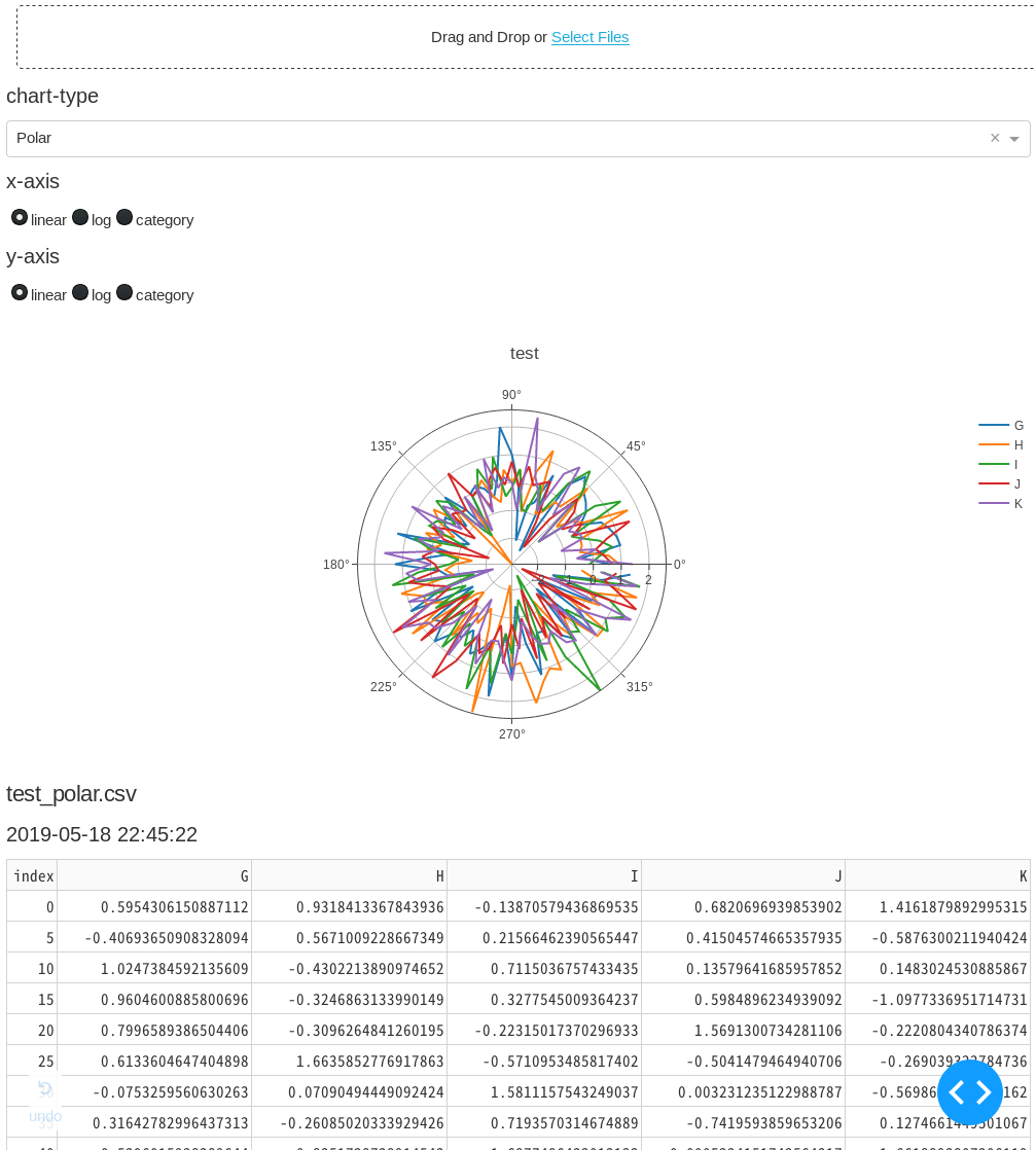
- 'Polar'
- 'Box'
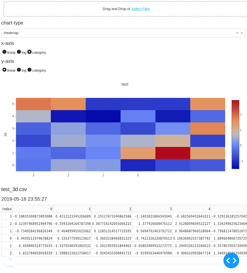
- 'Heatmap'
- '3D Scatter'
- '3D Surface'
- '2D Histogram'
対応予定のグラフ形式
- 'Contour'
- 'Candlestick'
Install
pip
あとでpypi登録予定
Github
GitHub u1and0/uplot
クローン後、$ python uplot.py
Dockerhub
$ sudo docker pull u1and0/uplot
$ sudo docker run -d -p 8880:8880 u1and0/uplot
USAGE
- サーバーを立ち上げたらブラウザに
http//:localhost:8880と打ち込みます。 - csvかxlsで作成したファイルをドラッグ・アンド・ドロップしてグラフ種類を選択します。
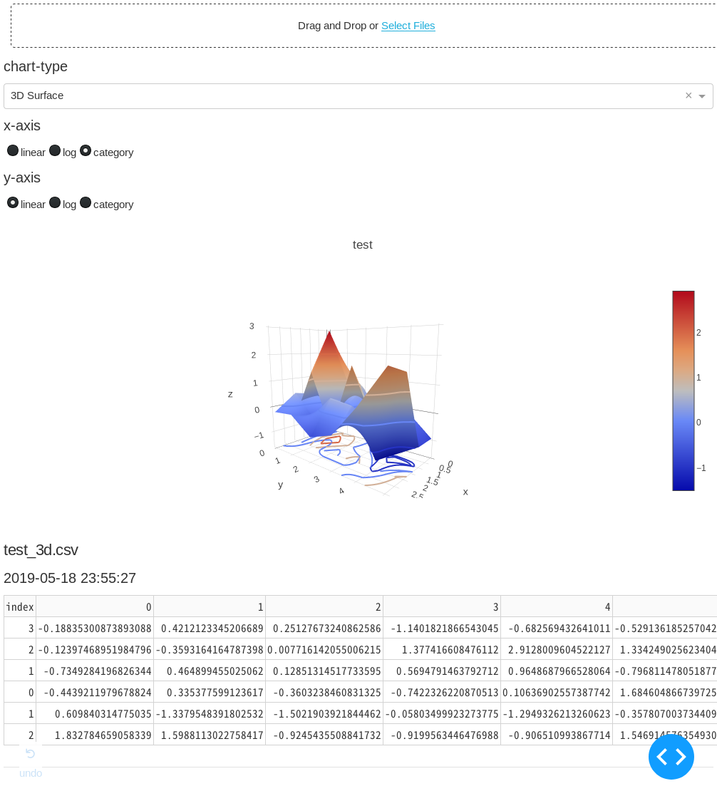
ScreenShots


作り方
python製
dash (= plotly + flask)でHTMLパーツを配置していって、plotlyで可視化。サーバーをflaskで立てる。
uplot.py
# !/usr/bin/env python3
import base64
import datetime
import io
import os
from collections import defaultdict

import dash
from dash.dependencies import Input, Output, State
import dash_core_components as dcc
import dash_html_components as html
import dash_table

import pandas as pd
import plotly.graph_objs as go

external_stylesheets = ['https://codepen.io/chriddyp/pen/bWLwgP.css']

app = dash.Dash(__name__, external_stylesheets=external_stylesheets)

CHART_LIST = [
    'Line',
    'Bar',
    'Histogram',
    'Pie',
    'Polar',
    'Box',
    'Heatmap',
    # 'Contour',
    # 'Candlestick',
    '3D Scatter',
    '3D Surface',
    '2D Histogram',
]
CHART_LIST.sort()

app.layout = html.Div(
    [
        # File upload bunner
        dcc.Upload(
            id='upload-data',
            children=html.Div(['Drag and Drop or ',
                               html.A('Select Files')]),
            style={
                'width': '100%',
                'height': '60px',
                'lineHeight': '60px',
                'borderWidth': '1px',
                'borderStyle': 'dashed',
                'borderRadius': '5px',
                'textAlign': 'center',
                'margin': '10px'
            },
            # Allow multiple files to be uploaded
            multiple=True),
        html.H6('chart-type'),
        dcc.Dropdown(id='chart-type',
                     options=[{
                         'label': i,
                         'value': i
                     } for i in CHART_LIST],
                     value='Line'),
        html.H6('x-axis'),
        dcc.RadioItems(id='xaxis-type',
                       options=[{
                           'label': i,
                           'value': i
                       } for i in ['linear', 'log', 'category']],
                       value='linear',
                       labelStyle={'display': 'inline-block'}),
        html.H6('y-axis'),
        dcc.RadioItems(id='yaxis-type',
                       options=[{
                           'label': i,
                           'value': i
                       } for i in ['linear', 'log', 'category']],
                       value='linear',
                       labelStyle={'display': 'inline-block'}),
        html.Div(id='the_graph'),
        html.Div(id='output-data-upload'),
    ], )


def data_graph(
        df,
        filename,
        chart_type,
        xaxis_type,
        yaxis_type,
):
    """アップロードされたデータのグラフを描画"""

    basename = os.path.splitext(filename)[0]
    # ファイル名の1つ目の'_'で区切って、グラフタイトルとY軸名に分ける
    if '_' in basename:
        title, yaxis_name = basename.split('_', 1)
    # ファイル名に'_'がなければグラフタイトル、Y軸名ともにファイル名
    else:
        title, yaxis_name = basename, basename

    def args(i):
        """graph_objs helper func"""
        return {'x': df.index, 'y': df[i], 'name': i}

    # チャートの種類をディクショナリで分岐
    # 内包表記でdfの列の数だけトレース
    data = {
        'Line': [go.Scatter(args(i)) for i in df.columns],
        'Bar': [go.Bar(args(i)) for i in df.columns],
        'Histogram':
        [go.Histogram(x=df[i], name=i, opacity=.5) for i in df.columns],
        'Pie': [
            go.Pie(labels=df.index,
                   values=df[i],
                   name=i,
                   domain={'column': list(df.columns).index(i)})
            for i in df.columns
        ],
        'Polar': [
            go.Scatterpolar(
                r=df[i],
                theta=df.index,
                name=i,
            ) for i in df.columns
        ],
        'Heatmap': [go.Heatmap(x=df.index, y=df.columns, z=df.values)],
        'Box': [go.Box(y=df[i], name=i) for i in df.columns],
        # 'Contour': [go.Contour(x=df.index, y=df.columns, z=df.values)]
        '3D Scatter': [
            go.Scatter3d(x=df.index, y=df.columns, z=df[i], name=i)
            for i in df.columns
        ],
        '3D Surface': [
            go.Surface(x=df.index,
                       y=df.columns,
                       z=df.values,
                       name=yaxis_name,
                       contours=go.surface.Contours(
                           z=go.surface.contours.Z(show=True,
                                                   usecolormap=True,
                                                   highlightcolor="#42f462",
                                                   project=dict(z=True)))),
        ],
        '2D Histogram': [go.Histogram2d(x=df.iloc[:, 0], y=df.iloc[:, 1])]
    }

    # チャートの種類でレイアウトを分岐
    # 分岐にはdefaultdictを使い、デフォルトはlambda式で返す
    layout = defaultdict(
        # default layout
        lambda: go.Layout(title=go.layout.Title(text=title),
                          xaxis={
                              'type': xaxis_type,
                              'title': df.index.name,
                              'rangeslider': dict(visible=False),
                          },
                          yaxis={
                              'type': yaxis_type,
                              'title': yaxis_name,
                          },
                          margin={
                              'l': 60,
                              'b': 50
                          },
                          hovermode='closest'),
        # other layout
        {
            'Histogram':
            go.Layout(title=title,
                      xaxis={'title': 'Value'},
                      yaxis={'title': 'Count'},
                      barmode='overlay',
                      hovermode='closest'),
            'Pie':
            go.Layout(title=go.layout.Title(text=title),
                      grid={
                          'columns': len(df.columns) - 1,
                          'rows': 1
                      },
                      hovermode='closest')
        })
    return dcc.Graph(id='the_graph',
                     figure={
                         'data': data[chart_type],
                         'layout': layout[chart_type]
                     })


def data_table(df):
    """アップロードされたデータの表を描画"""
    df.reset_index(inplace=True)  # indexもテーブルに含めるため
    data = df.to_dict('records')
    columns = [{'name': _i, 'id': _i} for _i in df.columns]
    return dash_table.DataTable(data=data, columns=columns)


def parse_contents(contents, filename, date, chart_type, xaxis_type,
                   yaxis_type):
    content_type, content_string = contents.split(',')

    decoded = base64.b64decode(content_string)
    try:
        if 'csv' in filename:
            # Assume that the user uploaded a CSV file
            df = pd.read_csv(io.StringIO(decoded.decode('utf-8')),
                             index_col=0,
                             parse_dates=True)
        elif 'xls' in filename:
            # Assume that the user uploaded an excel file
            df = pd.read_excel(io.BytesIO(decoded),
                               index_col=0,
                               parse_dates=True)
    except Exception as e:
        print(e)
        return html.Div(['There was an error processing this file.'])

    return html.Div([
        data_graph(df, filename, chart_type, xaxis_type, yaxis_type),
        html.H5(filename),
        html.H6(datetime.datetime.fromtimestamp(date)),
        data_table(df),
        html.Hr(),  # horizontal line

        # For debugging, display the raw contents provided by the web browser
        html.Div('Raw Content'),
        html.Pre(contents[0:200] + '...',
                 style={
                     'whiteSpace': 'pre-wrap',
                     'wordBreak': 'break-all'
                 })
    ])


@app.callback(Output(
    'output-data-upload',
    'children',
), [
    Input('upload-data', 'contents'),
    Input('chart-type', 'value'),
    Input('xaxis-type', 'value'),
    Input('yaxis-type', 'value'),
], [State('upload-data', 'filename'),
    State('upload-data', 'last_modified')])
def update_output(list_of_contents, chart_type, xaxis_type, yaxis_type,
                  list_of_names, list_of_dates):
    if list_of_contents is not None:
        children = [
            parse_contents(c, n, d, chart_type, xaxis_type, yaxis_type)
            for c, n, d in zip(list_of_contents, list_of_names, list_of_dates)
        ]
        return children


if __name__ == '__main__':
    app.run_server(debug=True, host='0.0.0.0', port=8880)