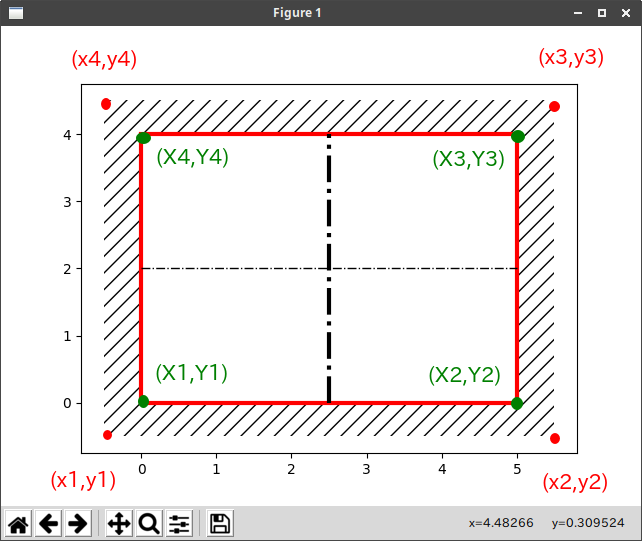
ハッチング
Python matplotlib 説明図を書いてみる
@damyarouさん
https://qiita.com/damyarou/items/eafcf27aa1a7852d32e9
を参考にさせていただきました。(わかりにくかったので、少し修正しました。)
import matplotlib.pyplot as plt

x1 = -0.5
x2 = 5.5
x3 = 5.5
x4 = -0.5

plt.fill([x1,x2,x3,x4],[-0.5,-0.5,4.5,4.5],fill=False, hatch='//',lw=0)  #ハッチング([x1,x2,x3,x4],[y1,y2,y3,y4])
plt.fill([0,5,5,0],[0,0,4,4],facecolor='#FFFFFF',edgecolor='#FF0000',lw=3)    #([X1,X2,X3,X4],[Y1,Y2,Y3,Y4])の範囲を塗りつぶす

plt.plot([0,5],[2,2],'-.',color='#000000',lw=1)  #中心線x [x1,x2],[y1,y2]
plt.plot([2.5,2.5],[0,4],'-.',color='#000000',lw=3)  #中心線y

plt.show()
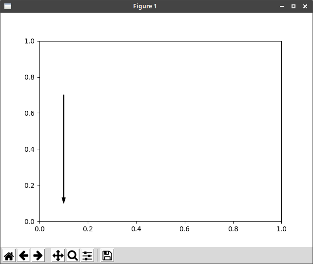
矢印
Python matplotlib 説明図を書いてみる
@damyarouさん
を参考にさせていただきました。
import matplotlib.pyplot as plt

x1=0.1;x2=x1;y1=0.1; y2=0.7; sv=0

plt.annotate('',
    xy=(x1,y1), xycoords='data',
    xytext=(x2,y2), textcoords='data', fontsize=0,
    arrowprops=dict(shrink=sv,width=1,headwidth=5,headlength=8,
        connectionstyle='arc3',facecolor='#000000',edgecolor='#000000'))

plt.show()
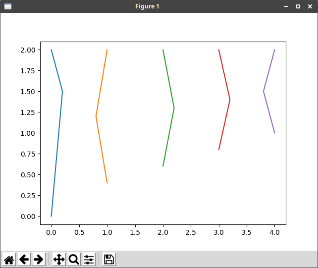
データの座標を直接与えてグラフを作成する
import matplotlib.pyplot as plt
import numpy as np

x = np.arange(5)
y = np.arange(3)
X, Y = np.meshgrid(x,y)

X = np.array([[0, 1, 2, 3, 4],
           [0.2, 0.8, 2.2, 3.2, 3.8],
           [0, 1, 2, 3, 4]])

Y = np.array([[0, 0.4, 0.6, 0.8, 1],
           [1.5, 1.2, 1.3, 1.4, 1.5],
           [2, 2, 2, 2, 2]])
''' これでも同じ
X = [[0, 1, 2, 3, 4],
           [0.2, 0.8, 2.2, 3.2, 3.8],
           [0, 1, 2, 3, 4]]
Y = [[0, 0.4, 0.6, 0.8, 1],
           [1.5, 1.2, 1.3, 1.4, 1.5],
           [2, 2, 2, 2, 2]]
'''

plt.plot(X, Y)

plt.show()
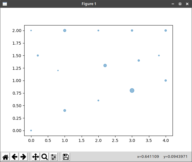
地震マップに使うようなグラフ(震源地と震度等)
ドキュメント
https://matplotlib.org/api/_as_gen/matplotlib.pyplot.scatter.html
import numpy as np
import matplotlib.pyplot as plt

x = np.arange(5)
y = np.arange(3)
s = np.arange(3)
X, Y, S = np.meshgrid(x,y,s)

X = np.array([[0, 1, 2, 3, 4],
           [0.2, 0.8, 2.2, 3.2, 3.8],
           [0, 1, 2, 3, 4]])

Y = np.array([[0, 0.4, 0.6, 0.8, 1],
           [1.5, 1.2, 1.3, 1.4, 1.5],
           [2, 2, 2, 2, 2]])

S = np.array([[8, 30, 10, 100, 20],
           [15, 5, 50, 20, 8],
           [6, 40, 10, 20, 22]])


plt.scatter(X, Y, s=S, alpha=0.5)
plt.show()
グラフの凡例
ドキュメント
https://matplotlib.org/api/_as_gen/matplotlib.pyplot.plot.html
https://matplotlib.org/api/_as_gen/matplotlib.pyplot.legend.html
凡例に日本語を使用すると、豆腐文字になり、日本語FONTを指定するとエラーになる。
凡例に日本語を使用する場合は、以下を追加する。(フォント名はインストールされているフォントに変更が必要です。)
import matplotlib as mpl                  #日本語フォントを指定するのに必要

mpl.rcParams['font.family'] = 'IPAGothic' #日本語フォントを指定するのに必要
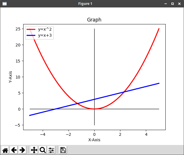
# グラフ y=x^2
import matplotlib.pyplot as plt
import numpy as np

x = np.linspace(-5, 5, 100, endpoint=True)  #x座標の-5〜5まで表示、配列の要素数、endpoint=True(終点を含む)

y = x ** 2
y1 = x + 3

plt.plot([-5,5],[0,0],'-',color='#000000',lw=1)  #x軸
plt.plot([0,0],[-5,25],'-',color='#000000',lw=1)  #y軸

plt.plot(x, y, color="red", linewidth=2.5, linestyle="-", label="y=x^2")  #label=グラフの凡例
plt.plot(x, y1, color="blue", linewidth=2.5, linestyle="-", label="y=x+3")

plt.legend(loc='upper left')  #グラフの凡例の表示位置
# plt.legend()  #グラフの凡例を右上に表示

plt.title('Graph')  #タイトル
plt.xlabel('X-Axis')  #グラフの軸の名称
plt.ylabel('Y-Axis')
# plt.axis([-5, 5, -5, 25])  #グラフの範囲(有効にすると上下左右の空白の部分がなくなる)

plt.show()
グラフをpngイメージで作成する
ドキュメント
https://matplotlib.org/api/_as_gen/matplotlib.pyplot.savefig.html
上記のプログラムの「plt.show()」を
plt.savefig('png_graph.png', dpi=300, orientation='portrait', transparent=False, pad_inches=0.0)
に置き換えると、グラフウインドウの代わりにグラフのpngイメージが作成される。
グラフをpdfファイルで作成する
plt.savefig('pdf_graph.pdf', orientation='portrait', transparent=False, bbox_inches=None, frameon=None)
に置き換えると、グラフウインドウの代わりにグラフのpdfファイルが作成される。
グラフウインドウとpng・pdfファイルを同時に作成する時は、グラフウインドウを先に記述する。
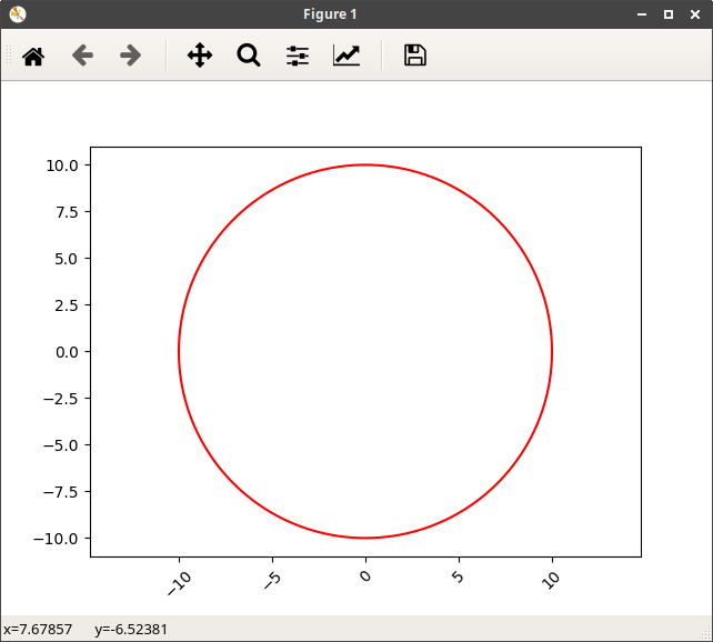
円のグラフ
# !/usr/bin/python3
# coding: UTF-8

# グラフ y=sqrt(r^2-x^2)
import matplotlib.pyplot as plt
import numpy as np

r = 10
x = np.linspace(-r, r, 10000, endpoint=True)
y = np.sqrt(r ** 2 - x ** 2)

plt.plot(x, y, 'red')  #実線
plt.plot(x, -y, 'red')

plt.axes().set_aspect('equal', 'datalim')  #xとy軸を同じ比率にする
plt.xticks(rotation=45) # x軸のラベルの文字が重なる場合、文字に角度を付ける
# plt.subplots_adjust(bottom=0.15) # ラベルの文字を回転すると、文字が隠れる場合、上に移動させる

plt.show()
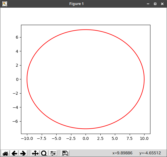
楕円のグラフ
# !/usr/bin/python3
# coding: UTF-8

# グラフ y=sqrt(r^2-x^2)
import matplotlib.pyplot as plt
import numpy as np

angle = 45
r = 10
x = np.linspace(-r, r, 10000, endpoint=True)
y = np.sqrt((r * np.sin(angle * np.pi / 180)) ** 2 * (1 - x ** 2 / r ** 2))

plt.plot(x, y, 'red')  #実線
plt.plot(x, -y, 'red')

plt.axes().set_aspect('equal', 'datalim')  #xとy軸を同じ比率にする

plt.show()
2方向に傾いた楕円のグラフ
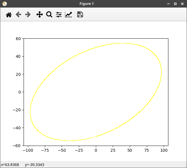
# !/usr/bin/python3
# coding: UTF-8
import numpy as np
import matplotlib.pyplot as plt
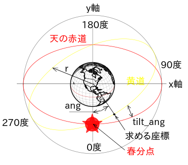
def ecl_xy(lat, r, tilt_ang, ang): #黄道のx,y座標を計算
#引数 lat:float 地球を見る角度(北緯:ラジアン)
# r :float 黄道の半径(m)
#tilt_ang:float 傾斜角(ラジアン)
# ang:float 春分点からの角度(ラジアン)0〜2π
# この場合の春分点は手前側(-y方向)
#戻り値 [x, y] angの角度の時の黄道の座標
# ang = 0 は春分点方向、半時計回り
flag = False
if np.rad2deg(ang) > 90 and np.rad2deg(ang) <= 180:
ang = ang + np.deg2rad(180)
flag = True
elif np.rad2deg(ang) > 180 and np.rad2deg(ang) <= 270:
ang = ang - np.deg2rad(180)
flag = True
x1 = r * np.sin(ang)
x2 = x1 *np.cos(tilt_ang)
b = r * np.sin(lat)
y1 = np.sqrt(b ** 2 * (1 - x1 ** 2 / r ** 2))
y2 = y1 - x1 * np.sin(tilt_ang) * np.cos(lat)
if np.rad2deg(ang) >= 0 and np.rad2deg(ang) <= 90 and flag == False:
return [x2, -y2]
elif np.rad2deg(ang) > 270 and np.rad2deg(ang) <= 360 and flag == True:
return [-x2, y2]
elif np.rad2deg(ang) >= 0 and np.rad2deg(ang) <= 90 and flag == True:
return [-x2, y2]
elif np.rad2deg(ang) > 270 and np.rad2deg(ang) <= 360 and flag == False:
return [x2, -y2]
if __name__ == '__main__':
lat = np.deg2rad(30) #円の面より30度上から見る(ラジアンに変換)
r = 100 #円の半径
tilt_ang = np.deg2rad(15) #傾いた円のy軸を中心に15度傾ける
#黄道のグラフ座標を求める
x_ecl_1 = []
y_ecl_1 = []
for i in range(0,360+1):
ang = np.deg2rad(i) #iは度なのでラジアンに変換
a = ecl_xy(lat, r, tilt_ang, ang) #ecl_xy()を呼び出し戻り値をaに代入する
x_ecl_1.append(a[0]) #Listに0〜360度のx座標を追加する
y_ecl_1.append(a[1]) #Listにy座標を追加する
plt.plot(x_ecl_1, y_ecl_1, 'yellow', linewidth=0.4) #黄道をプロット
plt.show()
太陽の黄道を表示させるために作成しました。
ecl_xy(lat, r, tilt_ang, ang)を呼び出すとangの位置の(x,y)座標を返します。
これは、cartopyのmap用に作成したのでbasemapとは原点が違うので座標を変換する必要があります。
cartopyは地球の中心が原点、basemapは左端がx=0、下端がy=0です。
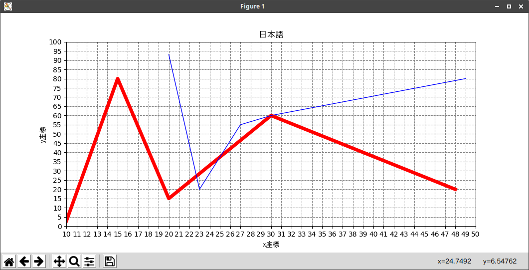
その他
# !/usr/bin/python3
# coding: UTF-8

import matplotlib.pyplot as plt

font = {'family': 'IPAGothic'}  # 日本語Fontを指定

start_x = 10 ; end_x = 50
start_y = 0 ; end_y = 100

x_range = [start_x, end_x]  #目盛り範囲
y_range = [start_y, end_y]

x_tics = range(start_x, end_x + 1)  #目盛りピッチ = 1
y_tics = range(0, 100 + 5, 5)       #目盛りピッチ = 5

plt.xlim(x_range)  #目盛り範囲
plt.ylim(x_range)

plt.xlabel('x座標', **font)  #ラベル
plt.ylabel('y座標', **font)

plt.xticks(x_tics)  #目盛りピッチ
plt.yticks(y_tics)
plt.grid(color='gray', linestyle='--')  #罫線 色、線種 破線

xx = [10,15,20,30,48]
yy = [3,80,15,60,20]
plt.plot(xx, yy,linewidth=5, color='red')  #折れ線グラフ1

xx1 = [20,23,27,30,49]
yy1 = [93,20,55,60,80]
plt.plot(xx1, yy1,linewidth=1, color='blue')  #折れ線グラフ2

plt.title('日本語', **font)  #グラフのタイトル

# plt.savefig('xxx.png')  #pngで保存
plt.show()                #グラフのウインドウ表示
Python matplotlibでグラフを作る(超初心者向け)-1
https://qiita.com/ty21ky/items/5374dec69df08584bc35
参考
サンプルプログラムが沢山あります。
https://matplotlib.org/xkcd/examples/index.html
https://matplotlib.org/gallery/index.html
MATPLOTLIB
https://matplotlib.org/xkcd/api/pyplot_api.html?highlight=plot#matplotlib.pyplot.plot