shadcn/uiとは
shadcn/uiとは、これは Radix UIとTailwind CSSを使って書かれた UI コンポーネントをまとめたもので、TailwindCSS を通じてスタイルをカスタマイズできる。2023 JavaScript Rising Starsでは、全Projectで見事ランキング1位に輝いた!!
shadcn/uiは、柔軟性 と カスタマイズ性 が高く、必要なコンポーネントだけを選択し、カスタマイズできる。また、通常のコンポーネントライブラリとは異なり、npmパッケージとして配布されていないので、npmの依存関係に影響しない。コンポーネントのコードはCLIでダウンロードする。
最新のバージョンのshadcn/uiのインストール方法は以下のサイトで解説しております。(React 19・Next.js 15にも対応)
インストール
この記事では、Next.jsの場合を紹介する。Viteなど他のフレームワークのインストール方法はInstallationを参照。
まず、 Next.jsをインストールしていない人はインストールしてください。
# npx create-next-app@latest my-app --tailwind --eslint
Need to install the following packages:
create-next-app@14.1.0
Ok to proceed? (y) y
✔ Would you like to use TypeScript? … No / Yes
✔ Would you like to use `src/` directory? … No / Yes
✔ Would you like to use App Router? (recommended) … No / Yes
✔ Would you like to customize the default import alias (@/*)? … No / Yes
Creating a new Next.js app in /workspaces/shadcn/my-app.
プロジェクトディレクトリに移行。
$ cd my-app
以下コマンドでshadcnのセットアップができます。
$ npx shadcn-ui@latest init
initすると以下のような質問をされ、component.jsonができる。
1. Would you like to use TypeScript (recommended)? no/yes
TypeScriptを使いたいか?

2. Which style would you like to use? › Default
デフォルトかNew Yorkどちらのスタイルを使いたいか?

3. Which color would you like to use as base color? › Slate
ベースカラーは何にするか?(後から変更不可)

4. Where is your global CSS file? › › app/globals.css
グローバルCSSファイルはどこに置くか?

5. Do you want to use CSS variables for colors? › no / yes
CSS変数で色を設定するか?(後から変更不可)

6. Where is your tailwind.config.js located? › tailwind.config.js
tailwind.config.jsをどこに置くか?

7. Configure the import alias for components: › @/components
コンポーネントをインポートのエイリアスは?

8. Configure the import alias for utils: › @/lib/utils
utilsのimportのエイリアスは?

9. Are you using React Server Components? › no / yes
React Serverのコンポーネントを使うか?
2と3のスタイルとベースカラーの組み合わせはhttps://ui.shadcn.com/themes で確認できる。
my-app/src/app/page.jsを以下のようにする。
shadcn/uiは推奨TypeScriptだが、この記事ではJavaScriptで行う。
export default function Home() {
  return (
    <main className="flex min-h-screen flex-col items-center justify-between p-24">
      <div>
        <button>クリック!</button>
      </div>
    </main>
  );
}
npm run devを叩き、http://localhost:3000 にアクセスすると

のような画面になる。ここからカスタマイズしていく。
以下のコマンドをターミナルで叩くと、my-app/src/components/ui/button.jsxにボタンのコンポーネントが作成される。
$ npx shadcn-ui@latest add button
早速、追加したボタンのコンポーネントを使ってみる。
+ import { Button } from "@/components/ui/button";

export default function Home() {
  return (
    <main className="flex min-h-screen flex-col items-center justify-between p-24">
     <div>
-        <button>クリック!</button>
+        <Button>クリック</Button>
      </div>
    </main>
  );
}
すると、以下のようになる。

以下のようにaddに引数をつけなかったら、インストールするコンポーネントを選択できる。
$ npx shadcn-ui@latest add
? Which components would you like to add? › Space to select. A to toggle all. Enter to submit.
◯   accordion
◯   alert
◯   alert-dialog
◯   aspect-ratio
◯   avatar
◯   badge
◯   button
◯   calendar
◯   card
◯ ↓ carousel
diffコマンドを使うと、更新のあるコンポーネントを調べられる。
$ npx shadcn-ui diff
テーマ
テーマの設定で CSS変数 を使用するか、Tailwind CSSユーティリティクラス を使用するかを選択できる。
CSS変数
components.jsonのtailwind.cssVariablesを true にする。
<div className="bg-background text-foreground" />
より詳細な設定はThemingを参照。
ユーティリティクラス
components.jsonのtailwind.cssVariablesを false にする。
<div className="bg-zinc-950 dark:bg-white" />
ダークテーマ
インストールする。
npm install next-themes
my-app/src/components/theme-provider.jsxが作成されるので、my-app/src/app/layout.jsにimportして、以下のように編集する。
import { Inter } from "next/font/google";
import "./globals.css";
+ import { ThemeProvider } from "@/components/theme-provider";

const inter = Inter({ subsets: ["latin"] });

export const metadata = {
  title: "Create Next App",
  description: "Generated by create next app",
};

export default function RootLayout({ children }) {
  return (
    <html lang="jp">
      <body className={inter.className}>
+        <ThemeProvider
+          attribute="class"
+          defaultTheme="dark"
+          enableSystem
+          disableTransitionOnChange
+        >
          {children}
+        </ThemeProvider>
      </body>
    </html>
  );
}
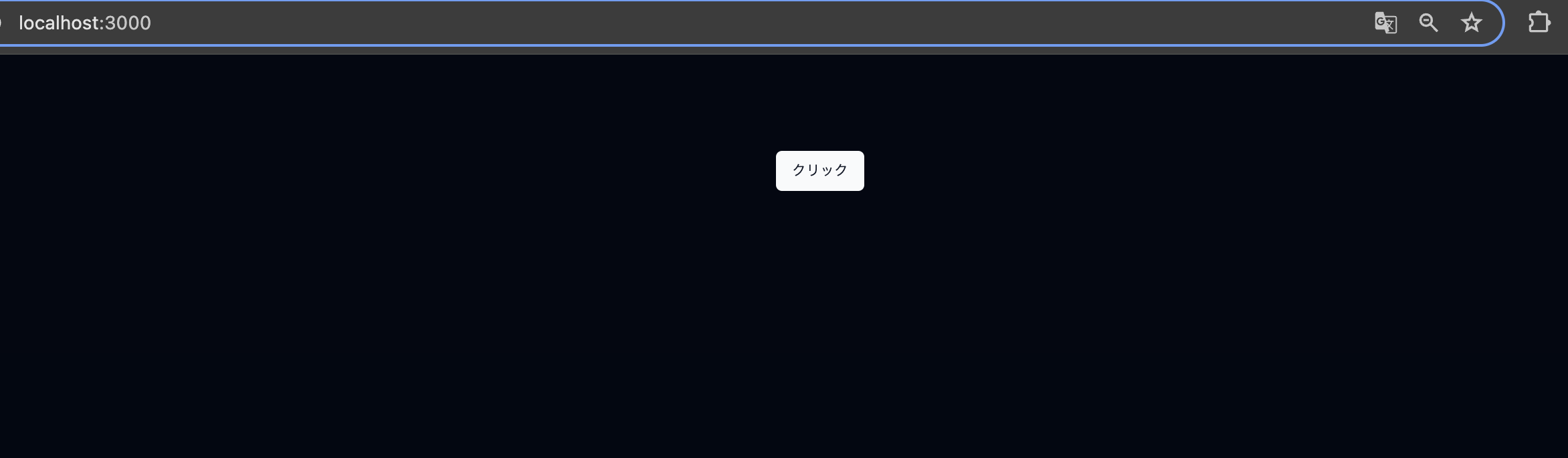
再度、http://localhost:3000 にアクセスするとダークモードになっている。
Figma
Figmaに多くのコンポーネントがあるので、以下URLからコピーして持ってくることができる。
Components
以下にbutton以外の多くのコンポーネントが掲載されている。
shadcn/uiのアーキテクチャ
shadcn/uiのアーキテクチャについて以下に書かれていた。
上記の日本語の解説 → shadcn/ui の内部構造を探る