SwiftUIとJetpackComposeで、同セグメントの機能を両フレームワークでつくろうとした時に
- きれいに対応関係がまとまっている
- コピペで動く
- 最もシンプルな実装
そんな記事があったらいいなと思い、備忘録も兼ねて自分が実装してみた範囲でまとめていきたいと思います。初心者ですので、より良い実装をご存知の方がいらっしゃいましたら、ご教示ください。
今回はホイールピッカー編です。
なお、見た目をSwiftUI寄りにしがちです(そっちしか知らないだけ...)
対応関係
【SwiftUI】Pickerに.pickerStyle(WheelPickerStyle())の修飾子をつける
【JetpackCompose】自作ホイールピッカー (NumberPickerという呼称が一般的のよう)
SwiftUI
Picker + WheelPickerStyle()
Picker構造体
struct Picker<Label, SelectionValue, Content>
    where Label : View, SelectionValue : Hashable, Content : View
PickerStyle (Pickerに修飾子の形でつける)
DefaultPickerStyle
InlinePickerStyle
MenuPickerStyle
NavigationLinkPickerStyle
PopUpButtonPickerStyle
RadioGroupPickerStyle
SegmentedPickerStyle
WheelPickerStyle  <- これを使う
具体例
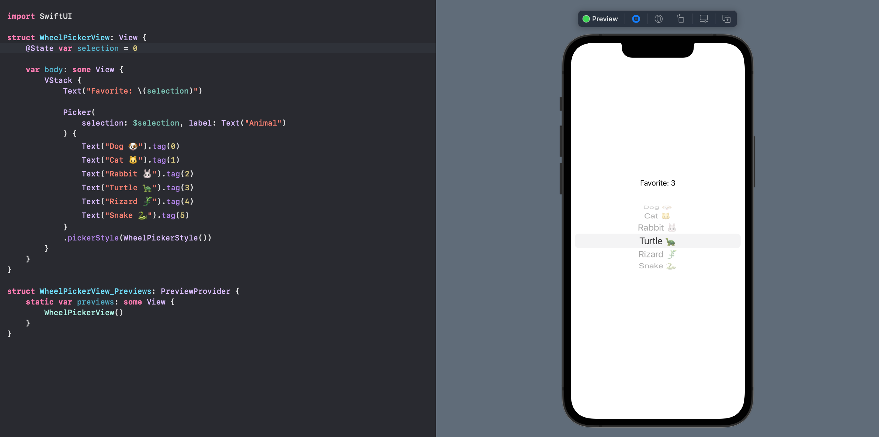
Pickerに修飾子の形でWheelのPickerStyleを適用します。
コードはこちら
struct WheelPickerView: View {
    @State var selection = 0

    var body: some View {
        VStack {
            Text("Favorite: \(selection)")

            Picker(
                selection: $selection, label: Text("Animal")
            ) {
                Text("Dog 🐶").tag(0)
                Text("Cat 🐱").tag(1)
                Text("Rabbit 🐰").tag(2)
                Text("Turtle 🐢").tag(3)
                Text("Rizard 🦎").tag(4)
                Text("Snake 🐍").tag(5)
            }
            .pickerStyle(WheelPickerStyle())
        }
    }
}
実行結果
遠近感と立体感のあるホイールピッカーができました。
JetpackCompose
自作ホイールピッカー
自分の場合は、こちらのListItemPickerを参考に、よりフェードが滑らかになるよう一部改造させていただいております。(Android公式のものに近かったのと、型がなんでもOKなものだったため)。これ自分でゼロから作るの想像つきません...。開発者の方に心から敬意と感謝を表します。
他にも、よりiOSに寄せたものや、スマートな実装のNumberPickerなどのライブラリやスニペットがありました。
コードはこちら
import androidx.compose.animation.core.*
import androidx.compose.foundation.background
import androidx.compose.foundation.gestures.Orientation
import androidx.compose.foundation.gestures.draggable
import androidx.compose.foundation.gestures.rememberDraggableState
import androidx.compose.foundation.layout.*
import androidx.compose.material.LocalTextStyle
import androidx.compose.material.MaterialTheme
import androidx.compose.material.ProvideTextStyle
import androidx.compose.material.Text
import androidx.compose.runtime.*
import androidx.compose.ui.Alignment
import androidx.compose.ui.Modifier
import androidx.compose.ui.draw.alpha
import androidx.compose.ui.graphics.Color
import androidx.compose.ui.layout.Layout
import androidx.compose.ui.platform.LocalDensity
import androidx.compose.ui.text.TextStyle
import androidx.compose.ui.text.style.TextAlign
import androidx.compose.ui.tooling.preview.Preview
import androidx.compose.ui.unit.IntOffset
import androidx.compose.ui.unit.dp
import com.turtlekazu.qiita.ui.theme.QiitaTheme
import kotlinx.coroutines.launch
import kotlin.math.abs
import kotlin.math.roundToInt

@Composable
fun <T> ListItemPicker(
    modifier: Modifier = Modifier,
    label: (T) -> String = { it.toString() },
    value: T,
    onValueChange: (T) -> Unit,
    dividersColor: Color = MaterialTheme.colors.primary,
    list: List<T>,
    textStyle: TextStyle = LocalTextStyle.current,
) {
    val verticalMargin = 8.dp
    val numbersColumnHeight = 80.dp
    val halfNumbersColumnHeight = numbersColumnHeight / 2
    val halfNumbersColumnHeightPx = with(LocalDensity.current) { halfNumbersColumnHeight.toPx() }

    val coroutineScope = rememberCoroutineScope()

    val animatedOffset = remember { Animatable(0f) }
        .apply {
            val index = list.indexOf(value)
            val offsetRange = remember(value, list) {
                -((list.count() - 1) - index) * halfNumbersColumnHeightPx to
                        index * halfNumbersColumnHeightPx
            }
            updateBounds(offsetRange.first, offsetRange.second)
        }

    val coercedAnimatedOffset = animatedOffset.value % halfNumbersColumnHeightPx

    val indexOfElement = getItemIndexForOffset(list, value, animatedOffset.value, halfNumbersColumnHeightPx)

    var dividersWidth by remember { mutableStateOf(0.dp) }

    Layout(
        modifier = modifier
            .draggable(
                orientation = Orientation.Vertical,
                state = rememberDraggableState { deltaY ->
                    coroutineScope.launch {
                        animatedOffset.snapTo(animatedOffset.value + deltaY)
                    }
                },
                onDragStopped = { velocity ->
                    coroutineScope.launch {
                        val endValue = animatedOffset.fling(
                            initialVelocity = velocity,
                            animationSpec = exponentialDecay(frictionMultiplier = 20f),
                            adjustTarget = { target ->
                                val coercedTarget = target % halfNumbersColumnHeightPx
                                val coercedAnchors =
                                    listOf(-halfNumbersColumnHeightPx, 0f, halfNumbersColumnHeightPx)
                                val coercedPoint = coercedAnchors.minByOrNull { abs(it - coercedTarget) }!!
                                val base = halfNumbersColumnHeightPx * (target / halfNumbersColumnHeightPx).toInt()
                                coercedPoint + base
                            }
                        ).endState.value

                        val result = list.elementAt(
                            getItemIndexForOffset(list, value, endValue, halfNumbersColumnHeightPx)
                        )
                        onValueChange(result)
                        animatedOffset.snapTo(0f)
                    }
                }
            )
            .padding(vertical = numbersColumnHeight / 3 + verticalMargin * 2),
        content = {
            Box(modifier.width(dividersWidth).height(2.dp).background(color = dividersColor))

            Box(
                modifier = Modifier
                    .padding(vertical = verticalMargin, horizontal = 20.dp)
                    .offset { IntOffset(x = 0, y = coercedAnimatedOffset.roundToInt()) },
                contentAlignment = Alignment.Center,
            ) {
                ProvideTextStyle(textStyle) {
                    if (indexOfElement > 1)
                        Label(
                            text = label(list.elementAt(indexOfElement - 2)),
                            modifier = modifier
                                .offset(y = -numbersColumnHeight)
                                .alpha(coercedAnimatedOffset / halfNumbersColumnHeightPx)
                        )
                    if (indexOfElement > 0)
                        Label(
                            text = list.elementAt(indexOfElement - 1).toString(),
                            modifier = modifier
                                .offset(y = -halfNumbersColumnHeight)
                                .alpha((coercedAnimatedOffset / halfNumbersColumnHeightPx) * 0.5f + 0.5f)
                        )
                    Label(
                        text = list.elementAt(indexOfElement).toString(),
                        modifier = modifier
                            .alpha(1 - (abs(coercedAnimatedOffset) / halfNumbersColumnHeightPx) * 0.5f)
                    )
                    if (indexOfElement < list.count() - 1)
                        Label(
                            text = list.elementAt(indexOfElement + 1).toString(),
                            modifier = modifier
                                .offset(y = halfNumbersColumnHeight)
                                .alpha(-(coercedAnimatedOffset / halfNumbersColumnHeightPx) * 0.5f + 0.5f)
                        )
                    if (indexOfElement < list.count() - 2)
                        Label(
                            text = list.elementAt(indexOfElement + 2).toString(),
                            modifier = modifier
                                .offset(y = numbersColumnHeight)
                                .alpha(-(coercedAnimatedOffset / halfNumbersColumnHeightPx) * 0.5f)
                        )
                }
            }

            Box(modifier.width(dividersWidth).height(2.dp).background(color = dividersColor))
        }
    ) { measurables, constraints ->
        val placeables = measurables.map { measurable ->
            measurable.measure(constraints)
        }

        dividersWidth = placeables.drop(1).first().width.toDp()

        layout(dividersWidth.toPx().toInt(), placeables
            .sumOf {
                it.height
            }
        ) {
            var yPosition = 0
            placeables.forEach { placeable ->
                placeable.placeRelative(x = 0, y = yPosition)
                yPosition += placeable.height
            }
        }
    }
}

@Composable
private fun Label(text: String, modifier: Modifier) {
    Text(
        modifier = modifier,
        text = text,
        textAlign = TextAlign.Center,
        color = MaterialTheme.colors.onPrimary,
    )
}

private fun <T> getItemIndexForOffset(
    range: List<T>,
    value: T,
    offset: Float,
    halfNumbersColumnHeightPx: Float
): Int {
    val indexOf = range.indexOf(value) - (offset / halfNumbersColumnHeightPx).toInt()
    return maxOf(0, minOf(indexOf, range.count() - 1))
}

private suspend fun Animatable<Float, AnimationVector1D>.fling(
    initialVelocity: Float,
    animationSpec: DecayAnimationSpec<Float>,
    adjustTarget: ((Float) -> Float)?,
    block: (Animatable<Float, AnimationVector1D>.() -> Unit)? = null,
): AnimationResult<Float, AnimationVector1D> {
    val targetValue = animationSpec.calculateTargetValue(value, initialVelocity)
    val adjustedTarget = adjustTarget?.invoke(targetValue)
    return if (adjustedTarget != null) {
        animateTo(
            targetValue = adjustedTarget,
            initialVelocity = initialVelocity,
            block = block
        )
    } else {
        animateDecay(
            initialVelocity = initialVelocity,
            animationSpec = animationSpec,
            block = block,
        )
    }
}
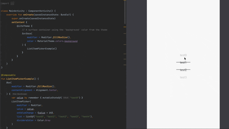
具体例
@Composable
fun ListItemPickerExample() {
    Box(
        modifier = Modifier.fillMaxSize(),
        contentAlignment = Alignment.Center,
    ) {
        var value by remember { mutableStateOf("test1") }
        ListItemPicker( // <- 作成したPicker
            value = value,
            onValueChange = {value = it},
            list = listOf("test1", "test2", "test3", "test4", "test5"),
            dividersColor = Color.Gray
        )
    }
}
実行結果
いい感じに動作するホイールピッカーができました。
まとめ
ホイールピッカー
対応関係を再掲します。
【SwiftUI】Pickerに.pickerStyle(WheelPickerStyle())の修飾子をつける
【JetpackCompose】自作ホイールピッカー (NumberPickerという呼称が一般的のよう)
SwiftUIびいきな感じになってしまいましたが、基本Androidは選択肢にドロップダウンリストを使うみたいですので、ホイールピッカーをそもそもあまり重視していないのだと思われます。その辺の違いも興味深いです。次はJetpackComposeの方が楽に実装できるものを取り上げてみたいと思います。