Bar-Chart-Raceを試してみたいと思ったので、プロ野球の歴代本塁打数で作ってみました。
データはこちらからお借りしました。
データの収集・加工
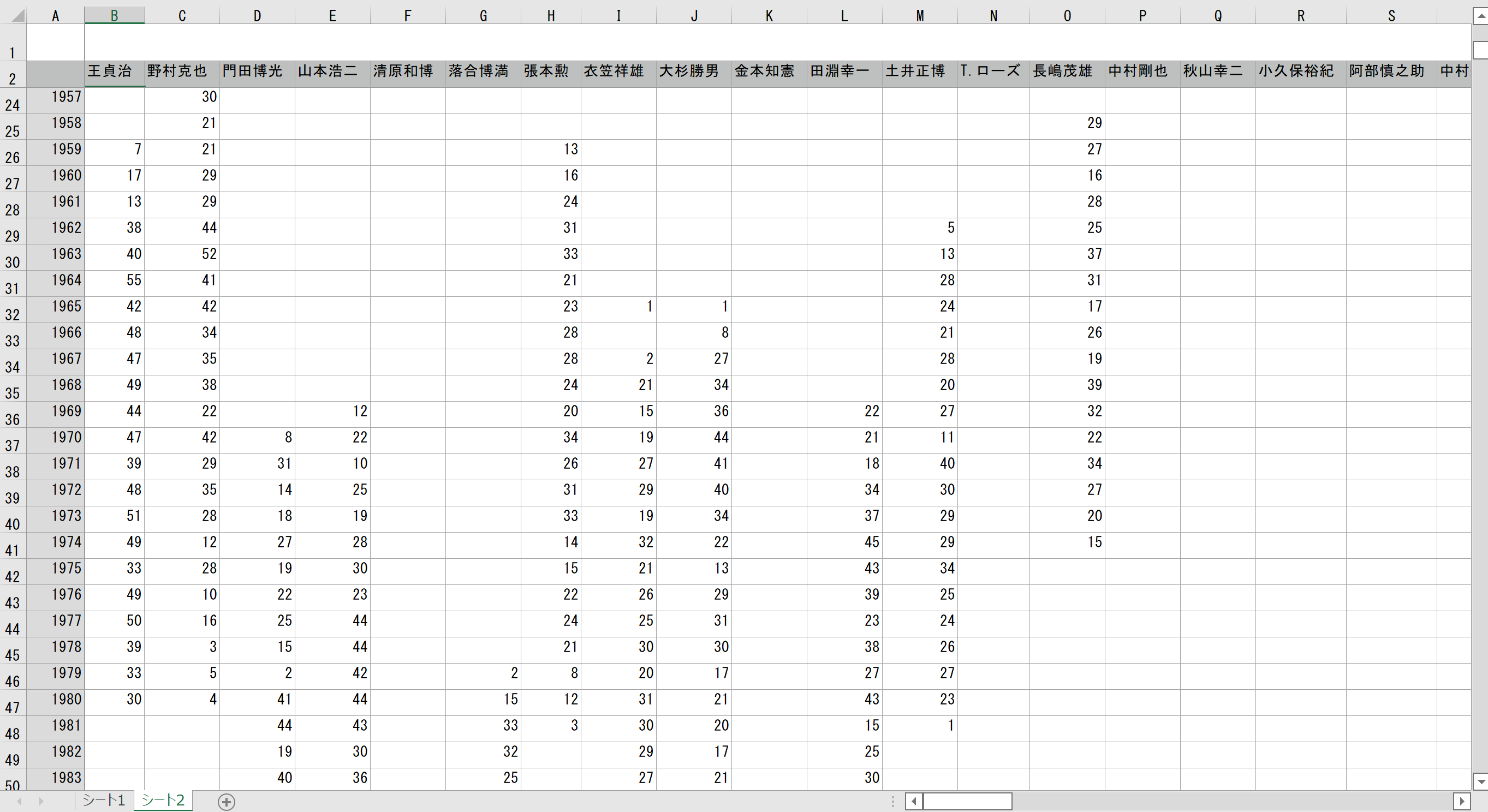
- 使うデータ:1946年~2021年までの本塁打数。
- 抽出した選手:2021年時点で歴代本塁打数上位の選手と各年度本塁打数が多い選手(特に1940年代~1960年代のデータ用)。
元データは各年度の本塁打データなので、それを累積に変換する。
Excelにデータを収集し、累積データへ変換
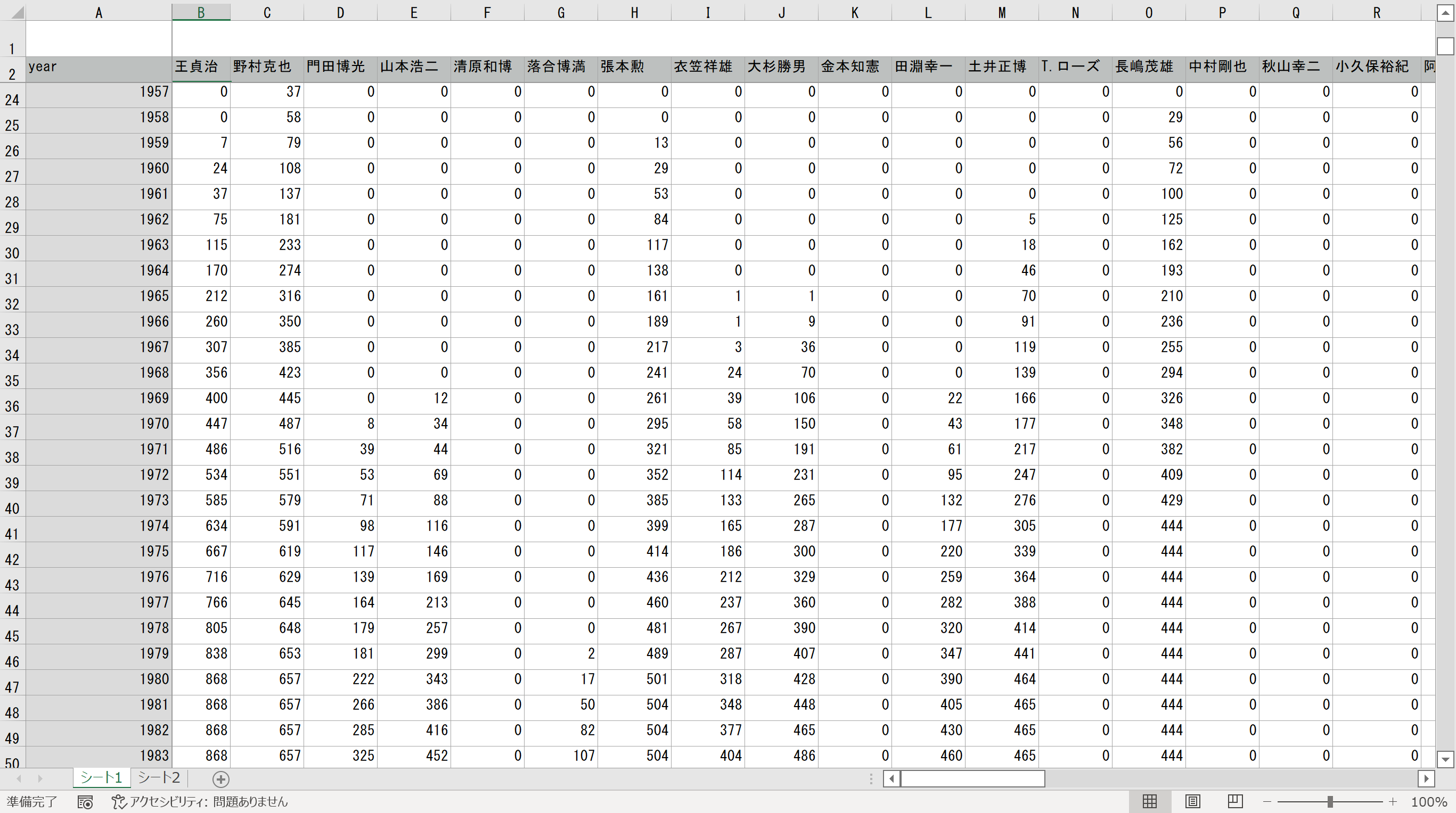
pandasで取り込むために累積データをCSVへ変換。
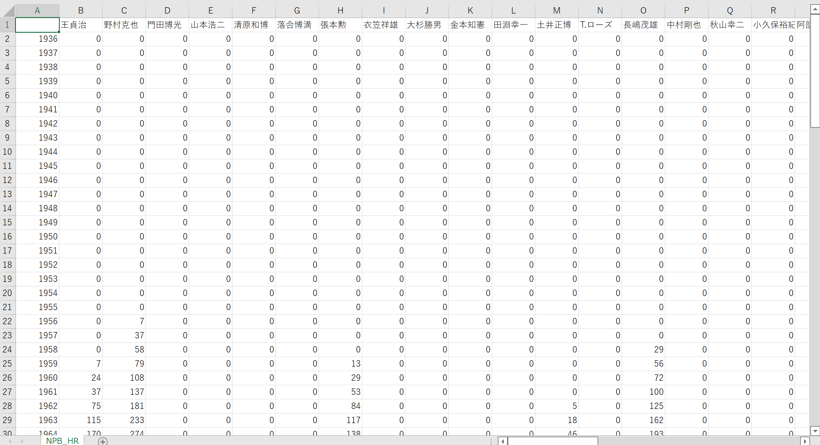
累積データのCSVファイルをGoogle Colabへアップロード
実装
Google Colabで実装
import numpy as np
import pandas as pd
import csv
import matplotlib.pyplot as plt

%matplotlib inline

# グラフに日本語フォントで出力するため、japanize-matplotlib が必要.
!pip install bar-chart-race
!pip install japanize-matplotlib

import bar_chart_race as bcr
import japanize_matplotlib


# 時間軸を設定
year = 2021
csvファイルの読み込み
df = pd.read_csv('ファイルパス', encoding='shift-jis',header=0, index_col=0)
# 欠損値を除外
df.dropna(inplace=True)
# 1946~yearで設定した年までのデータを取得
df = df.iloc[df.index.get_loc(1946):df.index.get_loc(year+1) ,:]

# 上位20件を表示
# period_lengthで再生時間を調整(大きくするとゆっくりになる)
bcr.bar_chart_race(df=df, n_bars=20, period_length=500)
出力!
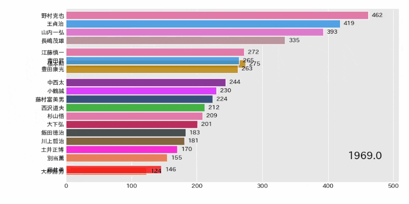
※ゴジラは日米通算と日本のみの2つデータを用意したので、区別するため(メジャー)としてます。
参考資料
日本プロ野球機構
【簡単/無料】「動くグラフ」の作り方を解説
Matplotlibを使って「ぬるぬる動く棒グラフ」を作ってみた