本記事はFlutter #2 Advent Calendar 2020の4日目の記事です。
はじめに
Flutterのアニメーションを実装するとしたらさまざまなアプローチがありますが、その中でもImplicit animationsは比較的楽に実装できます。
Implicit animationsを用いたアニメーションのサンプルを実装をしたので今回はその紹介をしたいと思います。
また紹介するアニメーションのサンプルはこちらのリポジトリで公開しています。
Implicit Animationsとは
Implicit Animationsは日本語に直訳すると、暗黙的なアニメーションです。
Flutterのアニメーションには、暗黙的なアニメーションと明示的なアニメーションがあります。
暗黙的なアニメーションは、Widgetに対してアニメーションさせたいプロパティ(幅や高さや色など)の値を設定するだけで、現在の値から新しい値までのアニメーションを処理してくれます。
これらのウィジェットはまとめて暗黙のアニメーション、または暗黙的にアニメーション化されたウィジェットと呼ばれます。(これ以降ではImplicit Animationsと明記します)
対して明示的なアニメーションでは、AnimationControllerクラスを用いて実装する必要があります。
この記事では明示的なアニメーションの説明は割愛します。
Implicit Animationsの種類
Implicit AnimationsのWidgetの多くは標準でフレームワークに組み込まれています。
Implicit AnimationsのWidgetのクラス名は、「AnimatedXXX」という名前で、「XXX」にはアニメーションされていないクラス名が入ることが多いです。
公式ドキュメントによると、Implicit Animationsには下記の種類があります。
- AnimatedAlign
- AnimatedContainer
- AnimatedDefaultTextStyle
- AnimatedOpacity
- AnimatedPadding
- AnimatedPhysicalModel
- AnimatedPositioned
- AnimatedPositionedDirectional
- AnimatedTheme
- AnimatedCrossFade
- AnimatedSize
- AnimatedSwitcher
それではそれぞれどんなアニメーションができるのか見ていきます。
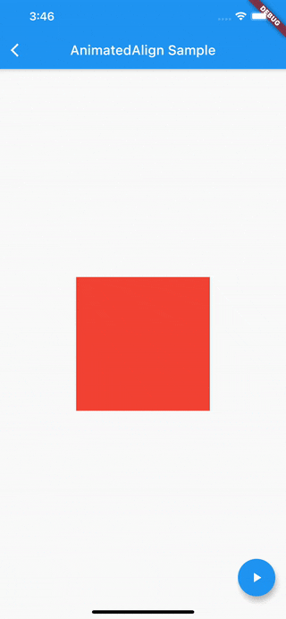
AnimatedAlign
AnimatedAlignは[Align](Align class - widgets library - Dart API)のchildに設定したWidgetのalignmentをアニメーションさせることができるImplicit Animationsです。
下記のサンプルでは、FloatingActionButtonを押下すると、ContainerをCenterからBottom(またはその逆)へアニメーションさせています。
class AnimatedAlignScreen extends StatefulWidget {
  @override
  _AnimatedAlignScreenState createState() => _AnimatedAlignScreenState();
}

class _AnimatedAlignScreenState extends State<AnimatedAlignScreen> {
  Alignment _alignment = Alignment.center;

  @override
  Widget build(BuildContext context) {
    return Scaffold(
      appBar: AppBar(
        title: Text('AnimatedAlign Sample'),
      ),
      body: Center(
          child: AnimatedAlign(
        alignment: this._alignment,
        duration: Duration(seconds: 1),
        child: Container(color: Colors.red, width: 200, height: 200),
      )),
      floatingActionButton: FloatingActionButton(
        child: Icon(Icons.play_arrow),
        onPressed: () {
          setState(() {
            if (this._alignment == Alignment.center) {
              this._alignment = Alignment.bottomLeft;
            } else {
              this._alignment = Alignment.center;
            }
          });
        },
      ),
    );
  }
}
アニメーションの途中で停止したい場合など詳細に制御したい場合は、[AlignTransition](AlignTransition class - widgets library - Dart API)クラスを使いましょう。
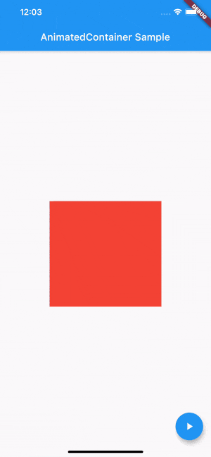
AnimatedContainer
AnimatedContainerは[Container](Container class - widgets library - Dart API)クラスのプロパティをアニメーションさせることができます。
アニメーションさせたいプロパティの値が変更されると、Durationの時間でアニメーションされます。
下記のサンプルではFloatingActionButtonを押下すると、1~300までのランダムな値をAnimatedContainerの幅と高さに設定して、アニメーションさせています。
class AnimatedContainerScreen extends StatefulWidget {
  @override
  _AnimatedContainerScreenState createState() =>
      _AnimatedContainerScreenState();
}

class _AnimatedContainerScreenState extends State<AnimatedContainerScreen> {
  double _width = 50;
  double _height = 50;

  @override
  Widget build(BuildContext context) {
    return Scaffold(
      appBar: AppBar(
        title: Text('AnimatedContainer Sample'),
      ),
      body: Center(
        child: AnimatedContainer(
          color: Colors.red,
          width: this._width,
          height: this._height,
          duration: Duration(seconds: 1),
        ),
      ),
      floatingActionButton: FloatingActionButton(
        child: Icon(Icons.play_arrow),
        onPressed: () {
          setState(() {
            this._width = Random().nextInt(300).toDouble();
            this._height = Random().nextInt(300).toDouble();
          });
        },
      ),
    );
  }
}
プロパティにnullを設定するとアニメーションされません。
また、AnimatedContainerのchildプロパティに設定したWidgetにはアニメーションの影響はありません。
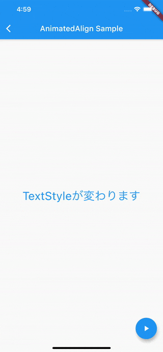
AnimatedDefaultTextStyle
AnimatedDefaultTextStyleは[DefaultTextStyle](DefaultTextStyle class - widgets library - Dart API)クラスのImplicit Animationsです。
下記のサンプルでは、FloatingActionButtonを押下すると、TextのTextStyleが1秒かけてアニメーションされています。
import 'package:flutter/cupertino.dart';
import 'package:flutter/material.dart';

class AnimatedDefaultTestStyleScreen extends StatefulWidget {
  @override
  _AnimatedDefaultTestStyleScreenState createState() =>
      _AnimatedDefaultTestStyleScreenState();
}

class _AnimatedDefaultTestStyleScreenState
    extends State<AnimatedDefaultTestStyleScreen> {
  TextStyle _textStyle1 =
      TextStyle(fontSize: 30, color: Colors.blue, fontWeight: FontWeight.w400);

  TextStyle _textStyle2 =
      TextStyle(fontSize: 15, color: Colors.green, fontWeight: FontWeight.bold);

  TextStyle _textStyle3 =
      TextStyle(fontSize: 24, color: Colors.red, fontWeight: FontWeight.w900);

  int _textStyleType = 0;

  TextStyle get _currentTextStyle {
    switch (this._textStyleType) {
      case 0:
        return this._textStyle1;
      case 1:
        return this._textStyle2;
      case 2:
        return this._textStyle3;
      default:
        return this._textStyle1;
    }
  }

  @override
  Widget build(BuildContext context) {
    return Scaffold(
      appBar: AppBar(
        title: Text('AnimatedAlign Sample'),
      ),
      body: Center(
          child: AnimatedDefaultTextStyle(
        style: this._currentTextStyle,
        duration: Duration(seconds: 1),
        child: Center(
          child: const Text('TextStyleが変わります'),
        ),
      )),
      floatingActionButton: FloatingActionButton(
        child: Icon(Icons.play_arrow),
        onPressed: () {
          setState(() {
            int nextTextStyleType = this._textStyleType += 1;
            if (nextTextStyleType > 2) {
              nextTextStyleType = 0;
            }
            this._textStyleType = nextTextStyleType;
          });
        },
      ),
    );
  }
}
サンプルでは、TextStyleのfontSize、color、fontWeightをアニメーションさせていますが、下記のプロパティはアニメーションできず、設定したらすぐ変更されます。
アニメーションの途中で停止したい場合など詳細に制御したい場合は、DefaultTextStyleTransitionクラスを使いましょう。
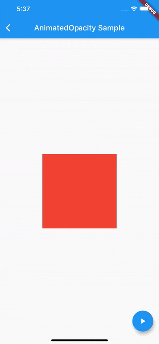
AnimatedOpacity
AnimatedOpacityは Opacity のImplicit Animationsです。Widgetの透明度をアニメーションさせることができます。
下記のサンプルではFloatingActionButtonを押下すると、ContainerのOpacityを1.0から0.0(またはその逆)にアニメーションさせています。
class AnimatedOpacityScreen extends StatefulWidget {
  @override
  _AnimatedOpacityScreenState createState() => _AnimatedOpacityScreenState();
}

class _AnimatedOpacityScreenState extends State<AnimatedOpacityScreen> {
  double _opacity = 1.0;

  @override
  Widget build(BuildContext context) {
    return Scaffold(
      appBar: AppBar(
        title: Text('AnimatedOpacity Sample'),
      ),
      body: Center(
          child: AnimatedOpacity(
        opacity: this._opacity,
        duration: Duration(seconds: 1),
        child: Container(
          width: 200,
          height: 200,
          color: Colors.red,
        ),
      )),
      floatingActionButton: FloatingActionButton(
        child: Icon(Icons.play_arrow),
        onPressed: () {
          setState(() {
            this._opacity = (this._opacity >= 1.0) ? 0.0 : 1.0;
          });
        },
      ),
    );
  }
}
また、透明度のアニメーションは処理が重いため必要最小限に留めておきましょう。
(下記[公式ドキュメント](AnimatedOpacity class - widgets library - Dart API)の引用)
Animating an opacity is relatively expensive because it requires painting the child into an intermediate buffer.
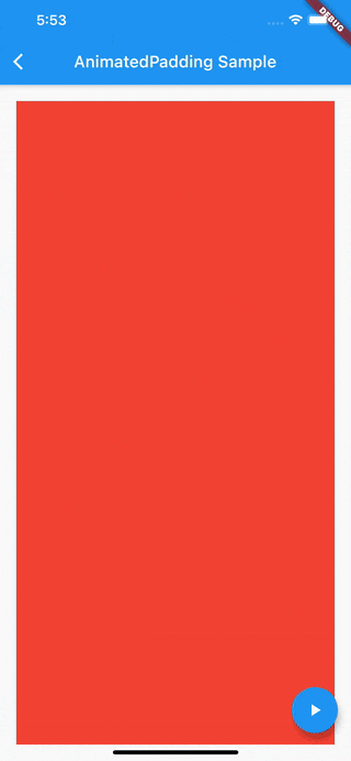
AnimatedPadding
AnimatedPaddingは Padding クラスのImplicit Animationsです。WidgetのPaddingをアニメーションさせることができます。
下記のサンプルではFloatingActionButtonを押下すると、ContainerのPaddingにランダム値を設定しアニメーションさせています。
import 'dart:math';

import 'package:flutter/cupertino.dart';
import 'package:flutter/material.dart';

class AnimatedPaddingScreen extends StatefulWidget {
  @override
  _AnimatedPaddingScreenState createState() => _AnimatedPaddingScreenState();
}

class _AnimatedPaddingScreenState extends State<AnimatedPaddingScreen> {
  EdgeInsets _edgeInsets = EdgeInsets.all(20);

  double _randomPaddingValue() {
    return Random().nextInt(200).toDouble();
  }

  @override
  Widget build(BuildContext context) {
    return Scaffold(
      appBar: AppBar(
        title: Text('AnimatedPadding Sample'),
      ),
      body: Center(
          child: AnimatedPadding(
        padding: this._edgeInsets,
        duration: Duration(seconds: 1),
        child: Container(color: Colors.red),
      )),
      floatingActionButton: FloatingActionButton(
        child: Icon(Icons.play_arrow),
        onPressed: () {
          setState(() {
            final Random random = Random();
            double top = this._randomPaddingValue();
            double right = this._randomPaddingValue();
            double left = this._randomPaddingValue();
            double bottom = this._randomPaddingValue();
            this._edgeInsets = EdgeInsets.only(
                top: top, right: right, left: left, bottom: bottom);
          });
        },
      ),
    );
  }
}
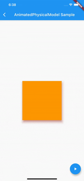
AnimatedPhysicalModel
AnimatedPhysicalModelは PhysicalModel のImplicit Animationsです。
PhysicalModelクラスはchildプロパティに設定したWidgetに対してZ座標の概念を持たせることができます。
Z座標の概念を持ったWidgetは影が描画され、影の色や形などを設定できます。
下記のサンプルではFloatingActionButtonを押下すると、AnimatedPhysicalModelを使用して、Z座標の値、Containerの色、影の色をアニメーションさせています。
(影の形を表すAnimatedPhysicalModelのshapeプロパティはアニメーションできないので固定値となっています)
class AnimatedPhysicalModelScreen extends StatefulWidget {
  @override
  _AnimatedPhysicalModelScreenState createState() =>
      _AnimatedPhysicalModelScreenState();
}

class _AnimatedPhysicalModelScreenState
    extends State<AnimatedPhysicalModelScreen> {
  // Z座標
  static final double fromElevation = 10.0;
  static final double toElevation = 30.0;
  double _elevation = fromElevation;

  // 色
  static final Color fromColor = Colors.orange;
  static final Color toColor = Colors.greenAccent;
  Color _color = fromColor;

  // 影の色
  static final Color fromShadowColor = Colors.red;
  static final Color toShadowColor = Colors.green;
  Color _shadowColor = fromShadowColor;

  @override
  Widget build(BuildContext context) {
    return Scaffold(
      appBar: AppBar(
        title: Text('AnimatedPhysicalModel Sample'),
      ),
      body: Center(
          child: AnimatedPhysicalModel(
        elevation: this._elevation,
        shape: BoxShape.rectangle,
        color: this._color,
        shadowColor: this._shadowColor,
        duration: Duration(seconds: 1),
        child: Container(
          width: 200,
          height: 200,
        ),
      )),
      floatingActionButton: FloatingActionButton(
        child: Icon(Icons.play_arrow),
        onPressed: () {
          setState(() {
            if (this._elevation >= toElevation) {
              this._elevation = fromElevation;
              this._color = fromColor;
              this._shadowColor = fromShadowColor;
            } else {
              this._elevation = toElevation;
              this._color = toColor;
              this._shadowColor = toShadowColor;
            }
          });
        },
      ),
    );
  }
}
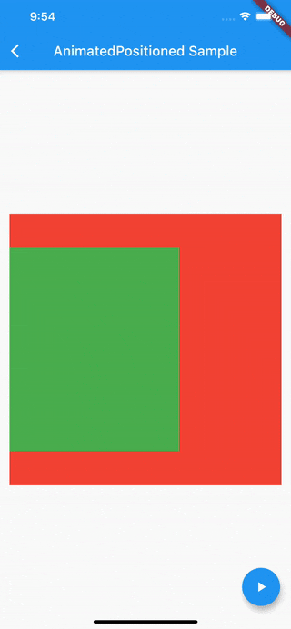
AnimatedPositioned
AnimatedPositionedは Positioned クラスのImplicit Animationsです。Positionedクラスは[Stack]([Stack class - widgets library - Dart API]
(https://api.flutter.dev/flutter/widgets/Stack-class.html))クラスの**child**プロパティに設定することで動作します。
下記のサンプルではFloatingActionButtonを押下すると、AnimatedPositionedのtop、right、left、bottomの値を設定し、childプロパティに設定しているContainerの位置をアニメーションさせています。
class AnimatedPositionedScreen extends StatefulWidget {
  @override
  _AnimatedPositionedScreenState createState() =>
      _AnimatedPositionedScreenState();
}

class _AnimatedPositionedScreenState extends State<AnimatedPositionedScreen> {
  // top
  static final double _fromTop = 50;
  static final double _toTop = 100;
  double _top = _fromTop;

  // right
  static final double _fromRight = 150;
  static final double _toRight = 60;
  double _right = _fromRight;

  // left
  static final double _fromLeft = 0;
  static final double _toLeft = 60;
  double _left = _fromLeft;

  // bottom
  static final double _fromBottom = 50;
  static final double _toBottom = 100;
  double _bottom = _fromBottom;

  // fromとtoのフラグ
  bool isFrom = true;

  @override
  Widget build(BuildContext context) {
    return Scaffold(
      appBar: AppBar(
        title: Text('AnimatedPositioned Sample'),
      ),
      body: Center(
        child: Stack(
          children: [
            Positioned(
                child: Container(
              width: 400,
              height: 400,
              color: Colors.red,
            )),
            AnimatedPositioned(
                duration: Duration(seconds: 1),
                top: this._top,
                right: this._right,
                left: this._left,
                bottom: this._bottom,
                child: Container(
                  color: Colors.green,
                ))
          ],
        ),
      ),
      floatingActionButton: FloatingActionButton(
        child: Icon(Icons.play_arrow),
        onPressed: () {
          setState(() {
            this.isFrom = !this.isFrom;
            this._top = this.isFrom ? _fromTop : _toTop;
            this._right = this.isFrom ? _fromRight : _toRight;
            this._left = this.isFrom ? _fromLeft : _toLeft;
            this._bottom = this.isFrom ? _fromBottom : _toBottom;
          });
        },
      ),
    );
  }
}
こちらのサンプルでは、top、right、left、bottomを変化させることで、Containerのサイズが変更しています。そのようなケースではAnimatedPositionedが適しています。
もし、Containerのサイズを同じままにして、位置のみを変更する場合は、 SlideTransition を検討した方が良いです。
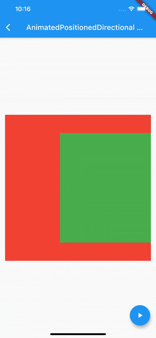
AnimatedPositionedDirectional
AnimatedPositionedDirectionalはPositionedDirectionalのImplicit Animationsです。
PositionedDirectionalはPositionedクラスとほとんど同じです。
違いはWidgetの横方向の始点と終点を変更できる点です。
例えば日本語のテキストだと、文字は左から右へ流れていきますが、言語によっては右から左へ流れる言語もあります。
条件によってどっちの方向が始点でどっちの方向が終点なのかが変わる場合はPositionedではなく、PositionedDirectionalを使用します。
下記のサンプルでは、上記で紹介したAnimatedPositionedのサンプルを右方向を始点にしてアニメーションさせています。
(AnimatedPositionedの部分をAnimatedPositionedDirectionalに変更したコード以外は同じなので省略します。)
Directionality(
    textDirection: TextDirection.rtl,	// 右を始点にする
    child: AnimatedPositionedDirectional(
        duration: Duration(seconds: 1),
        top: this._top,
        start: this._left,				// leftからstartに変更
        end: this._right,				// rightからendに変更
        bottom: this._bottom,
        child: Container(
          color: Colors.green,
        )))
AnimatedTheme
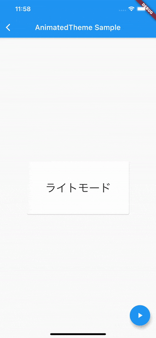
AnimatedThemeは Theme クラスのImplicit Animationsです。
Themeクラスは、childプロパティに設定したWidgetに ThemeData データを適用できます。
ThemeDataではColorやタイポグラフィなどを設定でき、これらのデータをAnimatedThemeを使ってアニメーションさせます。
下記のサンプルでは、FloatingActionButtonを押下すると、Cardの背景色をライトモードとダークモードで切り替えるようにアニメーションしています。
まず、MaterialAppでライトモードとダークモードのThemeDataを設定する必要があります。
class MyApp extends StatelessWidget {
  static final ThemeData _lightTheme = ThemeData(
      primaryColor: Colors.blue,
      accentColor: Colors.blue,
      textTheme: TextTheme(bodyText2: TextStyle(color: Colors.black)));

  static final ThemeData _darkTheme = ThemeData(
      primaryColor: Colors.blue,
      accentColor: Colors.black,
      textTheme: TextTheme(bodyText2: TextStyle(color: Colors.white)));

  @override
  Widget build(BuildContext context) {
    return MaterialApp(
      title: '',
      theme: _lightTheme,
      darkTheme: _darkTheme,
    );
  }
}
AnimatedThemeで設定したThemeDataを参照することで、childプロパティのWidgetに反映されます。
import 'package:flutter/cupertino.dart';
import 'package:flutter/material.dart';

class AnimatedThemeScreen extends StatefulWidget {
  @override
  _AnimatedThemeScreenState createState() => _AnimatedThemeScreenState();
}

class _AnimatedThemeScreenState extends State<AnimatedThemeScreen> {
  bool _isLightMode = true;

  @override
  Widget build(BuildContext context) {
    return Scaffold(
      appBar: AppBar(
        title: Text('AnimatedTheme Sample'),
      ),
      body: Center(
          child: AnimatedTheme(
        duration: Duration(seconds: 1),
        data: this._isLightMode ? ThemeData.light() : ThemeData.dark(),
        child: Card(
          child: Padding(
            padding: EdgeInsets.all(50),
            child: Text(
              this._isLightMode ? 'ライトモード' : 'ダークモード',
              style: TextStyle(fontSize: 30),
            ),
          ),
        ),
      )),
      floatingActionButton: FloatingActionButton(
        child: Icon(Icons.play_arrow),
        onPressed: () {
          setState(() {
            this._isLightMode = !this._isLightMode;
          });
        },
      ),
    );
  }
}
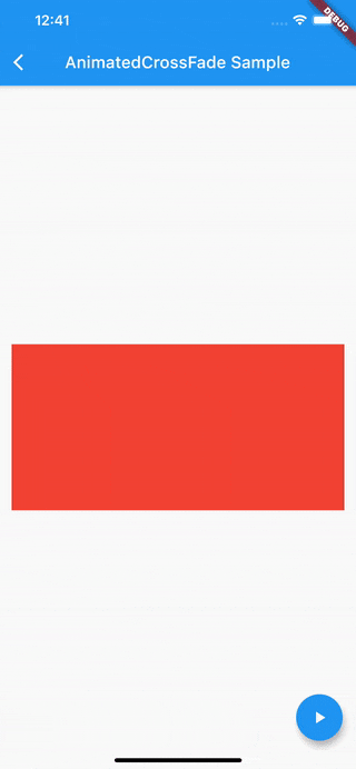
AnimatedCrossFade
AnimatedCrossFadeは異なる二つのWidgetをクロスフェードアニメーションさせるImplicit Animationsです。
下記のサンプルでは色とサイズの違うContainerをクロスフェードさせています。
import 'package:flutter/cupertino.dart';
import 'package:flutter/material.dart';

class AnimatedCrossFadeScreen extends StatefulWidget {
  @override
  _AnimatedCrossFadeScreenState createState() =>
      _AnimatedCrossFadeScreenState();
}

class _AnimatedCrossFadeScreenState extends State<AnimatedCrossFadeScreen> {
  // 最初に表示するWidget
  Widget _firstWidget() {
    return Container(
      width: 400,
      height: 200,
      color: Colors.red,
    );
  }

  // クロスフェードするWidget
  Widget _secondWidget() {
    return Container(
      width: 200,
      height: 300,
      color: Colors.blue,
    );
  }

  // 最初のWidgetを表示するフラグ
  bool showFirst = true;

  @override
  Widget build(BuildContext context) {
    return Scaffold(
      appBar: AppBar(
        title: Text('AnimatedCrossFade Sample'),
      ),
      body: Center(
          child: AnimatedCrossFade(
        duration: Duration(seconds: 1),
        crossFadeState: this.showFirst
            ? CrossFadeState.showFirst
            : CrossFadeState.showSecond,
        firstChild: this._firstWidget(),
        secondChild: this._secondWidget(),
        // layoutBuilderでサイズの違うWidgetでも違和感なく表示する
        layoutBuilder: (topChild, topChildKey, bottomChild, bottomChildKey) {
          return Stack(
            overflow: Overflow.visible,
            alignment: Alignment.center,
            children: [
              Positioned(
                child: bottomChild,
                key: bottomChildKey,
              ),
              Positioned(
                child: topChild,
                key: topChildKey,
              )
            ],
          );
        },
      )),
      floatingActionButton: FloatingActionButton(
        child: Icon(Icons.play_arrow),
        onPressed: () {
          setState(() {
            this.showFirst = !this.showFirst;
          });
        },
      ),
    );
  }
}
AnimatedCrossFadeは同じ幅のWidgetをクロスフェードするのを目的としています。
異なる幅をクロスフェードさせようした場合は、クロスフェードさせようとしたWidgetが急に現れる(伝えづらい…)ような違和感ある動きになってしまいます。
その場合、layoutBuilderを使用すると違和感なく表示することができます。
詳しくは[公式ドキュメント](AnimatedCrossFade class - widgets library - Dart API)を参照ください。
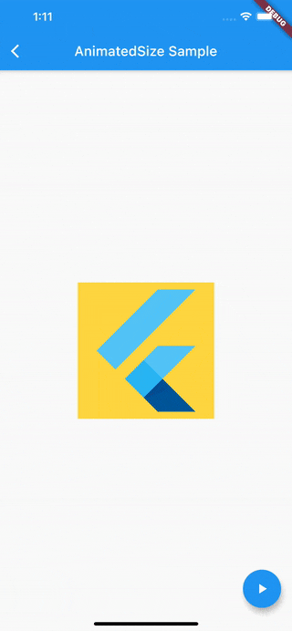
AnimatedSize
AnimatedSizeはchildに設定したWidgetのサイズをアニメーションできるImplicit Animationsです。
下記のサンプルではFlutterロゴのサイズを変更するアニメーションをします。
import 'dart:math';

import 'package:flutter/cupertino.dart';
import 'package:flutter/material.dart';

class AnimatedSizeScreen extends StatefulWidget {
  @override
  _AnimatedSizeScreenState createState() => _AnimatedSizeScreenState();
}

class _AnimatedSizeScreenState extends State<AnimatedSizeScreen>
    with SingleTickerProviderStateMixin {
  double _size = 200;

  @override
  Widget build(BuildContext context) {
    return Scaffold(
      appBar: AppBar(
        title: Text('AnimatedSize Sample'),
      ),
      body: Center(
          child: Container(
        color: Colors.amberAccent,
        child: AnimatedSize(
            vsync: this,
            duration: Duration(seconds: 1),
            child: FlutterLogo(
              size: this._size,
            )),
      )),
      floatingActionButton: FloatingActionButton(
        child: Icon(Icons.play_arrow),
        onPressed: () {
          setState(() {
            this._size = Random().nextInt(300).toDouble();
          });
        },
      ),
    );
  }
}
※ childプロパティにFlutterLogoではなくContainerを指定したところ、アニメーションが滑らかにいきませんでした。こちらは調査中です。
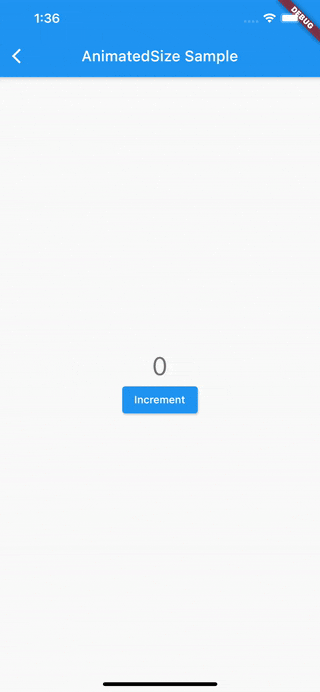
AnimatedSwitcher
AnimatedSwitcherはchildプロパティに新たに設定したWidgetと、前のWidgetをアニメーションで切り替えるImplicit Animationsです。
デフォルトのアニメーションはクロスフェードですが、そのほかにもスケールしながら表示させる[ScaleTransition](ScaleTransition class - widgets library - Dart API)や、回転しながら表示させる[RotationTransition](RotationTransition class - widgets library - Dart API)なども設定できます。
注意点として、新たに表示させるWidgetと前のwidgetが同じWidgetの場合は、keyを設定する必要があります。
下記のサンプルでは、ElevatedButton押下でカウントをインクリメントされたテキストをScaleTransitionでアニメーションさせています。
import 'package:flutter/cupertino.dart';
import 'package:flutter/material.dart';

class AnimatedSwitcherScreen extends StatefulWidget {
  @override
  _AnimatedSwitcherScreenState createState() => _AnimatedSwitcherScreenState();
}

class _AnimatedSwitcherScreenState extends State<AnimatedSwitcherScreen> {
  int _count = 0;

  @override
  Widget build(BuildContext context) {
    return Scaffold(
      appBar: AppBar(
        title: Text('AnimatedSize Sample'),
      ),
      body: Center(
        child: Container(
          child: Column(
            mainAxisAlignment: MainAxisAlignment.center,
            children: <Widget>[
              AnimatedSwitcher(
                duration: const Duration(milliseconds: 500),
                transitionBuilder: (Widget child, Animation<double> animation) {
                  return ScaleTransition(child: child, scale: animation);
                },
                child: Text(
                  '$_count',
                  key: ValueKey<int>(_count),
                  style: Theme.of(context).textTheme.headline4,
                ),
              ),
              ElevatedButton(
                child: const Text('Increment'),
                onPressed: () {
                  setState(() {
                    this._count += 1;
                  });
                },
              ),
            ],
          ),
        ),
      ),
    );
  }
}
終わりに
本記事ではImplicit Animationsのサンプルを紹介しました。
各アニメーションの実装で省略しましたが、ほとんどのImplicit AnimationsにはCurveを設定でき、アニメーションの速度の波を変えることもできます。
またこちらも紹介しませんでしたが、TweenAnimationBuilderクラスを使うと、カスタムのアニメーションを実装できるので、これまで紹介したImplicit Animationsでは実現が難しいならこちらを検討するのも良いと思います。
以上です。
参考にしたサイト
- Implicit animations - Flutter
- ImplicitlyAnimatedWidget class - widgets library - Dart API
- Flutterのお手軽にアニメーションを扱えるAnimated系Widgetをすべて紹介
リポジトリ