背景
高次元データは複雑で直感的に分かりにくいため,そのままでは分析・可視化するのは難しいです.そのような場面では,次元削減と呼ばれる手法によって,データを低次元に落とすことがよく行われています.
ところで,このサイト内では,UMAPと呼ばれる次元削減手法を色々なデータセットに使用したときに,どのように低次元化されるかをWeb上で(楽しく)見ることができます.
https://pair-code.github.io/understanding-umap/

ここでは,そのUMAPの紹介・・・ではなく,サイト内でtoy datasetsと呼ばれて使用されている人工的に作られたデータセットを他の次元削減手法(例えばPCAなど)に置き換えたらどうなるんだろう?という思いから,上記サイトのソースコードからデータセット部分を抜き出したものになります.つまり,javascriptで記述されているtoy dataset部分をpythonで書き直したものになります(ちなみに,私のjavascriptレベルは素人級なので,もし間違っている部分がありましたら指摘して頂けると幸いです).
方法
https://pair-code.github.io/understanding-umap/
上記サイト上で,chromeの開発者ツール(macの場合,cmd+option+i)のSourcesタブを開き,
/src/shared/js/generator.js
/src/shared/js/toy-configs.js
/src/visualizations/toy_comparison_visualization/js/demos.js
のjavascriptで書かれたソースコードをpythonに置き換えて実装する.
データセット(toy datasets)
ここではいきなり実行結果を貼っており,データセットの生成方法については一切触れません(私も勉強中なので)
全ての実行結果は,こちらのgithubに乗せてあります!
https://github.com/tsuno0829/ToyDatasets
また,実行結果のプログラムは全て下記を既にimportしている前提で進んでいます!
%matplotlib nbagg
import numpy as np
import matplotlib.pyplot as plt
from mpl_toolkits.mplot3d import Axes3D
import copy
from generator import *   # データセットを記述している部分
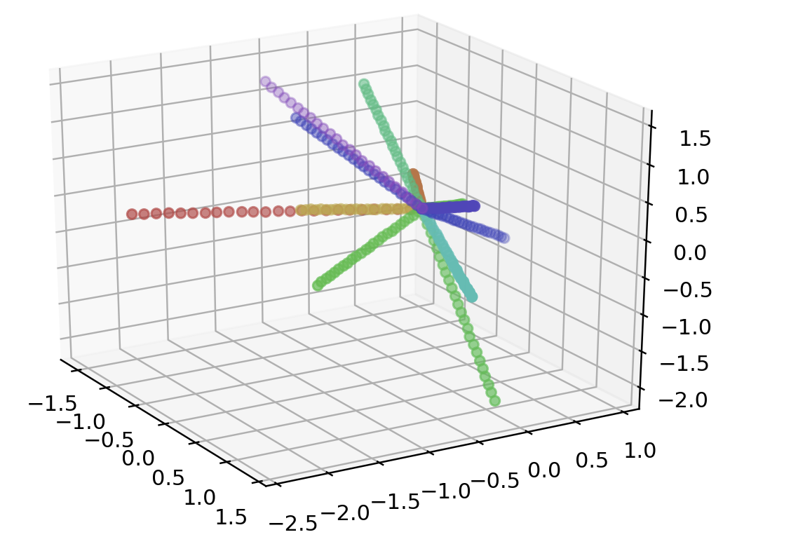
"""
name: "Star",
    description: "Points arranged in a radial star pattern",
    options: [
      {
        name: "Number of points",
        min: 10,
        max: 300,
        start: 100
      },
      {
        name: "Number of arms",
        min: 3,
        max: 20,
        start: 5
      },
      {
        name: "Dimensions",
        min: 3,
        max: 50,
        start: 10
      }
    ],
    generator: generators.star

name: "Star",
    options: [
      { name: "Number of points", start: 300 },
      { name: "Number of arms", start: 12 },
      { name: "Dimensions", start: 10 }

"""
points = star(300, 12, 3)
data = np.array(list(map(lambda point: point.coords, points)))
color = np.array(list(map(lambda point: point.color, points)))
print(data.shape)

fig = plt.figure()
ax = fig.add_subplot(111, projection='3d')
ax.scatter(data[:, 0], data[:, 1], data[:, 2], color=color)
plt.show()
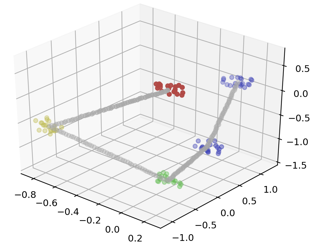
 """
name: "Linked Clusters",
description: "Clusters linked with a chain of points",
options: [
  {
    name: "Number of clusters",
    min: 3,
    max: 20,
    start: 6
  },
  {
    name: "Points per cluster",
    min: 10,
    max: 100,
    start: 30
  },
  {
    name: "Points per link",
    min: 5,
    max: 100,
    start: 15
  },
  {
    name: "Dimensions",
    min: 3,
    max: 100,
    start: 10
  }
],
generator: generators.linkedClusters

name: "Linked Clusters",
options: [
  { name: "Number of clusters", start: 6 },
  { name: "Points per cluster", start: 100 },
  { name: "Points per link", start: 50 },
  { name: "Dimensions", start: 10 }
"""
points = linkedClusters(5, 20, 50, 3)
data = np.array(list(map(lambda point: point.coords, points)))
color = np.array(list(map(lambda point: point.color, points)))

fig = plt.figure()
ax = fig.add_subplot(111 , projection='3d')
ax.scatter3D(data[:, 0], data[:, 1], data[:, 2], color=color)
plt.show()
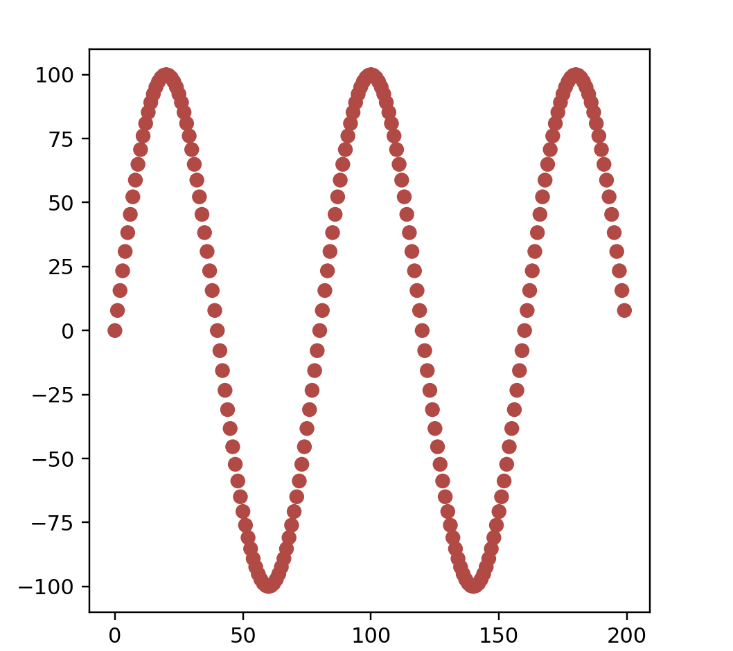
"""
name: "Sine frequency",
    description:
      "Vectors of a sine wave parameterized by frequency. Hue corresponds to frequency.",
    options: [
      {
        name: "Number of vectors",
        min: 10,
        max: 200,
        start: 50
      },
      {
        name: "Vector size",
        min: 3,
        max: 300,
        start: 100
      }
    ],
    generator: generators.sineFrequency,
    previewOverride: generators.sineFreqPreview

name: "Sine frequency",
    options: [
      { name: "Number of vectors", start: 200 },
      { name: "Vector size", start: 256 }
"""

points = sineFreqPreview(200)
data = np.array(list(map(lambda point: point.coords, points)))
color = np.array(list(map(lambda point: point.color, points)))
print(data.shape)

fig = plt.figure()
ax = fig.add_subplot(111)
ax.scatter(data[:, 0], data[:, 1], color=color)
ax.set_aspect('equal')
plt.show()
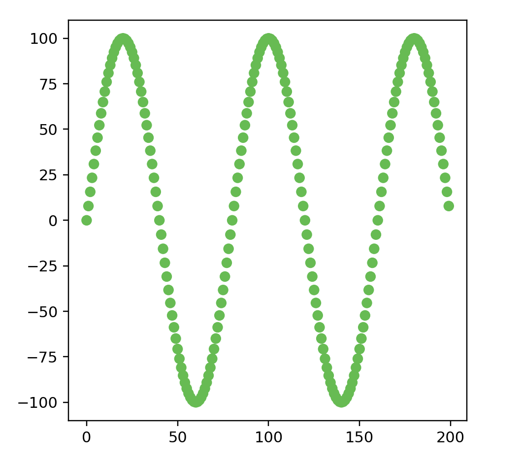
"""
name: "Sine phase",
    description:
      "Vectors of a sine wave parameterized by phase. Hue corresponds to phase.",
    options: [
      {
        name: "Number of vectors",
        min: 10,
        max: 200,
        start: 50
      },
      {
        name: "Vector size",
        min: 3,
        max: 300,
        start: 100
      }
    ],
    generator: generators.sinePhase,
    previewOverride: generators.sinePhasePreview

name: "Sine phase",
    options: [
      { name: "Number of vectors", start: 200 },
      { name: "Vector size", start: 256 }
"""

points = sinePhasePreview(200)
data = np.array(list(map(lambda point: point.coords, points)))
color = np.array(list(map(lambda point: point.color, points)))
print(data.shape)

fig = plt.figure()
ax = fig.add_subplot(111)
ax.scatter(data[:, 0], data[:, 1], color=color)
ax.set_aspect('equal')
plt.show()
"""
name: "Rotated lines",
description:
"nxn images of a line rotated smoothly around the center, represented as an n*n dimensional vector.",
options: [
{
name: "Number of lines",
min: 10,
max: 200,
start: 50
},
{
name: "Pixels per side",
min: 5,
max: 28,
start: 10
}
],
generator: generators.continuousLineImages,
previewOverride: generators.linePreview
name: "Rotated lines",
options: [
{ name: "Number of lines", start: 200 },
{ name: "Pixels per side", start: 28 }
"""
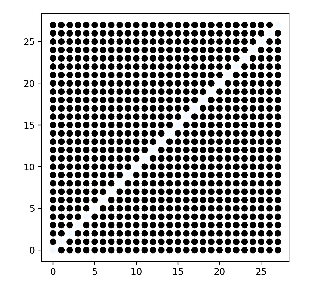
points = linePreview(200, 28)
data = np.array(list(map(lambda point: point.coords, points)))
color = np.array(list(map(lambda point: point.color, points)))
fig = plt.figure()
ax = fig.add_subplot(111)
ax.scatter(data[:, 0], data[:, 1], color=color)
ax.set_aspect('equal')
plt.show()
"""
name: "Rotated lines, clustered",
description:
"nxn images of a line rotated around the center, represented as an n*n dimensional vector. Grouped by similar angles.",
options: [
{
name: "Number of lines",
min: 10,
max: 200,
start: 50
},
{
name: "Number of clusters",
min: 3,
max: 12,
start: 5
},
{
name: "Noise",
min: 0,
max: 100,
start: 8
},
{
name: "Pixels per side",
min: 5,
max: 28,
start: 10
}
],
generator: generators.clusteredLineImages,
previewOverride: generators.lineClusterPreview
name: "Rotated lines, clustered",
options: [
{ name: "Number of lines", start: 200 },
{ name: "Number of clusters", start: 10 },
{ name: "Noise", start: 8 },
{ name: "Pixels per side", start: 28 }
"""
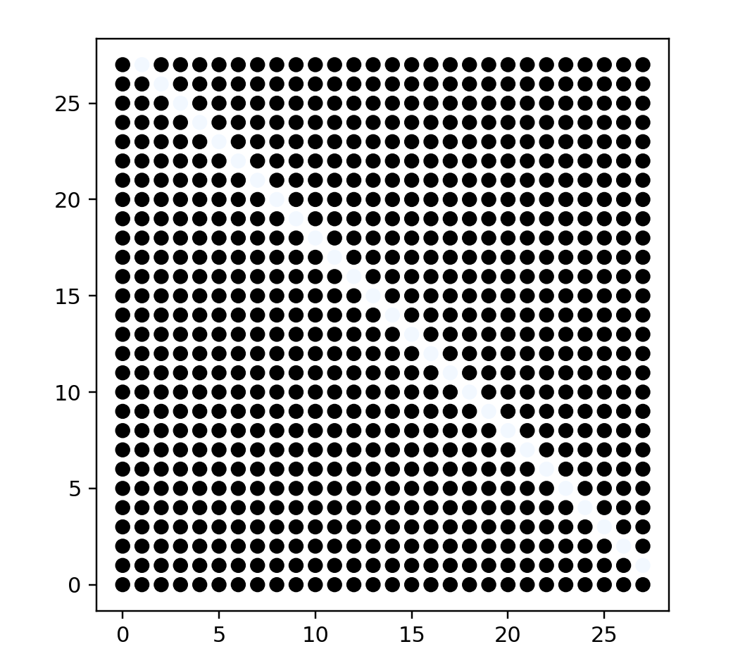
points = lineClusterPreview(200, 28)
data = np.array(list(map(lambda point: point.coords, points)))
color = np.array(list(map(lambda point: point.color, points)))
fig = plt.figure()
ax = fig.add_subplot(111)
ax.scatter(data[:, 0], data[:, 1], color=color)
ax.set_aspect('equal')
plt.show()
# name: "Grid",
# options: [{ name: "Points Per Side", start: 20 }],
# description: "A square grid with equal spacing between points."
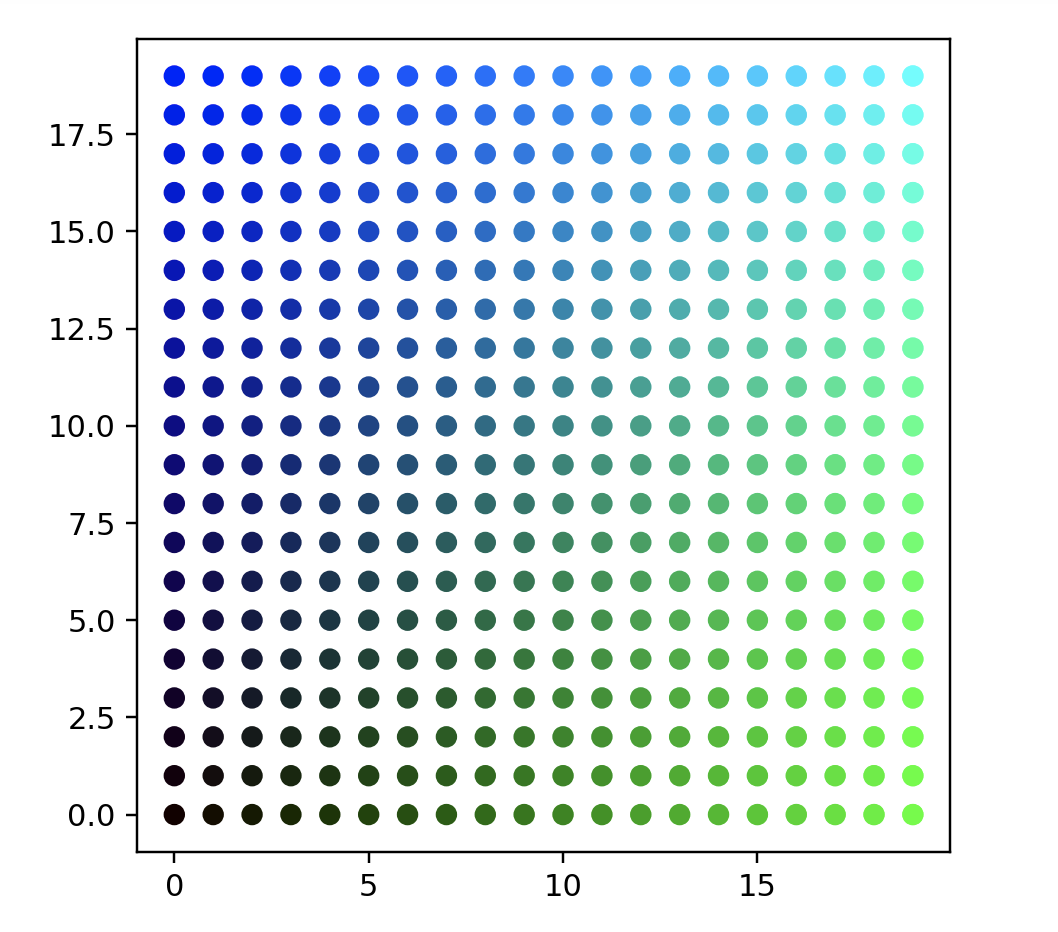
points = gridData(20)
data = np.array(list(map(lambda point: point.coords, points)))
color = np.array(list(map(lambda point: point.color, points))) / 255.0
fig = plt.figure()
ax = fig.add_subplot(111)
ax.scatter(data[:, 0], data[:, 1], color=color)
ax.set_aspect('equal')
plt.show()
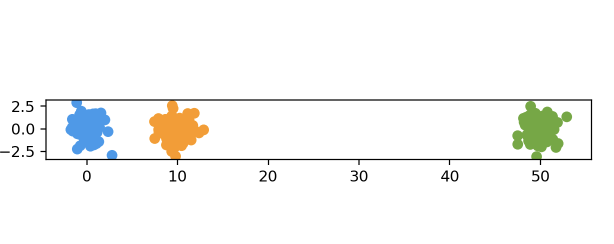
"""
name: "Two Clusters",
description: "Two clusters with equal numbers of points.",
options: [
{
name: "Points Per Cluster",
min: 10,
max: 100,
start: 50
},
{
name: "Dimensions",
min: 1,
max: 100,
start: 2
}
],
generator: generators.twoClustersData
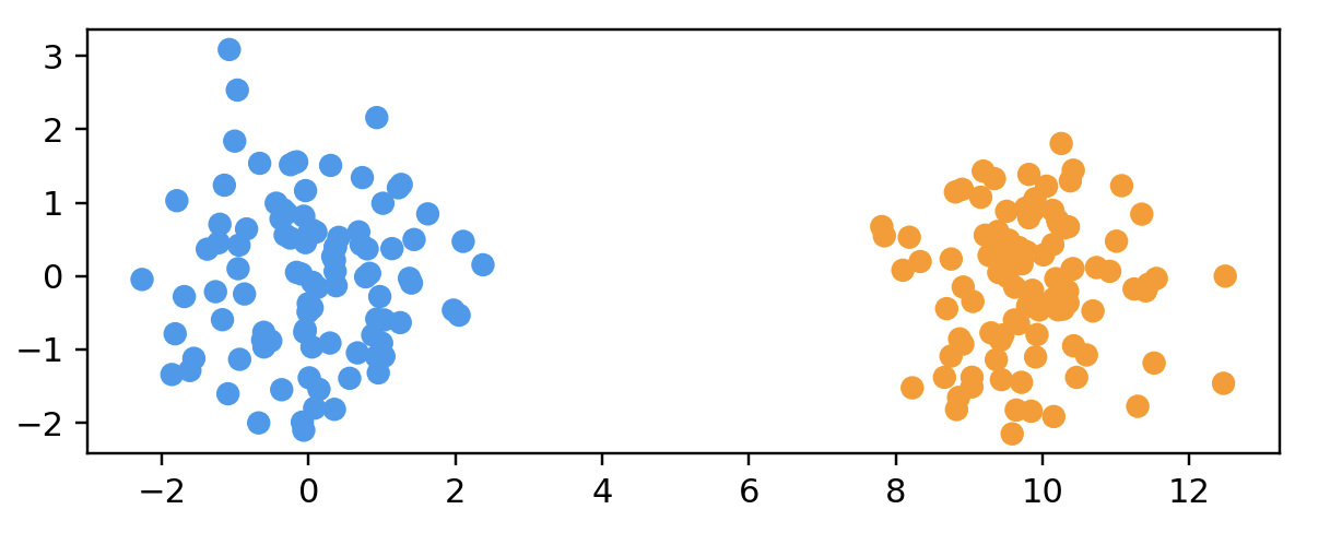
name: "Two Clusters",
options: [
{ name: "Points Per Cluster", start: 100 },
{ name: "Dimensions", start: 50 }
"""
points = twoClustersData(100, 2)
data = np.array(list(map(lambda point: point.coords, points)))
color = np.array(list(map(lambda point: point.color, points)))
print(data.shape)
fig = plt.figure()
ax = fig.add_subplot(111)
ax.scatter(data[:, 0], data[:, 1], color=color)
ax.set_aspect('equal')
plt.show()
# threeClustersData2d
points = threeClustersData2d(100)
data = np.array(list(map(lambda point: point.coords, points)))
color = np.array(list(map(lambda point: point.color, points)))
print(data.shape)

fig = plt.figure()
ax = fig.add_subplot(111)
ax.scatter(data[:, 0], data[:, 1], color=color)
ax.set_aspect('equal')
plt.show()
# twoDifferentClustersData
"""
name: "Two Different-Sized Clusters",
    description:
      "Two clusters with equal numbers of points, but different " +
      "variances within the clusters.",
    options: [
      {
        name: "Points Per Cluster",
        min: 10,
        max: 100,
        start: 50
      },
      {
        name: "Dimensions",
        min: 1,
        max: 100,
        start: 2
      },
      {
        name: "Scale",
        min: 1,
        max: 10,
        start: 5
      }
    ],
    generator: generators.twoDifferentClustersData

name: "Two Different-Sized Clusters",
    options: [
      { name: "Points Per Cluster", start: 100 },
      { name: "Dimensions", start: 50 },
      { name: "Scale", start: 5 }
"""
points = twoDifferentClustersData(100, 2, 5)
data = np.array(list(map(lambda point: point.coords, points)))
color = np.array(list(map(lambda point: point.color, points)))
print(data.shape)

fig = plt.figure()
ax = fig.add_subplot(111)
ax.scatter(data[:, 0], data[:, 1], color=color)
ax.set_aspect('equal')
plt.show()
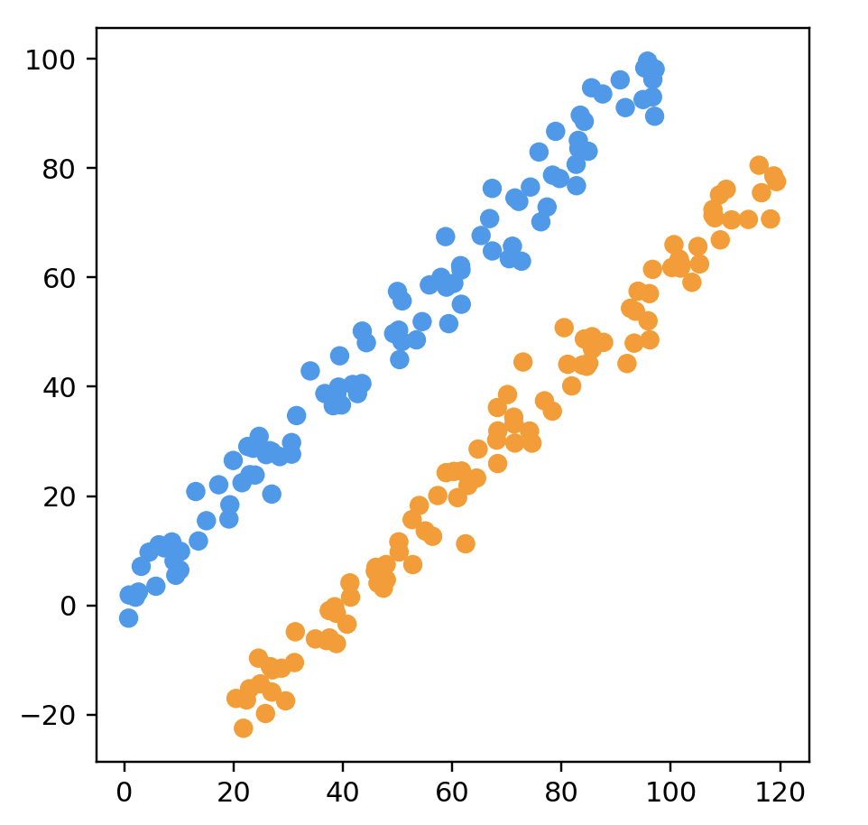
# longClusterData
"""
name: "Two Long Linear Clusters",
    description:
      "Two sets of points, arranged in parallel lines that " +
      "are close to each other. Note curvature of lines.",
    options: [
      {
        name: "Points Per Cluster",
        min: 10,
        max: 100,
        start: 50
      }
    ],
    generator: generators.longClusterData

name: "Two Long Linear Clusters",
    options: [{ name: "Points Per Cluster", start: 100 }]
"""

points = longClusterData(100)
data = np.array(list(map(lambda point: point.coords, points)))
color = np.array(list(map(lambda point: point.color, points)))
print(data.shape)

fig = plt.figure()
ax = fig.add_subplot(111)
ax.scatter(data[:, 0], data[:, 1], color=color)
ax.set_aspect('equal')
plt.show()
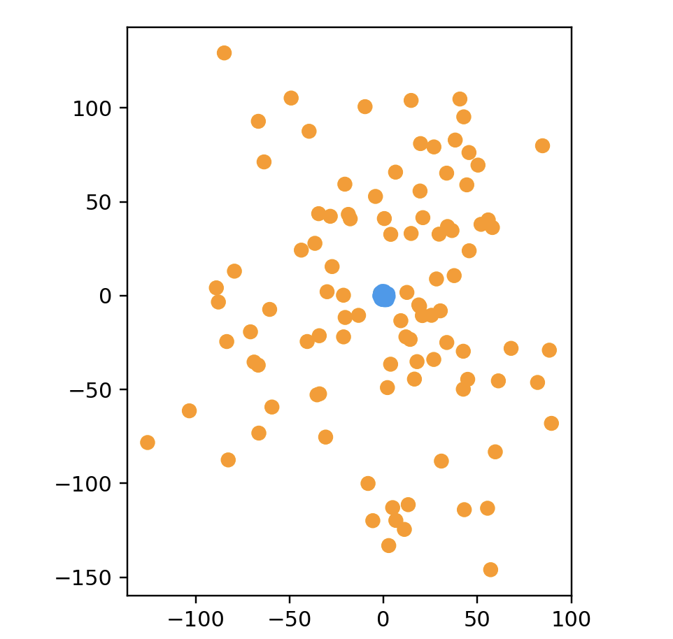
# subsetClustersData(色つけないとわからない)
# name: "Cluster In Cluster",
#     description: "A dense, tight cluster inside of a wide, sparse cluster.",
#     options: [
#       {
#         name: "Points Per Cluster",
#         min: 10,
#         max: 100,
#         start: 50
#       },
#       {
#         name: "Dimensions",
#         min: 1,
#         max: 100,
#         start: 2
#       }
#     ],
#     generator: generators.subsetClustersData
# name: "Cluster In Cluster",
#     options: [
#       { name: "Points Per Cluster", start: 100 },
#       { name: "Dimensions", start: 50 }
points = subsetClustersData(100, 2)
data = np.array(list(map(lambda point: point.coords, points)))
color = np.array(list(map(lambda point: point.color, points)))
print(data.shape)

fig = plt.figure()
ax = fig.add_subplot(111)
ax.scatter(data[:, 0], data[:, 1], color=color)
ax.set_aspect('equal')
plt.show()
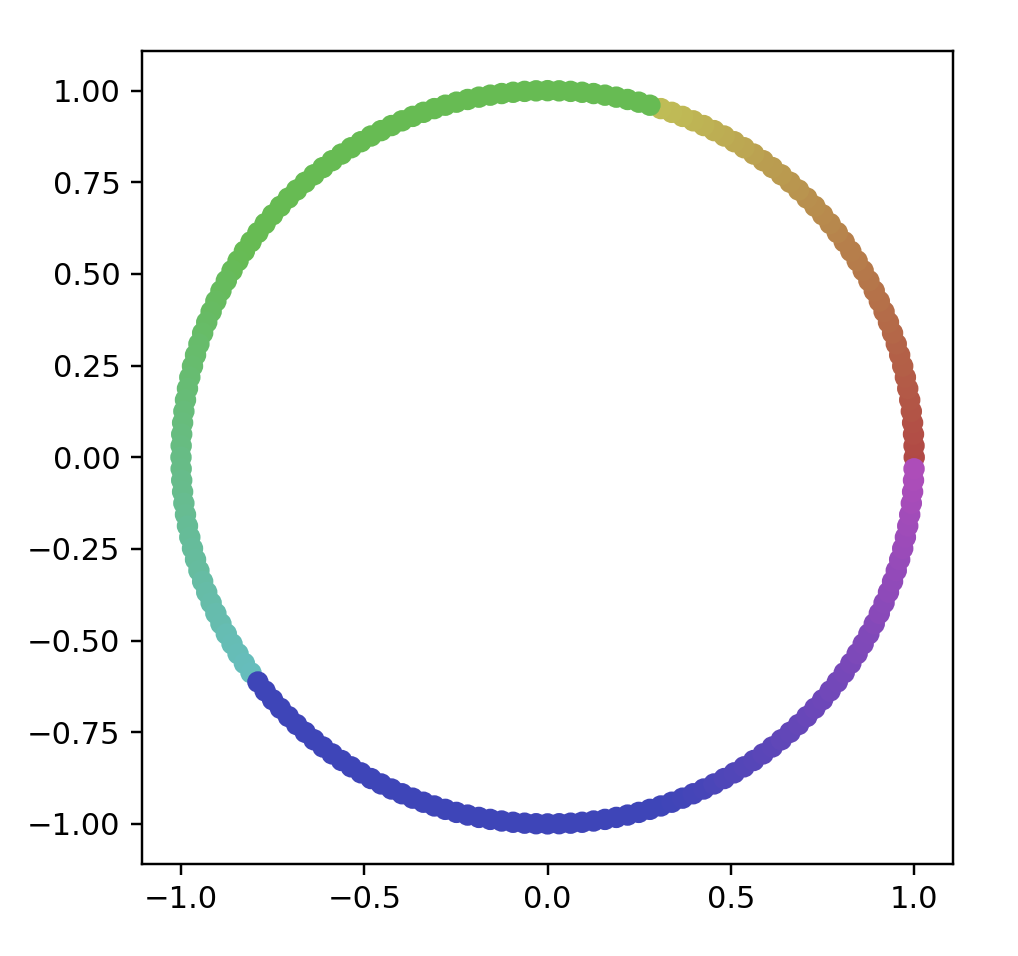
# name: "Circle (Evenly Spaced)",
# options: [{ name: "Number Of Points", start: 200 }]
points = circleData(200)
data = np.array(list(map(lambda point: point.coords, points)))
color = np.array(list(map(lambda point: point.color, points)))

fig = plt.figure()
ax = fig.add_subplot(111)
ax.scatter(data[:, 0], data[:, 1], color=color)
ax.set_aspect('equal')
plt.show()
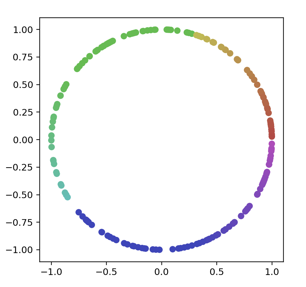
# name: "Circle (Randomly Spaced)",
# options: [{ name: "Number Of Points", start: 200 }]
points = randomCircleData(200)
data = np.array(list(map(lambda point: point.coords, points)))
color = np.array(list(map(lambda point: point.color, points)))

fig = plt.figure()
ax = fig.add_subplot(111)
ax.scatter(data[:, 0], data[:, 1], color=color)
ax.set_aspect('equal')
plt.show()
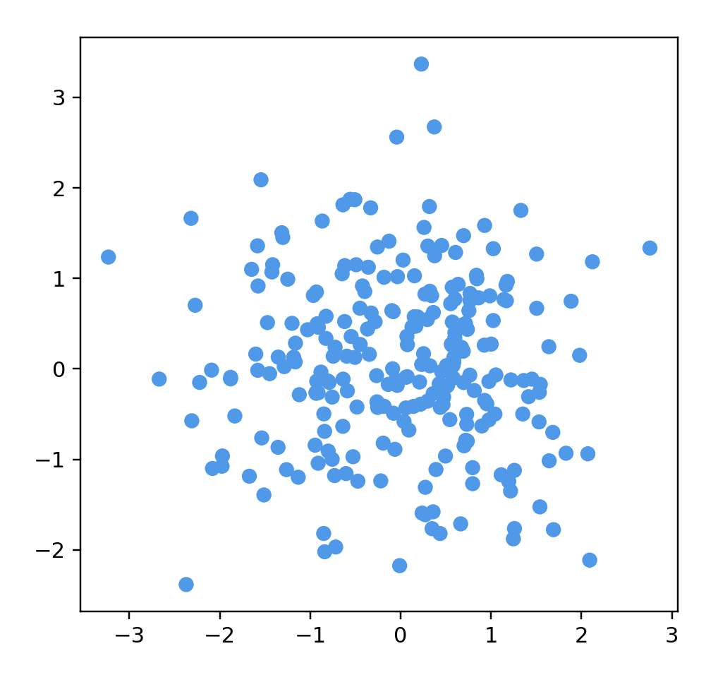
# name: "Gaussian Cloud",
# options: [
# { name: "Number Of Points", start: 250 },
# { name: "Dimensions", start: 50 }
points = gaussianData(250, 200)
data = np.array(list(map(lambda point: point.coords, points)))
color = np.array(list(map(lambda point: point.color, points)))

fig = plt.figure()
ax = fig.add_subplot(111)
ax.scatter(data[:, 0], data[:, 1], color=color)
ax.set_aspect('equal')
plt.show()
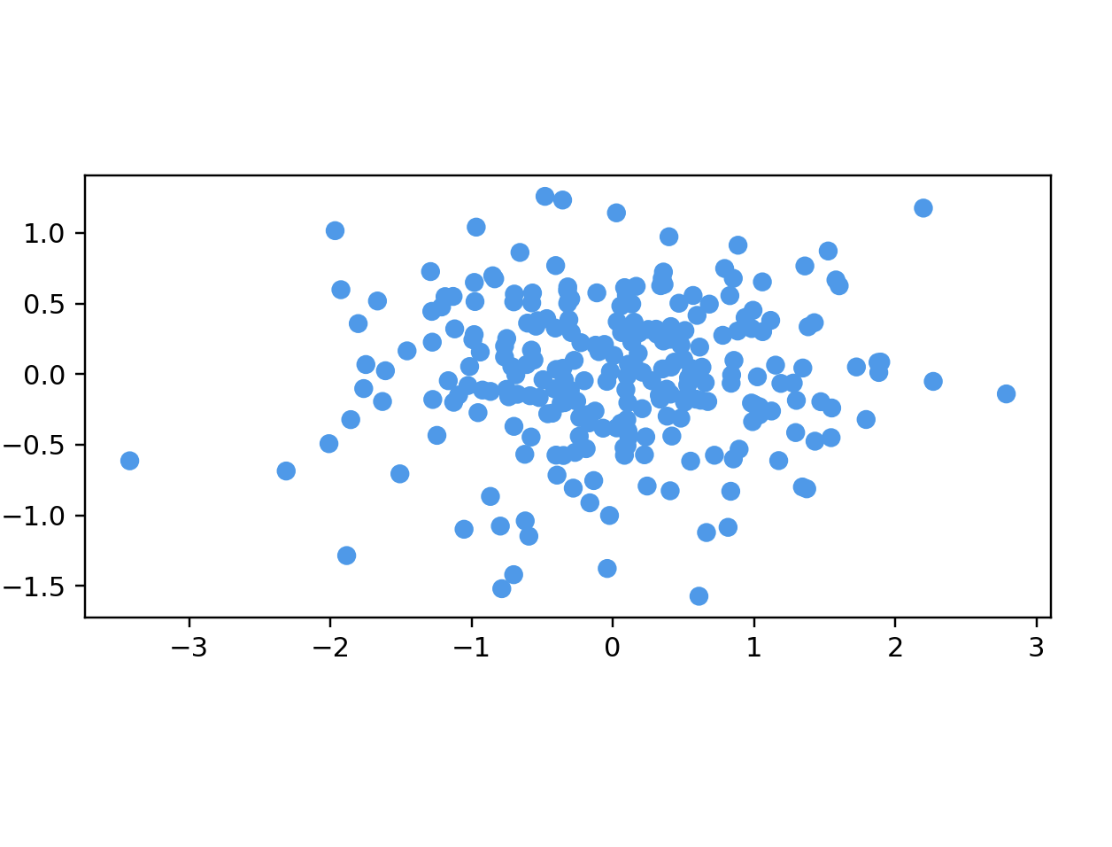
# name: "Ellipsoidal Gaussian Cloud",
# options: [
# { name: "Number Of Points", start: 250 },
# { name: "Dimensions", start: 50 }
points = longGaussianData(250, 50)
data = np.array(list(map(lambda point: point.coords, points)))
color = np.array(list(map(lambda point: point.color, points)))

fig = plt.figure()
ax = fig.add_subplot(111)
ax.scatter(data[:, 0], data[:, 1], color=color)
ax.set_aspect('equal')
plt.show()
# trefoil knot(三葉結び目)
# default: 200
points = trefoilData(200)
data = np.array(list(map(lambda point: point.coords, points)))
color = np.array(list(map(lambda point: point.color, points)))

fig = plt.figure()
ax = fig.add_subplot(111 , projection='3d')
ax.scatter3D(data[:, 0], data[:, 1], data[:, 2], color=color)
plt.show()
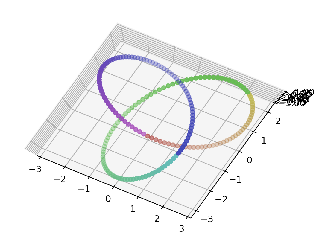
# Linked Rings
points = linkData(200)
data = np.array(list(map(lambda point: point.coords, points)))
color = np.array(list(map(lambda point: point.color, points)))

fig = plt.figure()
ax = fig.add_subplot(111 , projection='3d')
ax.scatter3D(data[:, 0], data[:, 1], data[:, 2], color=color)
plt.show()
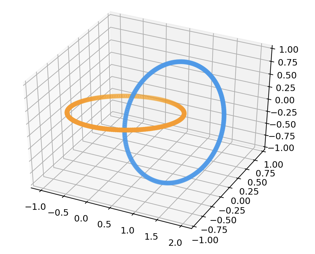
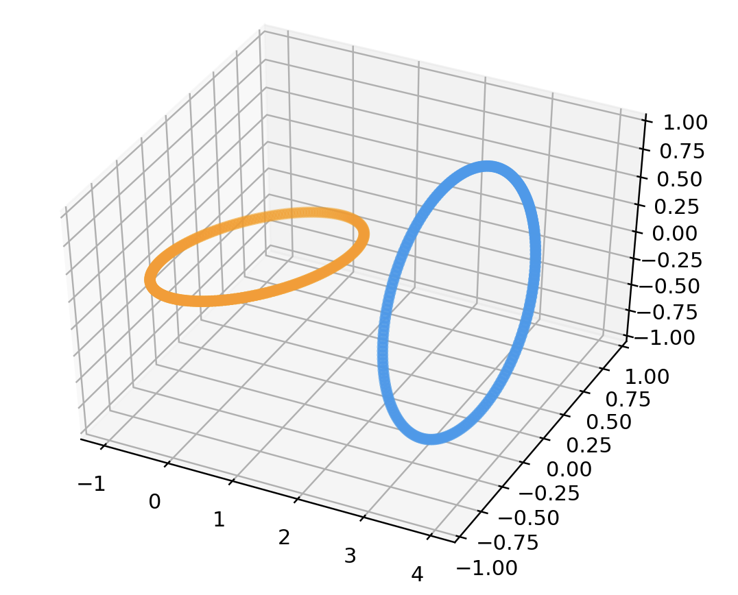
# unLinked Rings
points = unlinkData(200)
data = np.array(list(map(lambda point: point.coords, points)))
color = np.array(list(map(lambda point: point.color, points)))

fig = plt.figure()
ax = fig.add_subplot(111 , projection='3d')
ax.scatter3D(data[:, 0], data[:, 1], data[:, 2], color=color)
plt.show()
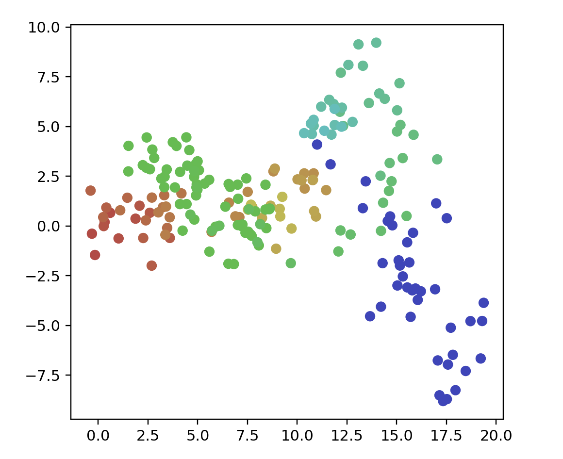
"""
name: "Orthogonal Steps",
    description:
      "Points related by mutually orthogonal steps. " +
      "Very similar to a random walk.",
    options: [
      {
        name: "Number Of Points",
        min: 20,
        max: 500,
        start: 50
      }
    ],
    generator: generators.orthoCurve

    name: "Orthogonal Steps",
    options: [{ name: "Number Of Points", start: 200 }]
"""

points = orthoCurve(200)
data = np.array(list(map(lambda point: point.coords, points)))
color = np.array(list(map(lambda point: point.color, points)))
print(data.shape)

fig = plt.figure()
ax = fig.add_subplot(111)
ax.scatter(data[:, 0], data[:, 1], color=color)
ax.set_aspect('equal')
plt.show()
# name: "Random Walk",
#    options: [
#      { name: "Number Of Points", start: 200 },
#      { name: "Dimension", start: 100 }
points = randomWalk(200, 2)
data = np.array(list(map(lambda point: point.coords, points)))
color = np.array(list(map(lambda point: point.color, points)))

fig = plt.figure()
ax = fig.add_subplot(111)
ax.scatter(data[:, 0], data[:, 1], color=color)
ax.set_aspect('equal')
plt.show()
# name: "Random Jump",
#    options: [
#      { name: "Number Of Points", start: 200 },
#      { name: "Dimension", start: 100 }]
points = randomJump(200, 2)
data = np.array(list(map(lambda point: point.coords, points)))
color = np.array(list(map(lambda point: point.color, points)))

fig = plt.figure()
ax = fig.add_subplot(111)
ax.scatter(data[:, 0], data[:, 1], color=color)
ax.set_aspect('equal')
plt.show()
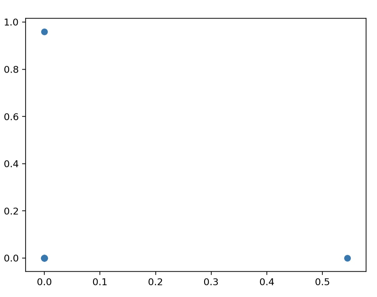
# 可視化の仕方が悪そう->200点生成すると200次元のデータセットができる(1点は大きさほぼ1(ノイズ付与)で1/200次元のデータとなる)
# name: "Equally Spaced",
# description:
# "A set of points, where distances between all pairs of " +
# "points are the same in the original space.",
# options: [
# {
# name: "Number Of Points",
# min: 20,
# max: 100,
# start: 50
# }
# ],
# generator: generators.simplexData
# name: "Equally Spaced",
# options: [{ name: "Number Of Points", start: 200 }]
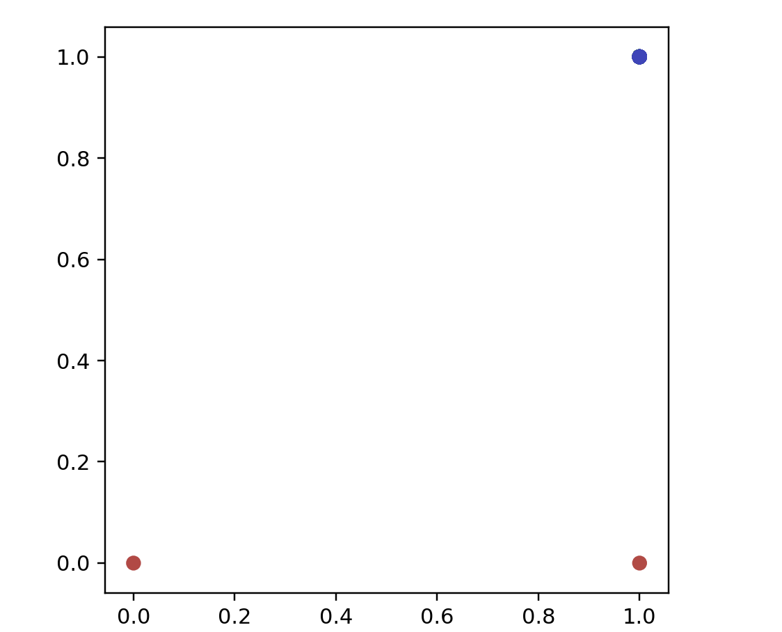
points = simplexData(200)
data = np.array(list(map(lambda point: point.coords, points)))
print(data.shape)
fig = plt.figure()
ax = fig.add_subplot(111)
ax.scatter(data[:, 0], data[:, 1]) # plotされるのは3点で良い=>[1,0,...], [0, 1, ...], [0, 0, ...], [0, 0, ...]より[1,0][0,1][0,0]の3点にプロットされる
# ax.set_aspect('equal')
plt.show()
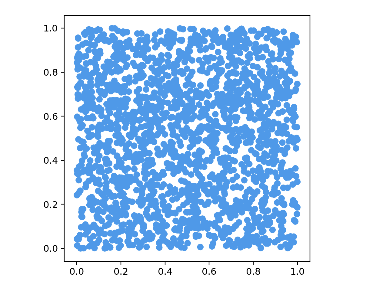
# name: "Uniform Distribution",
#     options: [
#       { name: "Number Of Points", start: 200 },
#       { name: "Dimensions", start: 10 }
points = cubeData(2000, 2)
data = np.array(list(map(lambda point: point.coords, points)))
color = np.array(list(map(lambda point: point.color, points)))

fig = plt.figure()
ax = fig.add_subplot(111)
ax.scatter(data[:, 0], data[:, 1], color=color)
ax.set_aspect('equal')
plt.show()
まとめ
時間がなくデータセットを行うプログラムをただ書きなぐる感じになってしまいました.もう少し補足やコメントを付け足すなど若干の修正は今後行いたいです・・・!
また,本来の目的であったこれらのデータセットをPCAやSOMなどに書けた場合にどのような結果になるかを今後実際に実験してみたいと思います!
参考文献
[1] Understanding UMAP https://pair-code.github.io/understanding-umap/
[2] How to Use t-SNE Effectively https://distill.pub/2016/misread-tsne/