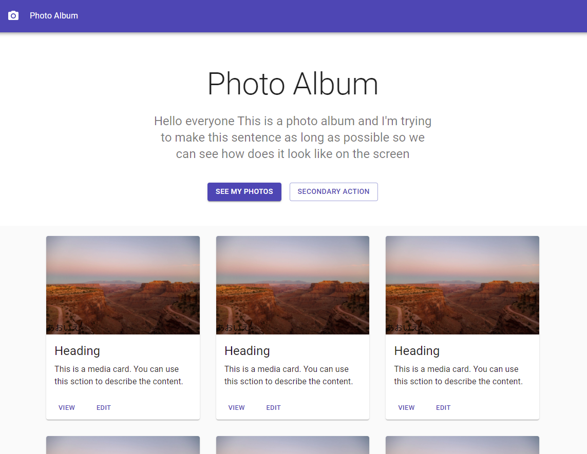
作るもの
以下のフォトアルバムをMaterial UIで作る
プロジェクトの作成
mkdir material-ui-demo
cd material-ui-demo
npx create-react-app ./ --use-npm
npm install @material-ui/core @material-ui/icons
npm start
- srcフォルダを消して、新たなsrcフォルダを作成する
- 3つのファイル作成
📦material-ui-demo
 ┣ 📂node_modules
 ┣ 📂public
 ┃ ┣ 📜index.html
 ┣ 📂src
 ┃ ┣ 📜App.jsx
 ┃ ┣ 📜index.js
 ┃ ┗ 📜styles.js
 ┣ 📜package-lock.json
 ┗ 📜package.json
- 以下を挿入する
public/index.html
<link rel="stylesheet" href="https://fonts.googleapis.com/css?family=Roboto:300,400,500,700&display=swap" />
<title>React App</title>
index.js
src/index.jsx
import React from "react";
import ReactDOM from "react-dom";

import App from "./App";

ReactDOM.render(<App />, document.getElementById("root"));
App.jsx
src/App.jsx
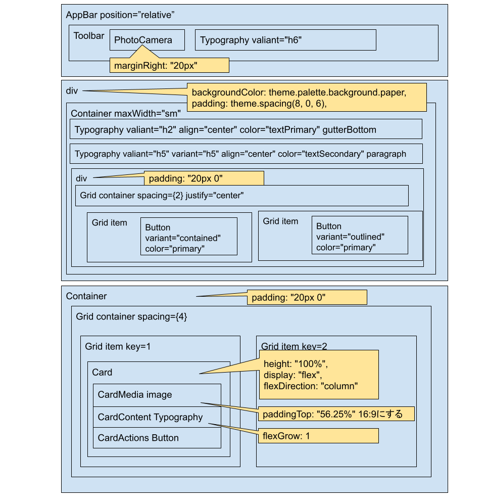
import React from "react";
import { Typography, AppBar, Button, Card, CardActions, CardContent, CardMedia, CssBaseline, Grid, Toolbar, Container } from "@material-ui/core";
import { PhotoCamera } from "@material-ui/icons";

import useStyles from "./styles";

const cards = [1, 2, 3, 4, 5, 6, 7, 8, 9];

const App = () => {
  const classes = useStyles();
  return (
    <>
      <CssBaseline />
      <AppBar position="relative">
        <Toolbar>
          <PhotoCamera className={classes.icon} />
          <Typography valiant="h6">Photo Album</Typography>
        </Toolbar>
      </AppBar>
      <main>
        <div className={classes.container}>
          <Container maxWidth="sm">
            <Typography variant="h2" align="center" color="textPrimary" gutterBottom>
              Photo Album
            </Typography>
            <Typography variant="h5" align="center" color="textSecondary" paragraph>
              Hello everyone This is a photo album and I'm trying to make this sentence as long as possible so we can see how does it look like on the screen
            </Typography>
            <div className={classes.buttons}>
              <Grid container spacing={2} justify="center">
                <Grid item>
                  <Button variant="contained" color="primary">
                    See my photos
                  </Button>
                </Grid>
                <Grid item>
                  <Button variant="outlined" color="primary">
                    Secondary Action
                  </Button>
                </Grid>
              </Grid>
            </div>
          </Container>
        </div>
        <Container className={classes.cardGrid} maxWidth="md">
          <Grid container spacing={4}>
            {cards.map((card) => (
              <Grid item key={card} xs={12} sm={6} md={4}>
                <Card className={classes.card}>
                  <CardMedia className={classes.cardMedia} image="https://source.unsplash.com/random" title="Image title">
                    <Typography>あおいえ</Typography>
                  </CardMedia>
                  <CardContent className={classes.cardContent}>
                    <Typography gutterBottom variant="h5">
                      Heading
                    </Typography>
                    <Typography>This is a media card. You can use this sction to describe the content.</Typography>
                  </CardContent>
                  <CardActions>
                    <Button size="small" color="primary">
                      View
                    </Button>
                    <Button size="small" color="primary">
                      Edit
                    </Button>
                  </CardActions>
                </Card>
              </Grid>
            ))}
          </Grid>
        </Container>
      </main>
      <footer className="classes.footer">
        <Typography variant="h6" align="center" gutterBottom>
          Footer
        </Typography>
        <Typography variant="subtitle1" align="center" color="textSecondary">
          Something here to give the footer a purpose!
        </Typography>
      </footer>
    </>
  );
};

export default App;
styles.js
src/styles.js
import { makeStyles } from "@material-ui/core/styles";

const useStyles = makeStyles((theme) => ({
  container: {
    backgroundColor: theme.palette.background.paper,
    padding: theme.spacing(8, 0, 6),
  },
  icon: {
    marginRight: "20px",
  },
  buttons: {
    marginTop: "40px",
  },
  cardGrid: {
    padding: "20px 0",
  },
  card: {
    height: "100%",
    display: "flex",
    flexDirection: "column",
  },
  cardMedia: {
    paddingTop: "56.25%",
  },
  cardContent: {
    flexGrow: 1,
  },
  footer: {
    backgroundColor: theme.palette.background.paper,
    padding: "50px 0",
  },
}));

export default useStyles;
参考
Learn Material UI in One Hour - React Material UI Project Tutorial [2021]
https://www.youtube.com/watch?v=Xoz31I1FuiY