概要
複数のグラフを比較をしたいときなどに,重ねて描画する方法をまとめていきます.
グラフの描画には、
- MATLAB的な書き方
- オブジェクト指向な書き方
の2種類があります.よくわからなかったらオブジェクト指向の方を使えばいいのかなと思います.
この記事もオブジェクト指向でいきます.
動作環境
- Windows10(64bit)
- Python 3.7.2
コード
graph_overlap.py
"""複数のグラフを重ねて描画するプログラム"""
import numpy as np
import matplotlib.pyplot as plt

fig, ax = plt.subplots()

t = np.linspace(0, 10, 1000)
y1 = np.sin(t)
y2 = np.cos(t)
y3 = np.abs(np.sin(t))
y4 = np.sin(t)**2

c1,c2,c3,c4 = "blue","green","red","black"      # 各プロットの色
l1,l2,l3,l4 = "sin","cos","abs(sin)","sin**2"   # 各ラベル

ax.set_xlabel('t')  # x軸ラベル
ax.set_ylabel('y')  # y軸ラベル
ax.set_title(r'$\sin(x)$ and $\cos(x)$') # グラフタイトル
# ax.set_aspect('equal') # スケールを揃える
ax.grid()            # 罫線
# ax.set_xlim([-10, 10]) # x方向の描画範囲を指定
# ax.set_ylim([0, 1])    # y方向の描画範囲を指定
ax.plot(t, y1, color=c1, label=l1)
ax.plot(t, y2, color=c2, label=l2)
ax.plot(t, y3, color=c3, label=l3)
ax.plot(t, y4, color=c4, label=l4)
ax.legend(loc=0)    # 凡例
fig.tight_layout()  # レイアウトの設定
# plt.savefig('hoge.png') # 画像の保存
plt.show()
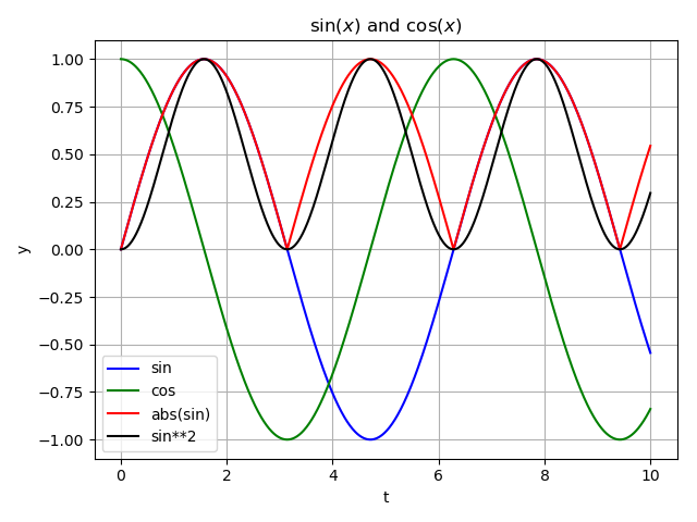
実行結果は以下のようになります.
解説
- fig, axオブジェクトの作成
fig, ax = plt.subplots()
- x軸のベクトル作成
np.linspace(strat, end, num)はstartからstopまでnum個の等間隔の一次元ベクトルを返します.
t = np.linspace(0, 10, 11)
これとに似たものに,np.arange(start, end, step)があります,これはstartからend-1までstep間隔の一次元ベクトルを返します.
t = np.arange(0, 11, 1)
# t = np.arange(11) これでも全く同じ.
- ラベル名の設定
ax.set_xlabel('t')
ax.set_ylabel('y')
- グラフタイトルの設定
ax.set_title(r'$\sin(x)$ and $\cos(x)$') # グラフタイトル
- 罫線の挿入
ax.grid()
- 描画範囲の設定
ax.set_xlim([-10, 10])
ax.set_ylim([0, 1])
- 凡例の表示
locは以下のように指定する.(matplotpib公式ドキュメントより)
文字列で指定しても、数値で指定してもよい。
| 場所 | 文字列 | 数値 |
|---|---|---|
| ベスト | 'best' | 0 |
| 右上 | 'upper right' | 1 |
| 左上 | 'upper left' | 2 |
| 左下 | 'lower left' | 3 |
| 右下 | 'lower right' | 4 |
| 右 | 'right' | 5 |
| 左中央 | 'center left' | 6 |
| 右中央 | 'center right' | 7 |
| 中央下 | 'lower center' | 8 |
| 中央上 | 'upper center' | 9 |
| 中央 | 'center' | 10 |
ax.legend(loc=0)
- レイアウトの設定
fig.tight_layout()
- 画像の保存
plt.savefig('hoge.png')
- グラフの表示
plt.show()
まとめ
いかがだったでしょうか?
グラフを重ねて描画して比較したいときはよくあると思うのでそのようなときに便利だと思います.
コードに関して建設的な意見があればコメントいただけると助かります.