はじめに
以前ggplotでのエラーバーの付け方を記事にしましたが,今回は複数系列の場合のエラーバーの付け方です.正直Excelでもすぐに作れますが,エラーバーの表示など一度覚えるとExcelより楽かもしれません.
R, ggplot2,生データから平均値と標準偏差を算出して棒グラフを描画する (geom_bar, geom_errorbar)
生データからデータの整形
今回もirisデータを用います.複数系列のグラフを作りたいので,Sepal.Length, Sepal.Width, Petal.Length, Petal.Widthの4つの形質に対して,Speciesごとに平均値,標準偏差を算出します.これを変数"data"に代入します.
tidyverseパッケージ
group_by, summariseが入っているdplyrパッケージ,グラフ描画のためのggplot2パッケージを読み込んでおく必要がありますが,これらの便利なパッケージがまとめて入っているtidyverseパッケージを読み込んでしまいましょう.
library(tidyverse)
パッケージ読み込みはこれだけでOKです.
変数dataに代入
では,グラフ描画用にデータフレームを整形していきましょう.
データフレームの整形にgatherという関数を用いていますが,簡単に言うとデータフレームを縦長に変形しています.
※パイプ演算子"%>%"についての説明は割愛します.
data <-
  iris %>% #対象となるデータ
    gather(key = Phenotype, value = value, Sepal.Length:Petal.Width, factor_key = T) %>% #縦長のデータにする
    group_by(Species, Phenotype) %>% #group_byでSpecies,Phenotypeごとにする
    summarise(mean = mean(value), sd = sd(value)) #SpeciesごとのSepal.Lengthの平均と標準偏差を求める
もとのirisのデータフレームが,,,
| Sepal.Length | Sepal.Width | Petal.Length | Petal.Width | Species | |
|---|---|---|---|---|---|
| .. | ... | ... | ... | ... | ...... |
こうなります.カラム名の"Phenotype"というのはこちらが任意に決めたものです.
| Species | Phenotype | mean | sd | |
|---|---|---|---|---|
| 1 | setosa | Sepal.Length | 5.006 | 0.352489687213451 |
| 2 | setosa | Sepal.Width | 3.428 | 0.379064369096289 |
| 3 | setosa | Petal.Length | 1.462 | 0.173663996480184 |
| 4 | setosa | Petal.Width | 0.246 | 0.105385589380046 |
| 5 | versicolor | Sepal.Length | 5.936 | 0.516171147063863 |
| 6 | versicolor | Sepal.Width | 2.77 | 0.313798323378411 |
| 7 | versicolor | Petal.Length | 4.26 | 0.469910977239958 |
| 8 | versicolor | Petal.Width | 1.326 | 0.197752680004544 |
| 9 | virginica | Sepal.Length | 6.588 | 0.635879593274432 |
| 10 | virginica | Sepal.Width | 2.974 | 0.322496638172637 |
| 11 | virginica | Petal.Length | 5.552 | 0.551894695663983 |
| 12 | virginica | Petal.Width | 2.026 | 0.274650055636667 |
グラフ描画
棒グラフ表示(geom_bar)
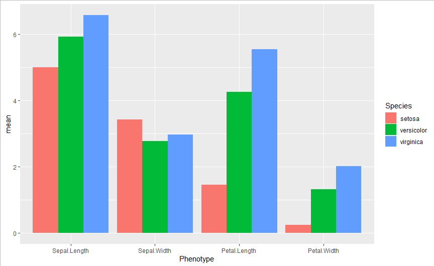
では,まず棒グラフを表示させましょう.
複数系列の場合,geom_barでpositionを指定する必要があり,このように横並びにする場合には
posision = position_dodge
とします.position_dodgeのwidthの数値を変えることで系列間の距離を制御できます.width = 0.9でぴったりくっつきました.
ggplot(data,
       aes(x = Phenotype, y = mean, fill = Species) #グラフのx,yの指定,fillは色の塗り分け.今回はSpeciesで塗り分けたい
  )+
  geom_bar(stat = "identity", #geom_barで棒グラフとなる
           position = position_dodge(width = 0.9) #widthで系列間の距離を制御
  )
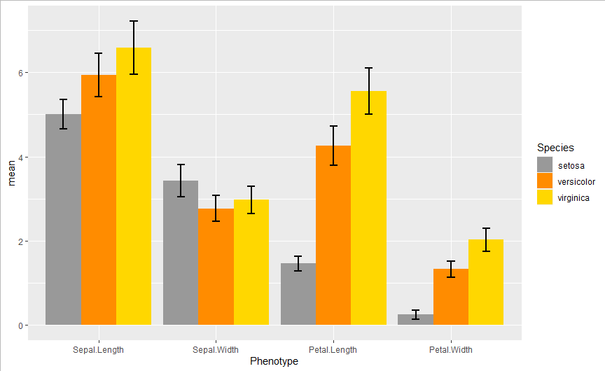
エラーバー表示 (geom_errorbar)
エラーバーについても,positionを指定する必要があります.position_dodgeのwidthをgeom_barの値と同じにすれば棒グラフ中央にエラーバーが表示されます.
ついでに色も変えておきましょう.
ggplot(data,
       aes(x = Phenotype, y = mean, fill = Species) #グラフのx,yの指定,fillは色の塗り分け.今回はSpeciesで塗り分けたい
  )+
  geom_bar(stat = "identity", #geom_barで棒グラフとなる
           position = position_dodge(width = 0.9) #widthで系列間の距離を制御
  )+
  scale_fill_manual(values = c("#999999", "darkorange", "gold") #色をRGBで設定できる
  )+
  geom_errorbar(aes(ymax = mean + sd, ymin = mean - sd), # geom_errorbarでエラーバー追加
                position = position_dodge(0.9), #geom_barと同じ値にする
                width = 0.2, # 横棒の長さ
                size = 0.75 # 線の太さ
  )
※使用コード