0.はじめに
現在開発しているアプリで以下のようなものを実装したかったため、以下2点を採用して実装しました。忘れないように備忘録として纏めます。
また、今回のようなものは大まかに探してみた感じ、Qiita記事を見受けられなかったので、同じようなものを実装したいと考えている方に少しでも参考になれば幸いです。(ただし、責任は一切負いません)
1.react-switch-selectorとは
・イメージ図
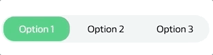リンク先:https://www.npmjs.com/package/react-switch-selector
2.material-ui Tabとは
・イメージ図(HeaderのItem OneなどがTabの部分)
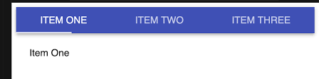リンク先:https://material-ui.com/api/tab/
3.今回やりたかったこと
上記1と同じUIでOption2や3を選択した場合に画面を切り替える
ただし、react-switch-selectorだけではなく、上記2のmaterial-ui(Tabのみ)を併用して実装
(もしかしたら、material-uiと併用しなくても実装可能だったかもしれませんが、現時点では思いつきませんでした)
4.準備(material-uiは参考記事も多いので割愛)
インストール
・npmの場合
・yarnの場合
5.コード
import React from 'react';
import { TabPanel, Tab, Divider } from '@material-ui/core';
import SwitchSelector from 'react-switch-selector';


   // 他importやスタイル関係は省略


    // 以下はmaterial-ui(Tab)に乗っているものをコピペしたもの--------------
      interface TabPanelProps {
        children?: React.ReactNode;
        index: any;
        value: any;
      }

      function TabPanel(props: TabPanelProps) {
        const { children, value, index, ...other } = props;

        return (
          <div
            role="tabpanel"
            hidden={value !== index}
            id={`simple-tabpanel-${index}`}
            aria-labelledby={`simple-tab-${index}`}
            {...other}
          >
            {value === index && (
              <Box>
                <Typography>{children}</Typography>
              </Box>
            )}
          </div>
        );
      }

      function a11yProps(index: any) {
        return {
          id: `simple-tab-${index}`,
          'aria-controls': `simple-tabpanel-${index}`,
        };
      }


   // switchSelector用--------------------------------------
  const options = [
    {
        label: "hogehoge",
        value: 0,
    },
    {
        label: "fuga",
        value: 1,
    }
  ];


    // 異なるTabを選択時に画面を切り替えるため必要(material-uiのものを参考に今回ように少しだけアレンジ)
    const [value, setValue] = React.useState(0);
    const onChange = (newNumber) => {
      setValue(newNumber);
    };


   {/* return----------------------------------------------*/}
         return(
            <div>
              <SwitchSelector
                  // 下記2行は必ず定義が必要
                  onChange={onChange}
                  options={options}
              >
                <Tab label={options[0].label} {...a11yProps(0)} />
                <Tab label={options[1].label} {...a11yProps(1)} />
              </SwitchSelector>
          </div>


  {/* 「index={0}」のタブ----------------------------------------*/}
          <TabPanel value={value} index={0}>
            <div>
                <h2>hogehoge</h2>
            </div>
          </TabPanel>


   {/* index={1}のタブ-----------------------------------------*/}
          <TabPanel value={value} index={1}>
            <div>
                <h2>fuga</h2>
            </div>
          </TabPanel>

      )
6.material-uiのサンプルコード(そのままコピペ)
import React from 'react';
import { makeStyles, Theme } from '@material-ui/core/styles';
import AppBar from '@material-ui/core/AppBar';
import Tabs from '@material-ui/core/Tabs';
import Tab from '@material-ui/core/Tab';
import Typography from '@material-ui/core/Typography';
import Box from '@material-ui/core/Box';

interface TabPanelProps {
  children?: React.ReactNode;
  index: any;
  value: any;
}

function TabPanel(props: TabPanelProps) {
  const { children, value, index, ...other } = props;

  return (
    <div
      role="tabpanel"
      hidden={value !== index}
      id={`simple-tabpanel-${index}`}
      aria-labelledby={`simple-tab-${index}`}
      {...other}
    >
      {value === index && (
        <Box p={3}>
          <Typography>{children}</Typography>
        </Box>
      )}
    </div>
  );
}

function a11yProps(index: any) {
  return {
    id: `simple-tab-${index}`,
    'aria-controls': `simple-tabpanel-${index}`,
  };
}

const useStyles = makeStyles((theme: Theme) => ({
  root: {
    flexGrow: 1,
    backgroundColor: theme.palette.background.paper,
  },
}));

export default function SimpleTabs() {
  const classes = useStyles();
  const [value, setValue] = React.useState(0);

  const handleChange = (event: React.ChangeEvent<{}>, newValue: number) => {
    setValue(newValue);
  };

  return (
    <div className={classes.root}>
      <AppBar position="static">
        <Tabs value={value} onChange={handleChange} aria-label="simple tabs example">
          <Tab label="Item One" {...a11yProps(0)} />
          <Tab label="Item Two" {...a11yProps(1)} />
          <Tab label="Item Three" {...a11yProps(2)} />
        </Tabs>
      </AppBar>
      <TabPanel value={value} index={0}>
        Item One
      </TabPanel>
      <TabPanel value={value} index={1}>
        Item Two
      </TabPanel>
      <TabPanel value={value} index={2}>
        Item Three
      </TabPanel>
    </div>
  );
}
7.ちょっとだけ拙い解説
上記の5と6を見比べてみると6では「Tabs」でTabを囲っているのに対し、5では「SwitchSelector」でTabを囲っています。このことから必ずしも「Tabs」で囲まなくても画面切り替え時に必要な「value」部分の変更がきちんとされていれば問題なく動くことが推測されますね。(最初はTabsで囲まないといけないとばかり思ってました)
valueの部分は数値でも文字列でも構いません。自分に合ったものを設定してみましょう。
8.最後に
纏めきれない部分・言葉にするのが難しい部分があり少しわかりにくい記事になってしまったかもしれませんが、今まで同じようなものを実装したいけどわからず諦めていた方達になんとなくでも伝わったら幸いです。
また、ここは間違っているよ!という部分あればコメントいただけたら嬉しいです。
以上で本記事を終わります。ご高覧いただきましてありがとうございました。