はじめに
この記事は、 CAMエンジニア Advent Calendar 2019 6日目の記事です。
記事一覧はこちらから↓
https://qiita.com/advent-calendar/2019/cam-inc
昨日はid:youkouJB さんの 「入社してCSS記述で指摘されたこと」 でした。
CSSの記述方法について気になる方は是非読んでみてください!とてもためになりました!!
ここからはid:tomomi_hがCSSアニメーションについて書いていきたいと思います。
アニメーションてなに?
そもそもcssアニメーションにはCSS TransitionとCSS Animationの2つの機能がある。
CSS Transition
アニメーションが始まって終わるまでの時間を設定するプロパティ。
CSS Animation
キーフレームアニメーションのプロパティとその変化を指定して、アニメーションの名前を設定します。
0〜100%までの値で、時間経過を元に変化する。
@Keyframeとanimationはセットで使うプロパティ。
今回は、CSS Animationを使って簡単なアニメーションを試してみます〜。
作るもの
12月といえばクリスマス
今回はクリスマスにちなんで「雪だるま」と「ツリー」を作ってCSS Animationを学びます。
keyframesとanimationのプロパティについて
keyframesの使い方
@keyframes の後の名前は任意で決める。
アニメーションの開始と終了を0%(/from) から100%(/to)で指定する。
@keyframes 自分で決めた名前 {
   0% {
     CSSプロパティ:値;
   }
   50% {
     CSSプロパティ:値;
   }
   100% {
     CSSプロパティ:値;
   }
}
たとえば、回転させたかったら
@keyframes rotation {
  0% {
    background: red;
  }
  100% {
    transform: rotate(90deg);
    background: blue;
  }
}
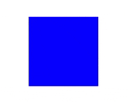
これに、例えば
animation: rotation 1s ease-out infinite;
を加えると、
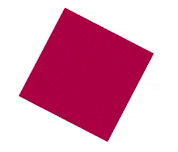
このように、0%の時は色がredのまま、100%のときに90°回転して色が青になる。
animationプロパティについて
animationプロパティには以下の9つがある。
①animation-name アニメーションを適用する要素を指定する
②animation-duration アニメーションが完了するまでの時間を指定する
③animation-timing-function アニメーションの進行度を指定する
④animation-delay アニメーションが開始するまでの時間を指定する
⑤animation-iteration-count アニメーションの実行回数を指定する
⑥animation-direction アニメーションの再生方向を指定する
⑦animation-fill-mode アニメーションの再生中・再生後のスタイルを指定する
⑧animation-play-state アニメーションの再生、または一時停止を指定する
⑨animation 上記8つのプロパティを1つでかけるショートハンドプロパティ
animation-name
animation-nameには@keyframesの名前を書く。
@keyframes rotation {
  0% {
    background: red;
  }
  100% {
    transform: rotate(90deg);
    background: blue;
  }
}

.クラス名 {
 animation-name: rotation;
}
animation-duration
animation-durationは、アニメーションの開始から終了までの時間を指定できる。
@keyframes rotation {
  0% {
    background: red;
  }
  100% {
    transform: rotate(90deg);
    background: blue;
  }
}

.クラス名 {
 animation-name: rotation;
 animation-duration: 5s;
}
これなら90度回転するのに5秒かかる。
animation-timing-function
アニメーションが変化する速度を指定できる。
① ease 初期値。開始時と終了時は緩やかに変化する。
② ease-in 開始時は緩やかに変化、終了に近づくと早く変化する。
③ ease-out 開始時は早く変化し、終了時は緩やかに変化する。
④ ease-in-out 開始時と終了時は、かなり緩やかに変化する。
⑤ linear 開始から終了まで一定に変化する。
⑥ step-start 開始時に最終の状態になる。
⑦ step-end 終了時に最終の状態になる。
⑧ steps(正数, start または end)
指定した正数の段階で変化する。第2引数には start または end を指定。
startを指定すると、アニメーション開始時から変化。endを指定すると、アニメーション終了時に変化。
違いがよくわからないから、サンタさんとトナカイを走らせて比べてみた。
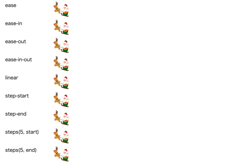
なるほど〜〜!
animation-delay
アニメーションが始まるまでの時間を指定できる。
@keyframes rotation {
  0% {
    background: red;
  }
  100% {
    transform: rotate(90deg);
    background: blue;
  }
}

.クラス名 {
 animation-name: rotation;
 animation-delay: 3s;
}
3秒経ってから始まる。

animation-iteration-count
アニメーションの繰り返しの回数を指定できる。
@keyframes rotation {
  0% {
    background: red;
  }
  100% {
    transform: rotate(90deg);
    background: blue;
  }
}

.クラス名 {
 animation-name: rotation;
 animation-delay: 2s;
 animation-iteration-count: 2;
}
2秒経ってから始まって、2回で終わる。

animation-direction
アニメーションの方向を指定できる。
①nomal アニメーションを毎回順方向に再生。
②reverse アニメーションを毎回逆方向に再生。
③alternate アニメーションを毎回反転させる。初回が順方向。
④alternate-reverse アニメーションを毎回反転させる。初回が逆方向。
またまた、サンタさんとトナカイを走らせて比べてみた。
.santa {
  animation-name: santa;
  animation-duration: 3s;
  animation-timing-function: ease;
  animation-direction: ここにanimation-direction;
}

@keyframes santa {
  0% { left: 500px; }

  100% { left: 0; }
}

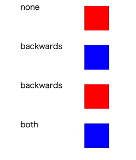
animation-fill-mode
アニメーション再生中、再生後のstyleを指定できる。
①none
スタイルを指定しない。アニメーション終了後はもとのスタイルが適用される。
animation-delayを指定している場合は、アニメーションが開始するまでは、もとのスタイルが適用される。
②backwards
アニメーション終了後は0%のスタイルが適用される。
animation-delayを指定している場合は、アニメーションが開始するまでは、0%のスタイルが適用される。
③forwards
アニメーション終了後は100%のスタイルが適用される。
animation-delayを指定している場合は、アニメーションが開始するまでは、もとののスタイルが適用される。
④both
アニメーション終了後は100%のスタイルが適用される。
animation-delayを指定している場合は、アニメーションが開始するまでは、0%のスタイルが適用される。
.squear {
  background-color: red;
  animation-name: rotation;
  animation-duration: 5s;
  animation-timing-function: ease-out;
  animation-fill-mode: ○ ○ ○;
}

@keyframes rotation {
  0% {
    background: blue;
  }
  50% {
    transform: rotate(90deg);
    background: yellow;
  }

  100% {
    transform: rotate(90deg);
    background: green;
  }
}
animation-play-state
アニメーションが実行中か停止中かを指定できる。
①running アニメーションを再生させる。
②paused アニメーションを停止させる。
.text {
  animation-name: color;
  animation-duration: 1s;
  animation-timing-function: ease;
  animation-play-state: running;
}

@keyframes color {
  0% {
    color: red;
  }
  100% {
    color: green;
  }
}
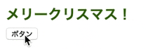
初期値runningで、ボタンを押したら止まる→動く→止まる
animation
1行にまとめられる。
例)
transition : 3s linear 0 infinite alternate;
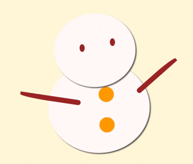
この機能を使って、雪だるまとツリーを動かしてみる⛄🎄
雪だるまをゆらゆらさせる⛄
.snowman {
  animation: swing 1s 1s ease-in-out infinite alternate;
}
@keyframes swing {
  0%,100% {
    transform-origin: bottom center;
  }
  50% {
    transform: rotate(-2deg);
  }
}
原点をbottom centerにして,1秒かけてswingさせる。
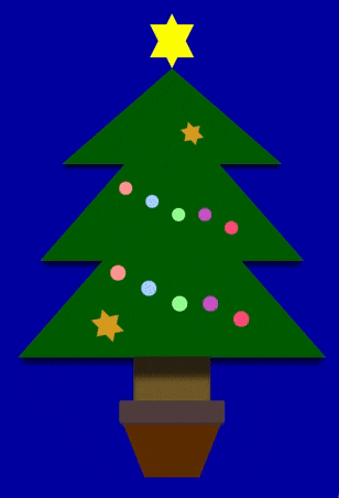
クリスマスツリーをキラキラさせる🎄✨
.reflect {
  animation: reflect 2s linear infinite;
}

@keyframes reflect {
  0% { opacity: 0.2; }
  50% { opacity: 0.8; }
  80% { opacity: 0.2; }
}
ひとつひとつに色を付けて、2秒間のopacityを指定する。
雪だるま⛄とクリスマスツリー🎄を使って、冬景色ぽくしてみた ↓
↓
🎁 Merry Christmas 🎁
See the Pen ExaYbQE by ともみ (@tomomi0425) on CodePen.
さて、明日はid:rumanさんの「JSのつまづいたところ」です。
お楽しみに!