概要
Matplotlibでのグラフの書き方を自分用の備忘録としてまとめる。
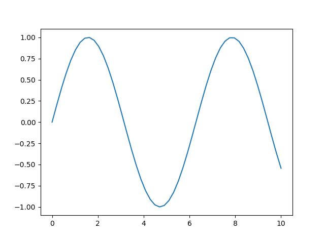
とりあえず一つグラフを書きたいとき
横軸(x)と縦軸(y)を設定して、plt.plot(x, y)とするだけ。
import matplotlib.pyplot as plt
import numpy

x = np.linspace(0, 10)
y = np.sin(x)
plt.plot(x, y)
plt.show()
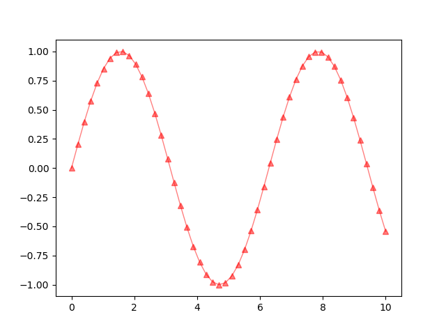
pltの引数
c : 色。"r"、"g"、"b"、"c"、"m"、"y"などでグラフの色を変えれる。
marker : マーカーの形を指定。"o"、"^"、"v"、"+"などがある。
lw : 線の太さを指定。線を消したいときは0にする。
alpha : 透明度を指定。0に近いほど透明に近づく。
label : 名前を指定。複数グラフを書くときは名前を付けとくとよい。(凡例に表示できる)
※凡例の付け方は後述。
x = np.linspace(0, 10)
y = np.sin(x)
plt.plot(x, y, c="r", marker="^", lw=1, alpha=0.5, label="test")
plt.show()
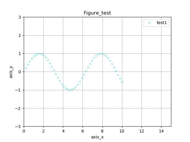
グラフに様々な情報を追加
plt.〇〇で、グラフに様々な情報を追加できる。
plt.titleでタイトルを追加
plt.xlabe/ylabelでx軸/y軸のラベルを追加
plt.xlim/ylimでx軸/y軸の最小値と最大値を指定
※最大値と最小値は直接数値を入れてもいいが、下記例のようにyのnp.minなどで指定してもよい
plt.gridでグラフにグリッドを表示
plt.legendでグラフに凡例を表示
x = np.linspace(0, 10)
y = np.sin(x)

plt.plot(x, y, c="c", marker="+", lw=0, alpha=0.5, label="test1")
plt.title("Figure_test")
plt.xlabel("axis_x")
plt.ylabel("axis_y")
plt.xlim(0, 15)
plt.ylim(np.min(y)-2, np.max(y)+2)
plt.grid()
plt.legend()

plt.show()
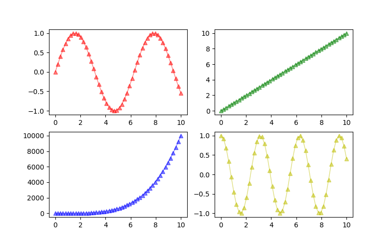
複数のグラフを描画
初めに、plt.figure()で大きな箱を準備する。箱の大きさはfigsizeで指定可能。
準備した箱の中にplt.subplot()で複数のグラフを入れていくイメージ。
plt.subplot()の第一引数に行、第二引数に列、第三引数に番号を指定する。
番号は、左上が1から始まり、右方向、下方向の順に数字が大きくなる。
x = np.linspace(0, 10)
y1 = np.sin(x)
y2 = x
y3 = x ** 4
y4 = np.cos(2*x)

plt.figure(figsize=(8, 5))

plt.subplot(2, 2, 1) # 左上
plt.plot(x, y1, c="r", marker="^", lw=1, alpha=0.5, label="left_up")

plt.subplot(2, 2, 2) # 右上
plt.plot(x, y2, c="g", marker="o", lw=1, alpha=0.5, label="right_up")

plt.subplot(2, 2, 3) # 左下
plt.plot(x, y3, c="b", marker="v", lw=1, alpha=0.5, label="left_down")

plt.subplot(2, 2, 4) # 右下
plt.plot(x, y4, c="y", marker="+", lw=1, alpha=0.5, label="right_down")

plt.show()
以下のようにも書ける。(結果は↑と同じ)
subplots()で、figという大きな箱の中にグラフをどこに配置するかを先に指定する。
ax[行, 列]で場所を指定しグラフを描画。
(こっちの書き方はまた別でまとめようかと思います。)
x = np.linspace(0, 10)
y1 = np.sin(x)
y2 = x
y3 = x ** 4
y4 = np.cos(2*x)

fig, ax = plt.subplots(2, 2, figsize=(8, 5))

# 左上
ax[0, 0].plot(x, y1, c="r", marker="^", lw=1, alpha=0.5, label="left_up")

# 右上
ax[0, 1].plot(x, y2, c="g", marker="^", lw=1, alpha=0.5, label="right_up")

# 左下
ax[1, 0].plot(x, y3, c="b", marker="^", lw=1, alpha=0.5, label="left_down")

# 右下
ax[1, 1].plot(x, y4, c="y", marker="^", lw=1, alpha=0.5, label="right_down")

plt.show()

まとめ
非常に基本的な事ばかりですが、初心者の自分用に、よく使う機能だけ書いてみました。
おすすめの機能なんかあれば、コメントください。