実現したいこと
動画見たく、クリックするとボタンが凹むような挙動にしたい。
結論
以下の2つをやります
- hover要素でbox-shadowを付与
- active要素でbox-shadowを削除。margin-topを付与
コード
こんな感じになります。
    a {
      display: inline-block;
      text-decoration: none;
      background-color: #0ACC64;
      color: #FFF;
      border-style: none;
      border-radius: 5px;
      padding: 5px 10px;
    }

    a:hover {
      cursor: pointer;
      font-weight: bold;
      box-shadow: 0 5px 10px black;
    }

    a:active {
      box-shadow: 0 0 5px black;
      margin-top: 5px;
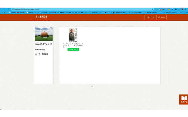
ポイント
active要素でmargin-topを付与する。これをやらないと以下のようになる。影はなくなっているけど、ボタンが凹んでいる感じがしない。
これを解決するために、margin-topを付与する。margin-topのpxはbox-shadowの2番目の値(上下方向の影のpx)に合わせる。こうすると影がなくなるだけでなくボタンが凹んでいる風の挙動になる。