はじめに
Pythonを使ってグラフを描く方法を紹介します。
matplotlibを使います。
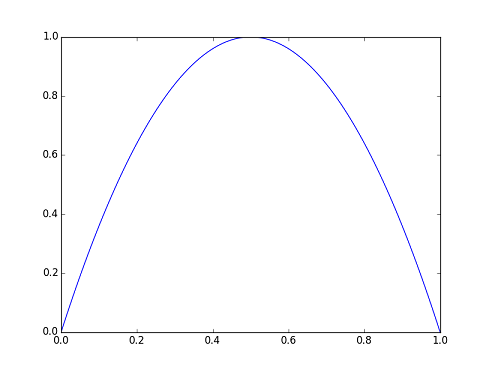
2次曲線
次の関数を例にして基本的なグラフの書き方を示します。
y = 4x(1-x)
定義域は[0,1]です。
plotでグラフデータを設定します。showで表示します。
import numpy as np
import matplotlib.pyplot as plt
x = np.linspace(0, 1, 100)
plt.figure(0)
plt.plot(x, 4*x*(1-x))
plt.show()
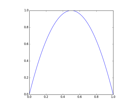
縦横比1:1
縦横比を1:1にします。
plt.gca().set_aspect('equal', adjustable='box')
import numpy as np
import matplotlib.pyplot as plt
x = np.linspace(0, 1, 100)
plt.figure(0)
plt.gca().set_aspect('equal', adjustable='box')
plt.plot(x, 4*x*(1-x))
plt.show()
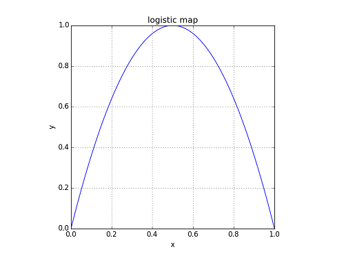
タイトル、xラベル、yラベル、グリッド
タイトル、xラベル、yラベル、グリッドを表示します。
title / xlabel / ylabel / gridを使います。
import numpy as np
import matplotlib.pyplot as plt
x = np.linspace(0, 1, 100)
plt.figure(0)
plt.gca().set_aspect('equal', adjustable='box')
plt.title('logistic map')
plt.grid(True)
plt.xlabel('x')
plt.ylabel('y')
plt.plot(x, 4*x*(1-x))
plt.show()
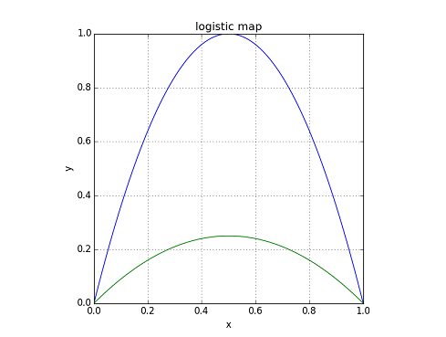
系列の追加
plotを実行することで系列を追加できます。
plt.plot(x, x*(1-x))
import numpy as np
import matplotlib.pyplot as plt
x = np.linspace(0, 1, 100)
plt.figure(0)
plt.gca().set_aspect('equal', adjustable='box')
plt.title('logistic map')
plt.grid(True)
plt.plot(x, 4*x*(1-x))
plt.plot(x, x*(1-x))
plt.xlabel('x')
plt.ylabel('y')
plt.show()
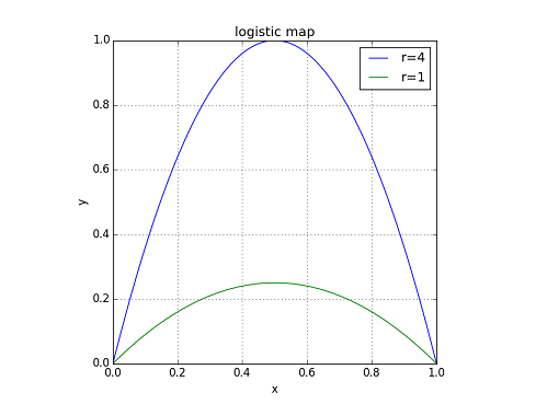
凡例
凡例はlegendで設定します。
plt.legend(["r=4", "r=1"])
import numpy as np
import matplotlib.pyplot as plt
x = np.linspace(0, 1, 100)
plt.figure(0)
plt.gca().set_aspect('equal', adjustable='box')
plt.title('logistic map')
plt.grid(True)
plt.plot(x, 4*x*(1-x))
plt.plot(x, x*(1-x))
plt.xlabel('x')
plt.ylabel('y')
plt.legend(["r=4", "r=1"])
plt.show()
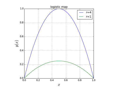
数式、フォントサイズ
$で囲むことで数式が入力できます。fontsizeでフォントサイズを指定できます。
plt.xlabel('$x$', fontsize=20)
plt.ylabel('$y(x)$', fontsize=20)
import numpy as np
import matplotlib.pyplot as plt
x = np.linspace(0, 1, 100)
plt.figure(0)
plt.gca().set_aspect('equal', adjustable='box')
plt.title('logistic map')
plt.grid(True)
plt.plot(x, 4*x*(1-x))
plt.plot(x, x*(1-x))
plt.xlabel('$x$', fontsize=20)
plt.ylabel('$y(x)$', fontsize=20)
plt.legend(["r=4", "r=1"])
plt.show()