はじめに(Introduction)
昨今、Webアプリケーションにおいてクライアントの性能が良いのでデータを取得し、JavaScript(Angular、React、Vue.js、など)でデータの加工、描写を行います。
データ取得、描写に時間がかかる場合、操作をロックしたりローディング画面を表示させる必要が出てきます。
かつて、ローディング画面を作成していた時よりもシンプルに作成可能だったので、備忘録として残しておきます。
ローディング画面(Loading Page)
原理は簡単です。
画面全てを覆うように、<div>を表示させるだけです。
基本的なサンプルとして、ボタンを押下すると3秒(3000ミリ秒)ローディング画面が表示するようにしました。
    <button data-id="sample01">Start sample01</button><br>

    <!-- 中略 -->

    <div id="sample01" class="loading">
    </div>
.loading {
    /* 画面最大 */
    position: fixed;
    top: 0;
    left: 0;
    width: 100vw;
    height: 100vh;
    /* 背景色(黒、不透明度80%) */
    background-color: #000000;
    opacity: 0.8;
    /* フレックスコンテナ(縦並べ、横中央、縦中央) */
    display: flex;
    flex-direction: column;
    justify-content: center;
    align-items: center;
    /* 表示を一番上 */
    z-index: 999;
    /* 選択付加 */
    user-select: none;
}
function init() {
    let elements = document.getElementsByTagName('button');
    for (let element of elements) {
        if (element.getAttribute('data-id')) {
            element.addEventListener('click', testLoad);
        }
    }
    stopAllLoad();
}

function testLoad() {
    let dataId = this.getAttribute('data-id');
    if (dataId) {
        startLoad(dataId);
        setTimeout(stopAllLoad, 3000);
    }
}

function startLoad(id) {
    document.getElementById(id).style.visibility = 'visible';
}

function stopAllLoad() {
    let elements = document.getElementsByClassName('loading');
    for (let element of elements) {
        element.style.visibility = 'hidden';
    }
}

window.addEventListener('load', init);
テキスト(Text)
テキストを追加してみます。

    <div id="loading">
        <div class="load-text">Loading...</div>
    </div>
.load-text {
    color: white;
    font-size: 16pt;
}
点滅(Blink)
ローディング感?を出すために、文字を点滅させてみます。
静止画だとわかりませんが、CSS(StyleSheet)のanimationでopacityの値を変える事で、不透明⇔透明を交互に変えます。

    <div id="sample03" class="loading">
        <div class="load-text load-blink">Loading...</div>
    </div>
.load-text {
    color: white;
    font-size: 16pt;
}

.load-blink {
    animation: blink 1s linear infinite;
}

@keyframes blink {
    0%, 100% {
        opacity: 1;
    }
    50% {
        opacity: 0;
    }
}
円(Circle)
円がくるくる回るローディング画面です。
正方形のdivを作成しborder(境界)を丸くして円をつくります。
borderの色を不透過率50%にして、上部だけ不透過率100%にします。
それからアニメーションを設定します。
相変わらず静止画だと動いているかわかりませんが、1秒で360°回ります。

    <div id="sample04" class="loading">
        <div class="load-circle"></div>
    </div>
.load-circle {
    width: 150px;
    height: 150px;
    border-radius: 50%;
    border: 10px solid rgba(255, 255, 255, 0.5);
    border-top-color: rgba(255, 255, 255, 1);
    animation: rotate 1s linear infinite;
}

@keyframes rotate {
    to {
        transform: rotate(360deg);
    }
}
点の円(Dots Circle)
画像みたいに、点が円みたいに並べられてそれが回っているようなものを作ります。

svgタグを使います。
一点(175,100)きめて、中心点(100,100)から30°ずつ回転rotateさせていきます。

アニメーションは点の数を考慮し1.2sにして、各点は0.1sずつanimation-delayでアニメーションの起動をずらします。
    <div id="sample05" class="loading">
        <svg width="200" height="200">
            <circle cx="175" cy="100" r="10" stroke="transparent" fill="#FFFFFF" class="load-blink-dot"
                style="animation-delay: 0.0s;" transform="rotate(0,100,100)"></circle>
            <circle cx="175" cy="100" r="10" stroke="transparent" fill="#FFFFFF" class="load-blink-dot"
                style="animation-delay: 0.1s;" transform="rotate(30,100,100)"></circle>
            <circle cx="175" cy="100" r="10" stroke="transparent" fill="#FFFFFF" class="load-blink-dot"
                style="animation-delay: 0.2s;" transform="rotate(60,100,100)"></circle>
            <circle cx="175" cy="100" r="10" stroke="transparent" fill="#FFFFFF" class="load-blink-dot"
                style="animation-delay: 0.3s;" transform="rotate(90,100,100)"></circle>
            <circle cx="175" cy="100" r="10" stroke="transparent" fill="#FFFFFF" class="load-blink-dot"
                style="animation-delay: 0.4s;" transform="rotate(120,100,100)"></circle>
            <circle cx="175" cy="100" r="10" stroke="transparent" fill="#FFFFFF" class="load-blink-dot"
                style="animation-delay: 0.5s;" transform="rotate(150,100,100)"></circle>
            <circle cx="175" cy="100" r="10" stroke="transparent" fill="#FFFFFF" class="load-blink-dot"
                style="animation-delay: 0.6s;" transform="rotate(180,100,100)"></circle>
            <circle cx="175" cy="100" r="10" stroke="transparent" fill="#FFFFFF" class="load-blink-dot"
                style="animation-delay: 0.7s;" transform="rotate(210,100,100)"></circle>
            <circle cx="175" cy="100" r="10" stroke="transparent" fill="#FFFFFF" class="load-blink-dot"
                style="animation-delay: 0.8s;" transform="rotate(240,100,100)"></circle>
            <circle cx="175" cy="100" r="10" stroke="transparent" fill="#FFFFFF" class="load-blink-dot"
                style="animation-delay: 0.9s;" transform="rotate(270,100,100)"></circle>
            <circle cx="175" cy="100" r="10" stroke="transparent" fill="#FFFFFF" class="load-blink-dot"
                style="animation-delay: 1.0s;" transform="rotate(300,100,100)"></circle>
            <circle cx="175" cy="100" r="10" stroke="transparent" fill="#FFFFFF" class="load-blink-dot"
                style="animation-delay: 1.1s;" transform="rotate(330,100,100)"></circle>
        </svg>
    </div>
.load-blink-dot {
    animation: blink-dot 1.2s linear infinite;
    opacity: 0;
}

@keyframes blink-dot {
    0% {
        opacity: 1;
    }
    100% {
        opacity: 0;
    }
}
楕円の円(Ellipse Circle)
点の円(Dots Circle)と同じCSSで基本的にはcircleタグをellipseに変えただけです。
楕円の大きさなどは調整しています。

    <div id="sample06" class="loading">
        <svg width="200" height="200">
            <ellipse cx="175" cy="100" rx="20" ry="8" stroke="transparent" fill="#FFFFFF" class="load-blink-dot"
                style="animation-delay: 0.0s;" transform="rotate(0,100,100)"></ellipse>
            <ellipse cx="175" cy="100" rx="20" ry="8" stroke="transparent" fill="#FFFFFF" class="load-blink-dot"
                style="animation-delay: 0.1s;" transform="rotate(30,100,100)"></ellipse>
            <ellipse cx="175" cy="100" rx="20" ry="8" stroke="transparent" fill="#FFFFFF" class="load-blink-dot"
                style="animation-delay: 0.2s;" transform="rotate(60,100,100)"></ellipse>
            <ellipse cx="175" cy="100" rx="20" ry="8" stroke="transparent" fill="#FFFFFF" class="load-blink-dot"
                style="animation-delay: 0.3s;" transform="rotate(90,100,100)"></ellipse>
            <ellipse cx="175" cy="100" rx="20" ry="8" stroke="transparent" fill="#FFFFFF" class="load-blink-dot"
                style="animation-delay: 0.4s;" transform="rotate(120,100,100)"></ellipse>
            <ellipse cx="175" cy="100" rx="20" ry="8" stroke="transparent" fill="#FFFFFF" class="load-blink-dot"
                style="animation-delay: 0.5s;" transform="rotate(150,100,100)"></ellipse>
            <ellipse cx="175" cy="100" rx="20" ry="8" stroke="transparent" fill="#FFFFFF" class="load-blink-dot"
                style="animation-delay: 0.6s;" transform="rotate(180,100,100)"></ellipse>
            <ellipse cx="175" cy="100" rx="20" ry="8" stroke="transparent" fill="#FFFFFF" class="load-blink-dot"
                style="animation-delay: 0.7s;" transform="rotate(210,100,100)"></ellipse>
            <ellipse cx="175" cy="100" rx="20" ry="8" stroke="transparent" fill="#FFFFFF" class="load-blink-dot"
                style="animation-delay: 0.8s;" transform="rotate(240,100,100)"></ellipse>
            <ellipse cx="175" cy="100" rx="20" ry="8" stroke="transparent" fill="#FFFFFF" class="load-blink-dot"
                style="animation-delay: 0.9s;" transform="rotate(270,100,100)"></ellipse>
            <ellipse cx="175" cy="100" rx="20" ry="8" stroke="transparent" fill="#FFFFFF" class="load-blink-dot"
                style="animation-delay: 1.0s;" transform="rotate(300,100,100)"></ellipse>
            <ellipse cx="175" cy="100" rx="20" ry="8" stroke="transparent" fill="#FFFFFF" class="load-blink-dot"
                style="animation-delay: 1.1s;" transform="rotate(330,100,100)"></ellipse>
        </svg>
    </div>
長方形の円(Rect Circle)
点の円(Dots Circle)と同じCSSで基本的にはcircleタグをrectに変えただけです。
長方形の大きさなどは調整しています。

    <div id="sample07" class="loading">
        <svg width="200" height="200">
            <rect x="125" y="95" width="50" height="10" stroke="transparent" fill="#FFFFFF"
                transform="rotate(0,100,100)" class="load-blink-dot" style="animation-delay: 0.0s;"> </rect>
            <rect x="125" y="95" width="50" height="10" stroke="transparent" fill="#FFFFFF"
                transform="rotate(30,100,100)" class="load-blink-dot" style="animation-delay: 0.1s;"></rect>
            <rect x="125" y="95" width="50" height="10" stroke="transparent" fill="#FFFFFF"
                transform="rotate(60,100,100)" class="load-blink-dot" style="animation-delay: 0.2s;"></rect>
            <rect x="125" y="95" width="50" height="10" stroke="transparent" fill="#FFFFFF"
                transform="rotate(90,100,100)" class="load-blink-dot" style="animation-delay: 0.3s;"></rect>
            <rect x="125" y="95" width="50" height="10" stroke="transparent" fill="#FFFFFF"
                transform="rotate(120,100,100)" class="load-blink-dot" style="animation-delay: 0.4s;"></rect>
            <rect x="125" y="95" width="50" height="10" stroke="transparent" fill="#FFFFFF"
                transform="rotate(150,100,100)" class="load-blink-dot" style="animation-delay: 0.5s;"></rect>
            <rect x="125" y="95" width="50" height="10" stroke="transparent" fill="#FFFFFF"
                transform="rotate(180,100,100)" class="load-blink-dot" style="animation-delay: 0.6s;"></rect>
            <rect x="125" y="95" width="50" height="10" stroke="transparent" fill="#FFFFFF"
                transform="rotate(210,100,100)" class="load-blink-dot" style="animation-delay: 0.7s;"></rect>
            <rect x="125" y="95" width="50" height="10" stroke="transparent" fill="#FFFFFF"
                transform="rotate(240,100,100)" class="load-blink-dot" style="animation-delay: 0.8s;"></rect>
            <rect x="125" y="95" width="50" height="10" stroke="transparent" fill="#FFFFFF"
                transform="rotate(270,100,100)" class="load-blink-dot" style="animation-delay: 0.9s;"></rect>
            <rect x="125" y="95" width="50" height="10" stroke="transparent" fill="#FFFFFF"
                transform="rotate(300,100,100)" class="load-blink-dot" style="animation-delay: 1.0s;"></rect>
            <rect x="125" y="95" width="50" height="10" stroke="transparent" fill="#FFFFFF"
                transform="rotate(330,100,100)" class="load-blink-dot" style="animation-delay: 1.1s;"></rect>
        </svg>
    </div>
文字の回転(Text Rotate)
svgには文字を弧に添って書ける機能があると思い出し、文字を書いて回してみました。

svgの詳細は割愛しますが、上半分の円弧と下半分の円弧それぞれに文字を添わせます。
今までの回転だと逆回りになるので、逆回転(-360°)の新しい回転rotate2を用意します。
    <div id="sample08" class="loading">
        <svg width="200" height="200" class="load-spin">
            <path id="upperArc" d="M 25 100
                A 50 50 0 1 1 175 100
                " stroke="transparent" fill="transparent" />
            <path id="lowerArc" d="M 175 100
                A 50 50 0 1 1 25 100
                " stroke="transparent" fill="transparent" />
            <text font-size="16pt" class="load-blink" fill="#FFFFFF">
                <textPath xlink:href="#upperArc">
                    Loading ...
                </textPath>
                <textPath xlink:href="#lowerArc">
                    Loading ...
                </textPath>
            </text>
        </svg>
    </div>
.load-blink {
    animation: blink 1s linear infinite;
}

@keyframes blink {
    0%, 100% {
        opacity: 1;
    }
    50% {
        opacity: 0;
    }
}

/* 中略 */

.load-spin {
    animation: rotate2 2s linear infinite;
}

@keyframes rotate2 {
    to {
        transform: rotate(-360deg);
    }
}
長方形の円とテキスト(Rect Circle & Text)
上部に長方形の円、下部に文字(点滅)を表示します。
単純に2つのタグを入れるだけです。
<div id="sample09" class="loading">
<svg width="200" height="200">
<rect x="125" y="95" width="50" height="10" stroke="transparent" fill="#FFFFFF"
transform="rotate(0,100,100)" class="load-blink-dot" style="animation-delay: 0.0s;"> </rect>
<rect x="125" y="95" width="50" height="10" stroke="transparent" fill="#FFFFFF"
transform="rotate(30,100,100)" class="load-blink-dot" style="animation-delay: 0.1s;"></rect>
<rect x="125" y="95" width="50" height="10" stroke="transparent" fill="#FFFFFF"
transform="rotate(60,100,100)" class="load-blink-dot" style="animation-delay: 0.2s;"></rect>
<rect x="125" y="95" width="50" height="10" stroke="transparent" fill="#FFFFFF"
transform="rotate(90,100,100)" class="load-blink-dot" style="animation-delay: 0.3s;"></rect>
<rect x="125" y="95" width="50" height="10" stroke="transparent" fill="#FFFFFF"
transform="rotate(120,100,100)" class="load-blink-dot" style="animation-delay: 0.4s;"></rect>
<rect x="125" y="95" width="50" height="10" stroke="transparent" fill="#FFFFFF"
transform="rotate(150,100,100)" class="load-blink-dot" style="animation-delay: 0.5s;"></rect>
<rect x="125" y="95" width="50" height="10" stroke="transparent" fill="#FFFFFF"
transform="rotate(180,100,100)" class="load-blink-dot" style="animation-delay: 0.6s;"></rect>
<rect x="125" y="95" width="50" height="10" stroke="transparent" fill="#FFFFFF"
transform="rotate(210,100,100)" class="load-blink-dot" style="animation-delay: 0.7s;"></rect>
<rect x="125" y="95" width="50" height="10" stroke="transparent" fill="#FFFFFF"
transform="rotate(240,100,100)" class="load-blink-dot" style="animation-delay: 0.8s;"></rect>
<rect x="125" y="95" width="50" height="10" stroke="transparent" fill="#FFFFFF"
transform="rotate(270,100,100)" class="load-blink-dot" style="animation-delay: 0.9s;"></rect>
<rect x="125" y="95" width="50" height="10" stroke="transparent" fill="#FFFFFF"
transform="rotate(300,100,100)" class="load-blink-dot" style="animation-delay: 1.0s;"></rect>
<rect x="125" y="95" width="50" height="10" stroke="transparent" fill="#FFFFFF"
transform="rotate(330,100,100)" class="load-blink-dot" style="animation-delay: 1.1s;"></rect>
</svg>
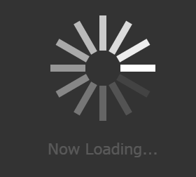
<div class="load-text load-blink">Now Loading...</div>
</div>
.load-text {
    color: white;
    font-size: 16pt;
}

.load-blink {
    animation: blink 1s linear infinite;
}

@keyframes blink {
    0%, 100% {
        opacity: 1;
    }
    50% {
        opacity: 0;
    }
}

.load-blink-dot {
    animation: blink-dot 1.2s linear infinite;
    opacity: 0;
}

@keyframes blink-dot {
    0% {
        opacity: 1;
    }
    100% {
        opacity: 0;
    }
}
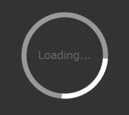
円とテキスト(Circle & Text)
円の中にテキストを入れてみます。
テキストの方のCSSにposition: absolute;を指定することでテキストが中央に設定されます。
    <div id="sample10" class="loading">
        <div class="load-circle"></div>
        <div class="load-text load-blink load-absolute">Loading...</div>
    </div>
.load-text {
    color: white;
    font-size: 16pt;
}

.load-blink {
    animation: blink 1s linear infinite;
}

@keyframes blink {
    0%, 100% {
        opacity: 1;
    }
    50% {
        opacity: 0;
    }
}

.load-circle {
    width: 150px;
    height: 150px;
    border-radius: 50%;
    border: 10px solid rgba(255, 255, 255, 0.5);
    border-top-color: rgba(255, 255, 255, 1);
    animation: rotate 1s linear infinite;
}

@keyframes rotate {
    to {
        transform: rotate(360deg);
    }
}

/* 中略 */

.load-absolute {
    position: absolute;
}
おわりに(Conclusion)
画像を使わずとも案外いけると思いました。
最後のサンプルはCSSはそこそこありますが、HTMLは4行で済みます。
シンプルなものを目指していましたが、svgは案外書く事が多くなってしまいました。
本当は、最初は円のサンプルまでやって終わりにしようとしてましたが、
svgをいじっていたら可能性が広がってサンプルが多くなりましたが、
同じ原理のパクリが多いので応用は簡単だと思います。
サンプルを以下に置いておきます。
Loading Samples