とりあえず共通のカラーバーを出す。
import pandas as pd
from matplotlib.cm import ScalarMappable
import matplotlib.colors as colors
import matplotlib.pyplot as plt

# データのダウンロードと処理
df = pd.read_csv('https://archive.ics.uci.edu/ml/machine-learning-databases/autos/imports-85.data',header=None)
df = df[[2,21,22,25]]
df.columns = ['make','horcepower','peak-rpm','price']
df = df.replace({'?':pd.np.nan}).dropna()
df = df.astype({'horcepower':'int','peak-rpm':'int','price':'int'})

# グラフをプロットする
fig, axes = plt.subplots(nrows=1, ncols=2,sharex=True,sharey=True,figsize=(10,4.5))
df[df['make'] == 'subaru'].plot(kind='scatter',x='horcepower',y='peak-rpm',c='price',ax=axes[0],cmap='winter',colorbar=False,title='subaru',s=3)
df[df['make'] == 'mazda'].plot(kind='scatter',x='horcepower',y='peak-rpm',c='price',ax=axes[1],cmap='winter',colorbar=False,title='mazda',s=3)

# カラーバーの設定
axpos = axes[1].get_position()
cbar_ax = fig.add_axes([0.87, axpos.y0, 0.02, axpos.height])
norm = colors.Normalize(vmin=df['price'].min(),vmax=df['price'].max())
mappable = ScalarMappable(cmap='winter',norm=norm)
mappable._A = []
fig.colorbar(mappable, cax=cbar_ax)

plt.show()
こうなる
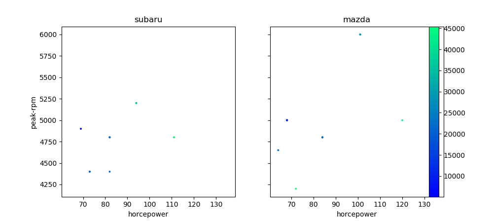
カラーバーをがグラフに被るので余白の調整を追加する。
import pandas as pd
from matplotlib.cm import ScalarMappable
import matplotlib.colors as colors
import matplotlib.pyplot as plt

# データのダウンロードと処理
df = pd.read_csv('https://archive.ics.uci.edu/ml/machine-learning-databases/autos/imports-85.data',header=None)
df = df[[2,21,22,25]]
df.columns = ['make','horcepower','peak-rpm','price']
df = df.replace({'?':pd.np.nan}).dropna()
df = df.astype({'horcepower':'int','peak-rpm':'int','price':'int'})

# グラフをプロットする
fig, axes = plt.subplots(nrows=1, ncols=2,sharex=True,sharey=True,figsize=(10,4.5))
df[df['make'] == 'subaru'].plot(kind='scatter',x='horcepower',y='peak-rpm',c='price',ax=axes[0],cmap='winter',colorbar=False,title='subaru',s=3)
df[df['make'] == 'mazda'].plot(kind='scatter',x='horcepower',y='peak-rpm',c='price',ax=axes[1],cmap='winter',colorbar=False,title='mazda',s=3)

# カラーバーの設定
axpos = axes[1].get_position()
cbar_ax = fig.add_axes([0.87, axpos.y0, 0.02, axpos.height])
norm = colors.Normalize(vmin=df['price'].min(),vmax=df['price'].max())
mappable = ScalarMappable(cmap='winter',norm=norm)
mappable._A = []
fig.colorbar(mappable, cax=cbar_ax)

# 余白の調整
plt.subplots_adjust(right=0.85)
plt.subplots_adjust(wspace=0.1)

plt.show()
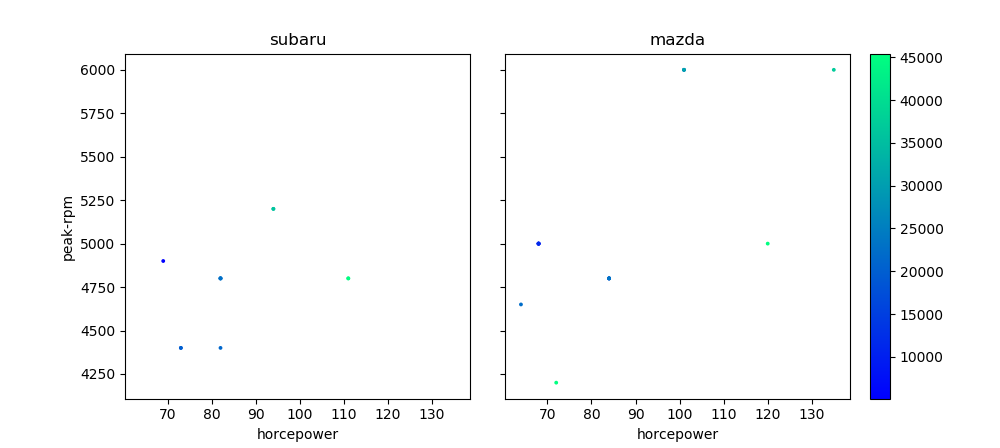
余白の値は適当です。
参考
【python】matplotlibで図の余白を調整する - 静かなる名辞
https://www.haya-programming.com/entry/2018/10/11/030103
複数の図
http://hydro.iis.u-tokyo.ac.jp/~akira/page/python/content/plt_multi-image.html