はじめに
matplotlibでよく利用するグラフのまとめ
- 折れ線グラフ
- 積み上げ面グラフ
参考:https://python-graph-gallery.com/
(詳細は追記予定)
実行環境
Jupyter notebook 4.4.0
Python 3.6.6
matplotlib 2.0.2
準備
matplitlib インポート
import matplotlib.pyplot as plt
データ
よくデータ分析の時に利用するような縦持ちのデータ
df_prop.head()
---
	topic	year	prop
0	1	1998	0.051152
1	2	1998	0.132362
2	3	1998	0.048417
3	4	1998	0.044677
4	5	1998	0.044055
色の設定
20色あって良い色なのでこちらを利用
color_list = list(plt.get_cmap("tab20").colors)
x軸(年度)データの表示感覚
2年間隔で表示させたいので、以下のリストを作成
year = df_prop['year'].unique()
range_year = np.arange(min(year), max(year)+1, 2).tolist()
print(range_year)
---
[1998, 2000, 2002, 2004, 2006, 2008, 2010, 2012, 2014, 2016]
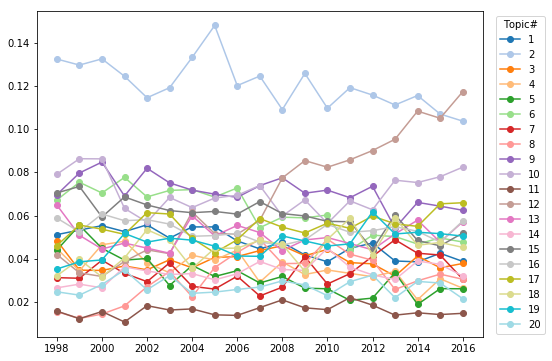
折れ線グラフ
複数データ 同一プロット
plt.figure(figsize=(8, 6))
for topic in df_prop['topic'].unique():
    phi_plot = df_prop[df_prop['topic']==topic]
    plt.plot(phi_plot['year'].astype(np.int64), phi_plot['prop'], marker="o", label=topic, color=color_list[topic-1])
    plt.xticks(range_year)
plt.legend(loc = 'upper right', bbox_to_anchor = (0.15, 0, 1, 1),title="Topic#")
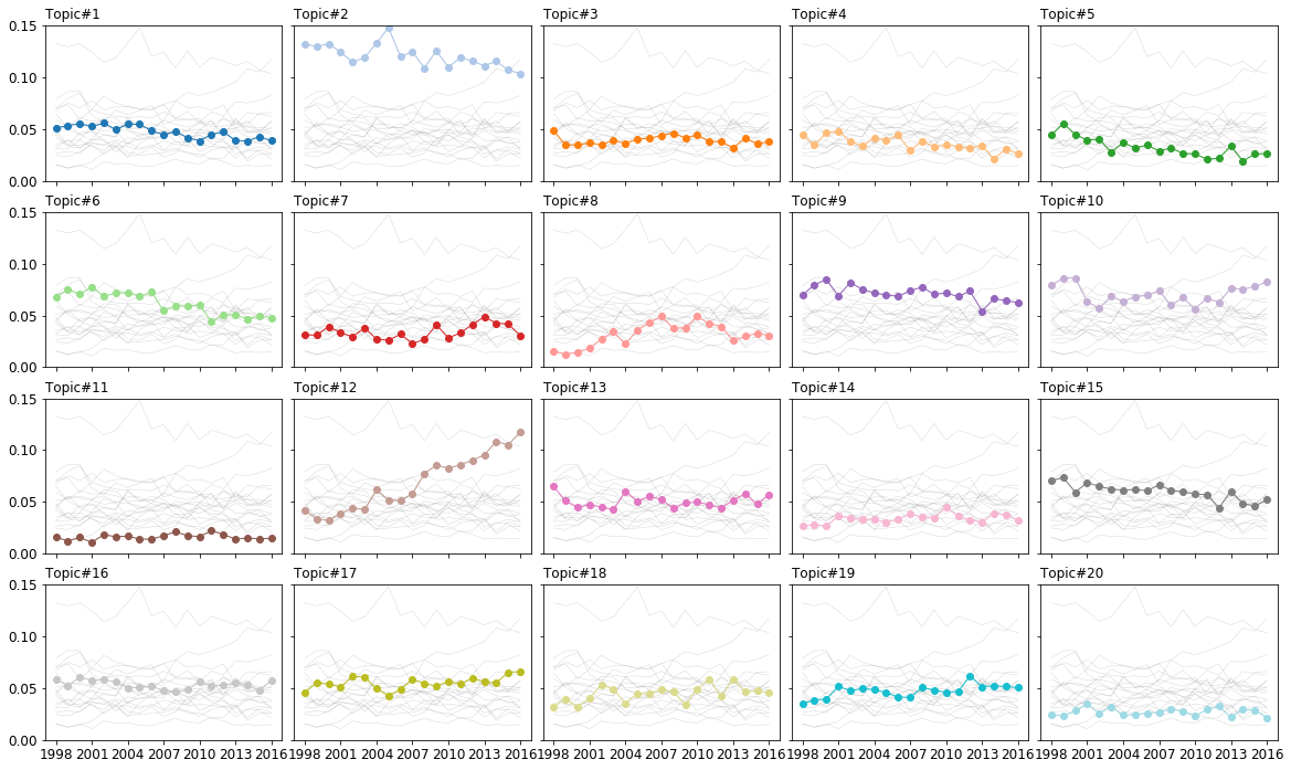
複数データ 複数サブプロット
x軸の値が入りきらなかったので、レンジを変更
range_year2 = np.arange(min(year), max(year)+1, 3).tolist()
print(range_year2)
---
[1998, 2001, 2004, 2007, 2010, 2013, 2016]
plt.figure(figsize=(20, 15))
plt.rcParams["font.size"] = 12
plt.subplots_adjust(wspace=0.05, hspace=0.2)

for topic in df_prop['topic'].unique():
    plt.subplot(5,5, topic)
    # plot every group
    for topic2 in df_prop['topic'].unique():
            phi_plot = df_prop[df_prop['topic']==topic2]
            plt.plot(phi_plot['year'].astype(np.int64), phi_plot['prop'],  marker='', color='grey', linewidth=0.5, alpha=0.3)
    # plot color line
    phi_plot = df_prop[df_prop['topic']==topic]
    plt.plot(phi_plot['year'].astype(np.int64), phi_plot['prop'], marker="o", linewidth=1, label=topic, color=color_list[topic-1])

    # Same limits for everybody!
    plt.xticks(range_year2)
    plt.ylim(0, 0.15)

    # Not ticks everywhere
    if topic in range(16) :
        plt.tick_params(labelbottom='off')
    if topic not in np.arange(1, 21, 5).tolist() :
        plt.tick_params(labelleft='off')

    plt.title('Topic#' + str(topic), loc='left', fontsize=12)
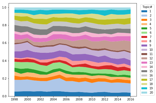
積み上げ面グラフ
plt.figure(figsize=(8, 6))
area_plot_data = []
topic_list = df_prop['topic'].unique().tolist()
for topic in topic_list:
    area_plot_data.append(df_prop[df_prop['topic']==topic]['prop'].tolist())
plt.stackplot(phi_plot['year'].astype(np.int64), area_plot_data, labels=topic_list, colors=color_list)
plt.xticks(range_year)
plt.legend(loc = 'upper right', bbox_to_anchor = (0.15, 0, 1, 1),title="Topic#")