Poloniexというアメリカの仮想通貨取引所が仮想通貨価格データをPythonのAPIで提供しているので、そこからデータを取得して、ローソク足チャートのグラフを作ろうと思います。さらに、テクニカル分析のための指標を追加し、下のようなグラフを作成します。

Poloniex API
GitHub
インストール
pipかgit cloneしてインストールします。
pip
pip3 install https://github.com/s4w3d0ff/python-poloniex/archive/v0.4.6.zip
git
git clone https://github.com/s4w3d0ff/python-poloniex.git
python setup.py install
データ取得
必要なライブラリをインポート
import poloniex

import pandas as pd
from pandas import Series, DataFrame
import numpy as np
import matplotlib.pyplot as plt
ビットコインの価格(USドル/BTC)を取得するには、'USDT_BTC'を指定(イーサリアムであれば、'USDT_ETH')。
1日ごとのデータを1年分取得するには、以下のようになります。
polo = poloniex.Poloniex()
period = polo.DAY # period of data
end = time.time()
start = end - period * 365 # 1 year

chart = polo.returnChartData('USDT_BTC', period=period, start=start, end=end)
取得したデータは辞書型なので、PandasのDataFrameに変換します。
df = DataFrame.from_dict(chart)
df.head()

dateカラムはタイムスタンプで、high(最高値)やclose(終値)などのデータがあります。
ここからデータを取り出し、open価格をプロットしてみます。
timestamp = df['date'].values.tolist() # Series -> ndarray -> list
# timestamp -> year/month/day
date = [datetime.datetime.fromtimestamp(timestamp[i]).date() for i in range(len(timestamp))]

price = df['open'].astype(float)

plt.figure(figsize=(15, 4))
plt.plot(date, price)

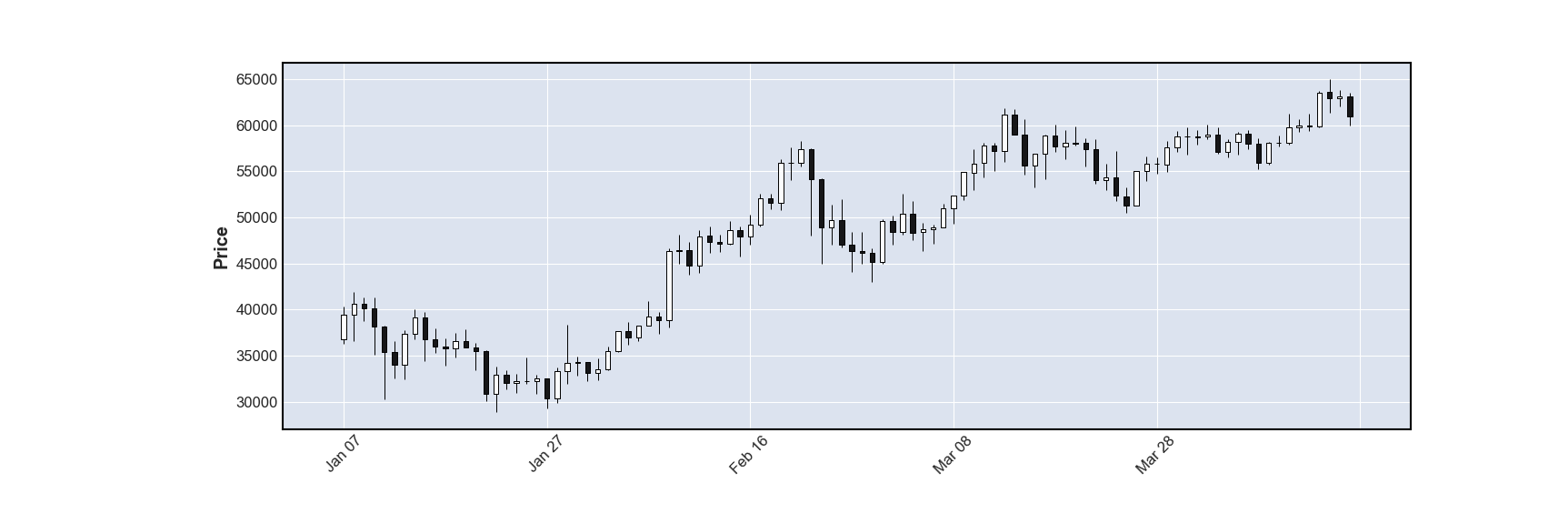
ローソク足チャート
matplotlibのファイナンス用ライブラリを使います。
pip install mplfinance
import mplfinance as mpf
直近100日のローソク足チャートを描画します。
必要なデータを含むDataFrameをmpfのplot関数に渡しますが、カラム名は['Open', 'High', 'Low', 'Close', 'Volume']と一致する必要があり、indexはDatatimeIndexの時系列データである必要があります。
df_candle = df.tail(100) # 100日分を取り出す
df_candle.index = pd.to_datetime(df_candle['date']) # DatatimeIndexに変換してindexに指定
df_candle = df_candle[['open', 'high', 'low', 'close', 'volume']] # 必要なカラムだけにする
df_candle.columns = ['Open', 'High', 'Low', 'Close', 'Volume'] # カラム名を変更
df_candle = df_candle.astype(float) # データ型を一致させる
df_candle.head()

mpfのplot関数でtype='candle'を指定して、プロット・保存。
mpf.plot(df_candle, type='candle', figratio=(12,4), savefig='candlestick_btc.png')
テクニカル分析のためのチャート
テクニカル分析のために、20日EMA(指数平滑移動平均線)・50日SMA(単純移動平均線)・ボリンジャーバンドをローソク足チャートに追加します。まず、必要なデータを計算し、DataFrameに追加します。
# 20日EMA
df['EMA20'] = df['open'].ewm(span=20).mean()
# 50日SMA
df['SMA50'] = df['open'].rolling(window=50).mean()

# ボリンジャーバンド
r = df['open'].rolling(10)
df['upper'] = r.mean() + 2 * r.std()
df['lower'] = r.mean() - 2 * r.std()
100日分をプロットします。
df_tech = df.tail(100)
df_tech.index = pd.to_datetime(df_tech['date'])
df_tech = df_tech[['open', 'high', 'low', 'close', 'volume', 'EMA20', 'SMA50', 'upper', 'lower']]
df_tech.columns = ['Open', 'High', 'Low', 'Close', 'Volume', 'EMA20', 'SMA50', 'upper', 'lower']

addplot = mpf.make_addplot(df_tech[['EMA20', 'SMA50']]) # 追加のグラフ
fig, axes = mpf.plot(
    df_tech, type='candle', # ローソク足
    addplot=addplot, # グラフを追加
    volume=True, # 出来高
    # ボリンジャーバンド
    fill_between=dict(y1=df1['lower'].values, y2=df1['upper'].values, color='lightblue', alpha=.3),
    style='charles', #スタイルを変更
    returnfig=True, # legendを表示するため、axesをreturn
    figratio=(12,8))
axes[0].legend(['EMA20', 'SMA50'], loc=2) # 左上にlegend
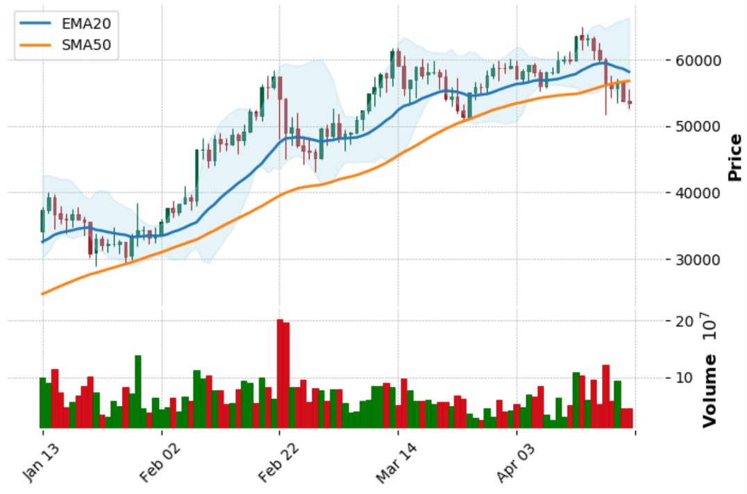
これで、テクニカル分析でよく見るようなチャートができました。
参考サイト