Google I/O 2019でJetpack Composeというツールキットの発表がありました。
現時点ではまだpre-alpha版ですが、Jetpack Composeを利用してどのようにコンポーネントを作成し、それらを組み合わせ、レイアウトを生成するかについてデモアプリのソースコードを元に調べてみました。
ソースコードはAOSP(Android Open Source Project)からダウンロードしました。手順は以下の記事を参考にしました。
Jetpack Composeのデモアプリを動かしてみた
ソースコードとレイアウト
以降はRallyというデモアプリをベースに話を進めます。
まず、ソースコードは以下です。
class RallyActivity : Activity() {
    override fun onCreate(savedInstanceState: Bundle?) {
        super.onCreate(savedInstanceState)
        setContent {
            CraneWrapper {
                RallyApp()
            }
        }
    }

    @Composable
    fun RallyApp() {
        RallyTheme {
            Scaffold(appBar = { RallyAppBar() }) {
                RallyBody()
            }
        }
    }

    @Composable
    fun RallyAppBar() {
        // TODO: Transform to tabs
        Row {
            // Icon()
            Text(text = "Overview", style = +themeTextStyle { h4 })
            // TODO: Other items
        }
    }
}

@Composable
fun RallyBody() {
    Padding(padding = 16.dp) {
        Column {
            // TODO: scrolling container
            RallyAlertCard()
            HeightSpacer(height = 10.dp)
            RallyAccountsCard()
            HeightSpacer(height = 10.dp)
            RallyBillsCard()
        }
    }
}
また、上記によって生成されるレイアウトは以下です。
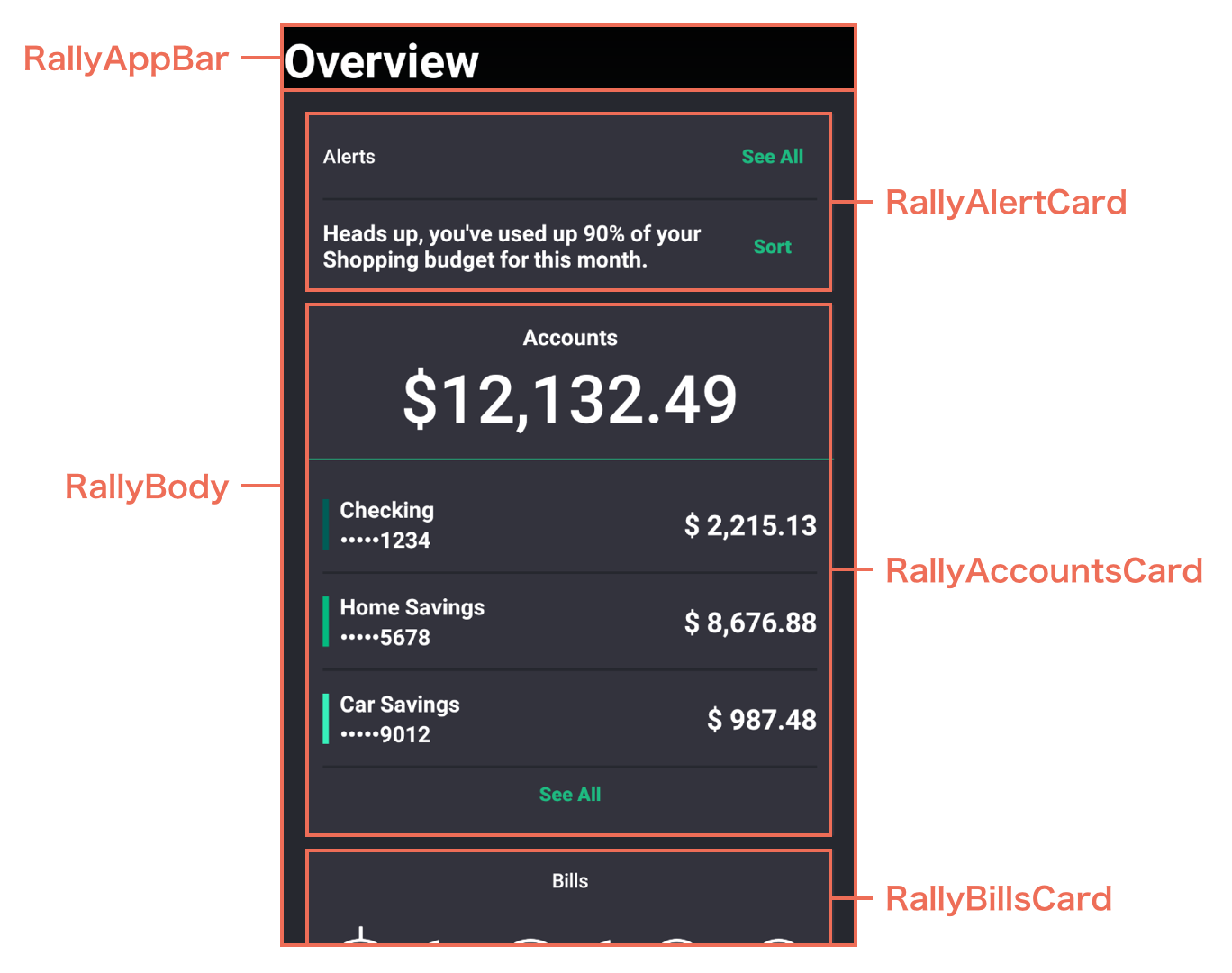
両者を比較しながら、Jetpack Composeを利用したコンポーネント作成からレイアウト生成までの流れを少しずつ見ていきたいと思います。
コンポーネントの作成方法
まず、肝となるコンポーネントの作成方法について見ていきます。
コンポーネントを作成する際は、関数を宣言し、その関数に@Composableアノテーションを付与します。これによってソースコード上でコンポーネントとして認識されます。
以降、@Composableアノテーションの付与された関数を「Composable function」と呼ぶこととします。Composable functionの関数名は慣習的(?)に大文字始まりで命名するようです。
コンポーネントに子Viewを追加する場合、コンポーネントにネストする形で記述していきます。
以下ではRowコンポーネントの子ViewとしてTextコンポーネントが配置されています。
@Composable
fun RallyAppBar() {
    // TODO: Transform to tabs
    Row {
        // Icon()
        Text(text = "Overview", style = +themeTextStyle { h4 })
        // TODO: Other items
    }
}
ここで、親ViewとなっているRowコンポーネントの実装を見てみると、最後の引数に@Childrenというアノテーションが付与されています。
この@Childrenアノテーションによって、ネストされたTextコンポーネントが子Viewとして認識されます。
@Composable
fun Row(
    mainAxisAlignment: Int = MainAxisAlignment.Start,
    mainAxisSize: Int = MainAxisSize.Max,
    crossAxisAlignment: Int = CrossAxisAlignment.Center,
    @Children block: @Composable() () -> Unit
) {
    FlexRow(
        mainAxisAlignment = mainAxisAlignment,
        mainAxisSize = mainAxisSize,
        crossAxisAlignment = crossAxisAlignment
    ) {
        inflexible {
            block()
        }
    }
}
Composable functionがコンポーネントとしてレイアウトに追加される仕組み
次に、Composable functionがコンポーネントとしてレイアウトに追加される仕組みについて見ていきます。
setContent
onCreateのすぐ下にsetContentという関数があります。
これはActivityの拡張関数として定義されており、コンテンツのRoot Viewとして使うFrameLayoutをidで探し、なければ新規で作成します。そして、引数として受け取ったComposable functionをcompose()でRoot Viewに渡します。
fun Activity.setContent(composable: @Composable() () -> Unit): CompositionContext? {
    // If there is already a FrameLayout in the root, we assume we want to compose
    // into it instead of create a new one. This allows for `setContent` to be
    // called multiple times.
    val root = window
        .decorView
        .findViewById<ViewGroup>(android.R.id.content)
        .getChildAt(0) as? ViewGroup
    ?: FrameLayout(this).also { setContentView(it) }
    return root.compose(composable)
}
CraneWrapper
さらに、setContentの下にCraneWrapperという関数があります。
内容としては先ほどsetContent内で作成されたFrameLayoutの子ViewとしてAndroidCraneViewというViewを配置しているようです。
@Composable
fun CraneWrapper(@Children children: @Composable() () -> Unit) {
    val rootRef = +memo { Ref<AndroidCraneView>() }

    // TODO(nona): Tie the focus manger lifecycle to Window, otherwise FocusManager won't work with
    //             nested AndroidCraneView case
    val focusManager = +memo { FocusManager() }

    <AndroidCraneView ref=rootRef>
        var reference: CompositionReference? = null
        var cc: CompositionContext? = null

        // This is a temporary solution until we get proper subcomposition APIs in place.
        // Right now, we want to enforce a sort of "depth-first" ordering of recompositions,
        // even when they happen across composition contexts. When we do "subcomposition",
        // like we are doing here, that means for every invalidation of the child context, we
        // need to invalidate the scope of the parent reference, and wait for it to recompose
        // the child. The Observe is put in place here to ensure that the scope around the
        // reference we are using is as small as possible, and, in particular, does not include
        // the composition of `children()`. This means that we are using the nullability of `cc`
        // to determine if the CraneWrapper in general is getting recomposed, or if its just
        // the invalidation scope of the Observe. If it's the latter, we just want to call
        // `cc.recomposeSync()` which will only recompose the invalidations in the child context,
        // which means it *will not* call `children()` again if it doesn't have to.
        Observe {
            reference = +compositionReference()
            cc?.recomposeSync()
        }
        val rootLayoutNode = rootRef.value?.root ?: error("Failed to create root platform view")
        val context = rootRef.value?.context ?: composer.composer.context
        cc = Compose.composeInto(container = rootLayoutNode, context = context, parent = reference) {
            ContextAmbient.Provider(value = context) {
                DensityAmbient.Provider(value = Density(context)) {
                    FocusManagerAmbient.Provider(value = focusManager) {
                        TextInputServiceAmbient.Provider(value = rootRef.value?.textInputService) {
                            children()
                        }
                    }
                }
            }
        }
    </AndroidCraneView>
}
CraneWrapper内では、AndroidCraneViewの子Viewとして配置されるView群がContextやDensityなどのリソースにアクセスするための設定も行っており(Ambientの意味が今ひとつ分かっていないですが)、基本的に実装しなければならないComposable functionとなります。
特にテーマをカスタマイズする場合、この記述がないとクラッシュしてしまいます。
(だったら)setContent内に最初から実装してほしい感じがしますが…w
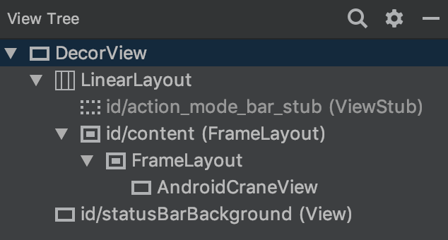
また、Jetpack Composeを利用して生成されるレイアウトはすべてのコンポーネントが組み合わさった状態でAndroidCraneViewとして認識されます。
Layout Inspectorでもそのように表示されるので、レイアウトをデバッグする際は少し苦労するかもしれないという印象を受けました。
テーマのカスタマイズ方法
さらに、レイアウトのテーマのカスタマイズ方法について見ていきます。
RallyApp
CraneWrapperの下にRallyAppという関数があります。この関数の内容が実際にレイアウトとして生成されることになります。
@Composable
fun RallyApp() {
    RallyTheme {
        Scaffold(appBar = { RallyAppBar() }) {
            RallyBody()
        }
    }
}
RallyAppの下にRallyThemeという関数があります。これはRallyアプリのテーマ(フォントファミリーやカラーなど)の設定を行うための関数です。
@Composable
fun RallyTheme(@Children children: @Composable() () -> Unit) {
    val colors = MaterialColors(
        primary = rallyGreen,
        surface = Color(0xFF26282F.toInt()),
        onSurface = Color(0xFFFFFFFF.toInt())
    )
    val typography = MaterialTypography(
        h1 = TextStyle(fontFamily = FontFamily("RobotoCondensed"),
            fontWeight = FontWeight.w100,
            fontSize = 96f),
        h2 = TextStyle(fontFamily = FontFamily("RobotoCondensed"),
            fontWeight = FontWeight.w100,
            fontSize = 60f),
        h3 = TextStyle(fontFamily = FontFamily("Eczar"),
            fontWeight = FontWeight.w500,
            fontSize = 48f),
        h4 = TextStyle(fontFamily = FontFamily("RobotoCondensed"),
            fontWeight = FontWeight.w700,
            fontSize = 34f),
        h5 = TextStyle(fontFamily = FontFamily("RobotoCondensed"),
            fontWeight = FontWeight.w700,
            fontSize = 24f),
        h6 = TextStyle(fontFamily = FontFamily("RobotoCondensed"),
            fontWeight = FontWeight.w700,
            fontSize = 20f),
        subtitle1 = TextStyle(fontFamily = FontFamily("RobotoCondensed"),
            fontWeight = FontWeight.w700,
            fontSize = 16f),
        subtitle2 = TextStyle(fontFamily = FontFamily("RobotoCondensed"),
            fontWeight = FontWeight.w500,
            fontSize = 14f),
        body1 = TextStyle(fontFamily = FontFamily("Eczar"),
            fontWeight = FontWeight.w700,
            fontSize = 16f),
        body2 = TextStyle(fontFamily = FontFamily("RobotoCondensed"),
            fontWeight = FontWeight.w200,
            fontSize = 14f),
        button = TextStyle(fontFamily = FontFamily("RobotoCondensed"),
            fontWeight = FontWeight.w800,
            fontSize = 14f),
        caption = TextStyle(fontFamily = FontFamily("RobotoCondensed"),
            fontWeight = FontWeight.w500,
            fontSize = 12f),
        overline = TextStyle(fontFamily = FontFamily("RobotoCondensed"),
            fontWeight = FontWeight.w500,
            fontSize = 10f)

    )
    MaterialTheme(colors = colors, typography = typography) {
        // TODO: remove this when surface auto-sets the text color
        val value = TextStyle(color = Color(0xFFFFFFFF.toInt()))
        CurrentTextStyleProvider(value = value) {
            children()
        }
    }
}
内容としては単にMaterialThemeをカスタマイズしています。
クラスの継承に近い雰囲気ですが、Jetpack Composeを利用する場合、元となるComposable functionをラップした形でテーマをカスタマイズするようです。
コンポーネントをカスタマイズする場合も同様になります。
Composable functionのソースコードとレイアウト
最後に、Composable functionのソースコードとレイアウトを見ていきたいと思います。
冒頭に記載した画像を再掲します。
いくつか具体的なコンポーネントがありますが、実装を理解する意味ではすべてを追う必要はないので、ここではRallyAlertCardを取り上げます。
RallyAlertCard
RallyAlertCardのソースコードは以下です。
@Composable
fun RallyAlertCard() {
    Card(color = cardInternalColor) {
        Padding(padding = 12.dp) {
            Column {
                Row(mainAxisAlignment = MainAxisAlignment.SpaceBetween) {
                    Text(text = "Alerts", style = +themeTextStyle { subtitle2 })
                    TransparentButton(text = "See All", onClick = { })
                }
                Padding(padding = EdgeInsets(0.dp, 12.dp, 0.dp, 12.dp)) {
                    val colors = +ambient(Colors)
                    Divider(color = colors.surface, height = 2.dp)
                }
                FlexRow {
                    expanded(flex = 1.0f) {
                        val text = "Heads up, you've used up 90% of your " +
                                "Shopping budget for this month."
                        Text(
                            style = +themeTextStyle { body1 },
                            text = text
                        )
                    }
                    inflexible {
                        // TODO: icons still don't work
//                        <vectorResource res=context.resources
//                            resId=androidx.ui.material.studies.R.drawable.sort_icon/>
                        TransparentButton(text = "Sort", onClick = { })
                    }
                }
            }
        }
    }
}
また、上記によって生成されるレイアウトは以下です。
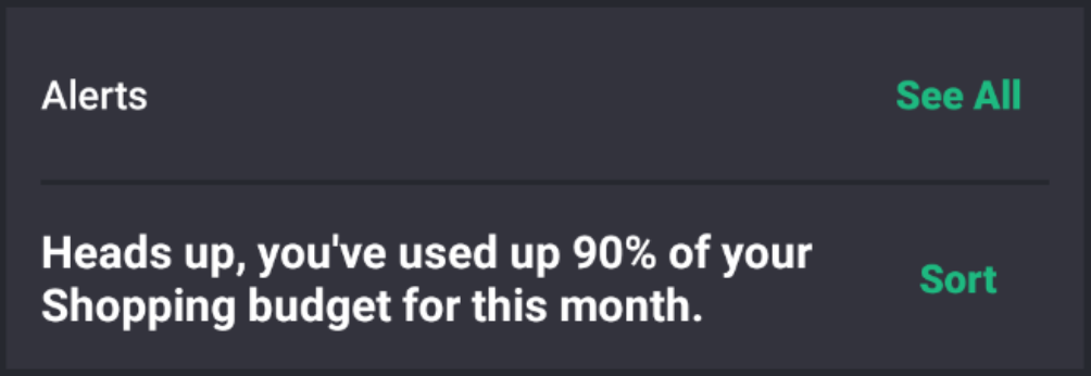
ここまで来れば、ソースコードとレイアウトの対応について特に説明する必要はないかと思います。
1つ特徴的だと感じたのは、今まで属性として指定していたPaddingがコンポーネントとして別個に用意されている点です。
個人的には+themeTextStyle { body1 }などの実装によって、内部的にどのような処理が行われ、指定したテーマが設定されるのかがきちんと追えなかったのでもやもやしているのですが、ここで時間をかけるよりは一旦production-readyになるのを待てばいいかなとも思い、"おまじない"として追うのを諦めました。笑
(単なる技術力不足の言い訳です。ご教示いただける方がいればぜひお願いしたいです…!🙏)
ざっとではありますが、Jetpack Composeを利用したコンポーネント作成からレイアウト生成までの流れについて、デモアプリのソースコードとレイアウトを比較しながら調べてみました。
力及ばず、この土日では本記事でまとめた内容を理解するので精一杯でしたが、ステートフルなコンポーネントの作成方法、エフェクトの付け方、リスト表示など気になる要素はたくさんあるので、追々見ていければと思います。
※個人ブログにも同様の内容を書いたのですが、Qiitaの方がコメントやアドバイスがいただける可能性が高そうなので、Qiitaにも転記させていただきました。